When it comes to capturing the details and shapes of architectural structures, knowing what to include and what to leave out are equally important factors. We speak to three photographers about their abstract approach to architecture photography
What is abstract architecture photography?
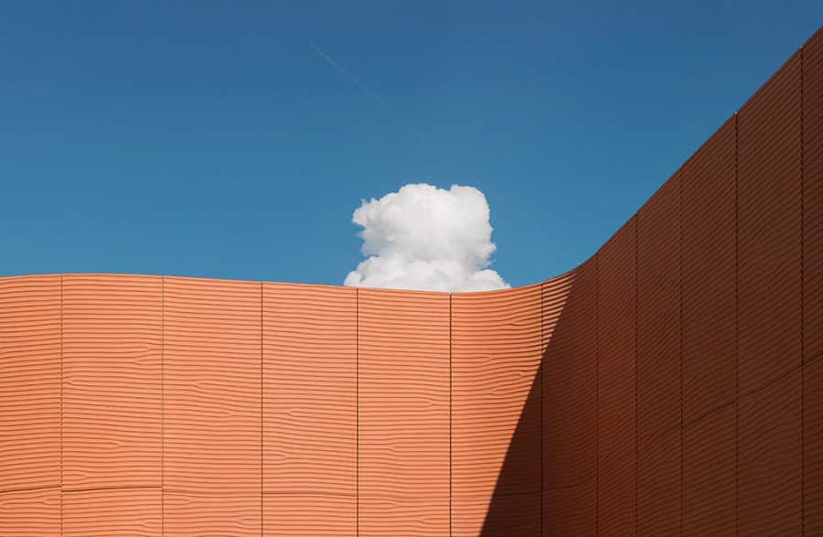
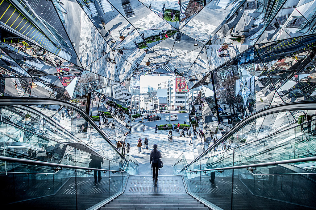
Abstract architectural photography is about finding the most interesting elements of the exterior or interior of a building or structure and capturing them in unique ways. This type of architecture photography focuses on shape, forms, textures, colour, light and perspective. The results are often unexpected, and unrecogniseable from their original state.
Mike Hollman’s tips for abstract architecture photography
Use leading lines
With architectural photography, leading lines can be used to guide the viewer’s eye towards specific elements of the building or to create a sense of depth and dimension in the image. By incorporating diagonal lines, curves, or vertical lines into the composition, you can create a more dynamic shot. They can be found in various architectural features such as staircases, columns, or the convergence of parallel lines in a building’s design.
To harness the power of leading lines, carefully consider their direction and placement within your frame. Strong horizontal lines can convey stability and serenity, while diagonal lines suggest energy and dynamism. Leading lines need not be limited to only physical structures. Shadows, light patterns, or even the flow of people within a space can also serve as powerful leading lines. Experiment with different angles and perspectives to find the most captivating composition.
Make use of colour
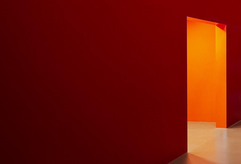
Colour can play an important job by adding visual interest and emphasising certain features of a building. It can also be used to complement or contrast with the surrounding environment.
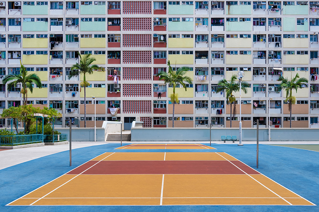
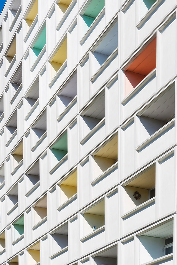
When thinking about colour in fine art architectural photography, colour becomes a great tool to express emotions, highlight architectural details, and add impact to your shots. To make the most of colour, observe the dominant tones and complementary colour palettes present in the scene.
Experiment with contrasting colours to create bold visual statements or use similar colour combinations for a more tranquil and cohesive look. Pay attention to how different colours interact with architectural elements.
Shoot in Black & White
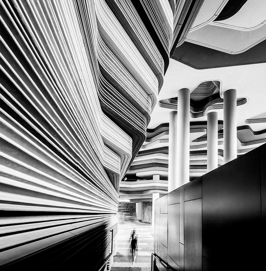
While colour can be a powerful tool, black & white photography offers a unique way to capture the essence of architecture in a timeless and abstract manner. Stripping away the distraction of colour allows you to focus on shapes, textures, patterns, and the interplay of light and shadow, revealing the beauty of the architecture.
Shooting in black & white can enhance the graphic and geometric qualities of a building. By removing the distraction of colour, you can focus on the lines, shapes, and patterns of the architecture, and create a more dramatic and striking image.
Create a Triptych
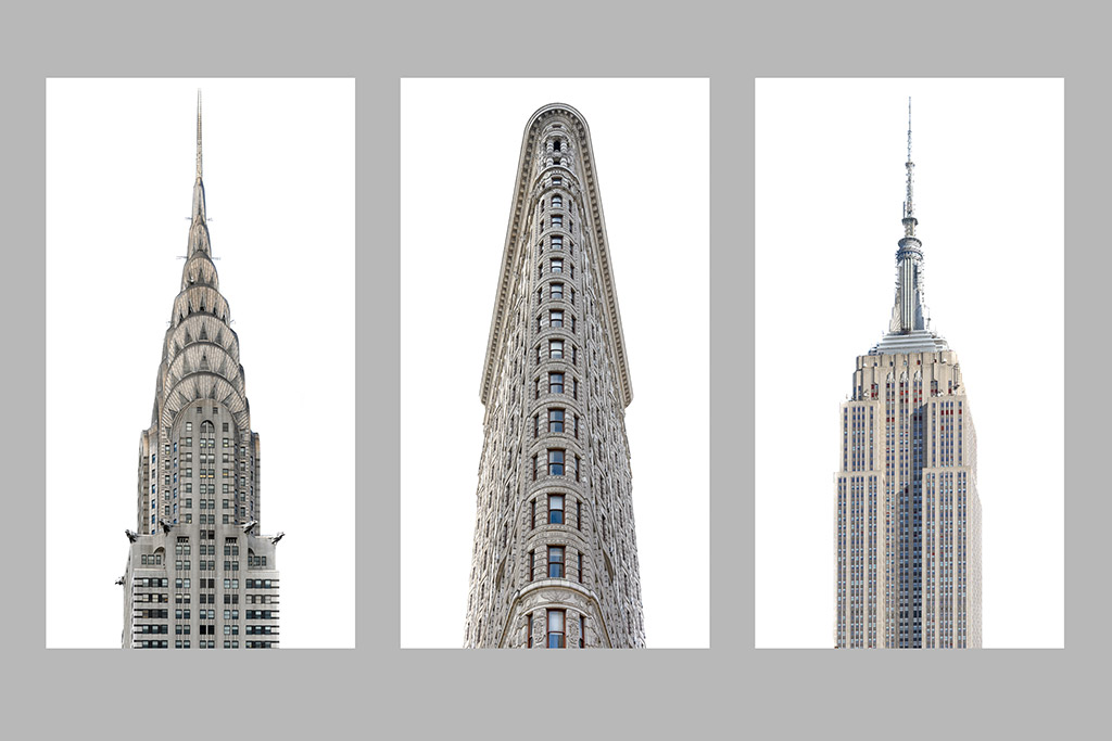
By creating a triptych of your images, you can tell a story about the architecture, showing how it fits into its surroundings, or how it changes over time. A series of images enables you to explore the architectural subject from different perspectives or tell a story with images that relate to each other. Another approach is to shoot one subject from different angles, or lighting conditions, to capture the architectural subject from various viewpoints. This diversity will add depth to your series and help engage your viewers.
Multiple Exposures
Multiple exposures reveal the hidden dimensions of architecture. Shooting a multiple exposure, you can challenge the viewer’s perception and encourage them to see your subject in a new and different way. Many cameras allow you to shoot multiple exposures in-camera and overlay and align the images in the viewfinder.
You need to be mindful of your composition, and how the lines, textures and shapes interact with each other to combine a winning shot. This can also be achieved in post-processing using Photoshop etc. Creating multiple exposures are a great way to add an abstract element to your shots.
Include people
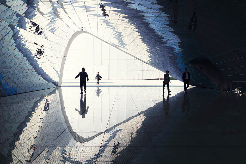
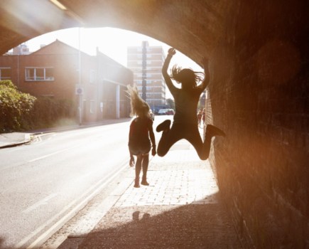
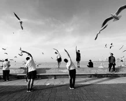
Architecture is designed for people. Including them adds a sense of scale and shows the context of how the building is used and interacted with. People can make the shot more engaging and relatable. When including people in architectural compositions, consider their placement and interaction with the surroundings.
Experiment with positioning them to complement the lines, shapes, and patterns of the architecture, or to add a sense of movement against the rigid lines of a building. People also help you tell a story. Whether it’s capturing a solitary figure contemplating the architectural beauty or a bustling crowd that consumes the space. Look for the moments of interaction with the architecture.
Mike’s recommended kit for abstract architecture photography
Arca-Swiss L-Bracket
When attached to a camera, this piece of kit makes it easy to swap from horizontal to vertical shooting, whilst keeping the camera’s weight centered over the tripod.
Nikon PC 19mm F4E Ed Tilt Shift Lens
A fantastic lens for architectural photography, allowing me to control perspective, create seamless panoramas and scenes with selective focus.
The Photographer’s Ephemeris App
I use this app all the time to plan my shoots. It allows me to see how the light will fall on any location, any time of day, anywhere in the word.
Mike Hollman
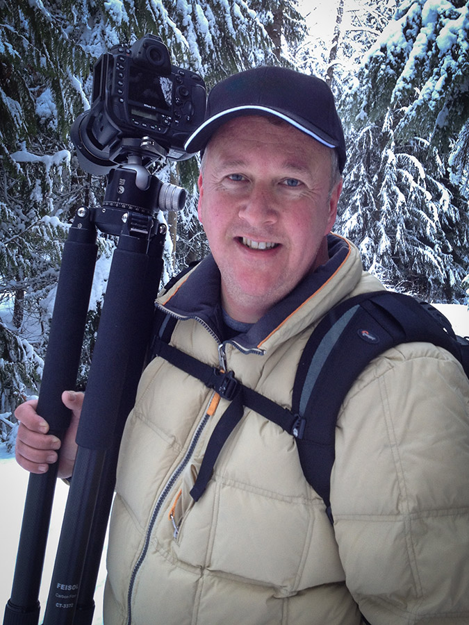
Mike is a commercial architectural and travel photographer. He has photographed some of the most iconic buildings around the world and has been featured on CNN and in National Geographic Magazine. He is a New Zealand Nikon Ambassador. See him on Instagram @mike_hollman_ or www.MikeHollman.com
Tips for abstract architecture photography from Andrés Gallardo Albajar
The importance of a cohesive visual language
My series, Urban Geometry, is all about geometry, symmetry, colors, light and shadows. Over the years I’ve realised how important it is to build a cohesive language, and it’s something I have been working on for a long time. The first series (2013-2015) were a more heavily edited set of images, I altered the colors in search of more warmth and surreal skies. But I eventually concluded that was not really what I liked, and I started bringing a more realistic look to my images to fulfill the expectations of the architecture industry. The key is to create a cohesive portfolio of work.
Add a sense of scale
Something I find interesting with architectural photography is to add people to my photos. By adding a human element, you don’t only add life to the images, you also offer a way to understand the scale of the architecture.
Light and shadow
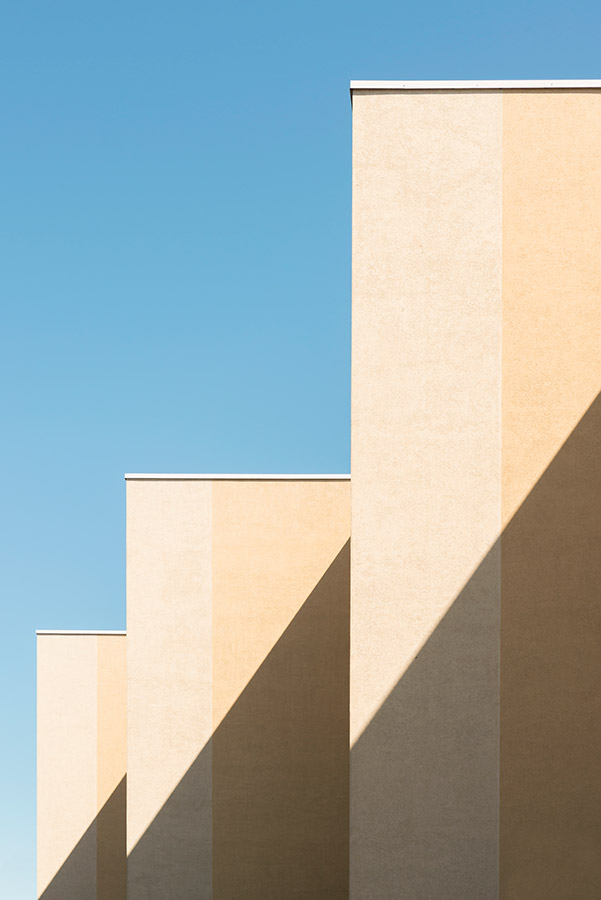
As you can see by taking a quick look at Urban Geometry, I love intense light and hard shadows. You can’t control it, but of course a basic understanding of how the sun moves is essential. I like to avoid the time of the day when the sun is at its highest, since that gives very little or no shadows. A lot of time goes to waiting for the right moment. Sometimes the shadow you are looking for is just 30 minutes away. And we should not forget the element of luck. Being in the right place at the right time can make a picture unique.
Research your location
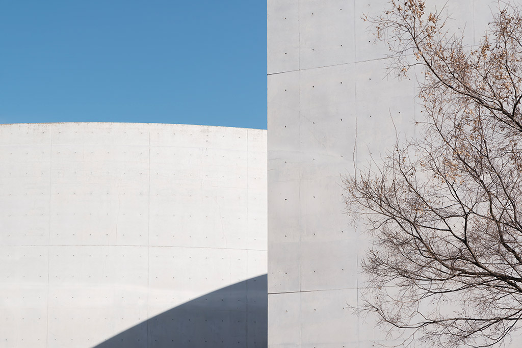
Mimesis Museum. Castanheira & Bastai Arquitectos + Jun Sung Kim + Álvaro Siza Vieira. Seoul, South Korea. Photo credit: Andrés Gallardo Albajar
Research is a very important part of the process for me, and vital to the Urban Geometry series. Before visiting a new city, I study the architecture and map out their locations. I never have the time to visit every single one, but that’s a good thing, I have a reason to go back. And I should also mention that I have the worst sense of orientation and get lost very easily. But I love that because many of my favorite photos have been taken in accidental locations. Planning is important and a good starting point, but I think it’s great to leave room for spontaneous and random encounters.
Add depth
While I do own and use several tripods, I shot my Urban Geometry series handheld. When it comes to the camera settings, I switch between an aperture of f/8 and f/11. My aim is to include as many details as possible so a medium to large depth of field is important, but this very much depends on the ambient light conditions and the shutter speeds I’m working with handheld. Showing depth in my photos is vital to the elements I like to capture, I want to include the details, patterns, and repetition as these are also very playful elements and are key to my style of photography, particularly in my Urban Geometry series.
Andrés’ recommended kit for abstract architecture
Nikon D800
I shoot with a Nikon D800. I got it ten years ago, and it’s a great full-frame camera. But over the years I’ve realised that the camera is just a necessary tool. Any camera that you have will allow you to take great pictures. I know people doing incredible work with their phones.
Tamron 24-70mm f/2.8
Most of my Urban Geometry series has been shot with a 24-70mm, but I always carry a 15-30mm for any wider shots. Both lenses are from Tamron, and they perform well.
Manfrotto 410 Junior Geared Head mounted on Sirui legs
I have a few tripods, but my favourite is a Manfrotto 410 junior mounted on Sirui legs. The head is a bit heavy to carry but offers great stability when needed.
Chocolate!
When wandering the streets looking for potential photo opportunities, I run on chocolate, so there’s always some in my backpack. Shout out to chocolate brands to sponsor me!
Andrés Gallardo Albajar

Andrés is a self-taught photographer specializing in architecture and everything urban. As a son of architects, Andrés grew up surrounded by architecture books and magazines. He got his first camera in 2012 as a gift and photography has been his main passion ever since. See more of his work at www.andresgallardo.photography and on Instagram @andresgallardo.photography
Top tips for abstract architecture photography from Mark Benham
Be curious and keep an open mind
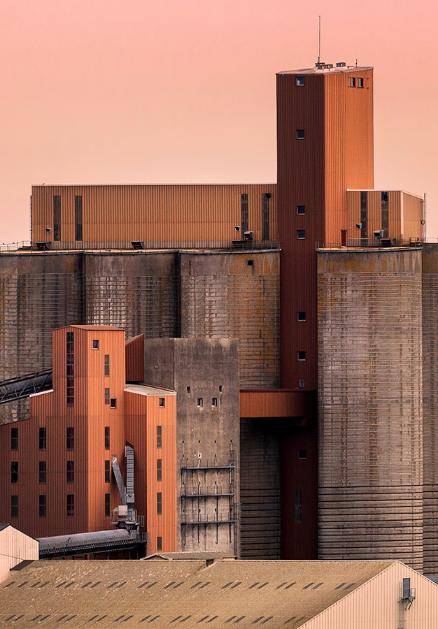
Quite often when travelling, subjects, architectural or not, will present themselves unexpectedly. The Silos, which won the Architecture category of the 2023 Sony World Photography Awards, was taken during a holiday in France while visiting Brest. Wandering around the roads which run through the port area, I came across several interesting buildings, but the group of buildings in this image were of particular interest. Having taken several shots, I was curious to see how they would look further away. That curiosity led to the shot you see, taken on a hillside overlooking the port.
Pick a focal point
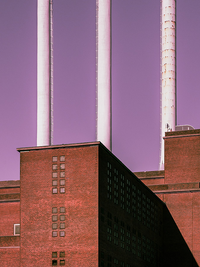
How we frame our images determines how they are seen, and how each image portrays the architecture itself. When confronted with a building there can be a lot to take in. By framing selected sections of a building, or buildings, we can create images which are more individual, and which have a pleasing aesthetic. The Svanemolle Power Plant in Copenhagen is a huge building with three distinctive chimneys. By leaving out much of the building I was able to make the chimneys the main point of interest.
Less can be more
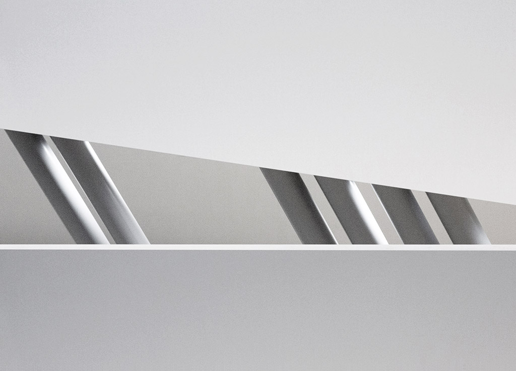
I think it’s fair to say that my architectural shots are largely, if not entirely, all about reducing the constituent parts of a building, or buildings, in order to satisfy the way I like to interpret what I see. I call this ‘Deconstruct’. For me, it is as much about what to leave out as it is about what to include in each composition. By framing smaller areas of buildings, we simplify the content within a more intimate composition.
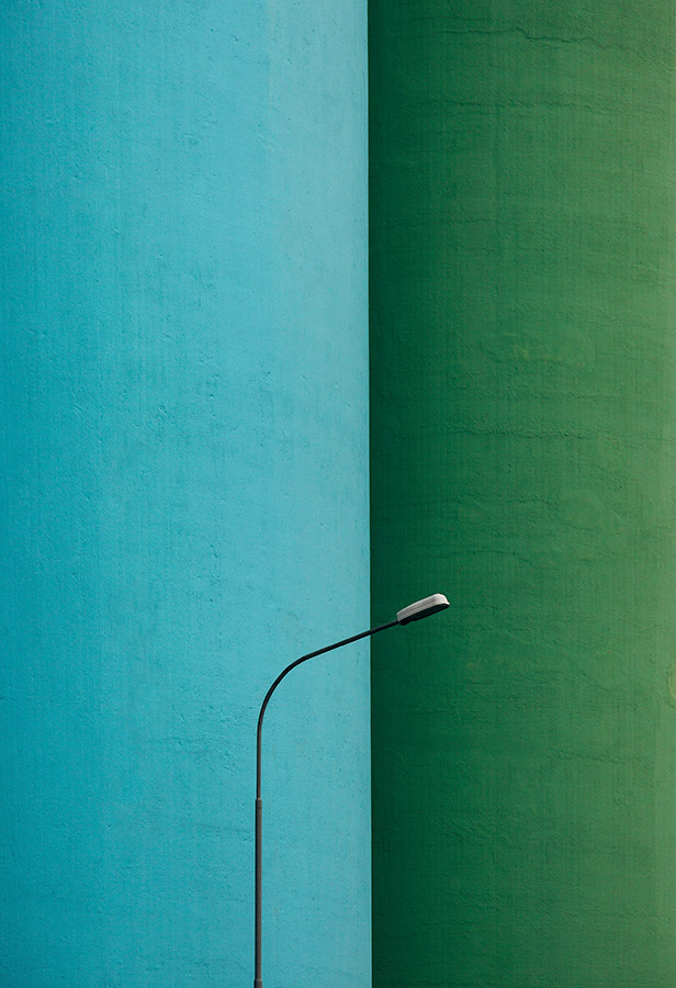
Two examples are the images I took at the cement plant in Akranes in Iceland and inside the University of Economics in Vienna. At the cement plant I favoured a tight composition which enhanced the juxtaposition of the large coloured storage silos and the delicate looking lamp post in front. By closing in on the detail inside the University, I hint at the style of the modernist building, through a minimalist abstract image.
Shadows and shapes
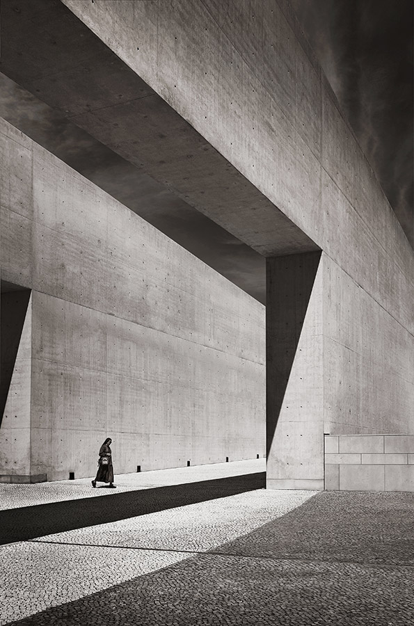
While middle of the day sun is often frowned upon for landscape photography, I’ve used it to my advantage in some of my architectural work. The harsh contrast between light and dark areas at this time of day can work well, particularly in black & white. The example shown here, of the Basilica of the Holy Trinity modernist church in Fatima, Portugal was shot between 1pm and 2pm. In my humble view, the image is enhanced by carefully using the shadows within the composition. The shapes of the shadows themselves add another dimension to the scene.
Colour, light and style
Architectural photography offers a great deal of scope to photographers, the way in which a photographer portrays the same building can be very different. Light will play an important part in this and should determine whether an image works better in colour, or black & white. Mood being the key word here.
For me, the building and its immediate surroundings will often influence how I want to portray it. The image taken of the modernist church in Fatima was all about shapes and scale, as a minimalist image. I felt that colour was a distraction. Whereas the shot of the room off the corridor in the arts center in France really needed to be in colour to show just how vivid the interior art space was. Again, this was a minimalist image. But it’s a personal choice.
Travel light
Lugging heavy kit around can be tiring and impractical. When I’m photographing architecture, it often involves a lot of walking to check out angles and viewing points. I am often on my feet for a day or two at a time! Over the years I have learnt to whittle down my kit to the essentials: I carry a small bag with one camera and just a couple of lenses inside.
Mark’s recommended kit
Canon 5D Mark III
It is worth mentioning that I am not into changing kit often. Apart from the expense, I am of the view that if your kit works for you, then stick with it, unless there is a good reason not to. To reiterate this point I am still using my trusty Canon EOS 5D Mark III. I have been so pleased with this camera that I have had it repaired numerous times.
Canon EF 24-105mm f/4L IS USM
My 24-105mm lens is worth its weight in gold because of its wide angle and zoom facilities. Although it is heavier than I would like, it allows me to capture a range of architectural images without needing to change lens. In addition, the 70-200mm I use gives me that extra distance range when required.
Manfrotto 441 Carbon One Tripod
I only use a tripod for interior work or night work. The models I have are a well-used 441 Manfrotto and a smaller 198cm K&F Concept if I want to travel light when flying. I use both with ball heads.
Mark Benham
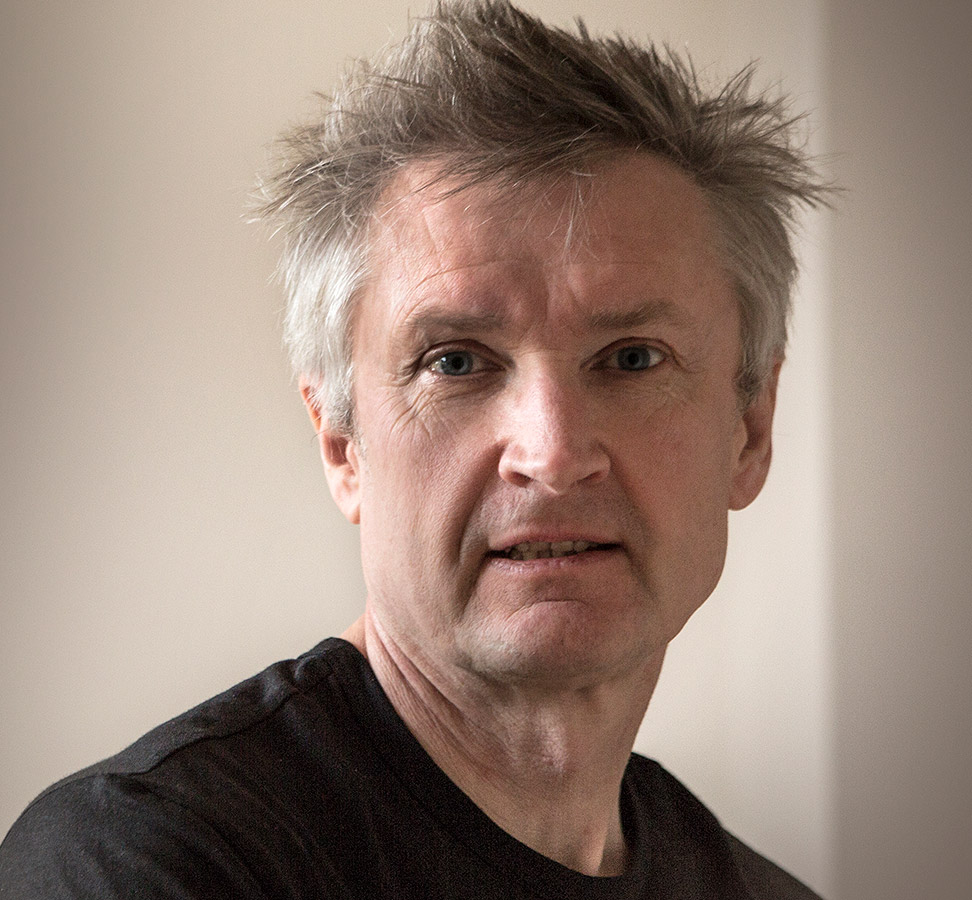
Mark is a self-taught award-winning photographer whose work has spanned a broad range of subjects across several genres; from people at work and artisan producers and food in action, to travel and the environment. To see more of his work, visit www.markbenham.co.uk or find him on Facebook @markbenhamphotography or Instagram @markbenhamphoto
Further reading:
Fine art architecture photography guide
Master black and white building photography
Follow AP on Facebook, Twitter, Instagram, YouTube and TikTok.

