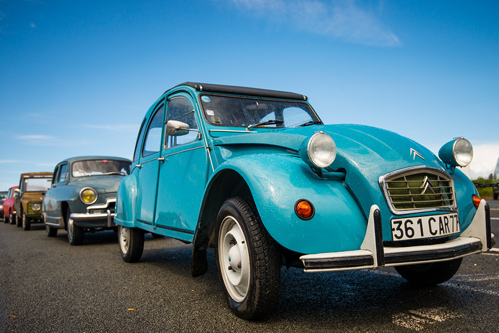
Colour grading is a hot topic in photo editing, and a great way to enhance the mood of your images. James Paterson gets you up to speed
What is colour grading?
Colour grading is something we associate with video editing, but as the boundaries between video and stills – as well as photographers and videographers – become increasingly blurred, it’s a technique that is ever more relevant to photographers. But what exactly is colour grading? And what tools and apps do we need? Below, we’ll explore some of the key techniques for colour grading in Lightroom and Photoshop and show you how to create classic colour grading looks.
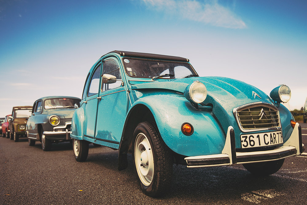
Photo editing can be divided into two broad stages. First is the correction stage, where we fix white balance, fine-tune exposure, crop and make other tweaks. Then comes the creative stage, where we create an atmosphere. This is where colour grading can be so effective. It’s a great mood enhancer, whether we want to give our photos a warm, sunny vibe, a cold sombre feeling, or a retro makeover. By mapping colours onto the highlights, midtones or shadows, we can take our images in all kinds of interesting directions.
Lightroom colour grading
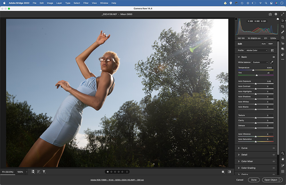
The best place to begin colour grading in Lightroom is – no surprise – the Colour Grading panel. A replacement to the old Split Toning panel, this invites you to add colour tints to the shadows, midtones and highlights in your photos (of course, you don’t necessarily have to tint all three). As with most photo edits, you’re better off starting with a raw file than a JPEG as there’s more colour information to work with, and therefore greater headroom for editing. What’s more, with raws you can set white balance after the fact with exactly the same results as if you’d done so before taking the shot, which gives you greater freedom both for correcting colour casts and introducing creative colour shifts.
Get to grips with the Lightroom color grading panel
Fix colour casts
Colour grading and colour correction are sometimes confused with one another. Correction makes colours look natural, while grading shifts colours and enhances a mood. To correct colours, grab the White Balance eyedropper tool in the Develop Module Basic panel and click on a neutral point.
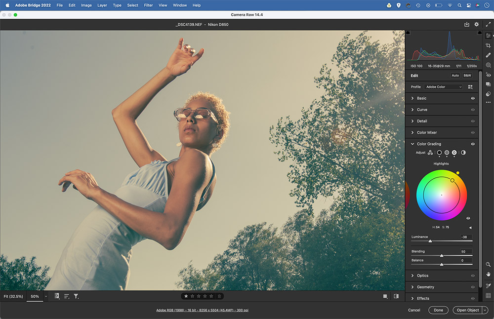
Colour grading wheels
Scroll down to the Colour Grading Panel on the right. The icons at the top of the panel let you display different colour wheel views. You can view Shadows, Midtones or Highlight colours, or all three at once. There’s also a global wheel that lets you add a universal colour tint.
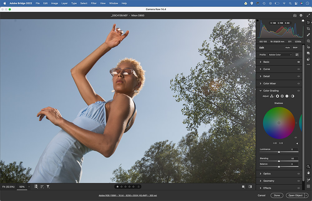
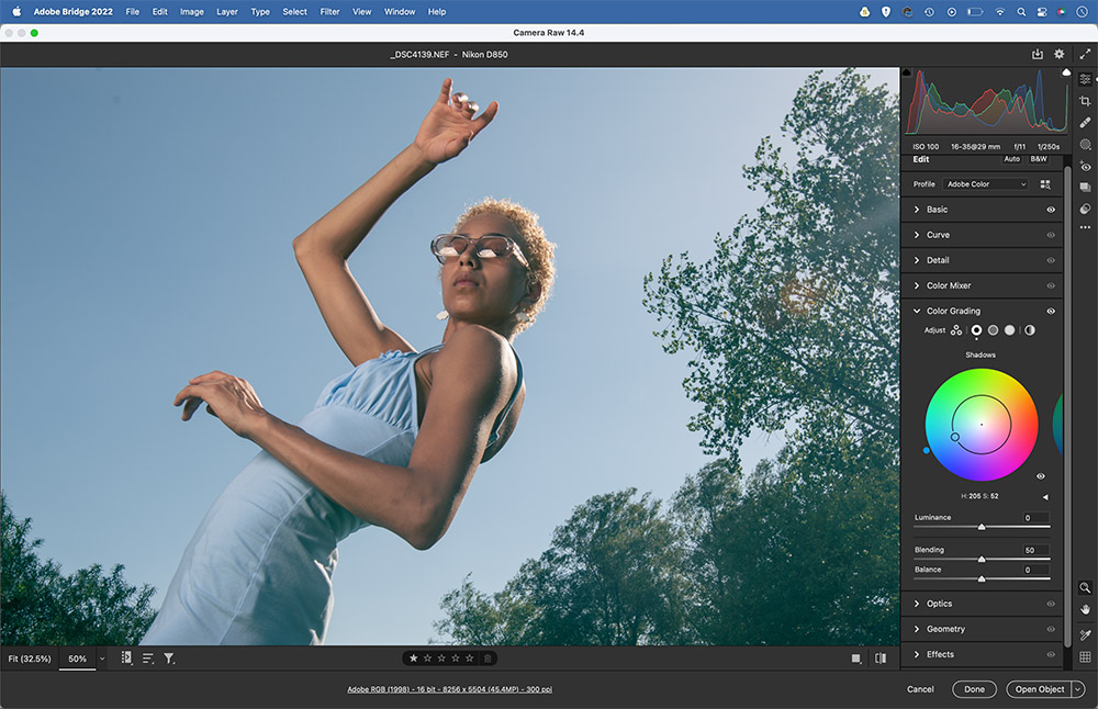
Tint the shadows
Start with the Shadows colour wheel. Drag the point around the colour wheel to tint the shadows. The circular position of the point will determine the hue of the chosen colour, while the distance from the centre will set the saturation. If you want to reset and try again, simply double-click the wheel.
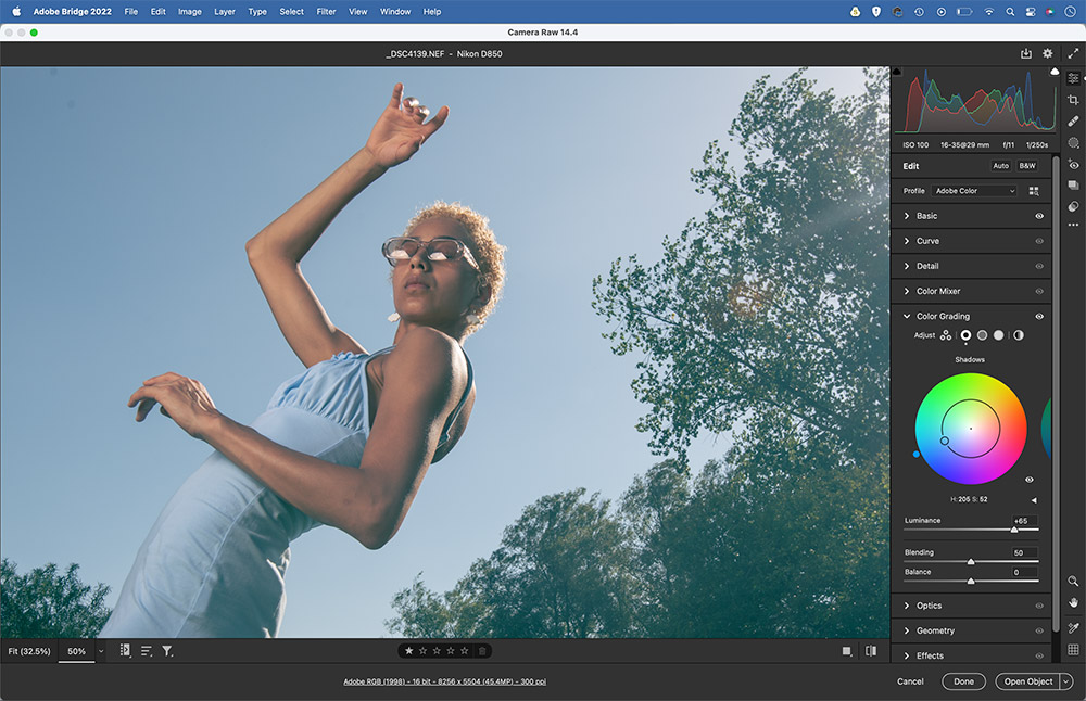
Adjust the brightness
As well as adding a colour tint, you can also fine-tune the brightness of the shadows, midtones or highlights with the Luminance slider, which is found below the wheel. In this example, we’ve lifted the shadows slightly, which makes the blue colour tint more pronounced.
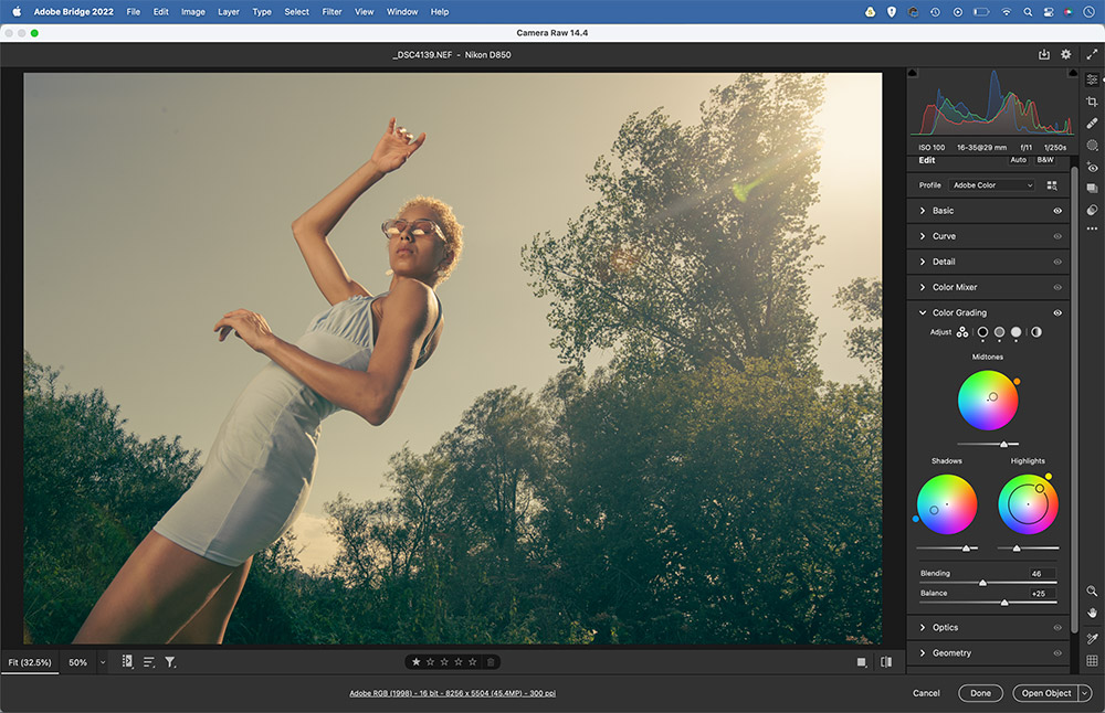
Grade midtones and highlights
Next, click the edge of the wheel on the right to switch to the midtones. Tint the midtones in whichever way you like, then switch to the highlights and do the same. Here, we’ve added a warm orange tint to the midtones and a subtle yellow tint to the highlights.
Set blending and balance
Switch to the 3-wheel view to fine-tune the effect. The Blending slider lets you tweak how abruptly the colours change from one to another. The Balance slider widens or shrinks the part of the tonal range affected. Push it towards the left to shift the bias towards the shadows, or right for the highlights.
The power of Profiles
Found in the Lightroom Basic Panel, the Profile browser offers a range of one-click treatments, many of which are fantastic for colour grading. Profiles are organised into different sets like Modern and Vintage. Hover over the thumbnails to see how they affect your image. Once chosen, the Amount slider lets you control the strength of the effect.
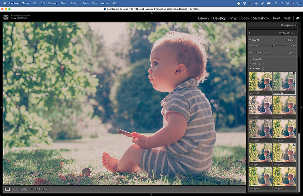
You might find the perfect Profile for your image straight off the bat, but even if not, they can still be useful for kick-starting your colour grading. You can also save your own colour effects as profiles. To do so, open the image in Camera Raw, go to the Presets panel, hold Alt and click the New Preset icon to create a new custom profile.
Colour grading with Curves
Curves is a fabulous tool for colour grading. Not only can you change the brightness of different parts of the tonal range by dragging the curve line up or down (the left side affects shadows, the right highlights), you can also target and alter colour channels (red, green and blue for an RGB image). The easiest way to get started is with the Curve panel in Lightroom/Camera Raw.
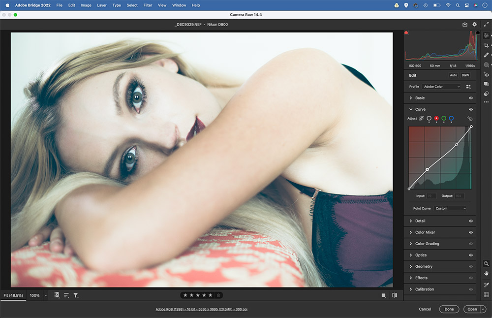
Target a colour channel, then experiment by dragging the top or bottom points up, down, left or right to tint the shadows or highlights. The colours in the graph give you an idea of the shifts you can make. The red channel lets you add red or cyan, the green channel introduces green or magenta, and the blue channel offers blue or yellow. You can get some unusual colour shifts by making several points along the curve line by, for example, adding a red tint to highlights and a cyan tint to shadows.
LUTs and how to use them
Learn how to use and create colour LUTs (lookup tables) for your favourite colour grades
Colour lookup tables – which are known as LUTs for short – are a means of applying different colour grades to your photographs or videos. As the name suggests, a LUT simply determines how a certain colour should look. To explain how they work, imagine a table with two columns, in which column A is a list of all the colours in your image as they are, while column B lists an alternative set of colours. When applying a LUT, each colour in column A is switched to the corresponding colour in column B. So in effect, LUTs are presets for different colour treatments.
However, as well as altering the hue and saturation of a colour, LUTs also allow you to change the brightness. This can lead to all sorts of interesting effects, such as the popular matte shadows look, where the darkest tones in an image are flattened out for a retro feel.
There are numerous ways of applying LUTs to your photos. In Photoshop, there’s the dedicated Colour Lookup Adjustment Layer. This offers a range of presets. Some are good, but most are awful. More interestingly, Photoshop gives you the option to create and export your own LUTs. Any combination of Adjustment Layers and blending modes can be exported as a LUT, so you can save your favourite colour grading treatments for quick use on other photos. The best way to do so is to include the LUT in a custom profile for Lightroom.
Many third-party LUTs are available, too, many of which emulate the look of blockbuster movies. Some are paid for via monthly subscription, so watch the cost.
Create your own LUTs and custom profiles
Try Photoshop LUTs
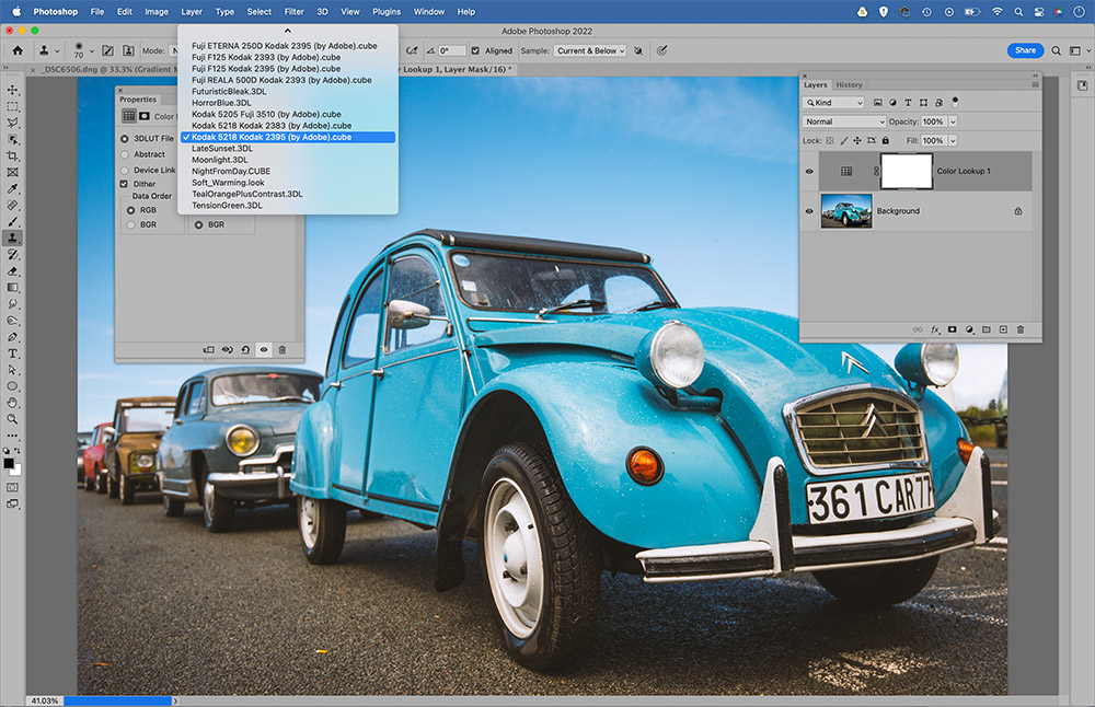
Open an image into Photoshop then click the Adjustment layer icon at the bottom of the Layers panel and choose Color Lookup. Click through the various presets in the 3DLUT dropdown to try out different effects. The film presets like the Kodak LUT here can add a nice retro treatment.
Make an adjustment
If the Color Lookup presets don’t work for you, try making your own colour changes. Start with the Gradient Map Adjustment Layer. It allows you to map colours onto the tonal range of your photos. You can then lower the layer opacity or use a blend mode (Overlay here) to make the colour shifts more subtle.
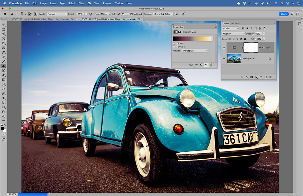
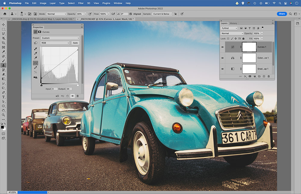
Combine tonal effects
The great thing about using Adjustment Layers for your colour grading is how you can build up the effect on several layers and combine a range of adjustments. Here, we’ve added a Colour Balance layer to skew the colours slightly, and a Curves layer to flatten out the contrast.
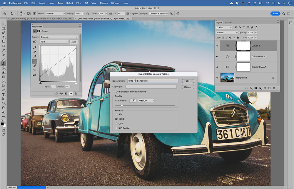
Export your LUT
If we settle upon a combination of Adjustment Layers we like, we can export them as a new LUT. Go to File>Export>Colour Lookup Tables. Give it a name and save as a Cube file. Once done, you can load the cube file into the Color Lookup Adjustment Layer, although it’s a clunky workflow; better to save the LUT as a profile.
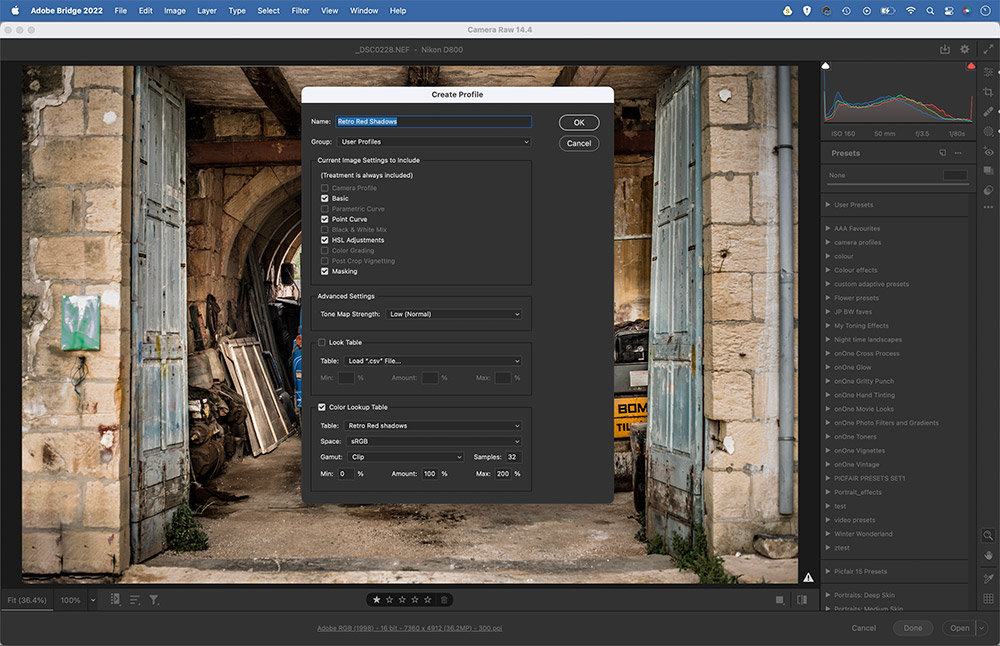
Make a profile
LUTs saved in Photoshop can be added in to Profiles for use in Camera Raw or Lightroom. Open any image into Camera Raw, click the Presets icon in the toolbar then hold Alt and click the New Preset icon. In the New Profile box, go to the Colour Lookup section and load in your custom LUT, then save it as a Profile.
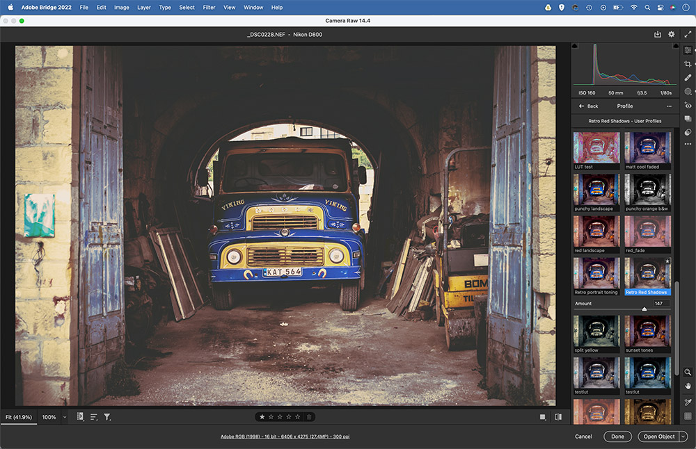
Test your new profile
Your newly created Profile will be available in the Profile Browser, ready to be applied to other images. It’ll also sync to Lightroom the next time you open the application. The great thing about creating LUTs in this way is that you also get an Amount slider that lets you control the strength of the colour change.
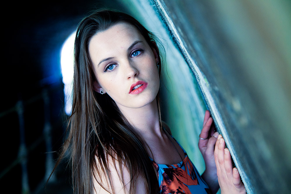
Get the cinematic look with colour grading
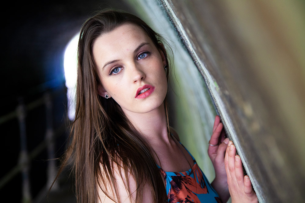
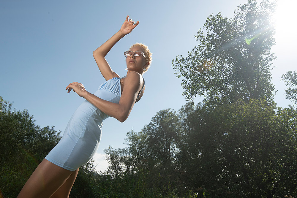
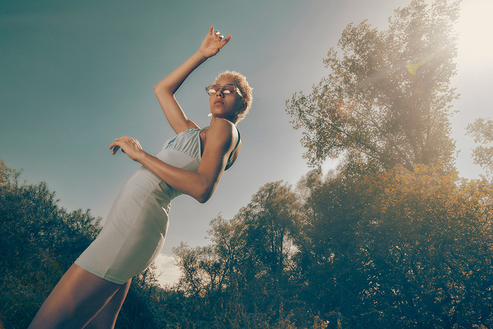
Among the most popular of the colour grading effects, the cinematic look introduces blue into the shadows while retaining the delicate tones in skin, which makes it ideal for a stylish environmental portrait. We can achieve this using the Selective Color Adjustment Layer in Photoshop. A useful tool for all sorts of colour grading effects, it allows us to tint existing colour ranges for different results. Here, we can add blue and cyan to the image, then target the reds and yellows in the skin tones and reduce the effect.
Open an image into Photoshop and add a Selective Color Adjustment Layer. Select Colors: Neutrals and set Cyan +15, Yellow -10. Then Select Color: Red and set Cyan -15, Yellow +10. Next select Color: Yellow and set Cyan -15. Finally, use a Curves layer to boost contrast by plotting an S-shaped curve.
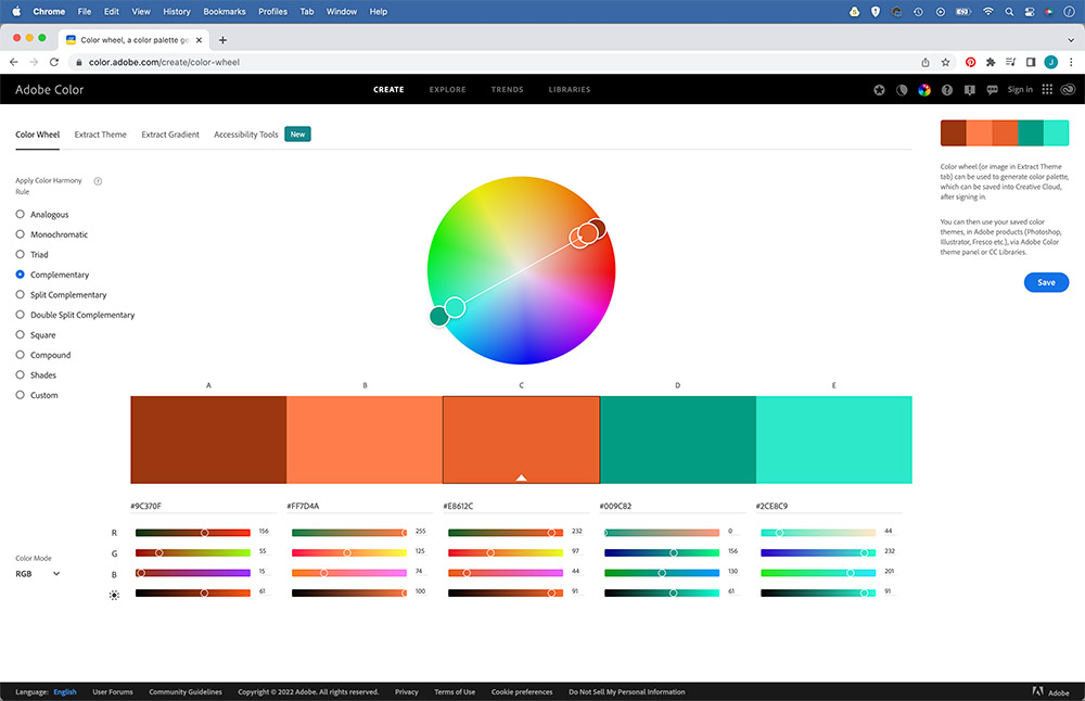
Find complementary colours
Once you start colour grading, you’ll quickly realise that the techniques and tools involved aren’t that difficult to master. Instead, perhaps the bigger challenge is in choosing the right combination of colours for your image. But which colours work best together, and at what strengths? There are no rules here, but a little colour theory can help. You’ve probably heard of complementary colours.
These are different shades that work well together, and they usually sit opposite one another on the colour wheel – red/cyan, orange/teal and purple/green can all work well. Adobe offers a great tool for colour combinations. Go to color.adobe.com for a handy interactive colour wheel. Choose from the different Harmony rules on the right, then drag the colour wheel to find complimentary combinations. If you log in with your Adobe account, you can save these to your Photoshop Library for quick access in your projects.
Six colour grading hints and tips
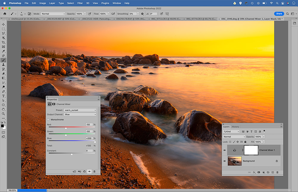
Intense sunsets with Channel Mixer
Here’s a quick Photoshop trick for sunsets. Add a Channel Mixer Adjustment Layer. Select Output Channel: Red and set Red +200, Green -50, Blue -50. Next set Output Channel: Blue with Red -50, Green -50, Blue +200. Tweak Layer opacity to adjust the strength.
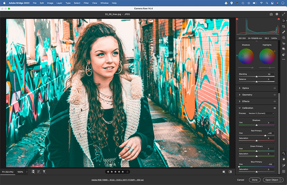
Get the orange-teal look
For an orange-teal treatment, open the image in Camera Raw or Lightroom and go to the Camera Calibration Panel. Set the Blue Hue slider to -100, and the Red Hue slider to +50. Go to the Color Grading panel and add orange to the highlights and cyan to the shadows, then lift shadow luminance to crush blacks.
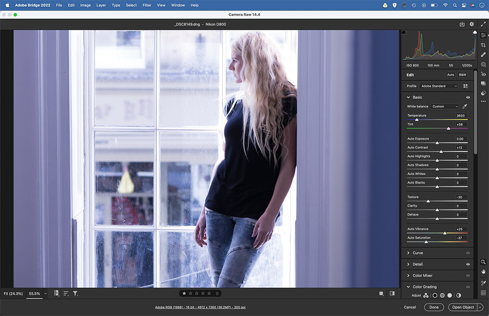
Creative white balance
We tend to think of white balance as a tool for correcting colours, but it can also be used to great effect to introduce creative colour shifts into your photos. Here, by pushing the temperature slider to the left we can create more of a sombre mood. Of course, you can also do this at the time of shooting.
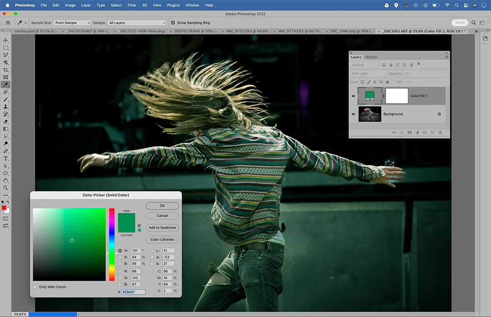
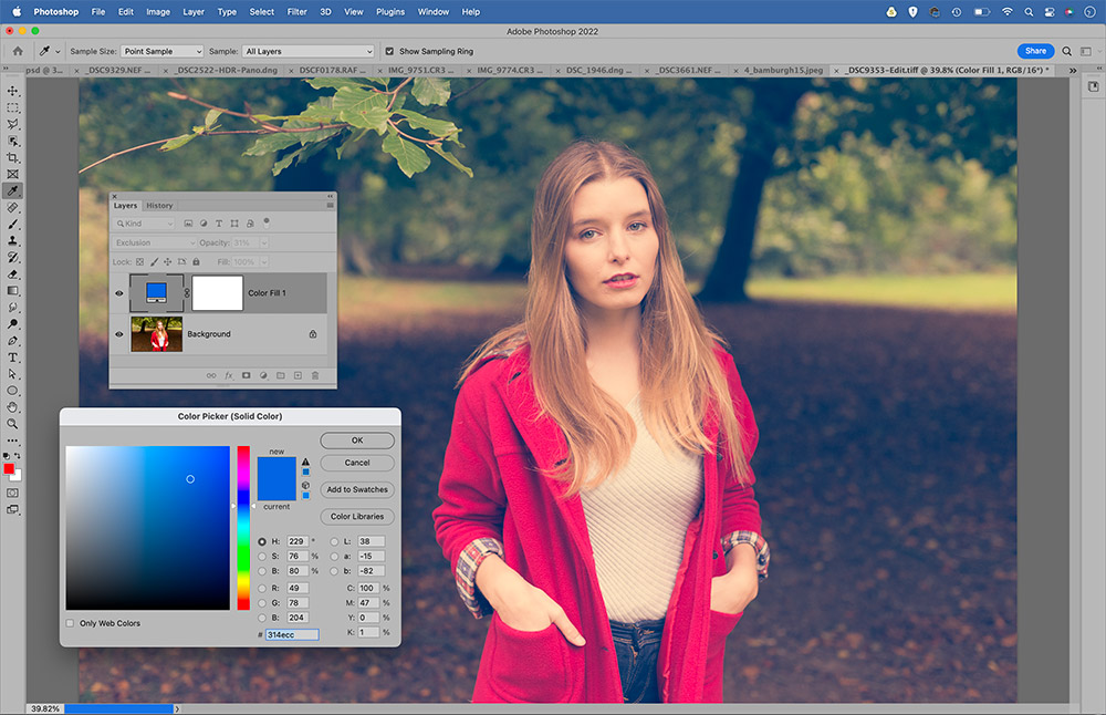
Blend a Solid Color
For a simple colour change, try adding a Solid Colour Adjustment Layer. Choose a colour to fill the image, then experiment with layer blending modes. The Screen, Multiply, Overlay, Soft Light and Color modes can all work well. Once done, use layer opacity to adjust the strength of the effect.
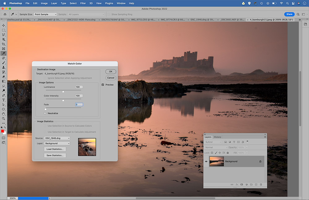
Match images
Photoshop offers two commands that let you replicate a colour look from one image to another. First open both images in Photoshop, then either go to Adjustments> Match Color, or try Filter>Neural Filters>Color Transfer. Target the other open image in the Source options, then fine-tune with sliders.
Speedy retro
Here’s a quick trick for a retro yellow/blue treatment. Add a Solid Color Adjustment and choose a bright blue, then change the blending mode of the layer to Exclusion. This will add blue to the shadows and yellow to the highlights. It will be too strong at first, so lower the layer opacity until it looks right.
So, now you have some of the key techniques for colour grading in Lightroom and Photoshop, you can begin experimenting with the moods of your photos, from cinematic to retro or playful complementary colours to sombre. There’s a host of software out there alongside the popular Lightroom and Photoshop, some more intuitive than others. Once you master the key methods, you can unleash your creativity.
Related reading:
- How to edit Raw – AI and new software features
- How to use Lightroom presets & profiles
- Best Adobe Lightroom presets
- How to use colour creatively in your photography
Follow AP on Facebook, Twitter, Instagram, YouTube and TikTok.