Get close to your foreground subject to exaggerate the perspective in the scene. Canon EOS 5D Mark III, 70-200mm, 5sec at f/22, ISO 100. Credit: Ian Plant
What makes a great photograph? Many candidates immediately spring to mind, such as subject matter, light, mood and moment. In my opinion, however, one aspect clearly rises above the rest, and that is composition: the visual design of your photograph. Composition is your way of communicating your artistic vision to others, commanding the viewer’s eye and directing it to what is important. A snapshot shows the world what your camera sees, but when you create a composition, you show the world what you see. In this article, I will explain how to make compelling visual designs that get noticed.
Learn to think in the abstract
The key to successful composition is abstract thinking, which involves learning to see everyday elements not for what they are (i.e. trees, clouds, mountains, etc.) but for what else they are – shapes and colours and visual energy. In particular, you must learn to recognise and establish dynamic visual relationships between shapes (also known as forms). Shapes fill the space within the image frame, and are the building blocks of image design, the foundation upon which a composition is built. Our world contains a seemingly never-ending array of shapes, such as lines, curves, triangles, squares, spirals, rectangles, and circles. Training yourself to notice these shapes around you – and, more critically, finding ways to make shapes work together – is fundamentally important to mastering composition.
Pick great subjects
I don’t mean that you should only shoot subjects that are beautiful, majestic or awe-inspiring, but look for subjects that are meaningful and unique. Try to tell your subject’s story by including visual elements that reveal something special. Critical to picking the best subjects are research and scouting. Before every shoot, I spend time researching my subject, and when in the field, I don’t just wait for something good to fall from the sky into my lap; instead, I get out and explore, looking for amazing compositions. Only then can you really see what the world has to offer.

Getting close to the foreground ferns with a wideangle lens exaggerates their size and adds impact. Canon EOS 5D Mark III, 16-35mm, 1 sec at f/16, ISO 400. Credit: Ian Plant
Move your feet
Ansel Adams once said, ‘A good photograph is knowing where to stand.’ Good advice. If you want to make compelling compositions, you need to get your feet moving and to experiment with different angles, focal lengths, and positions. Picking great subjects is only the beginning; your next job is to find the best position for your camera to allow you to make the most of your chosen subject. One thing to remember as you assess various angles is that, unlike human vision, which sees the world in three dimensions, a photograph is only two-dimensional. This means that you should seek out a position that allows the objects in your composition to have visual separation. If objects are bunched up they will appear to merge, in a two-dimensional photograph, so diminishing the impact of your composition.
Think about visual mass
The ability of an object to attract attention – its ‘eye-catchingness’, if you will – is known as visual mass. Something big within the image frame will likely attract more attention than something small, but keep in mind that visual mass is not simply dictated by the relative size of an object; colour, brightness, shape and other things can give an object visual mass out of proportion to its physical size. Also, visual mass is not static; rather, the photographer can manipulate the visual mass of an object through lens choice, camera position and the use of light. For example, by getting closer to an object, the photographer can increase its apparent size relative to other objects within the scene (or, by using a wideangle lens, the photographer can make background objects look smaller). Visual mass is critical to understand because it can be used to focus the viewer’s attention on specific parts of your composition, so learning how to manipulate visual mass allows you to emphasise those objects that are most important to your visual design.

The juxtaposition of the nearby foreground rock and the sea stacks in the background creates compositional energy and interest. Canon EOS 5D Mark III, 24-105mm, 1.6sec at f/16, ISO 50. Credit: Ian Plant
Entice the viewer into the scene – visual flow
Good compositions enthral the viewer and hold their interest. I call this effect ‘visual flow’, and it is helpful to think of it this way: imagine you are standing in the middle of a river, looking downstream. The water flows around, beneath and past you on its journey into the distant landscape beyond. The flow of the river is irresistible – anything caught in its path is swept along, following every twist and turn, inevitably transported into the distance. This effect – this irresistible pull – is precisely what you want to accomplish visually with your images. Your goal as a photographer is to engage the viewer’s eye and command their attention, leading them deeper into the scene. By doing so, you transform the viewer from a passive observer into an active participant, giving them a sense of being there, of being immersed within the scene. This helps to establish an emotional connection between the viewer and the photo and ensures that they will keep coming back to look time and time again.
Strive to achieve ‘dynamic balance’
A good composition has a mix of energy and harmony, known as dynamic balance. If a composition is too symmetrical and balanced, it will be boring, while a composition with too much visual energy will be chaotic. Somewhere between the two extremes is usually best. I typically strive to have some amount of symmetry for the general structure, while including anomalous visual elements that break up the symmetry and add visual energy to the composition. The ultimate goal is to create a balanced and pleasing composition, that nonetheless maintains a sense of vibrancy and motion.

Torres del Paine National Park, Chile. Canon EOS 5D Mark III, 11-24mm, 0.4sec at f/11, ISO 100. Credit: Ian Plant
Why it works
This image demonstrates the concept of ‘dynamic balance’. Too much energy in a composition leads to chaos, while too much balance makes a composition static and boring: a mix of the two is best. The general background structure of the composition is roughly symmetrical from left to right (most notably, I centred the background mountain range, leaving equal room on both sides from the edge of the image frame), creating order and balance. But the dynamic, curving shapes of the wave and the cloud break the symmetry, adding energy to the visual design. The result is a composition that is both pleasingly balanced and dynamic at the same time – a compromise between two extremes that works to effectively engage the viewer’s eye.
Ten tips for compelling visual designs
- Keep it simple Think critically about what should be included within the image frame, and more importantly, what shouldn’t. Exclude anything that doesn’t make the composition stronger.
- Avoid visual merger Change your position as necessary to open up space between important objects so that they don’t overlap.
- Get close with wideangle lenses By getting close to nearby objects with a wideangle lens, you can make even small objects look much larger and more prominent in the composition.
- Wait for the decisive moment Don’t just show up and shoot. When you’ve found the perfect subject or composition, wait for the ‘decisive moment’ that creates maximum visual energy.
- Mix energy and balance Too much balance in a composition is boring. Too much energy is chaotic. Try to find a mix between these two extremes.
- Create a visual progression A progression of multiple visual elements from the bottom to the top can encourage the viewer’s eye to travel deeper into the composition.
- Use visual opposition Opposing visual elements create energy in a composition. Look for lines or shapes that tilt or point in opposite directions, encouraging the viewer to study multiple parts of the composition.
- Get diagonal Diagonal lines, and diagonal visual relationships, bring energy to a composition. When appropriate, change your position to skew shapes diagonally.
- Use shapes Look for simple, bold and dynamic shapes such as triangles or circles to form the basis of your compositions.
- Put something between you and your subject Just photographing your subject often isn’t enough to make an effective photo. Include additional objects between you and your subject to create depth and enhance visual interest.
Ian’s favourite compositional styles
There are a number of ways to draw the eye into a scene and add impact for an unforgettable image

Credit: Ian Plant
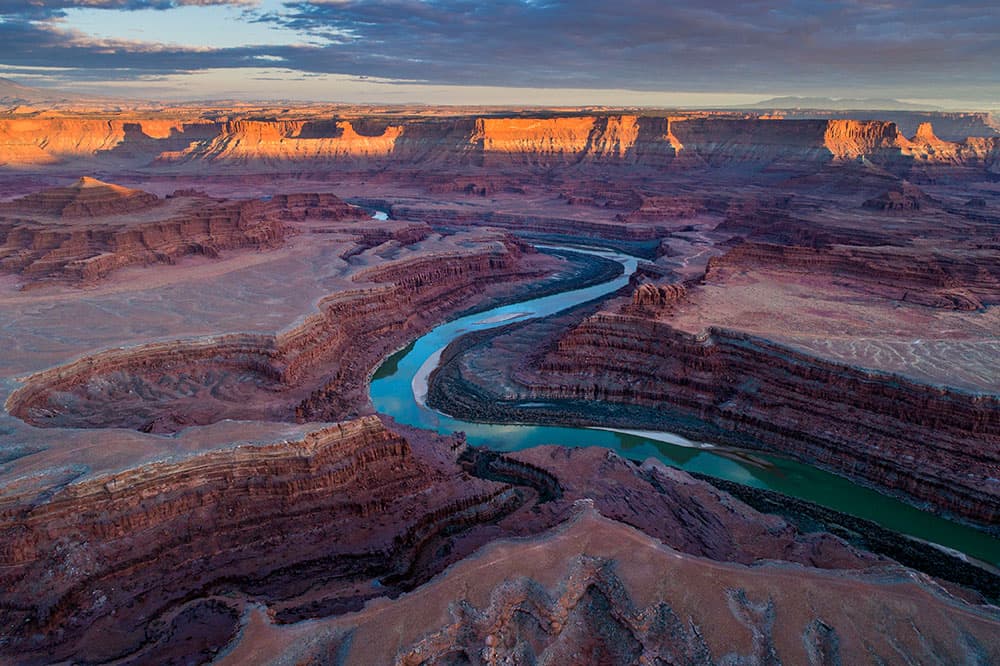
Leading lines
Lines stretching from foreground to background propel the viewer’s eye deeper into the photo. When the lines emanate from the bottom of the image frame and point to important elements in the background, they can be very effective at grabbing the viewer’s attention and leading the eye into the composition.

Credit: Ian Plant
Framing
Framing is an effective tool for creating depth, simplifying a composition, and focusing attention on what’s important. Examples of commonly used frames include trees, natural arches and old barn windows. Framing compositions often works best if the frame and subject are in different light, such as silhouetted trees framing a sunlit mountain.

Credit: Ian Plant
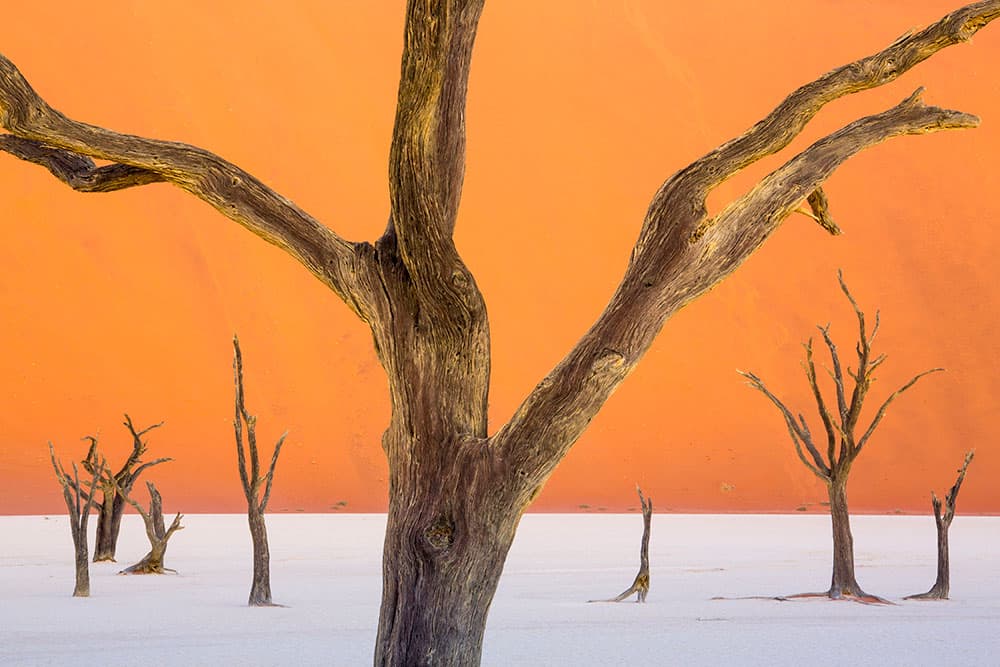
Near-far
Juxtaposing a close object with a far object creates depth in a composition and enhances visual interest. This is a favourite technique of landscape photographers and is especially powerful when using a wideangle lens close to a nearby object with stunning, dramatic scenery in the background.
Credit: Ian Plant
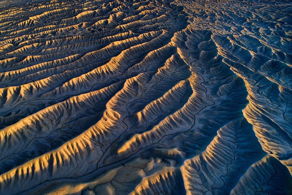
Patterns
Effective images can be made using a repetition of shapes that creates a pattern. The patterns can include things like a grove of trees, rippled sand, lichens on a rock, distant mountain ridges, a field of wild flowers, a flock of birds or pebbles on a rocky shore.
Credit: Ian Plant
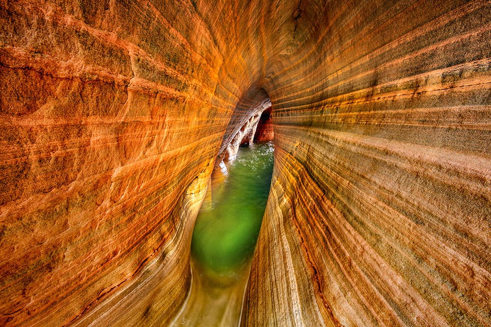
S-curves
It is often said that a ‘curved line is the loveliest distance between two points.’ Arguably, curves are more sweeping and elegant than lines, and although they take a bit longer to get to the point, s-curves encourage the viewer’s eye to meander through multiple parts of the composition.
Credit: Ian Plant
Visual vortex
When you have diagonal lines travelling from the image edges and corners right into the centre of the composition, an eye-catching vanishing point emerges, inexorably leading the viewer deep into the scene. I call this style of composition the ‘visual vortex’, and it creates a commanding visual effect, one to be used judiciously.