In 2018, filmmaker Peter Jackson used ground-breaking computer restoration technology to produce They Shall Not Grow Old, a documentary featuring colourised archive footage of the First World War. Suddenly, an event that most of us consider historical was catapulted into the present. ‘The soldiers are returned to an eerie, hyperreal kind of life in front of our eyes, like ghosts or figures summoned in a séance,’ wrote Peter Bradshaw in his review for The Guardian. The reason the documentary felt so electrifying (and alien) was because, as Bradshaw notes, ‘colour means modern.’ In which case, these people could be our fathers, brothers, sons, or even us.
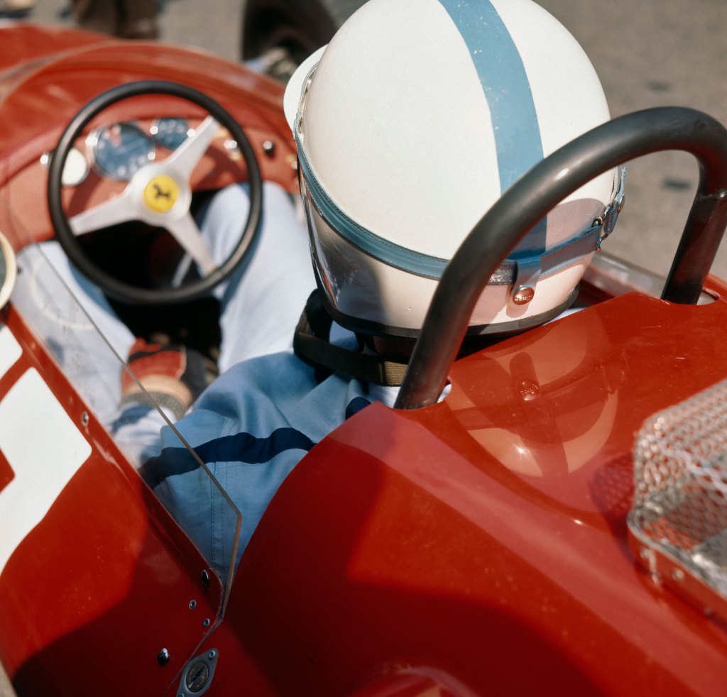
Looking at the colour work of French photographer Jacques Henri Lartigue delivers a similar time-travelling jolt. Like many masters of the medium, Lartigue is defined by a handful of pictures, most of them black and white. When we look at Grand Prix of the Automobile Club of France, for example, we are transported to 1912 (or 1913 depending on whose account you trust) – a time when cars featured open cockpits and aviation was in its infancy. We can place this picture in a mental timeline alongside work by the likes of Eugène Atget, Paul Strand and Dorothea Lange. These photographs are clearly from the past, with all their sepia-toned nostalgia and sense of novelty.
But, if we look closer, there are signs that Lartigue was ahead of his time. Grand Prix of the Automobile Club of France, for example, was taken when the photographer was still a teenager and exhibits all the energy, vitality and boldness we might associate with youth. Crucially, it shows Lartigue’s keenness to experiment. Positioning himself in the crowd close to the action, the photographer panned his camera to follow each car as it sped past him at 140km an hour. It was his first attempt at using this technique, and it enabled him to convey the speed and intensity of the race perfectly to the viewer.
Lartigue’s approach to photography was playful, and a welcome departure from the posed, formal portraiture that dominated the medium at the time. He often adopted a low vantage point, cropped tightly and followed his instinct rather than sticking to the ‘rules’ laid out by his predecessors. It should come as no surprise, then, to learn that he was an early adopter of colour photography. And yet, until fairly recently, you would be hard pressed to describe a single colour image he produced. To find out why, I spoke to Marion Perceval, Director of Donation Lartigue.
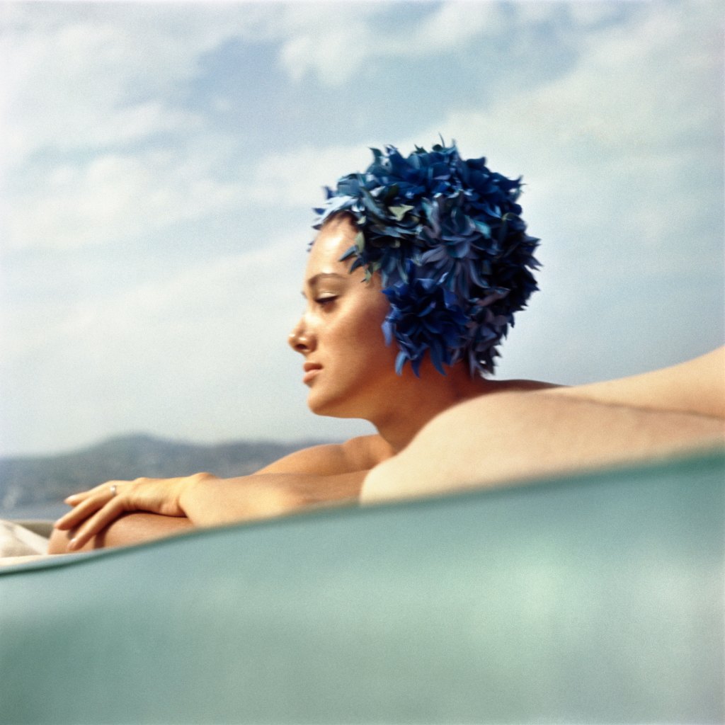
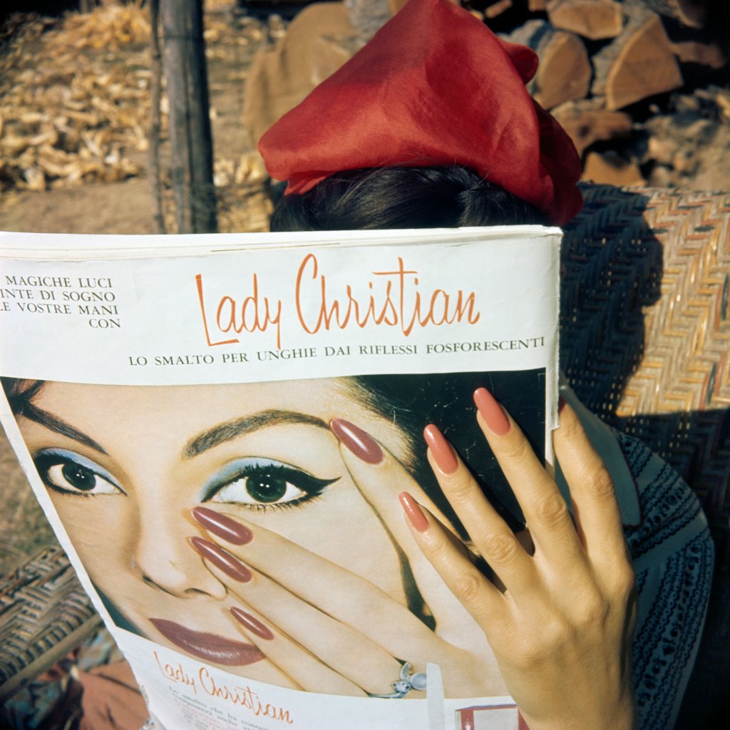
‘Lartigue’s colour work was only “rediscovered’ a few years ago,’ she reveals. ‘To begin with it was considered purely commercial, but after some research it appears he was also using it to reflect on the relationship between painting and photography.’ Ten years ago, Foam in Amsterdam hosted one of the first major exhibitions of Lartigue’s colour work. The show featured 140 colour reproductions, ranging in date from 1912 to 1983. ‘From the pink pastel of Bibi’s dainty hands (1921) to the fiery red nails of Florette and her glossy magazine (1961), the prints testify to Lartigue’s eagerness to experiment with any new photographic process he could get his hands on,’ writes Hinde Haest in aperture.
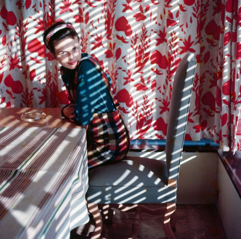
Despite this frisson of excitement around Lartigue’s colour work (and the fact that it accounts for around a third of the 120,000 images in his archive) it has taken more than a decade for this side of his oeuvre to be celebrated in the UK. This summer, MK Gallery in Milton Keynes plans to redress the balance with Jacques Henri Lartigue: Life in Colour – an exhibition that features more than 150 drawings, stereoscopic prints, colour photographs and archival documents. ‘The most difficult thing was choosing what to include from the archive,’ admits Perceval. ‘Ultimately, we wanted to share Lartigue’s message that his work didn’t stop in the 1920s.’
While Lartigue enjoyed experimenting with colour in the 1920s, he became frustrated by the long exposure times and cumbersome equipment required to produce autochromes (an additive colour process developed by the Lumière brothers in 1903). For an artist who enjoyed shooting cars, planes, people and pets in motion, the technology lagged behind his ambition. This discrepancy is one of the reasons he decided to focus on painting throughout the 1930s and 1940s, eventually returning to colour in the 1950s. ‘One of the things I found most interesting while researching the show is the fact that he re-enacted some of his photographs from the beginning of the century in colour later,’ says Perceval.
For archivists of Lartigue’s work, it’s the fragility and instability of his colour prints that pose the greatest challenge. ‘The prints in the show are almost all modern because the Donation doesn’t have many well-preserved colour vintage prints,’ says Perceval. ‘Paper from the 1950s and ‘60s was fragile and the prints faded.’ Thankfully, since the Donation took over the preservation of Lartigue’s work in 1979, the team has been working tirelessly to protect the photographer’s negatives, prints, diaries and paintings. It’s a labour of love and a fitting way to honour Lartigue and the contribution he made to the medium of photography. ‘He was special,’ says Perceval. ‘He had an eye for a picture, and he knew how to capture it.’
Jacques Henri Lartigue: Life in Colour runs from 20 June to 4 October at MK Gallery in Milton Keynes. To find out more, visit mkgallery.org.
Related reading:
- JFK photos revealed after negatives lost in 9/11 attacks
- I met iconic photographer Cecil Beaton in the 1970s – here’s what happened
- These incredible street photos of New York and Europe were hidden for half a century – see them now!
- “Personal images are the most powerful” These stunning self-portraits will make you reflect on your own identity
Follow AP on Facebook, Instagram, YouTube, TikTok, and IRYS.