Professor Newman on understanding why the Bayer colour filter array is such a clever design for image sensors.
Every so often there is a release of a new image sensor concept which does away with the ubiquitous Bayer colour filter array, accompanied by somewhat hyperbolic statements about the negative effects of the ubiquitous solution to colour imaging. These statements, it seems to me, are very often made without any appreciation of what a clever design the Bayer filter really is. Very often apparent simplicity conceals subtleties that are responsible for the performance of technology, and this is very much the case here.
Bryce Bayer was an American scientist who worked for the Kodak company. He developed the eponymous filter in 1974, long before there was a need for it. When solid state imagers came along, and needed to be adapted to produce colour images, there was the Bayer filter ready and waiting. On a historical note, it’s ironic that the company that has come to dominate the market for the films used to make Bayer Colour Filter Arrays is Kodak’s great rival, Fujifilm.

Figure 1: The Bayer colour filter array, as used by most cameras, senses colour using a repeated pattern of red, green and blue filters over the sensor pixels.
The Bayer pattern is shown in Figure 1 (above). Understanding it is helped by using the terminology that Bayer used in his original patent. Whereas the filters are usually described as ‘green, red and blue’, Bayer described them as ‘luminance’ (‘green’) and ‘chrominance’ (‘red’ and ‘blue’) elements.
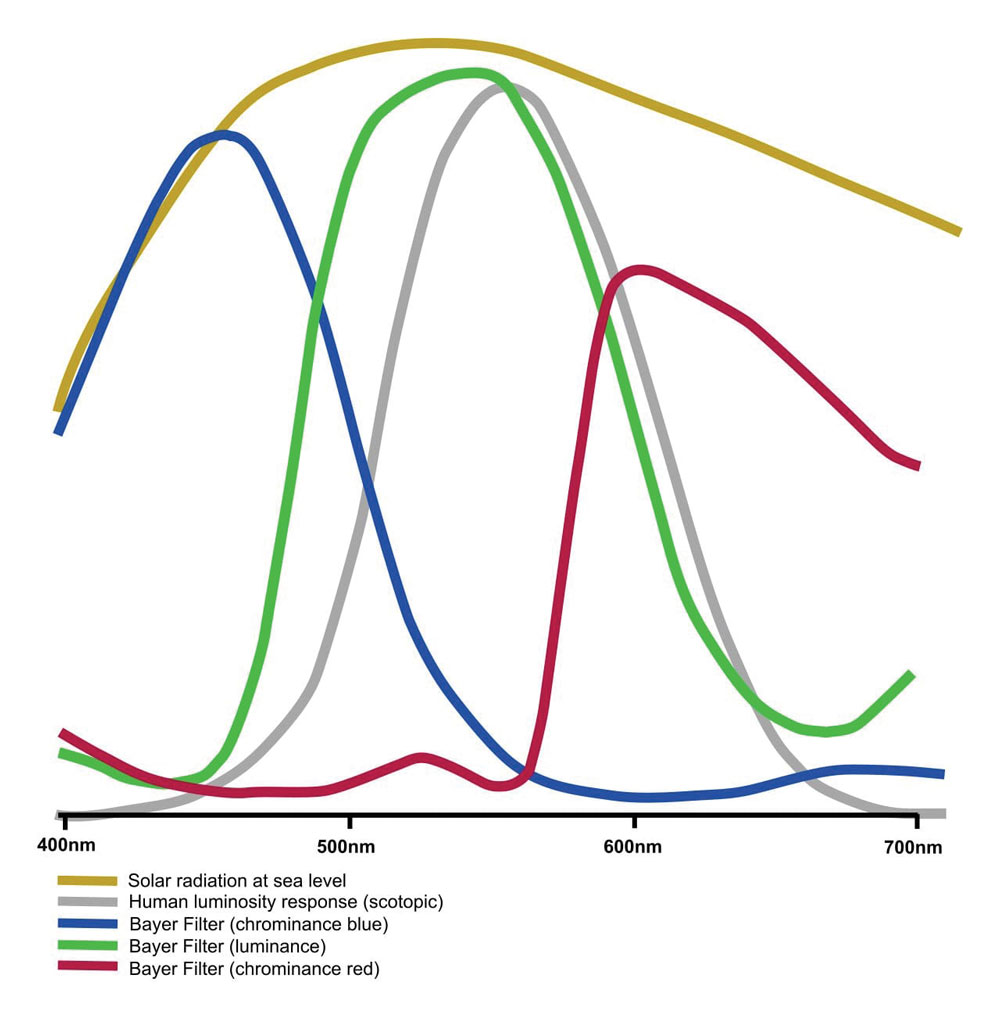
Looking at Figure 2 (below), the grey curve shows the shape of the spectrum of human luminous sensitivity, while the red, green and blue curves show the response of the colour filters.

Figure 2: Spectral response curves for the colour filters, compared to human luminous sensitivity.
Bayer Sensor Design
On to the first clever bit of design. Notice that the Bayer array has two luminance elements for each chrominance one. Thus it favours the parts of the spectrum to which the eye is most responsive.
This raises the second question. Shouldn’t a design goal be to increase sensor efficiency in regions where the eye is less responsive? The answer is ‘no’. Taken to its logical conclusion, it would mean extending sensors into infra-red and ultra-violet parts of the spectrum. The results of this are quite apparent in terms of unwanted colour shifts for cameras without blocking filters.
In any case, the human response curve has evolved as it has for a reason. The yellow trace in Figure 2 shows the solar radiation spectrum. Notice how the peak closely matches that of the human visual responsivity. Briefly, our eyes have evolved to take advantage of the light that is in our environment and the wavebands reflected by objects in it. Had we evolved on another planet, orbiting a different star, our vision would likely be completely different.
What we see from the above is that the Bayer design makes the most of the light that it actually receives, here on Earth. An added design tweak is the design of the colour filters themselves. The traces in Figure 2 show the filter response of a typical Bayer filtered sensor. Here it can be seen that the luminance (green) filters are quite closely tailored to the human luminosity response curve.
Furthermore, the other two curves have significant response in the luminosity region. Together, this means that the Bayer sensor is making use of much more light, in the usual circumstances, than the naïve idea often put around that it rejects two-thirds of the available light.
And thus it is that despite multiple attempts to produce ‘full colour’ sensors, which supposedly use all the light at every pixel location, the Bayer sensor still rules supreme.
Featured image: Composite of Bryce Bayer and the Bayer Colour Filter
Further reading:
- Sensor size – which is best? APS-C, Full-frame, or MFT?
- What is pixel binning in smartphone cameras?


