Marsel van Oosten reveals when colour can be a major distraction in wildlife images and how he eliminates it
Marsel van Oosten
Marsel van Oosten was born in The Netherlands and worked as an art director for 15 years. He switched careers to become a photographer and has since won Wildlife Photographer of the Year and Travel Photographer of the Year. He’s a regular contributor to National Geographic and runs nature photography tours around the world. Visit www.squiver.com.
The vast majority of all my images are in colour. I love colourful pictures and so do most people. This is why the most popular landscape images on Instagram are, without exception, the ones with the most vibrant sunrises and sunsets. But as great as colours can be, they can also be distracting. Colours draw attention.
Warning signs use very bright colours as our eyes are drawn to them, like bees to a colourful flower. It’s great to go to the beach in your Hawaiian print shirt, but you’ll probably wear more muted colours for a business meeting.
In my photography I try to use colour as a way to draw attention to the areas or elements that are important, to separate shapes and to create mood. But every now and then colour can do more harm than good. The two images here both feature elephant seals that I photographed in South Georgia – it’s the most incredible wildlife location on this planet with a ridiculous number of animals on its beaches.
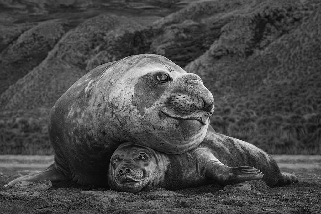
Mismatch, South Georgia. Males can reach up to 6m (20ft) and weigh up to 4,000kg (9,000lb). Cows typically measure about 3m (10ft) and weigh 900kg (2,000lb). Nikon D5, 24-70mm f/2.8 lens, 1/320sec at f/8, ISO 800
The image with the two elephant seals doesn’t feature an adult and a baby as you probably think – they’re both adults. The one on top is the male; the unfortunate one underneath is the female. The size difference between the two sexes is absolutely insane. When I saw this scene, I knew it would be perfect to show this difference as a simple double portrait.
But – although the exposure, the composition and the framing were right – the overall image didn’t work for me. Elephant seals are not only big; they’re also grey. The tussock grass in the background, however, was green, which caused my eyes to be drawn to the background instead of resting on the main subjects in the foreground. Colour will always dominate de-saturated tones, and it this case it created a ‘hierarchy problem’.
When processing the image, I therefore first tried to slightly de-saturate the grass, but that didn’t make much of a difference. That’s when I decided to turn it into black & white. The difference was immense – the background no longer shouted for attention and the focus completely shifted to the foreground, where it belongs.
The same thing happened to the other image, featuring an elephant seal pup. This is one of my favourite images from my latest book, MOTHER, as it is such a touching little moment that I captured on what is a very hectic and chaotic beach. Despite all the chaos, and the noise made by hundreds of thousands of animals, this baby elephant seal seemed totally mesmerised by a tiny, little white feather on the beach.
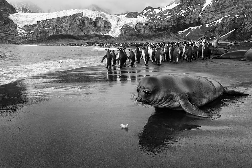
Feather, South Georgia. Nikon D5, 200-400mm f/4 lens, 1/200sec at f/11, ISO 500
As it was staring at it, time seemed to stand still for a few moments and I’m very happy that I noticed it. The colour image is nice but as with the other shot, there were several areas in the background with vibrant colours that I found distracting. Converting it to black & white once again proved to be the perfect solution.
These elephant seals are super grey, a really drab grey, so there’s nothing really jumping out at you in terms of colour. If you photograph them with penguins with bright orange chests, bright green grass or a clear blue sky in the background these are horrible scenarios for me. Photographing species like this means those colours will immediately dominate the entire frame.
Part of my standard routine of analysing an image after I’ve shot it, is to just look at it to see if it works and work out if there’s any way to make it better. I’m very allergic to distractions, so I’ll always try to fix anything that distracts from the idea or the subject matter. That could either be by dodging and burning to make areas of the images brighter or darker, or by cropping to get rid of certain areas or elements that I don’t want.
To convert an image from colour to black & white I always use Nik Silver Efex from the Nik plug-in filters. It’s a very powerful plug-in with tons of options. The thing that I like a lot about it is that it has a ton of presets so, even though I never use the presets, they’re very helpful.
This is because you can very quickly click through all the presets and there’ll always be one or two that are very close to something that you like. I use that as a starting point, then just start tweaking and fine-tuning and go from there.
As told to Steve Fairclough
Further reading
Marsel van Oosten: how to add context to your wildlife subjects