Once you’ve mastered how to use your camera and lens, as well as the basics of shooting, the next thing you’ll want to look at is something that could fill several books – and often does! Of course, we’re talking about the Art of photography and composition, and how you take a good or great photo!
There are various elements that go towards taking (and making) a great photo, and it’s also worth being aware of the difference between a photo that means a lot to you, versus a photo that appeals to others. If you’re shooting for yourself, then this could be much easier, depending on what you want to achieve, but to create commercially successful photographs, you will most likely need to master your photography.

This family photo means a lot to me, but most likely nothing to you, the photo is mostly out of focus, but captures a fun looking family moment. Photo: Stephen Waller, 1983
How you “see” a photograph vs how other people see a photograph – Do you like the composition, styles, and framing, or do you like the subject in the picture? Family photos and photos of people we care about will always bring about an emotional response to us, but not necessarily to other people.
It doesn’t have to be perfect if it captures the moment, or the thing you wanted to capture, and if it captures your vision of the scene, or just the moment in time. In the example above, it doesn’t really matter that the main subjects are out of focus, as it is about a memory, and in this photo, it has captured the moment well enough. But to take your photography to the next level, here are some useful things to keep in mind…
The very basics – landscape vs portrait orientation
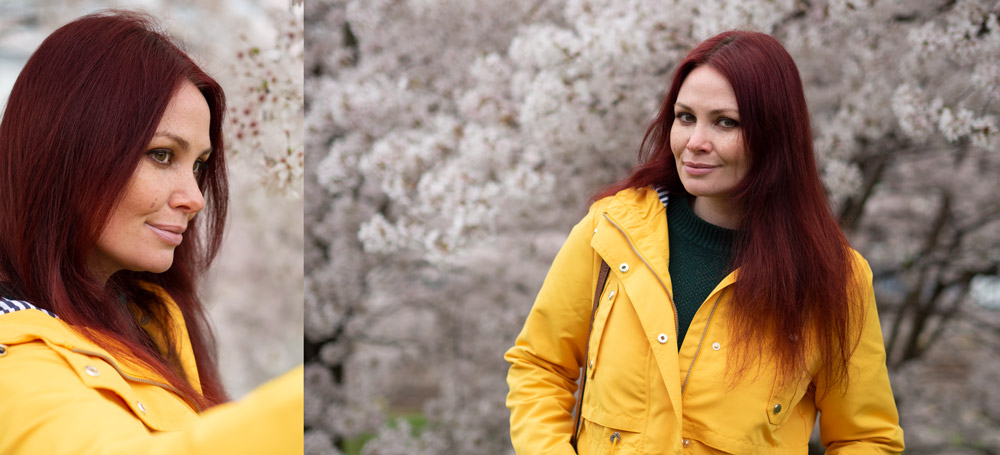
Left: Portrait / Vertical orientation using in a portrait photo, Right: Landscape / horizontal orientation used in a portrait photo. Model: Lucy Woodroffe, Photo: Joshua Waller.
What format suits your subject better? Landscape / horizontal orientation is typically used for landscape photography, but where you want to frame the scene differently you could use a portrait / vertical shot, and what works best will often depend on what you are photographing. Shooting off-centre lets you frame the shot and subject differently, and you can move the focus point and use focus-lock, or use the touch-screen to set the focus point, so that your subject is in focus.
Nb. Focus-lock – When you half-press the shutter release button, your camera will focus on the subject, however, if you want to reframe your shot, you can continue holding the button, and move the camera, whilst the camera maintains focus on the subject.
What is the decisive moment?
The ‘decisive moment’ is a concept that initially emerged in street photography and popularised by Henri Cartier Bresson. The concept refers to the right moment to take a photograph and can also be applied to other genres.
How do you capture the moment?
How do you know when the right moment is? Well, start without the camera. Look around, try to plan and previsualise the photograph you hope to capture. Consider factors such as location and time of day. Then on location, consider your perspective, looking at all angles of your subject to get an idea of the whole picture; a slight change can alter the balance of a photograph. By doing this it is likely you will find something that interests you and ‘the moment’ will arise. However, also be open to serendipity and chance – the moment may arise quickly and unexpectedly. So it pays to be ready!
Creative Vision
Although having the latest/best/suitable equipment can improve your photography, one of the most important elements of photography is having creative vision and developing your eye for capturing images. How you see the world will change the way you take photographs, and this will develop over time with practice.
Elements that will help develop your creative eye include finding something of interest to you, becoming more aware of details, considering composition and perspective. Shooting with intention and consideration will capture the difference between a nice looking photograph and great one.
Colour or black and white?
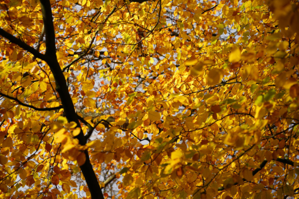
Bold Colour – Yellow leaves, Photo: Joshua Waller
Contrasting colours, or complimentary colours? Bold colours, and abstract thinking. Once you start seeing things as shapes, and colours, rather than objects, such as trees, people, buildings, then you can start to see things in a more visual way. In this photo, the leaves are a radiant yellow colour, and by filling the frame with the leaves, we get a “wall of colour”.
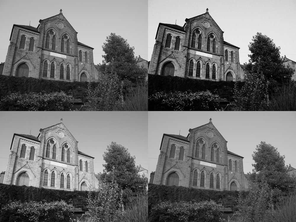
Shooting in black and white, if you start with a colour photo, you can get a range of different looks when converting to black and white.
Monochrome – Shoot in black and white, and get a different look. Or shoot in colour, and then convert to black and white later, and you can adjust how the image looks during the process. We’ll go over black and white photography in more detail in a later article, but for now, if this is something you’re interested in exploring more, have a look at this article on how to see in black and white.
Why is light so important in photography?
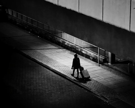
Light is everywhere. In photography, light can determine not only light and dark areas of a photograph, but also tone, mood and atmosphere. How you see, understand, and use light will help you make a difference between a ‘boring’ shot and an impactful one.
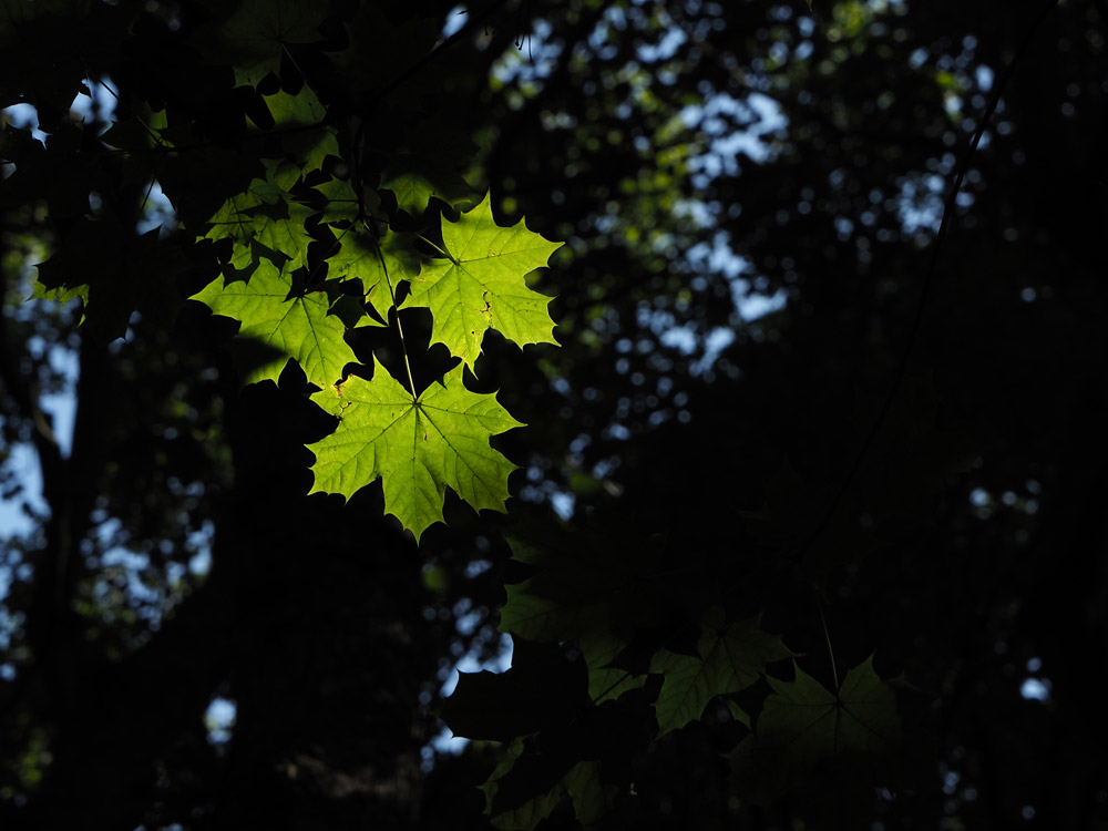
Find where the light is in a scene, and you can use it to highlight something in the frame, or give your images an additional level of contrast, interest, or pop, but if the light is wrong, then it can also ruin a photograph. Photo: Joshua Waller.
If you are using natural light or shooting on location, try shooting the same subject or scene at different times of the day. Explore how the light changes the scene or subject. By returning to the same subject, you are also likely to experience and notice new things each time that will increase your creativity.
High contrasting light and dark lighting, otherwise known as chiaroscuro, can be dramatic and create atmosphere. Softer lighting, for example early in the morning, will create a more subtle effect.
If you can train yourself to see the effects of light, you’ll start recognising the effects it has in your photography, and you’ll be able to see a great photo before you even take it. As you learn to see light, you’ll start seeing the change light can make to the colour in an image, for example, as the sun starts to set you’ll notice light takes on a warm yellow colour.
Creativity – finding your own style, experimentation, try different things, what do you like?
Picking a subject or genre that you find interesting, will allow creativity to flow more easily, and you can enjoy the process much more. Once you have your subject, you could consider the following suggestions when taking photos:
Textures and patterns: Incorporating textures and patterns into your photographs will add an element of interest and draw the eye in. Choosing subjects that have natural contrasted textures will make photographing texture much easier – subjects in nature and fashion for example offer plentiful options. Contrast can also highlight and emphasise textures where they are not as strong.
Negative Space: Negative space is a term that refers to the large empty space and very few elements surrounding a subject, often creating dramatic narratives with emphasis and definition being drawn to the subject itself. Negative spaces are often solid backgrounds and the results can be very minimal, but can also take a more textured form – such as a brick wall, trees, grass, or sand. Utilising light and shadows can also be very effective.
What is most important when using negative space is the scale and room around the subject, allowing for balance. You’ll want to read our guide to mastering minimalist architecture photography if this sounds good to you.
Symmetry: A symmetrical composition can be very powerful. Look for natural symmetry in a scene, for example in architecture, nature and reflections.
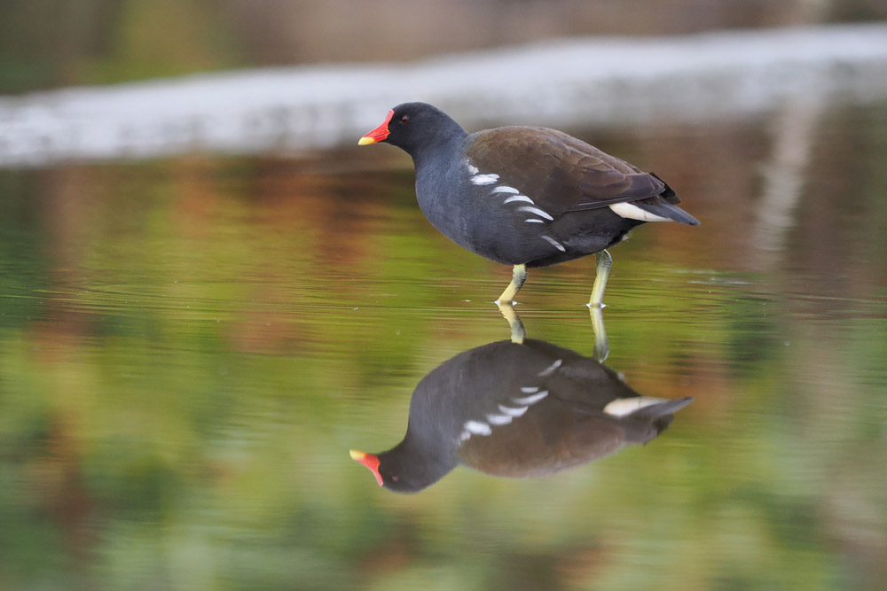
A moorhen reflected in water, Olympus OM-1 photo, Photo: Joshua Waller
Reflections: Reflections provide great photographic subject matter. Whether it’s a mountain reflected in a lake, a neon sign reflected in a puddle, a bird reflected in water, or one building reflected in the window of another, there are endless picture opportunities. When capturing a reflection in glass, you may have to move around to find the right perspective.
Angles: Many photographs are typically taken at head height. Consider experimenting with different angles – looking up, down, or from low down or at a height. A camera with a tilt and swivel LCD screen can make this type of shot easier.
What is Composition?
The general definition of composition is ‘putting together using conscious thought’. In photography, composition is the arrangement of the visual elements you see within a frame. It is your way of communicating your artistic vision to others, commanding the viewer’s eye and directing them to what is important. A photograph shows the world what your camera sees, but when you create a composition, you show the world what you see.
When you are photographing at a studio or other controlled environment, it is easier to control the composition because we are able to build the image ourselves. When working on location however, we need to take more consideration of our surroundings, what to include or not include in the frame to create an impact.

The Asian Openbill stork is in the midground, with a blurred foreground, and blurred background. Photo: Getty Images, Premanand Khilare
Foreground, Midground and Background
A photographic composition is made up of the Foreground, Midground and Background. Using these three areas will help to build your shots together
- Foreground is the section of the image closest to the photographer and viewer.
- Background is the top section of the image, or the background out of focus of the main subject.
- Midground is the area that lies between the foreground and the background, typically in the center of the frame.
In landscape photography you will want to consider the foreground, midground, and background, but you can also consider this in other forms of photography as well. You can use this creatively in portrait photography for example.
There are some cases, in portraiture, nature and close-up photography, where the main areas of concern are the foreground and the background. Likewise, there are some occasions where the image is made up only of the foreground (a close-up of peeling paint for example).
What is framing?
Framing is an effective tool for creating depth, simplifying a composition, and focusing attention on what’s important. Where do you place your subject? In the centre of the frame? Looking into the frame? Looking out of the frame?
One popular compositional trick is to shoot through a natural frame in the scene. This could be the overhanging branches of a tree or perhaps an arch or doorway. Framing compositions often works best if the frame and subject are in different light, such as silhouetted trees framing a sunlit mountain. You don’t find these opportunities all the time but when you do, try using them to your advantage.
Photography “rules” – the rules of photography
They’re not really rules, but guides, that you can use if they appeal to you, as they’re generally an easy way to create some pleasing looking images, and they can help give you additional ideas on composition.
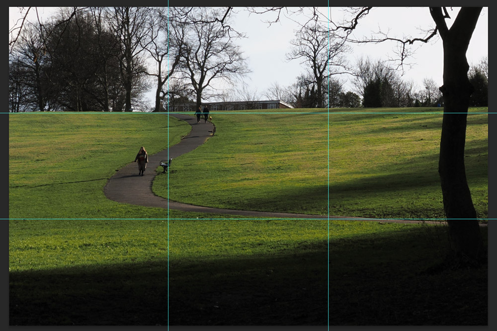
Rule of thirds, and leading lines, photo: Joshua Waller
The “Rule of thirds” is perhaps one of the most well-known “rules” regarding composition, and how you place subjects or objects in your frame, and in your photo. It simply divides up your image into thirds across the frame from left to right, and from top to bottom.
Using this as a guide can give your image a pleasing look, but once you’ve started using it, or noticed in in use, you’ll find that you end up spotting it everywhere, from photographs, to TV, to films.
It can be used to help you frame a landscape, with the horizon being placed on the top line (as shown above), or the bottom line, with the sky filling the rest of the image, as shown below. Or you can shoot portraits, with the subject on the left line or right line, and you can see this in the portrait photo above.
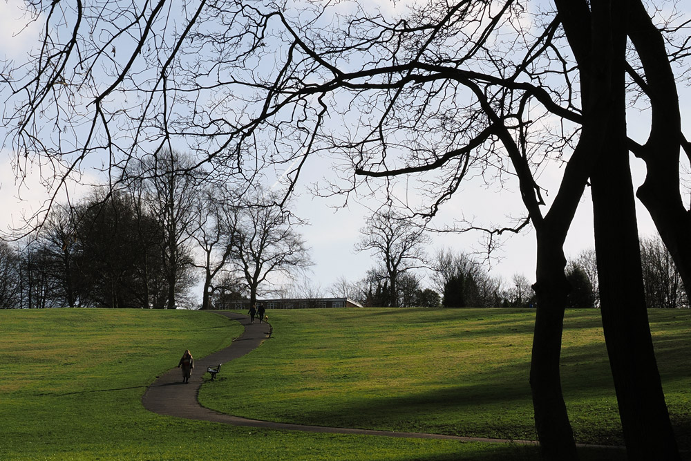
In this rule of thirds example, the image has been cropped to move the horizon to the bottom line, placing the ground in the bottom third. Photo: Joshua Waller
Once you’ve started spotting this, and using this to shoot and frame your images, you’ll then be able break the rule of thirds, and try different ideas as well!
Leading lines – These are lines that lead the viewer into the image, and can help create a sense of depth, or scale. The images above are examples of images with leading lines, and these can work well with both natural lines in a scene, or man-made lines. They can work particularly well, when there’s something of natural beauty, or interest at the end of the line(s), or on the line. Another way of thinking about this is thinking of it as visual flow, as you guide the viewer through the image.
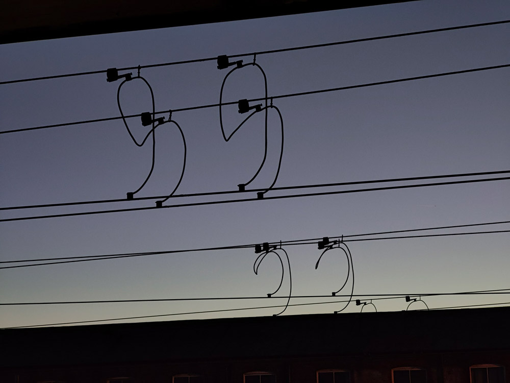
Overhead wires, almost look like notes on sheet music. Photo: Joshua Waller.
Other things to look out for: Shapes, geometry, patterns, and things that look like other things. But most important of all, is to have some fun while doing it!
Here’s our video guide to 5 photography rules you need to know:
Tune in next week, for the next article in the series of the AP Improve Your Photography Series – in partnership with MPB.
- Part 1: Beginners guide to different camera types.
- Part 2: Beginners guide to different lens types.
- Part 3: Beginners guide to using a camera taking photos.
- Part 4: Beginners guide to Exposure, aperture, shutter, ISO, and metering.
- Part 5: Understanding white balance settings and colour
- Part 6: 10 essential cameras accessories for beginners
Find the latest Improve Your Photography articles here.
Article: Joshua Waller, Jessica Miller.


