MPB remains one of the biggest names when it comes to buying and selling used cameras, lenses and accessories, and now has an international presence.
The Brighton, UK-based company, which founder Matt Barker started by putting classified ads in the back of Amateur Photographer, has this week unveiled a bold new logo and corporate branding.
Designed in partnership with London-based creative brand agency The Clearing, the new look is designed to reflect MPB’s belief that ‘every creator should have access to the right tools, in the right way,’ whether they’re buying, selling, or trading gear.
Visitors to the MPB site will already see the new logo and branding/colour schemes in action.
See more content about MPB here and our guides to the biggest used camera and lens bargains here.
From MPB (edited)
MPB, the largest global platform for buying and selling secondhand photography and video equipment, has today unveiled a refreshed brand identity that reflects its belief that every creator should have access to the right tools, in the right way. The new identity injects fresh energy into the brand and reinforces MPB’s commitment to make buying and selling used gear smarter, simpler and more accessible.
Founded in 2011 and with headquarters in Brighton, MPB operates across the UK, US and Europe, recirculating over 615,000 cameras and lenses a year. Every item is bought directly from photographers and filmmakers, then carefully checked, graded and guaranteed by MPB’s in-house experts. It’s a simple, transparent process that gives creators complete confidence when buying, selling or trading gear.
London-based creative brand agency The Clearing has designed a visual and verbal identity system that will bring MPB’s brand story to life. The new look frames MPB as the smarter, more sustainable and more accessible way to buy, sell and trade camera gear, so that creators can spend less time worrying about their kit and more time creating.
Brand elements
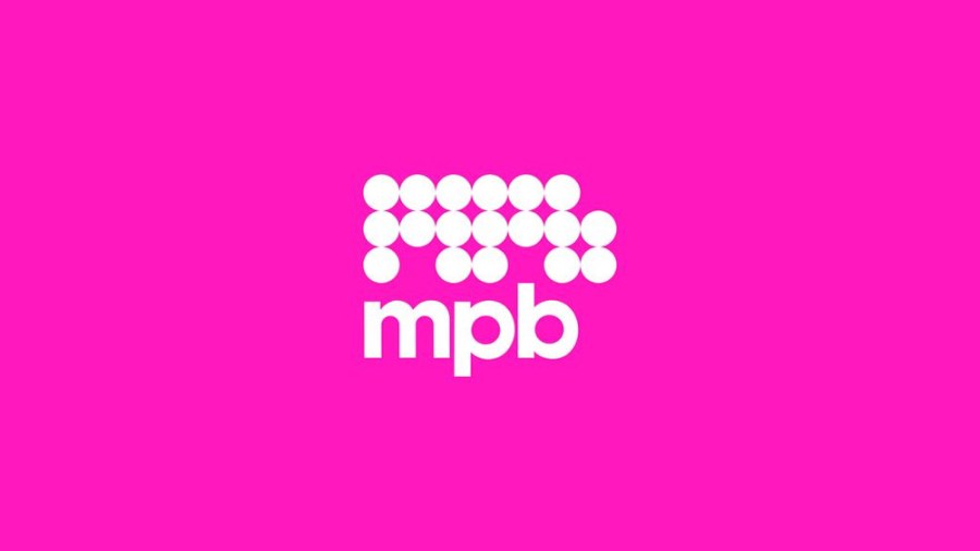
The brightened and emboldened logo now standing on its own and without the “.com” places the MPB name front and centre for impact and stand out.
A boldly simple and attitude-driven tone of voice instantly positions MPB as a disruptor – cutting through the marketing clutter and jargon that dominates the market. Instead of speaking like an instruction manual or a sales person, the new voice is confident, concise and provocative, bringing clarity to complexity and allowing the brand to speak with a relaxed and reassured authority.
It uses attitude to connect with people whether they see themselves as creators or consumers, transforming a transactional experience into a personal one. This tone doesn’t just sell cameras, it sells MPB’s mindset: that theirs is the right way to buy, sell or trade secondhand gear.
Paired with a vibrant colour palette that leads with a distinctive Pink and secondary use of Midnight Blue, it aims to inject energy and stand out in a monotone category.
The typeface, Suisse Intl, was chosen to support the bold expression conveyed through their tone of voice – it allows them to present themselves as a straight-talking brand with a voice that aims to get people’s attention.
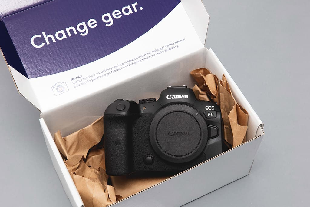
The brand introduces a fresh product photography style, where cameras can be viewed from all angles – up close, in situ or within dynamic layouts imbued with movement. This allows MPB to highlight products when using them in listings, and in content.
Content and storytelling shots feature real creators shot in a reportage style that tells a story about the shots they’re taking in the environment that they’re working in. At times, it’s combined with the brand’s new graphic device – inspired by the focus ring of a camera – creating a flexible visual tool that can be used across print and digital.
A set of hand-drawn icons have been designed to bring a human touch to the brand, adding warmth to the platform and reinforcing MPB’s personality. Dotted throughout MPB’s platform, social media and other marketing channels, the icons are set in the new bold Pink.