Steve Fairclough uncovers the story of the legendary image for Pink Floyd’s 1975 album cover for Wish You Were Here
Fact File: Pink Floyd’s Wish You Were Here
Musicians: Roger Waters, David Gilmour, Nick Mason, Richard Wright, Dick Parry (saxophones, Shine On You Crazy Diamond), Roy Harper (lead vocals, Have a Cigar), Venetta Fields and Carlena Williams (backing vocals).
Released: 12 September 1975, UK (Harvest Records), 13 September 1975, US (Columbia Records)
Charts: No. 1 in the US, UK, Australia, The Netherlands, New Zealand and Spain
Sales: Over 20,000,000
Fascinating fact: At 4am on the evening of the cover shoot Powell left a party with assistant Peter Christopherson and noticed mist at the front of the Cadillac. Powell reveals, ‘Peter said, “your car’s on fire”. I stopped the car and we jumped out. The car exploded and burnt to the ground. We’d just done this dangerous fire stunt and here we were coming from a party and the car caught fire.’
Wish You Were Here, the ninth studio album by the legendary rock band Pink Floyd, saw chief songwriter Roger Waters exploring themes of absence, alienation and the band’s melancholy following the departure of former guitarist Syd Barrett, due to his mental health issues, in 1968. It was also, in places, a searing critique of a cynical music business.
As with the iconic light prism design for Pink Floyd’s 1973 album Dark Side of the Moon the design was handled by the Hipgnosis agency, which had been co-founded by the late Storm Thorgerson and Aubrey ‘Po’ Powell. Powell explains, ‘I photographed all of the pictures on the album.
They were shot in ’75 during a Pink Floyd tour of America. We flew to California and Storm had already presented the band with the ideas, which were sketches that I’d done, at Abbey Road Studios. He was very nervous showing them but when he finished he got a round of applause from the band.’
Powell reveals, ‘We’d heard tracks up at Abbey Road Studios and we knew what Roger Waters’ concept of it was. We knew his idea was very much about absence and Shine On You Crazy Diamond really came from the loss of Syd Barrett. Barrett’s spectre still haunted Pink Floyd – the fact that he’d gone mad overnight and the band was left to fend for themselves had only been five or six years before.
On Dark Side of the Moon Roger had written about madness, loneliness, life on the road and all these rather in-depth subjects that transcended into Wish You Were Here – it’s a very deep album.’
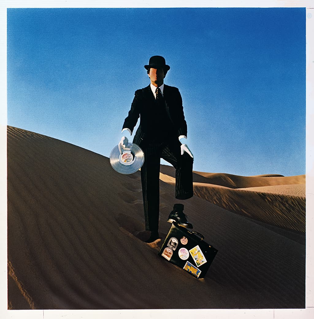
Storm Thorgerson said the faceless man is a ‘salesman selling his soul’ and features on the back. It was shot in the Yuma Desert. Said to represent earth, the absence of wrists and ankles is said to show him as an ‘empty suit’
In a 2012 TV documentary, The Making of Wish You Were Here, Pink Floyd’s lead guitarist David Gilmour recalls, ‘We mostly, in those days, left it to Storm to come up with things [design ideas]… we would give him a desultory two minutes of our mixing time to say, “that one maybe, that one, not that, not that”. He came up with these [ideas]… from the lyrics, this theme of absence.’
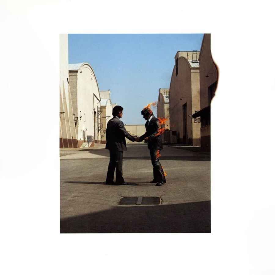
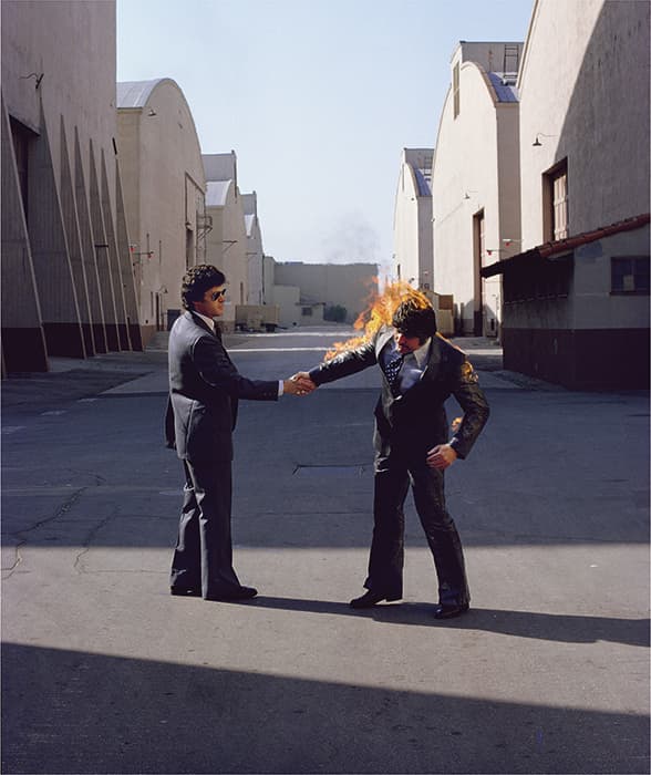
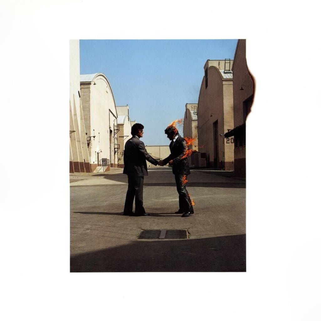
The core idea for the album cover was to illustrate the cynical nature of the music business at that time. Powell explains, ‘The album being about absence and insincerity gave way to Storm’s idea about two businessmen shaking hands – one of them is being insincere and the other is getting burnt in the deal.
I’d said to Storm, “How are we going to do that?” as it wasn’t the days of digital retouching. He said, “I guess you’re going to have to burn a man for real.”’
Working with fire
When he got to LA, Powell interviewed stuntmen and recruited expert fire stuntmen Ronnie Rondell and Danny Rogers Jr. Powell recalls, ‘Rondell was the main “fire man” and he had so much charisma and strength of character. He said to me when he saw the [cover concept] drawing, “I never stand still to do a fire stunt. You have to be moving to keep the fire behind you… running, jumping or whatever.”
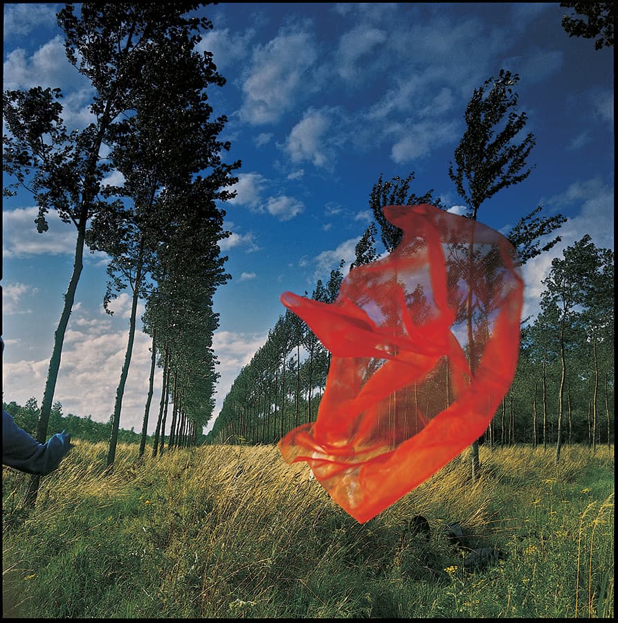
The red veil shot represented air within the inner sleeve. © Hipgnosis/Aubrey Powell/Harvest Records/Columbia Record
I said, “Well, this has to be two men shaking hands, one on fire.” He said, “I can’t guarantee that. I’ll try it running and so on.” I didn’t want to lose him, so I agreed and thought I’d just have to busk it on the day.’
Rondell used his specialist team of fire stunt experts and the shoot was scheduled for the following Saturday at the Warner Bros. studio lot in Burbank, California. Powell admits, ’It was a dangerous shoot to do. We started off doing pictures of him running towards camera on fire and it just wasn’t what we wanted.
It was an incredibly still afternoon so, after lunch, I said, “I really have to have you shaking hands. There’s no wind, it’s still.” Ronnie said, “Okay. We’ll try it.” They covered him in the flammable material and set him on fire. I had three cameras shooting, one after the other. Jeff [Smith] shot one, Powell’s assistant Peter [Christopherson] shot one and I was shooting on a Hasselblad – we just shot and shot and shot.’
Powell was using Kodak colour transparency film and explains, ‘It was probably at a fairly high shutter speed because some of the shots were in sunlight and some were slightly in shadow. It was very bright with clear blue skies, so I would have been shooting at least at 1/250sec to get the flames sharp. I also wanted the depth-of-field so the buildings were sharp behind.
Half a stop could make a big difference, so we used to bracket. I’m shooting that in 20 seconds, so I’m going half a stop under, half a stop over, a stop under, a stop over and back to the centre. ‘Each time the fire lasted about 20 seconds because it blew up so quickly. Before the second time Rondell said, “I wasn’t so happy with that. I think we can do better.”
So we did it again and that was really good. The third time a small gust of wind blew and blew round his face. He threw himself to the ground and his team was on top of him with blankets, with fire extinguishers and got him [put] out.
He’d burnt his eyebrows and singed his moustache – he was lucky he didn’t burn his face. He got up and said, “That’s it. No more.” But I knew I had the shot – it was fantastic. I was very pleased and he went away happy.’
Shrink-wrapping the cover
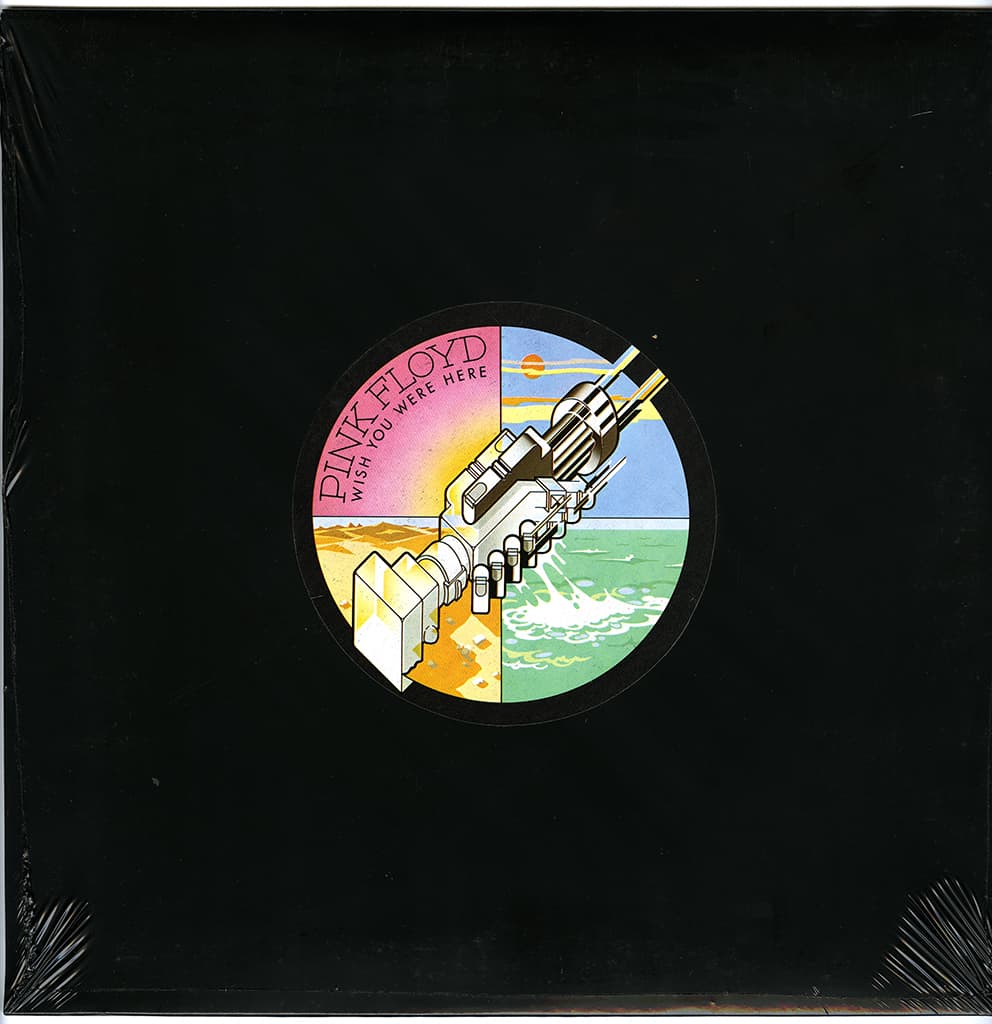
The final design twist on the theme of absence came with the decision to package the album in black shrink-wrap, obscuring the cover. The decision was hugely unpopular with US record firm Columbia Records, but it was over-ruled. EMI (of which Harvest Records was a subsidiary) in the UK was less concerned.
Powell explains, ‘Storm was always very smart at coming up with interesting ideas and he persuaded the band that why should they give away the content of the album?’
He adds, ‘In big record stores where you had 10,000 albums you had to stand out and, of course, a black shrink-wrapped cover with a colourful central logo on it did stand out.
It had no name of the band on it other than on the label. George Hardie, who did all the graphics, designed that robotic handshaking, cold, AI kind of image (for the circular label). All those factors were reasons to put the shrink-wrapping on. Many people tore the wrapping off and, afterwards, regretted they’d not kept the wrapping. I’ve got one at home, which is intact.’
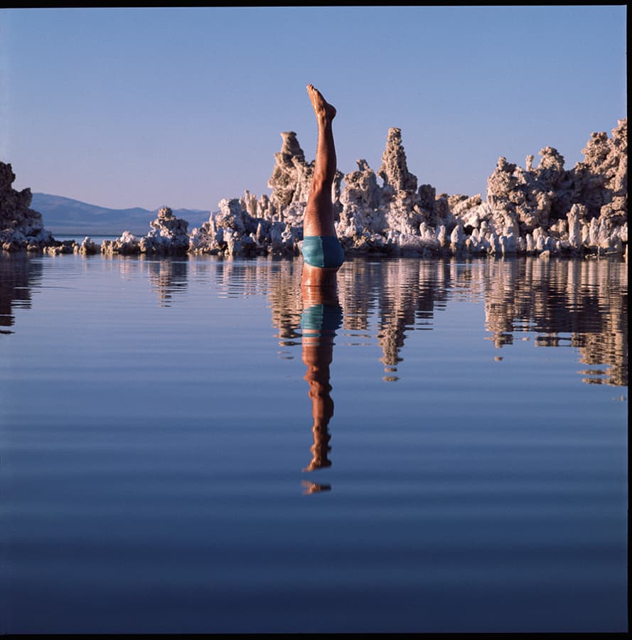
The classic photography for the album also took the theme of the four elements – fire, earth, air and water – for four images. The cover was fire, a splashless diver was water, an invisible nude model with a red scarf was air and a salesman standing in the desert was earth.
‘I’m very proud of the cover image but my favourite photo is the diver. I still have goose bumps thinking about that shot because it was just a magical moment. I knew I’d got an incredible shot.’
Aubrey ‘Po’ Powell
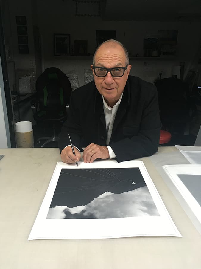
Aubrey ‘Po’ Powell began his career in the mid-1960s as a set designer. He shared an apartment with Storm Thorgerson and the two co-founded Hipgnosis in 1967. Hipgnosis thrived and produced many LP covers. He progressed on to making music videos, TV commercials, documentaries and corporate films but in 2014 returned to album design for Pink Floyd’s The Division Bell 20th anniversary box set.
The panel on Wish You Were Here
Harry Borden

An unforgettable moment of my career was photographing David Gilmour in rehearsal doing a stripped-down version of Wish You Were Here. The disturbingly surreal image perfectly illustrates the eponymous song about founding member Syd Barrett (who suffered a drug-
induced breakdown).
Andy Cowles

This sleeve remains as famous as the music. The serenity of the pose belies the burning tension between artist and management. It reflects outward appearances and private pain and, probably, Gilmour’s and Waters combustible relationship. It’s amazing it didn’t blow up in your hand!
Dr Andy Earl
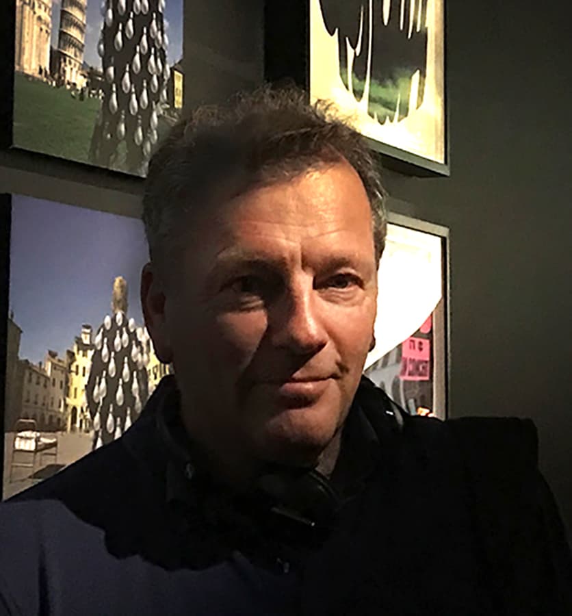
Wish You Were Here is a perfect example of how music throws up ideas, questions, feelings and personal interpretations. Hipgnosis’s vision captured that moment in this photograph where surrealism and madness gel together and produce a shocking, but humorous, image.
Our panel of judges
Some of the finest names in music and photography chose the series’ covers
Janette Beckmann
Jason Bell
Harry Borden
Ed Caraeff
Andy Cowles
Kevin Cummins
Dr Andy Earl
Jill Furmanovsky
Christie Goodwin
Peter Hook
Simon Larbalestier
Gered Mankowitz
Dennis Morris
Peter Neill
Aubrey ‘Po’ Powell
Rankin
Jamel Shabazz
Mat Snow
Howard Wakefield
Kirk Weddle
Rachael Wright
Further reading

