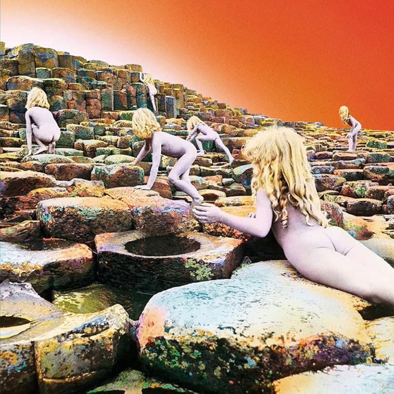
Naked kids – in car paint. They wouldn’t get away with that now, etc, etc… We reveal the fascinating story behind the jaw-dropping album artwork for Led Zeppelin’s Houses of the Holy (1973), as executed by Aubrey ‘Po’ Powell
The commission for design agency Hipgnosis to create the Houses of the Holy album cover came about after Led Zeppelin’s lead guitarist Jimmy Page telephoned the company’s studio. Hipgnosis was co-founded by Aubrey Powell and the late Storm Thorgerson in 1967 and Powell recalls, ‘Page had seen an album cover we’d done for Wishbone Ash, called Argus, which was a photo of a warrior shot in the south of France. It was a very misty picture and we painted a flying saucer into the mist. He liked the atmosphere of that and said, “Would you be interested to work for Led Zeppelin?”
Of course, we said “yes”.’ Powell reveals, ‘There was no brief at all. I phoned the secretary of the band’s management company to make an appointment and said, “Could we have a title, some lyrics, was there music to listen to or something to go on?” The message came back, “No. There’s nothing. Just turn up with some ideas.”’
Powell and Thorgerson met the band – Jimmy Page, singer Robert Plant, drummer John Bonham and bassist John Paul Jones – and their notoriously truculent manager Peter Grant at Grant’s offices in London. Powell says, ‘I brought a book by Arthur C. Clarke, Childhood’s End. I talked about recreating the book’s end where the children in the book, in a kind of apocalyptic scene, go up in the sky to escape the “overlords”. I suggested a science fiction family being led forward by a kind of alien and they would be painted in gold and silver… this appealed [to them].’
Another idea was to carve out the ZoSo logo with bulldozers on the plains of Nazca in Peru, but this was rejected due to the likely huge cost and tricky politics involved. Powell recalls, ‘Peter Grant suddenly called a halt to proceedings, saying, “We’re going off to Japan to tour. Choose whichever you want and go and do it.”
Back at their studio, Powell and Thorgerson realised no budget had been mentioned. Powell reveals, ‘I called Grant and asked. He replied, “There is no budget. Whatever it costs, it costs. Get an advance and don’t fuck up.”’ Hipgnosis decided to shoot the ‘science fiction family’ idea at Giant’s Causeway in Northern Ireland in late 1972.
It was the year of Bloody Sunday and 479 deaths, due to the Troubles, so locals treated an English crew with suspicion. Powell admits, ‘It was a very unsafe place to go. I didn’t really take that onboard at the time.’
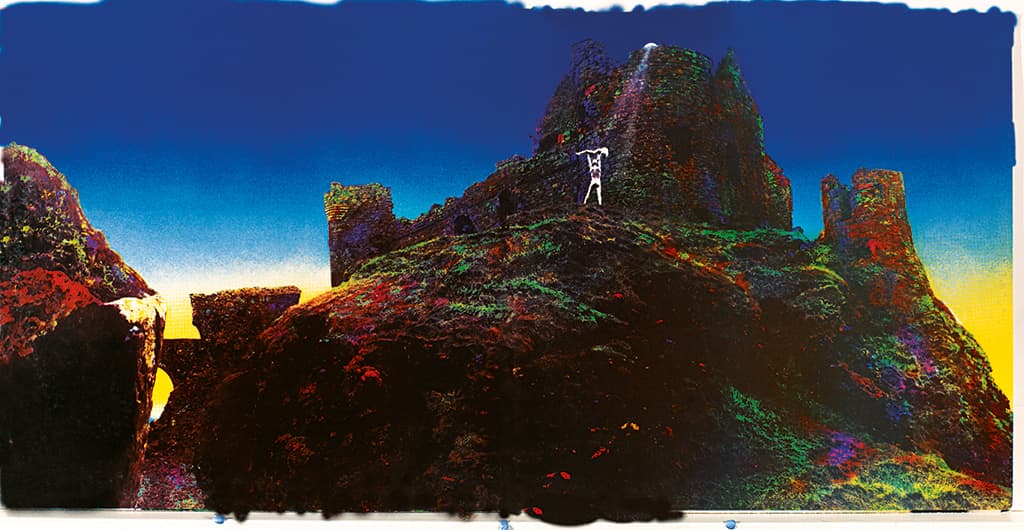
The inside gatefold sleeve image. Taken at Dunluce Castle
Collages and hand painting
The family was cast – the children were siblings Stefan and Samantha Gates – and Oscar-winning make-up artist Tom Smith did the gold and silver paintwork on the family’s bodies. Powell reveals, ‘All the cast had to get up at 4am because I wanted to get a sunrise or sunset – that was the idea, to get a glorious view. For five days it poured with rain and was absolute misery.’
Smith ran out of make-up and had to resort to using car paint on the models, but Powell then had a brainwave… ‘At Hipgnosis we were experts at creating collage pictures. We’d create imagery that was sharp front to back and had developed this technique of cutting out [parts of photographs], sanding down the edges of the paper to be Rizla-thin, blacking them, then gluing them down and creating these hyper-realist looking pictures.
Because the rocks were octagonal I realised that I could cut round them. I put the children in different positions on the rocks, shot them like that, realised where I could cut round and the whole thing was done in 20 minutes.’
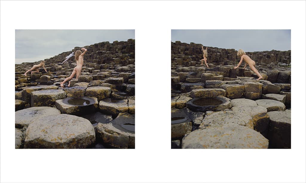
An example of the album’s original ‘science fiction family’ artwork idea with them being led away by an alien creature
Powell shot the sleeve on a Hasselblad medium format camera, using a spirit level to pan across so he could get a back cover that would line up exactly with the front cover. He reveals, ‘I used Ilford 400 ASA film – that’s why it’s a bit grainy and also because the light level was so low.’
When Powell got back to England he created a precise collage and handed the black & white artwork over to hand colouring expert Phil Crennell. Powell recalls, ‘I told him the vibe I wanted, gave him the Arthur C. Clarke book, and six weeks later we had the front cover. It looked incredible.
His technique was unbelievably detailed. Crennell was a bloody genius but he was very late. I had a lot of trouble with Grant about being late with the artwork.’
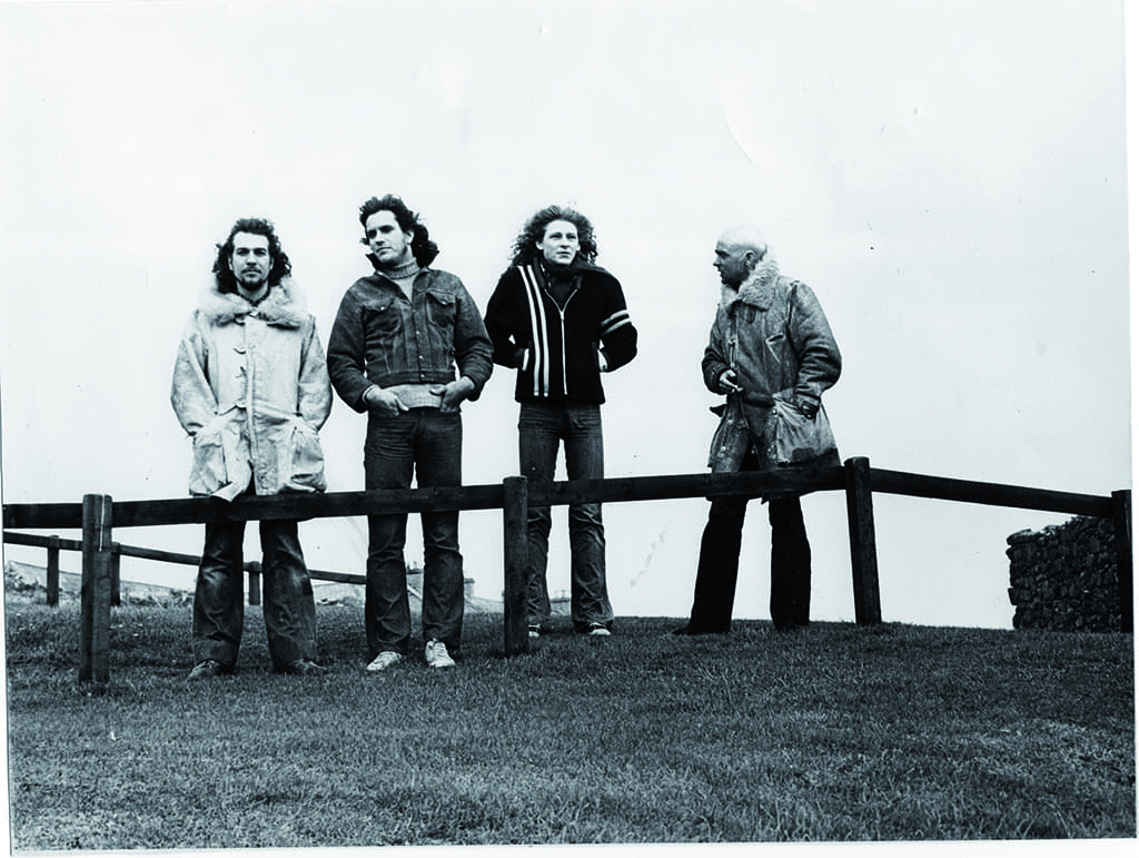
Some of the crew at Giant’s Causeway in 1972. From left to right – Powell, photographer’s assistant Alex Henderson, ‘dad’ model Mark Sayer and ‘alien’ model Jules Laughton
Peter Grant wants a word…
An impatient Grant demanded Powell meet him and Jimmy Page at St. Pancras Station after the pair had arrived following a Led Zeppelin gig in Birmingham. Powell drove Grant and Page, in his Mini Cooper, to Victoria Station to catch their connecting trains to Sussex. Powell reveals, ‘In those days you could drive onto the station. We jumped out, I opened the boot and there were the two artworks – the front and back covers.
Peter and Jimmy went, “That’s amazing. How did you get those colours? That’s incredible,” because it was so vibrant.’ He adds, ‘Jimmy was over the moon. They said, “Great, well done, fantastic, finish the rest of it”. They went off together and a whole crowd of people had got round the car. Jimmy was still in his stage clothes, so he drew a crowd, and when we left all these people clapped… it was extraordinary but I was very relieved and very pleased they liked it.’
The artwork was shown to sales conventions in the US and Powell recalls, ‘I thought we’d done something pretty special but I wasn’t prepared for some of the backlash. The mid-West [record] dealers in America were concerned about the naked children so the record company asked if we could put an Obi, a Japanese sash/band, around the centre of the record with ‘Led Zeppelin Houses of the Holy’ on it, to cover up the children’s backsides, which I did.
It was released like that. It was kind of cool because you had to break the obi to get to the record, so it was a bit like getting a present. Storm and I were happy about that. I’m very proud of the picture and it stands the test of time.’
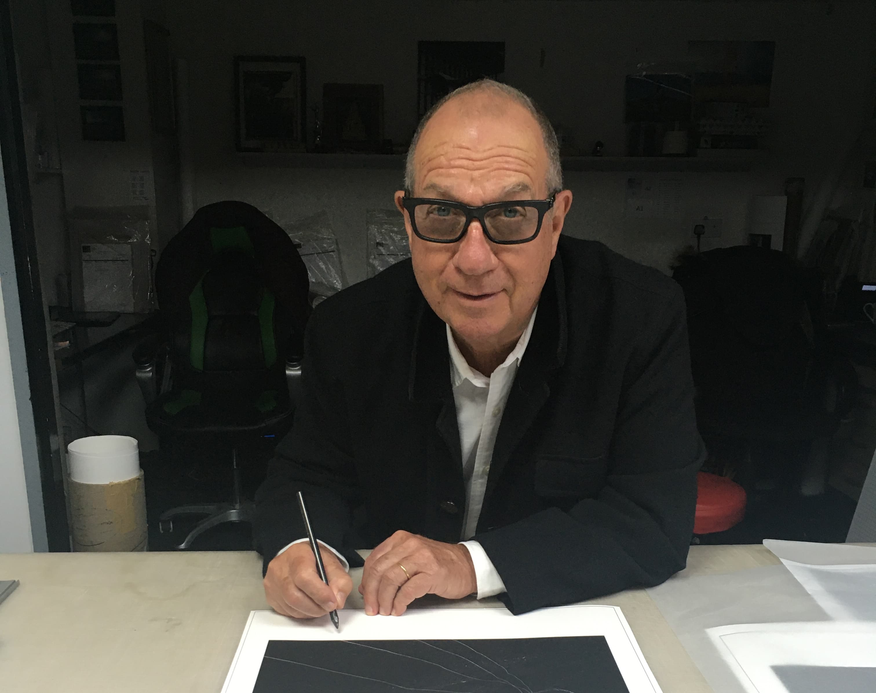
Aubrey ‘Po’ Powell began his career as a set designer. He and Storm Thorgerson co-founded Hipgnosis in 1967, and produced LP covers for Pink Floyd, Yes, Genesis and many more. He progressed to making music videos, TV commercials, documentaries and corporate films but in 2014 returned to album design for Pink Floyd’s The Division Bell 20th anniversary box set. See aubreypowell.com.
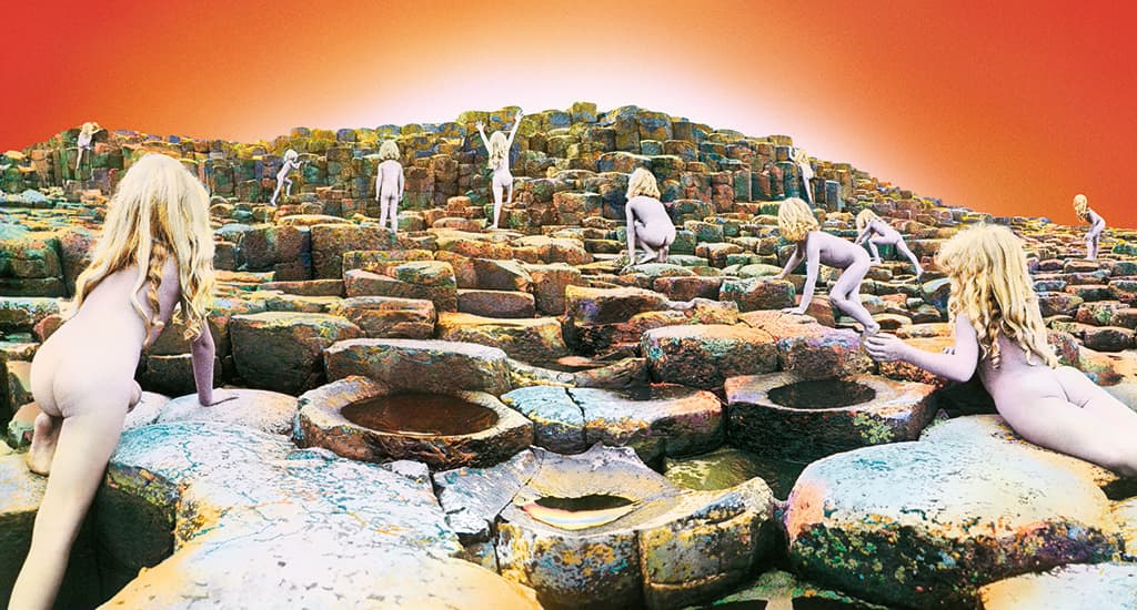
The opened-out gatefold front and back covers of Houses of the Holy
Fact file: Led Zeppelin’s Houses of the Holy
Musicians: John Bonham, John Paul Jones, Jimmy Page, Robert Plant
Released: 28 March 1973 (Atlantic Records)
Best chart performance: No. 1 in the US Billboard 200, the UK Albums Chart, Canadian RPM Top 100 Albums Chart and the Australian Go-Set Top 20 Albums Chart Sales: Over 11,800,000 certified sales
Fascinating fact: Houses of the Holy was the first Led Zeppelin album to have a specific title. It was the band’s fifth studio album – the first three had been titled I, II, II and the fourth album was deliberately not titled at all but has been known by different names, including IV, Four Symbols, ZoSo, Runes and even Untitled. In 1974 the Houses of the Holy album was nominated for a Grammy Award in the Best Album Package category
Our panel on Houses of the Holy
Some of the finest names in music and photography chose this series’ covers. Here is what three of our expert panel think about Houses of the Holy…

Peter Hook
It was the very first Zeppelin cover by Hipgnosis and they came up with a unique and striking look. Very innovative, and the way the gatefold opened up… it was like a work of art. The most important thing at school was to have a cool album beneath your arm and the fact it was Led Zep made you stand out.

Andy Cowles
Just like the band, this sleeve delivers colossal power and bacchanalian bloody-mindedness. Hand-tinting is an ancient technique and looks crude by today’s standards, but it perfectly reflects the Zep brand – letting the black & white image abstract reality while the colour does all the heavy lifting.
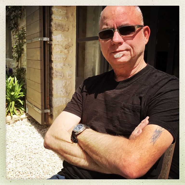
Kirk Weddle
Aubrey Powell produced an epic album cover with Houses of the Holy. This image is almost more of a painting than a photograph. Multiple images shot in black & white and then blended together and hand tinted. This was done way before Photoshop. It’s a mysterious, wild, surreal image.
Further reading
The Ramones by The Ramones
Nevermind by Nirvana
Born to Run by Bruce Springsteen
Aladdin Sane by David Bowie


