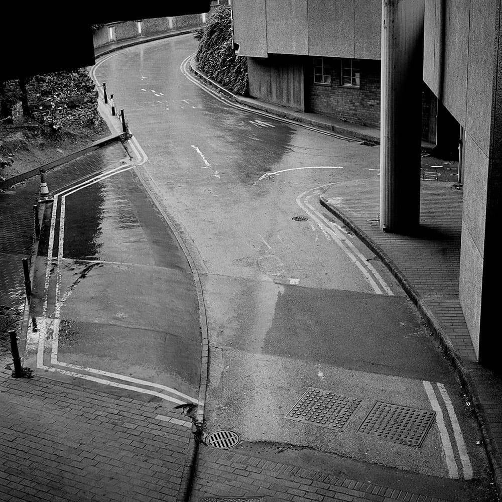
Although square in format, the focal balance of this photography has a circular pattern to it. Barbican Centre, London. Rolleiflex 2.8E, Ilford HP5 Plus. Credit: Mike Crawford
When working in the darkroom, controlling tonal balance is a very important consideration in making a fine print. It should not be confused with compositional balance, that is, how the contents of the frame are aligned in the photograph – but there is a close and symbiotic relationship between the two. Indeed, controlling the tonality by changes to the contrast and depth of tone should emphasise and strengthen the composition so the viewer will correctly ‘read’ the image, not from left to right as with text but to be guided by the weight of the tones and how they lead the eye in to the focal point.
With tonal balance we can control areas of the photograph by making changes on how light or dark to print different areas. This will not only emphasise key subjects, but will also hopefully reduce distractions that may take the viewer’s eye away from more important elements of the print. While this is achieved through selective choices of contrast and exposures for different parts of the print, this article is not so much about how to dodge and burn, but why we dodge and burn.
Why we dodge and burn
This is certainly not exclusive to photography; indeed it is a fundamental part of art theory. I find it worthwhile to study books on photographers and painters, or if possible view their work in a gallery, to see how an individual artist or photographer has used different tones to control the balance within the work, whether on canvas or photographic paper. Sometimes it can be a very subtle thing. While careful manipulation and dodging and burning can transform an image and often convey a different story to the intentions of the original photograph, a print may sometimes just need some selective darkening on one side, or in a corner, to hold the photograph together and remove distracting highlights.
Our eyes will instinctively go towards large areas of light or dark tones, despite there being no interesting content there. In such cases the differences between two such prints may not be initially obvious to the viewer, but when shown both together, the print in which the tones have been balanced will usually be preferred, even if at first glance there seems to be little difference between the two.
This is not to say that we should aim to make our prints regimental or symmetrical in tone, far from it; instead we should consider how the tonal values of a print work together. I know printers who recommend holding a print upside down, or reflected in a mirror, with the idea that a well-balanced print should work tonally both ways – a practice taken from painting. Some photographs will naturally be higher key, comprising predominantly of highlights with darker compositional lines and details in the shadow range. These may require extra burning in or print flashing to smooth the lighter tones, especially where they meet the print border. Alternatively, a lower key print consisting of more shadows and midtones may need selective dodging to accentuate the highlights.
Flashing
Flashing is a very useful tool when correctly applied and can bring in just enough detail to register information in the highlights. I certainly find it essential sometimes for balancing out bright skies or other distracting light areas. It can also be applied selectively, using card to cover most of the print or even cutting out a mask to only add tone to one area. Like dodging and burning, it is important to keep the mask moving during the flash exposure. If the flash is too long, the print will soon look grey and degraded though there are occasions when a longer flash will be useful and appropriate for darkening a burnt-out highlight towards a deeper tone.
While it may sound theoretical, generally there are no strict rules for controlling tonal balance, as shown in the examples printed for this article. Each image usually requires a different approach from the next. When working on a series of prints, particularly of the same subject for an exhibition, this choice of controls will help to unify the work. The compositional details will change, and the depth and key of each print may vary, but hopefully the tonalities will be well balanced so that there is a consistency to the work while still making each photograph individual.
Print flashing
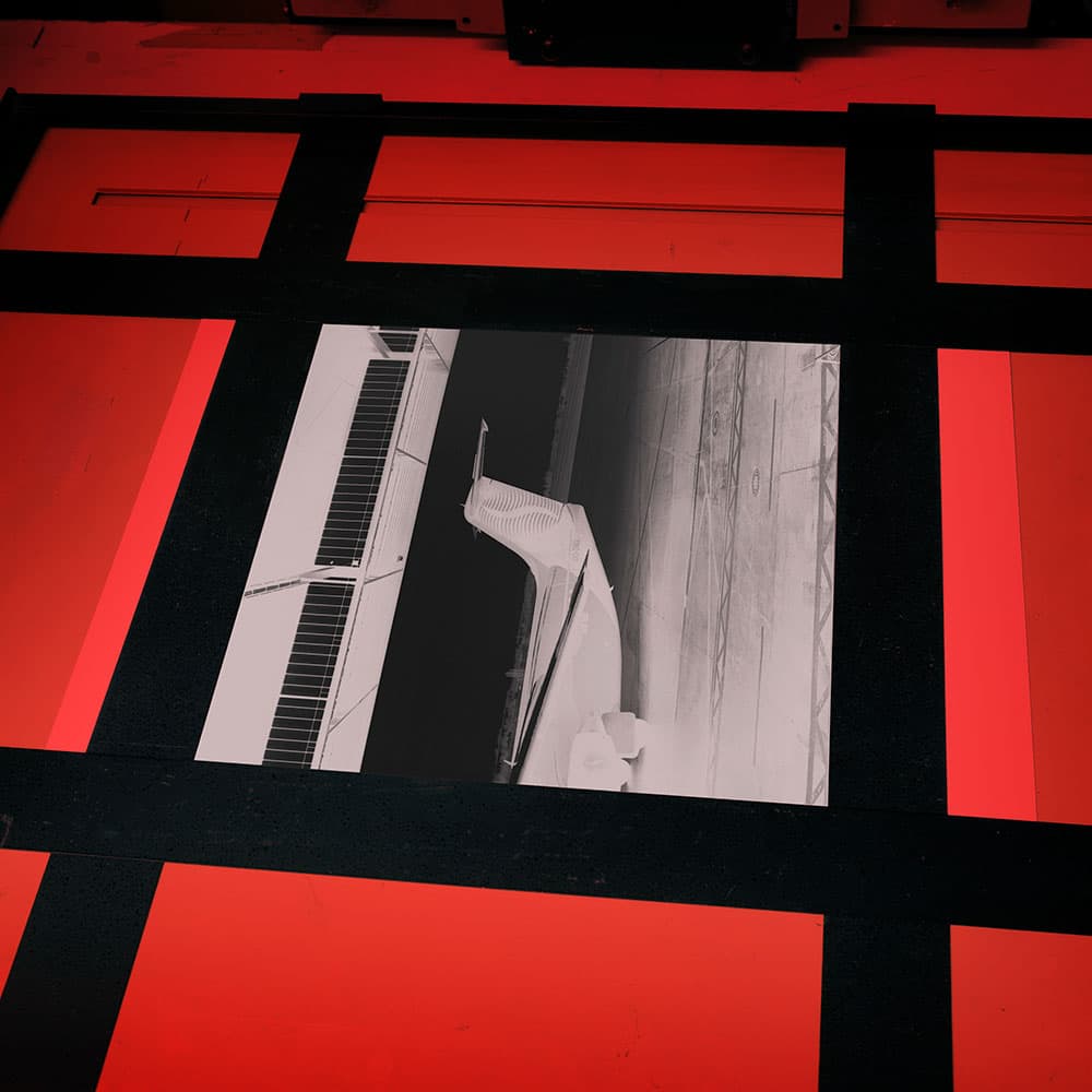
Credit: Mike Crawford
1. Assessing the negative
This photograph’s composition is made from layers of contrasting tones interrupted by the tail of an airplane, thus breaking its symmetry. The shadow detail of the negative was quite thin so it was necessary to print on grade 4 with some additional burning in on the highlights at a softer grade.

Credit: Mike Crawford
2. First print
To add more tone, I subsequently flashed the paper, which requires a very short burst of white light. This can be done by removing the negative from the carrier, stopping the enlarging lens down, and giving a brief exposure, probably for less than a second.
Credit: Mike Crawford
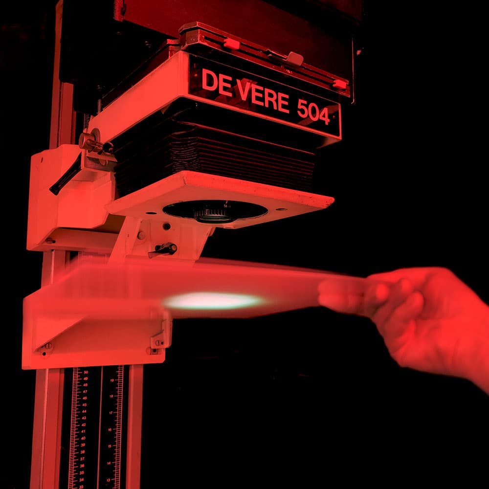
3. Flashing the print
A simpler method is to hold an opaque Perspex sheet under the lens, (pre- or post-exposure), leaving the negative and f-stop untouched. This projects a diffused even tone allowing an exposure of seconds instead of tenths of a second. It is then easier to selectively flash, holding back with a card.
Credit: Mike Crawford
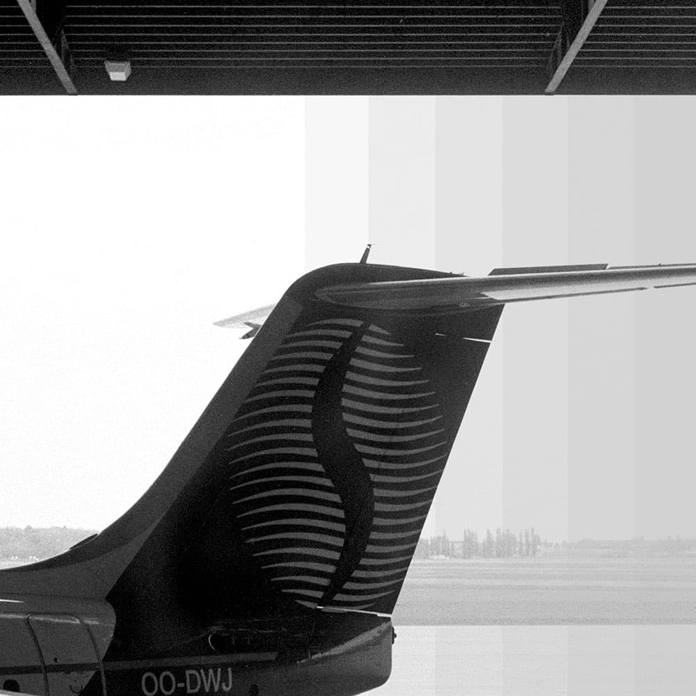
4. Test strip
A test strip is essential to judge how much flashing is required to add tone but not to dull the highlights or midtones. As can be seen, too long a flash will make the print appear flat and grey.
Credit: Mike Crawford
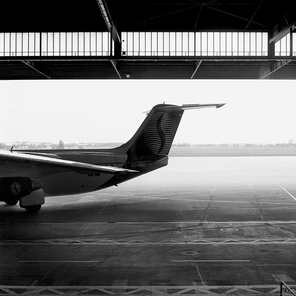
5. The finished print
If done correctly, flashing can subtly aid the tonal balance of a print by controlling distracting highlights. This is very useful for adding tone to a blank white sky so it stands out from the print border.
Creating a high-key image
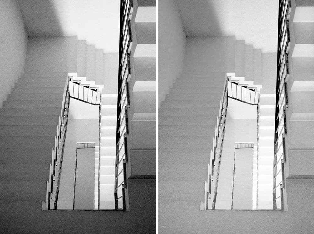
Before (left). After (right). Credit: Mike Crawford
With this image of the staircase I aimed to create a print in a higher tonal key with more highlights and midtones than shadow. As can be seen from the left-hand straight print on grade 3, the area of shadow at the bottom of the frame is visually dominating. I found that by printing a lot softer, on grade 1.5, and carefully holding back the lower section during part of the exposure, it was possible to even out the tones. Maybe I was thinking too literally of the content of the photograph, but I wanted the viewer to keep following the direction of the steps in a spiral manner, which previously was difficult to achieve with such a difference in tones. I also wanted to reference the work of artist MC Escher and his optical illusions of impossible staircases that never end, which is perhaps why I printed the negative upside down. So while it looks as though the steps are descending, in reality I was shooting upwards underneath a rising staircase.
Making your subject stand out
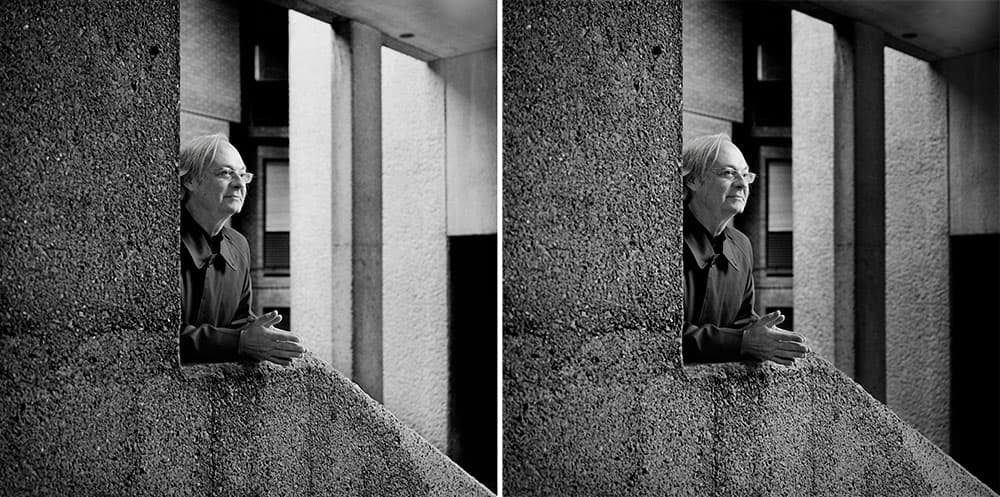
Before (left). After (right). Credit: Mike Crawford
With portraiture, the composition within the frame should lead the viewer to the subject while considering the environment or location of the portrait. Again, controlling the tonality will help to strengthen and accentuate how the photograph is perceived. This portrait of Slovenian artist Oto Rimele was taken at the Barbican Centre in London. With the subject placed centrally, among the concrete pillars and stairways, a straight print tends to be read too obviously, from left to right, which is further emphasised by the direction in which he is looking. Almost half the photograph consists of the dark L-shaped concrete banister he is resting on. This anchors the balance towards the left, while opposite, diagonally towards the top right, the print is very bright. With these contrasting tones, the main subject tends to be somewhat lost in the middle. Holding back the darker areas on the left and selectively burning in the lighter pillars on the right not only balanced the tones, which accentuated the composition, but importantly, let Oto stand out more as the main subject of the photograph.


