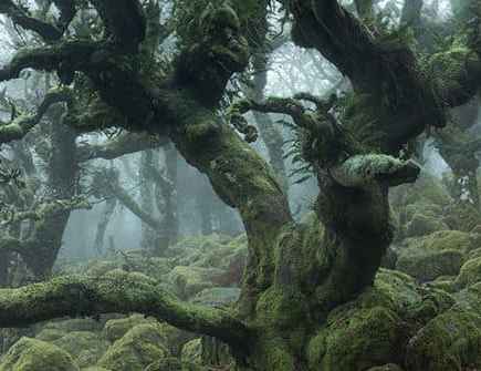
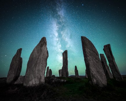
In almost every article written about the art of landscape photography technique, we are told that foreground is key and that it is the most essential part of the overall composition. Without it, we are told, the image is dead, lifeless and lacks depth. Foreground is the start of the journey through the picture, and a successful landscape photograph cannot survive without it. But is foreground overrated and possibly unnecessary in landscape photography? If you look beyond the obvious and compose your images with depth and impact, yet feature no obvious foreground element, can your images still be seen as successful? Does it still engage and invite the viewer into the scene? Perhaps, in fact, foreground is the least important aspect and we can do without it.
This may be playing devil’s advocate, and I’m sure many would argue the case for foreground with confidence, but I believe it’s possible to compose a successful image without foreground. There are several ways to create an engaging composition yet not be influenced by a prominent foreground feature. It’s all about adapting your technique and taking time to look beyond the foreground into the middle distance.
Distant subjects
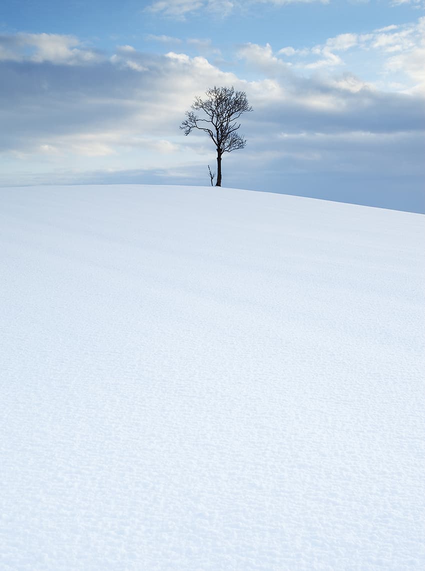
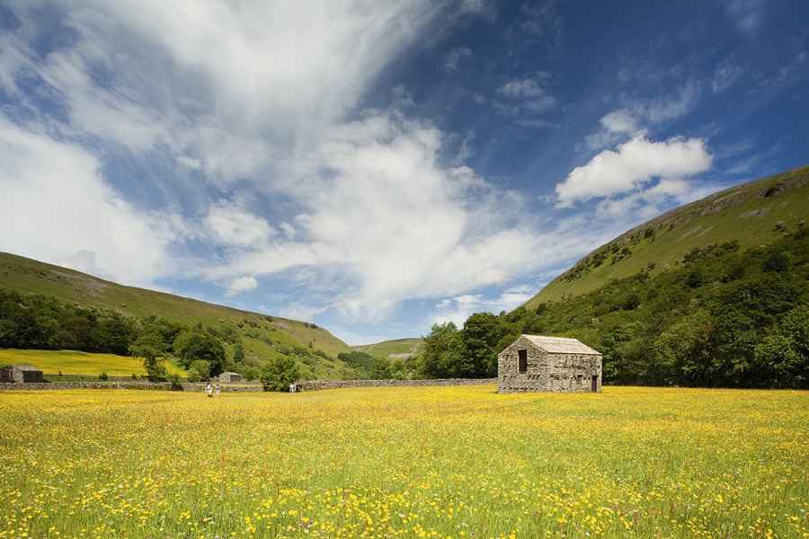
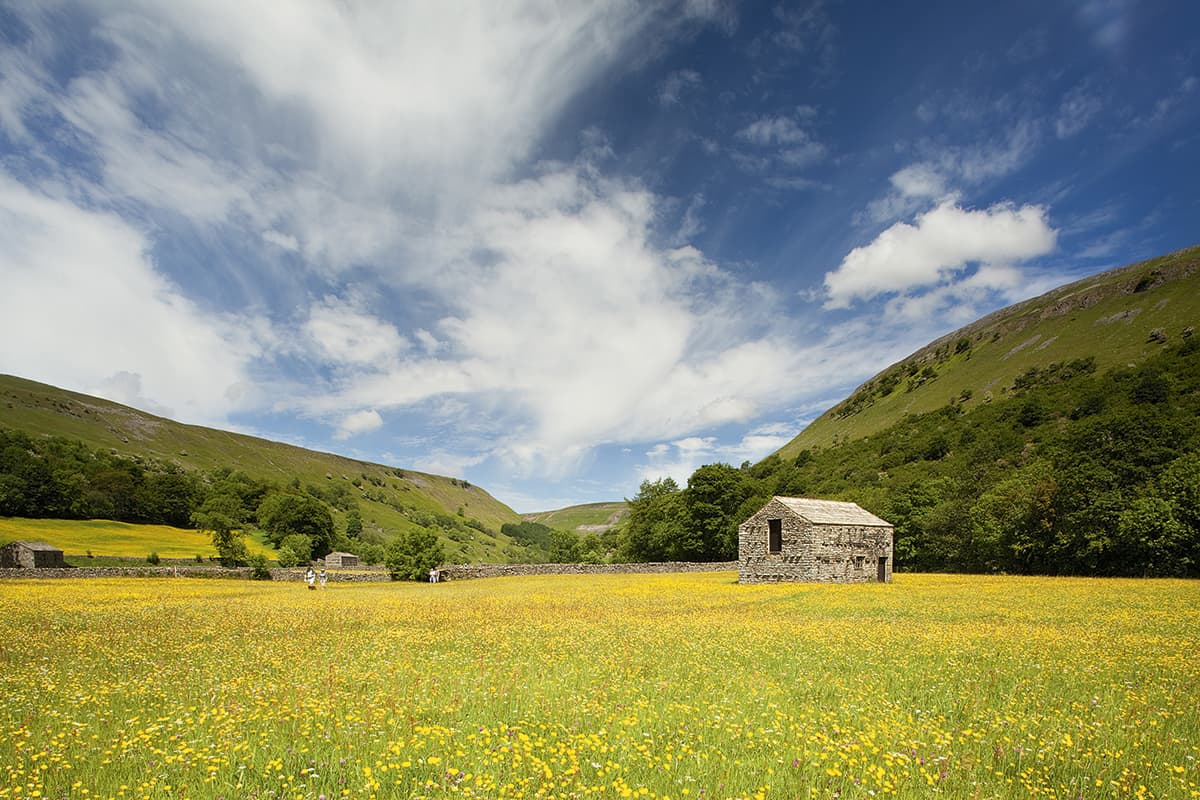
The brain can be made to ignore the lack of foreground if the main focal point is strong enough to draw the eye to it without an obvious beginning. The other job of foreground is to give balance to the scene, so the main focal point doesn’t dominate the picture. Landscape photography is all about balance, but as we work our way to the horizon, the main subject may still be quite small within the frame and therefore not shout for attention, despite having the picture to itself.
A strong focal point often eliminates the need for any prominent foreground feature. Even a bare foreground, if relevant to the overall image, can be used effectively in this way. Let your main focal point draw the viewer in, but in such a way that it is slow and considered.
The low horizon
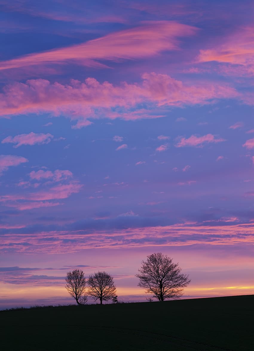
An immediate way of completely eliminating the foreground is by composing with a low horizon, applying the rule of thirds composition technique. In this case the sky and any distant elements become dominant features and the main focal point. Any foreground included acts as a base and reference point for the higher view. It’s used only as a sense of scale and serves no purpose of leading the eye into the picture.
In such examples the image is kept strong with the low horizon position and breaks the rules to a certain extent by including so much sky. However, the rule of thirds composition keeps a two-thirds balance on the main feature and creates an overall composition that is pleasing to the eye.
Vertical formats

When composing your images vertically, allow for the fact that our brains scan such formats up and down
Swapping from a horizontal format to a vertical one is often done when there is a prominent foreground feature that you want to exploit. Shooting with an elongated frame allows more foreground to be included into the picture and starts the visual journey close to the bottom of the frame. It could be said that this vertical format requires even more foreground, rather than less.
However, this is another example where that ‘suggested’ foreground could work. You are allowing a longer lead-in time before the viewer reaches the main focal point in the distance, so the eye is naturally drawn from the bottom to the top of the picture.
We don’t naturally view the world in this format, as our vision is purely horizontal and even panoramic with peripheral vision. Presented with a vertical image, our brain scans up and down to take in this odd view. Compose your image to allow for this and your foreground can be left empty so the eye is not drawn back down the image after it reaches the distant focal point, as it would be if foreground were included.
Natural elements
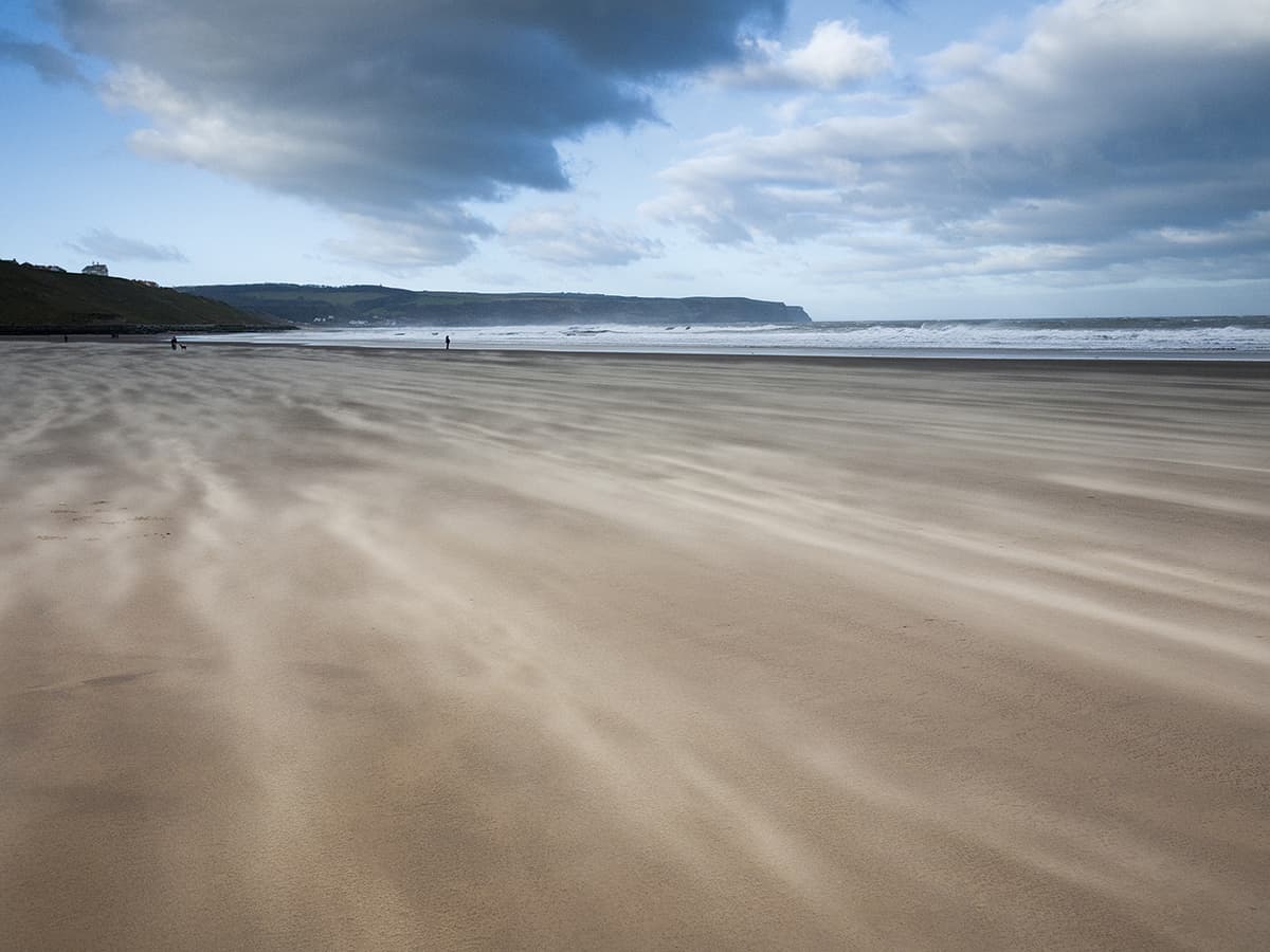
Without an obvious rock, path or fence, you can still use the natural landscape as an inconspicuous foreground and a lead-in to the image. Mother Nature works her magic in lots of wonderful ways and the way the landscape is etched out in front of us can be more than enough to add to our compositions. Thus a subtle approach to foreground gives the suggestion of leading the eye into the shot and provides enough interest without the viewer realising the foreground is predominantly empty.
The way the wind moves over any flowing and non-fixed feature can add a subtle ingredient to a picture. Any long grass or crop field is given some life, while a beach becomes a moving trail of particles of sand where imaginary lines are created that disappear when the wind drops again. These brief moments where nature interacts with your chosen scene provides enough drama and interest to dispose of any traditional solid foreground feature and will be unique to your moment of capture.
The suggested foreground
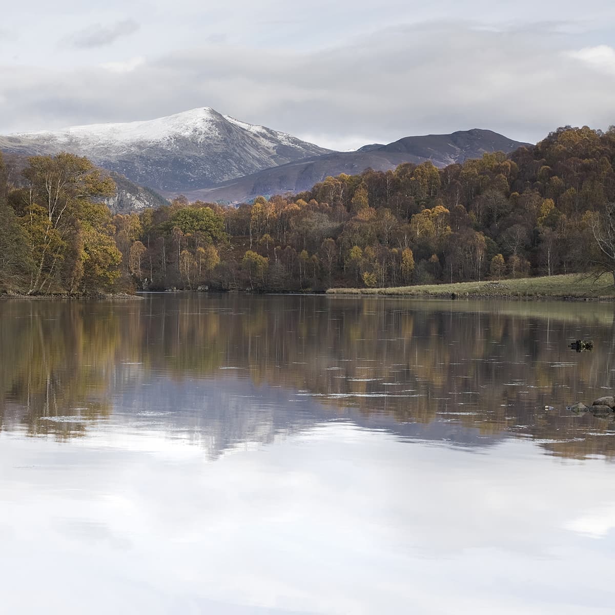
Without any obvious foreground element, you can trick the eye into thinking there is something there
Without any obvious foreground you can still compose your image using the lie of the land to lead the eye to the main focal point. It’s as if the foreground element is there, but has been removed at the last moment. In the same way that the brain completes missing letters in a familiar word, it responds to this missing element. The rest of the photograph and the way the landscape is formed ‘suggests’ that this is the start of the image. The eye is then drawn to the next available element, as if by accident, with the negative space offering the brain nothing to hang onto and therefore it quickly bypasses this for something more interesting.
This way of composing is not a bland shot without a foreground – the landscape needs to be shaped and formed. But be aware that only certain scenes will allow such a composition and it’s no excuse to exclude the foreground from a shot.
Symmetry rules
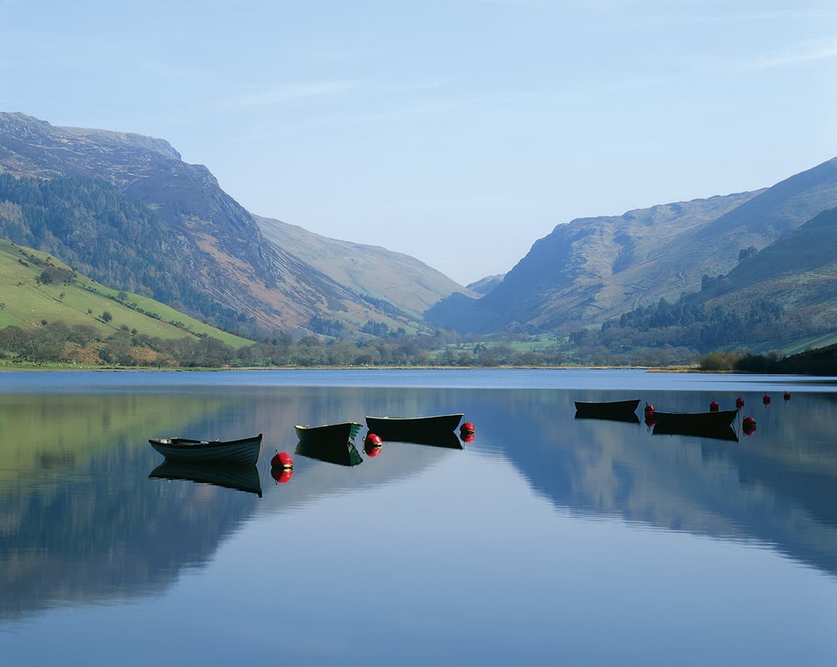
A typical symmetrical composition is based around the centre of the image. The essence of the composition is that the bottom half mirrors the top. Obviously, the larger and more detailed the reflection, the better. With this in mind, the horizon is placed directly across the middle of the frame. This is another rule this landscape photography technique breaks, but to good effect. Without a foreground and when the rule of thirds is ignored, the eye is drawn to the centre of the frame. The result is striking and another way of composing an image without a foreground. Use water and a perfect reflection for strong images with empty foregrounds.
Midground is the new foreground
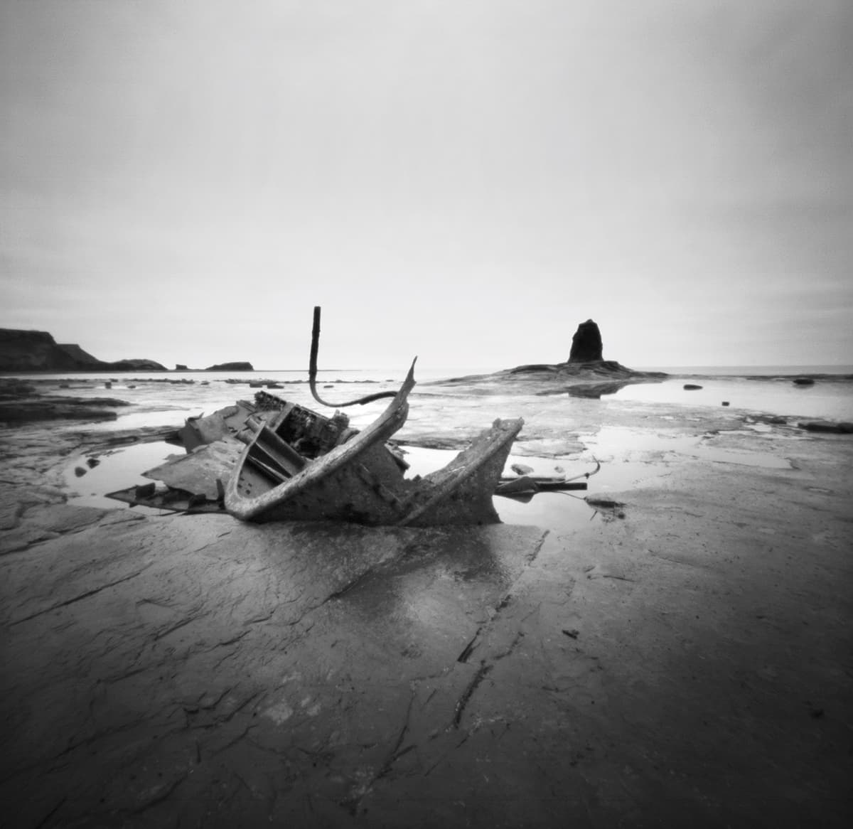
A typical foreground composition is made up of three main elements; foreground, midground and background that provide the start, middle and end of the viewer’s journey through the picture. The foreground feature is often used to help create a sense of depth, but midground elements can prove effective enough to replace a foreground feature.
With a strong midground, a picture doesn’t always need a complementary foreground feature to balance the image. The build up of the three elements can vary in size within the frame to create an image of balance and harmony.
Confidence is key

Composing images with no foreground requires confidence – in both the scene and the composition. The final image needs to stand up to scrutiny, and such a break away from tradition can result in a contemporary feel. Visually simple and stark images can be as effective and as powerful as a multi-layered composition, and will often be more striking through their relative starkness. It is bold and refreshing to remove all distracting elements to create an image with minimal form and structure. It can grab the attention of the viewer, but your own confidence in creating it is key.
Telephoto views
Telephoto views work by compressing the scene and often exclude foreground, yet are still effective. By using a telephoto lens you draw the distant view in, as if on the end of a rope, at the expense of any foreground in front of you. You create an image in the distance, incorporating many elements within the scene, to build up the picture. The lens compresses the scene and creates a foreshortening effect, making all the elements seem closer to one another than they actually are. Foreground is removed by default and yet the image loses no drama. In fact, it is often increased by the new elements you now bring into view.
Why it works
Let’s take a closer look at why this shot, that appears to be devoid of any foreground interest, is still a successful landscape image:

1. Strong distant subject
A dominant and even distinctive main subject is a natural focus for the eye to be drawn to. Its outline and hint of reflection are strong enough to be the dominant feature in a picture of muted colour and overall simplicity.
2. Focal point placed on rule of thirds line
Careful positioning has ensured the castle’s placement draws the eye perfectly. The rule of thirds line is a strong compositional tool and it has been used here alongside the shaped cloud to be the key focal point.
3. Vertical format
The composition has added drama from the use of a vertical format. This adds tension to the horizontal of the horizon line, as well as emphasising the emptiness of the foreground. The lack of obvious foreground naturally draws the eye
up the image.
4. Suggested foreground
Here we have no obvious foreground rocks, beach textures or any dominant feature for the eye to lock onto. We are fooling the brain into ‘filling in’ the foreground with a suggestion of foreground with the swirling water.
5. Movement in natural elements
The long exposure has allowed the water to create a swirling pattern in the low tide. This gives the image a subtle foreground that helps draw the eye to the top of the picture.

