One of the most important aspects of making a successful landscape image is creating a well-balanced composition. However, I feel that sometimes we can be too quick to take the shot and perhaps don’t consider all the elements, which are key to a successful composition. On numerous occasions I have been to a location and noticed photographers turning up and taking a shot almost the instant they arrive. The camera is invariably held in landscape orientation and no thought is given to perspective.
I’ve often said that if you love the landscape, then photographing it in great conditions can be an adrenaline rush. We need to be aware of this and ensure we don’t go home afterwards, load the images onto the computer and think, ‘Why didn’t I move a bit to the left?’, ‘Why didn’t I get a bit closer?’, ‘Why didn’t I get all that tree in?’
Consider first, shoot later
One of the first things I do when I get to a location is put my bag down and have a wander around. It is important to look at all the angles and change the perspective by moving left and right, closer and further away, higher and lower. We have to look at the whole picture and be aware that a slight change in perspective can change the whole balance of an image, no matter how near or far away the subject is.
I am a big fan of going out to shoot with no preconceived ideas and approaching the landscape with an open mind. In this way you are far more likely to see something that interests you. Once you have seen that ‘something’, you are then faced with the task of how to arrange it as a satisfactory photograph.
I try not to have too many ‘rules’, if any, but I advise you to think of the following composition tips when you are next faced with a beautiful landscape moment.
1. Space
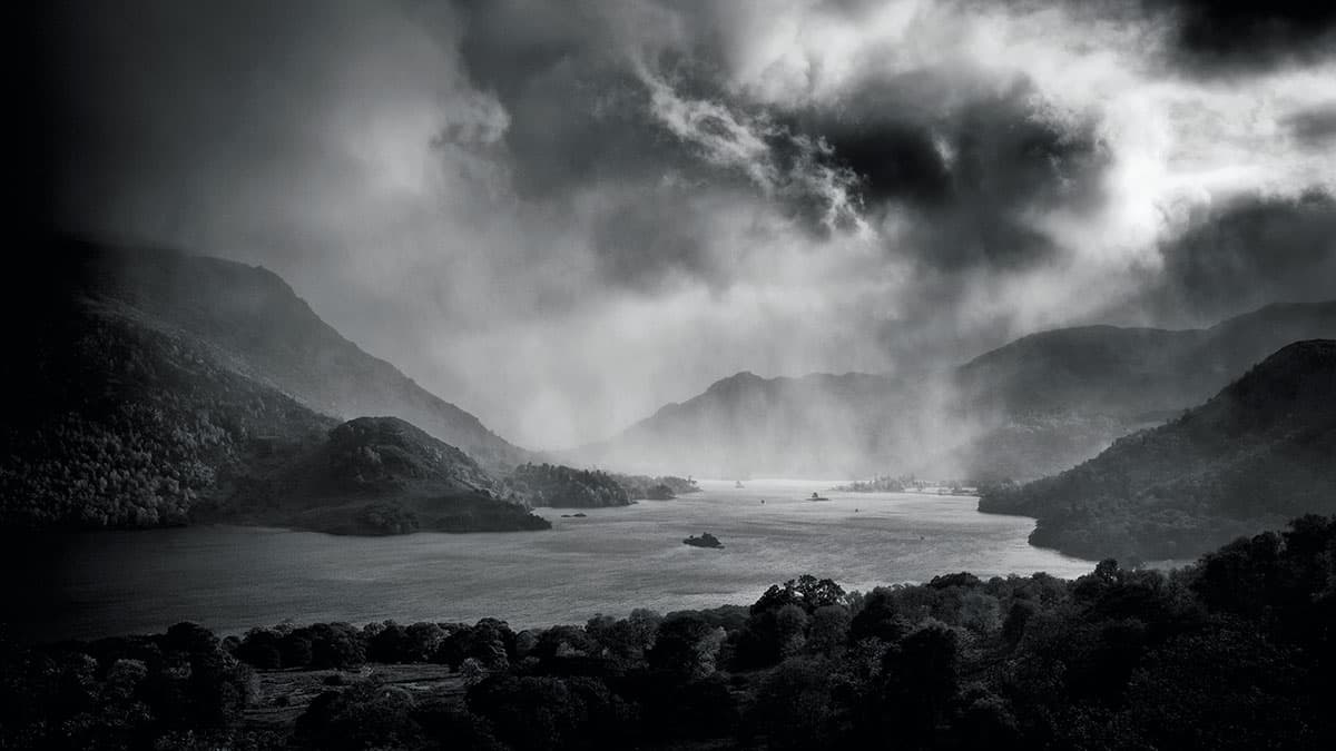
The first shot I’m going to look at is a picture of Ullswater in the Lake District on a stormy day (above). The scene is so dynamic that it doesn’t need any foreground interest to lead you in. It’s a simple enough scene to photograph, once you master how best to expose it. The problem lies in how much space to give at the edges. I see a lot of people with little spirit levels attached to their camera. A horizontal horizon is a necessity in most situations. However, the Lakes are a different proposition. What is level doesn’t look level and what does look level isn’t. Without sufficient space around the edges of the frame, any attempts to level an image in post-processing can result in the picture looking cramped. Space is important if you wish to achieve mood and atmosphere.
2. Balance
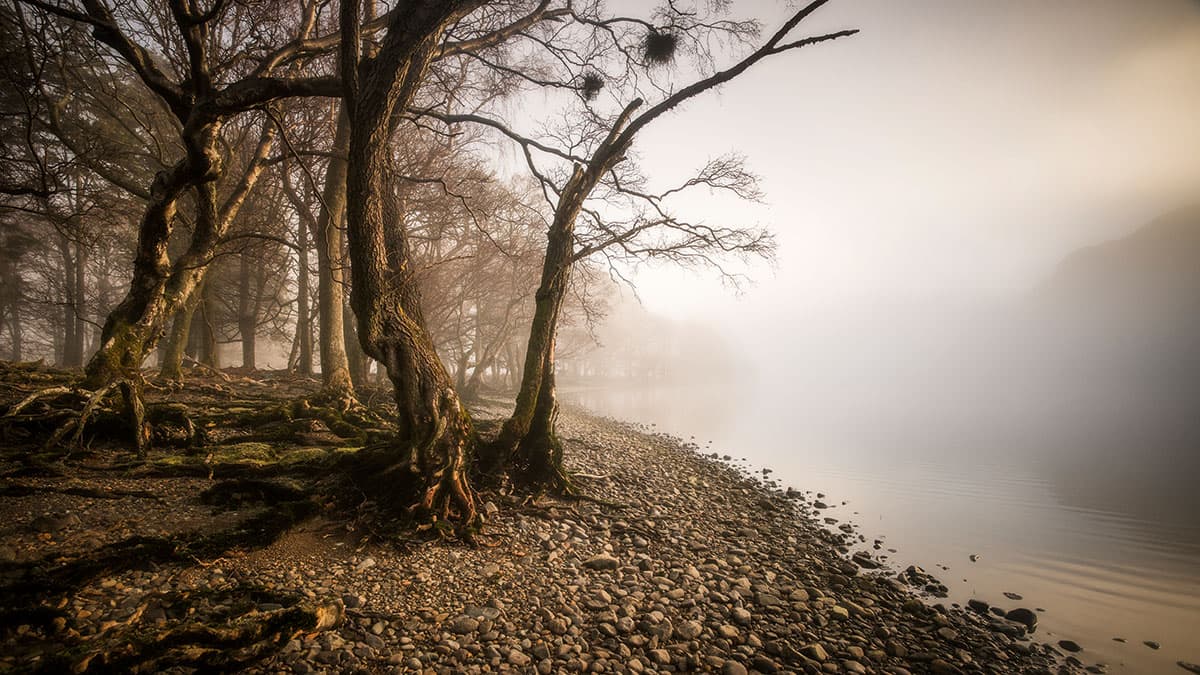
Allow for space in an image to enhance the context and meaning of a composition
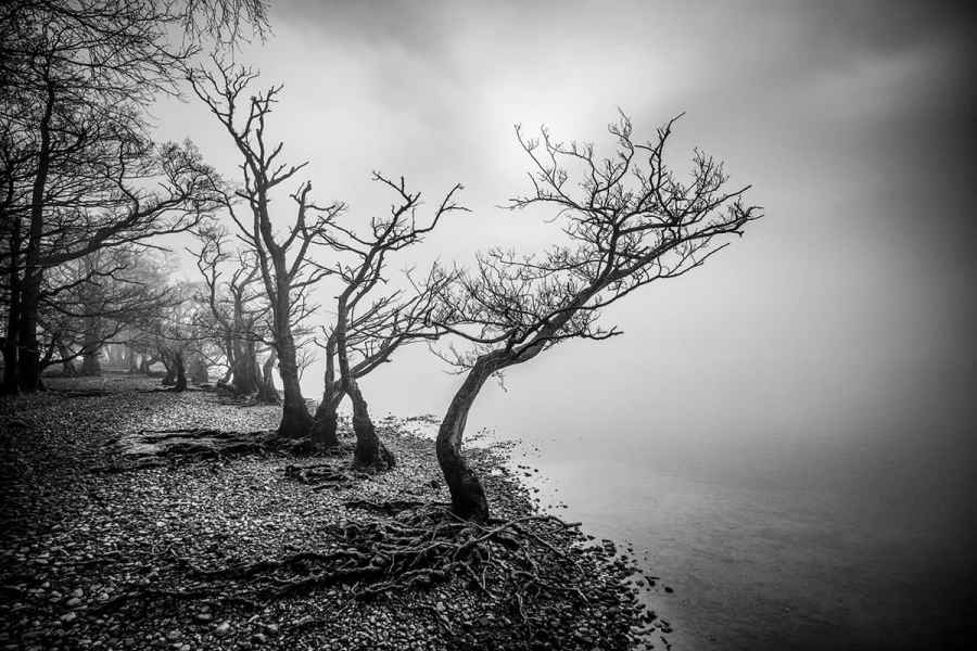
This image is another one from the shores of Ullswater in the Lake District. I am a huge believer in negative space. In my view, it can provide balance, and also increase the mood and atmosphere in any image. This has been shot with quite a wideangle lens, allowing me to get close to the slightly threatening trees, which are the main subject of the image.
Cropping in around them or making them the entire focus of the image wouldn’t have worked. It would have become a picture of trees with no sense of the dynamics of the scene around them. They needed space to breathe. I composed the image from the left and worked my way across to the right. I think it pays to have an ‘anchor point’, which you can use as somewhere to start for your composition.
3. Perspective
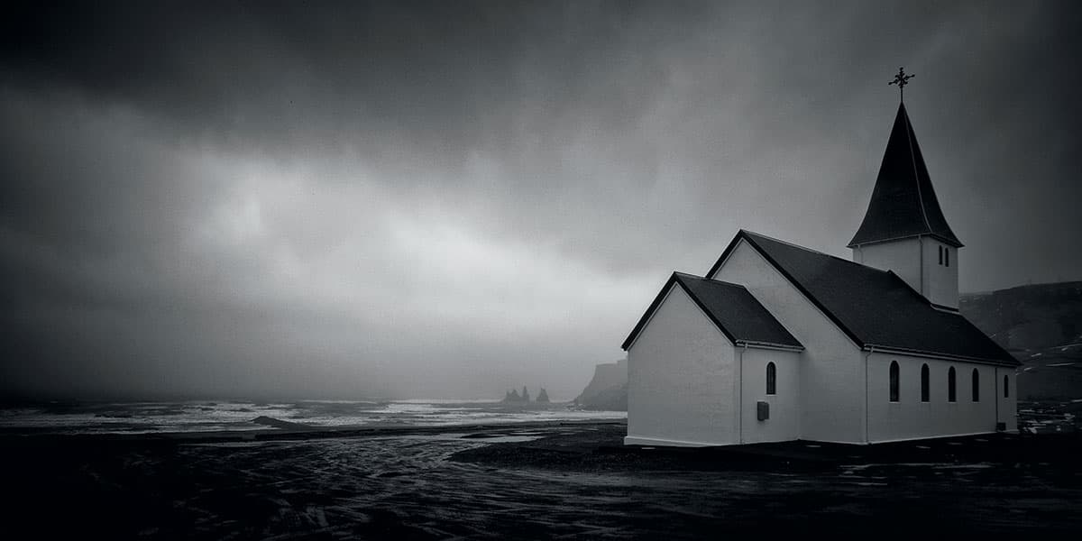
The low angle of this shot, taken in Iceland, has made the church seem as though it’s on the beach
This image was taken on another stormy day, but this time a little further afield – in Iceland. The subject is the little church at Vík on the southern tip of the island. In between the church and the sea is a rather unphotogenic main street and the houses of Vík. By getting into a very low position, I was able to manoeuvre the view of the church so that it concealed the town. The next stage was to work out how close I needed to be. If I were too far away, the edge of the car park would hide the whole of the beach. I just wanted the very edge to be visible, with no sea hidden. By photographing from this perspective, it almost makes the church appear to be sitting on the beach.
4. The horizon
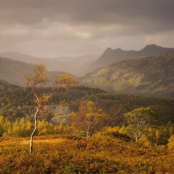
The trees are lower in the frame and complement, rather than compete with, Langdale Pikes on the right
Take care not to have elements such as trees and buildings coinciding with the horizon. It can look awkward and your image will look more fluently composed if you have taken the time to align them correctly in the frame, by either having them break the horizon cleanly or by placing them neatly under the horizon line.
In this image taken in the Lake District, the Langdale Pikes in the top right are the main feature in the frame and it was important that the three trees were not competing with them within the frame, from a height perspective. Fitting them in under the fell ensures they complement and add to the overall atmosphere of the image, without taking anything away from the Pikes.
5. Cropping & aspect ratio
An uncropped image that benefits from the space at the bottom and right of frame
I can’t fully separate cropping and aspect ratios as they go hand in hand, but there are two things that have struck me about them. The first is that people are reluctant to see an image in the vertical sense. The camera is always aligned horizontally and no thought is given to perhaps thinking of a 5:4 portrait crop or even a 5:7. Many landscape scenes work perfectly as a vertical presentation.
The second is in relation to cropping and has become more frequent with the introduction of 36/42/50-million-pixel DSLR cameras. I hear the phrase, ‘Well, I can just crop it to get that section there.’ It’s almost as if people are thinking of using a 50-million-pixel sensor to make a screen grab of everything in front of them, with the intention of sitting in front of a computer later and looking for a successful picture within their ‘grab’.
My view is that if you can see it later, you can see it at the time. Compose correctly and carefully the first time. Be aware of all the elements, relax, enjoy the view and decide how you are going to arrange the shot. Probably 99% of my finished images have one completely unchanged aspect. This image is uncropped and, in my view, needs that space at the bottom and right to keep the proper feel. If it’s a horizontal image then the long side will be unchanged and if it’s a vertical image or a square, then the short side will be unchanged.
The ones that didn’t work
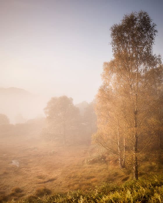
Cropping the top of this image would improve its composition
Here are two examples where I didn’t follow my own rules and was left in the position of ruining certain opportunities for a successful image.
In the first image (above), I liked the light and colour of the tall silver birch on the right and also the top of the fell just appearing through the mist on the left. Hindsight shows that I should have decisively cropped the tall tree to maintain the balance of the image. I would still have retained the light and colour as a balance to the fell.
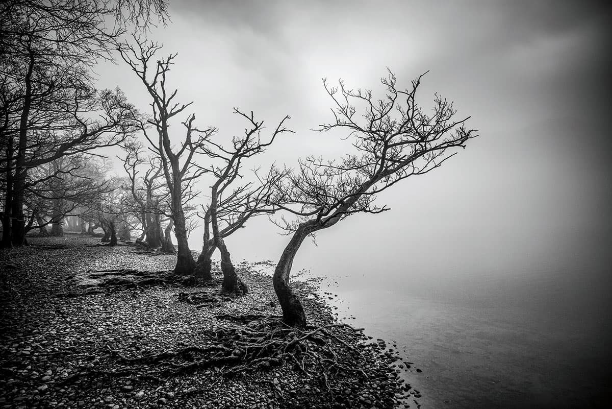
The second image (below) suffers from a lack of space around the trees. As such, it simply becomes a picture of some trees, lacking input from the surroundings to make it any more dynamic or atmospheric.
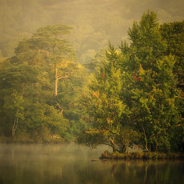
This photograph suffers from a lack of surrounding space
Ultra-wideangle lenses
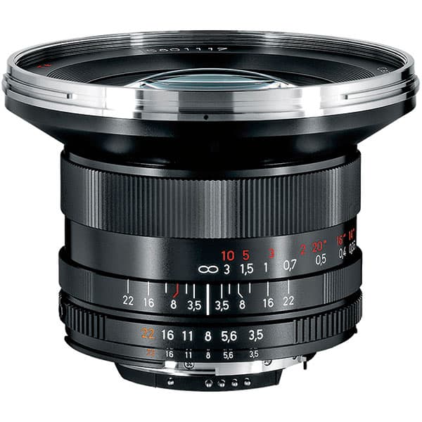
The first item many prospective landscape photographers add to their photographic armoury is the wideangle lens. There is a real danger, though, that by just adding more and more into the frame using one of these optics, the magnificent view you were looking at then fails to materialise on your computer monitor when you get home and view your hard day’s work.
In some respects, it can be like looking through the wrong end of a telescope. The foreground becomes all-important and is the most important part of the frame. Getting the balance right can be a tricky operation.
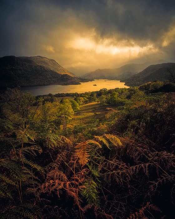
The background light is strong enough to balance the light on the ferns
To shoot this photograph of Ullswater in the Lake District, I used a Zeiss 18mm lens and realised that the light on the foreground ferns was rather beautiful, as was the light on the fells in the background. The background in this instance, with that wonderful fleeting light, was strong and dynamic enough to provide a sufficient balance for the foreground.

