Colour can influence our emotions and dictate the way we feel about an image. Tracy Calder introduces key points from colour psychology and theory, and shares some practical tips
Pre-Raphaelite artist Edward Burne-Jones was having Sunday lunch with a friend in 1881 when his companion mentioned that he had recently seen an Egyptian mummy ground up at a colourman’s warehouse. The painter, it transpired, had no idea that in order to make the tube of paint known as Mummy (or Egyptian) brown, muscles, flesh, bones and even bandages were sometimes ground and mixed with a drying oil and amber varnish. Burne-Jones was so horrified that he raced to his studio, grabbed his tube of Mummy brown and gave it a ‘decent burial’ in the garden.
This story is one of 75 colour-related yarns in Kassia St Clair’s wonderful book The Secret Lives of Colour. The book opens with a discussion about the picture of a dress that went viral in 2015 because nobody could decide if it was blue/black or white/gold. The level of discomfort this ambiguity caused is interesting. Why should anyone care if something appears black to some and gold to others? And yet they really did. Reading this book makes one thing clear: colour has the ability to spark intense emotions.
How we see colour
As most of us know, colour is not a physical property of an object: bananas and sunflowers are not actually yellow, leaves and peas are not green, and the sea and sky are not blue. As Sir Isaac Newton noted more than 300 years ago, objects appear coloured due to the way they reflect and absorb light. The light that’s reflected from an object’s surface enters the human eye, hitting the retina at the back, which is covered in millions of light-sensitive cells known as rods and cones (due to their shape).

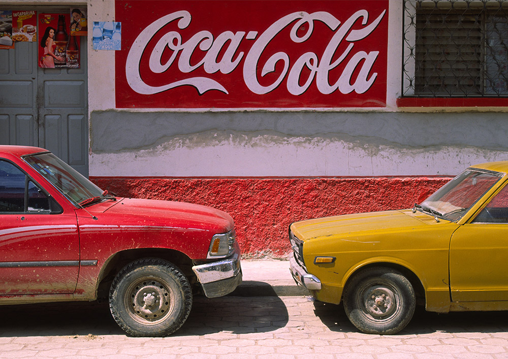
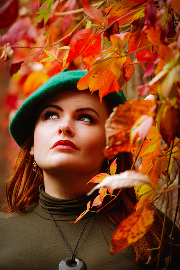
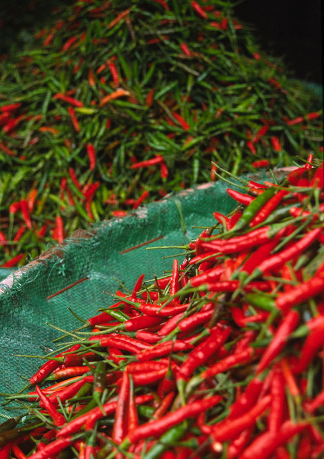
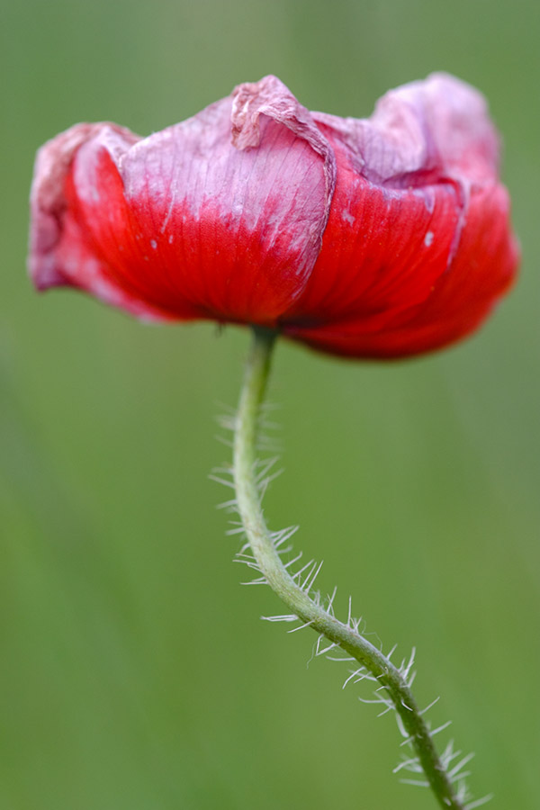
Red and green sit opposite each other on a traditional colour wheel and are considered complementary. Image: Tracy Calder
These cells send signals to the brain, which then translates this information into what we understand as colour. (There are plenty of more in-depth explanations online!) How the brain ‘reads’ this information varies slightly (or sometimes even significantly) between individuals – hence the confusion over the aforementioned dress.
As Josef Albers notes in his book Interaction of Color, ‘If one says “Red” (the name of a color) and there are 50 people listening, it can be expected that there will be 50 reds in their minds. And one can be sure that all these reds will be very different.’ Once the brain gets involved, it uses a mixture of experience and guesswork to process the information and label the colour as yellow, green, blue etc.
Embracing colour psychology
The idea that colour can have a profound effect on the mind and body is nothing new. In fact, the Egyptians believed that certain colours could be used to treat fatigue and skin disorders. But it wasn’t until 1810, when multi-skilled poet, artist and politician Johann Wolfgang von Goethe published Theory of Colours that colour psychology became a field worthy of exploration by prominent philosophers, physicists and artists.
Goethe believed that colours could impact (and influence) our moods and emotions, and it’s a theory that has been tested by artists, interior designers, fashion labels and healthcare providers ever since. Blue and green, for instance, are considered cool colours and are said to boost feelings of tranquillity and peace, whereas red and yellow are thought to be warm and are linked to danger, excitement and sometimes raised blood pressure!
(Of course, the psychological effect of colours can vary between cultures: black, for instance, is associated with death and mourning in some parts of the world, whereas white has similar connotations elsewhere – and, yes, I know white is not strictly a colour!)
Understanding colour theory
To understand colour theory, we need to return to the experiments of Newton. Having proven that colour is not a physical property of an object, Newton went on
to show that a ray of white light can be refracted via a glass prism to create a visible spectrum of colour – comprising red, orange, yellow, green, blue, indigo and violet. He was not the first to discover this rainbow, but he is thought to be the first to translate this information into what we now understand as an artist’s colour wheel.
At first, Newton arranged the colours in a grid format, noting the relationships between them, but he later positioned them onto a rotating disc (or wheel). How much of the wheel was apportioned to each colour depended on its wavelength and its width in the colour spectrum. (If you spin one of these discs, the colours will recombine to create white – another of Newton’s great discoveries.)
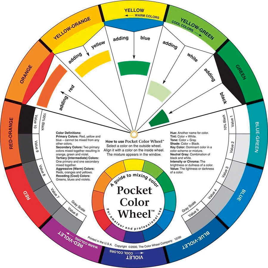
The colour wheel is a useful aid for painters, photographers, designers and scientists as it allows the relationship between primary, secondary and tertiary colours to be seen at a glance.
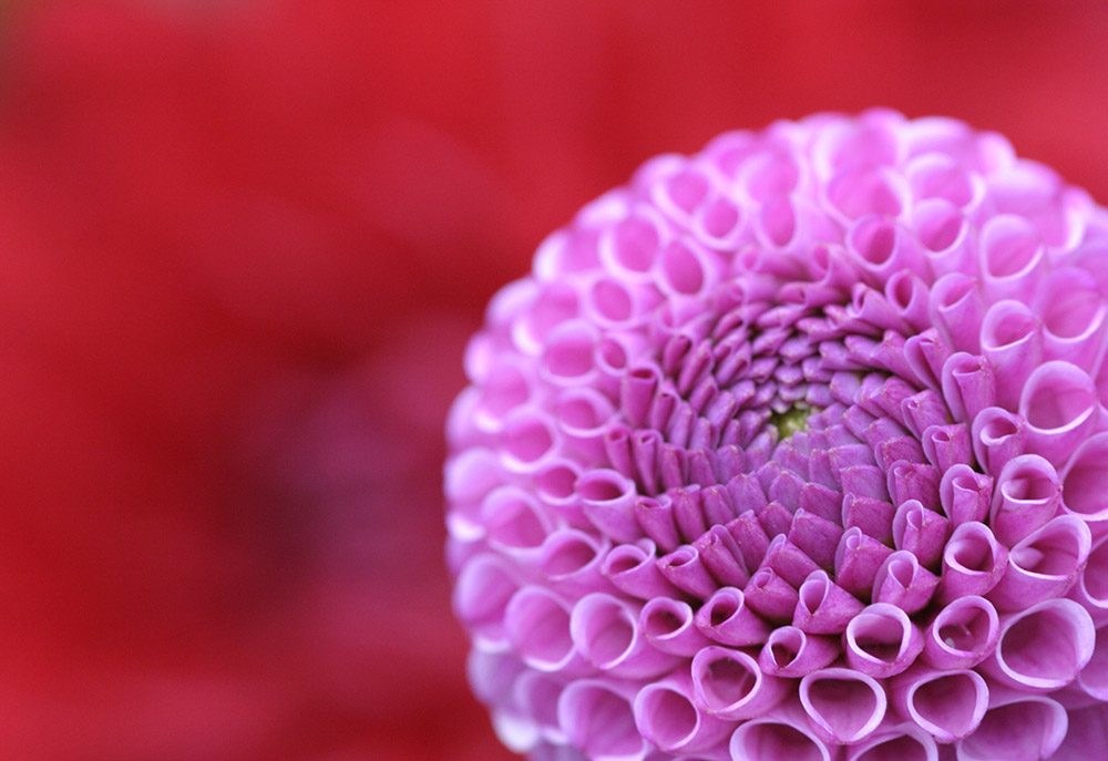
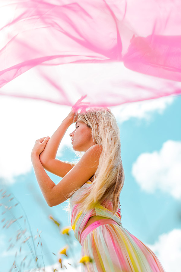
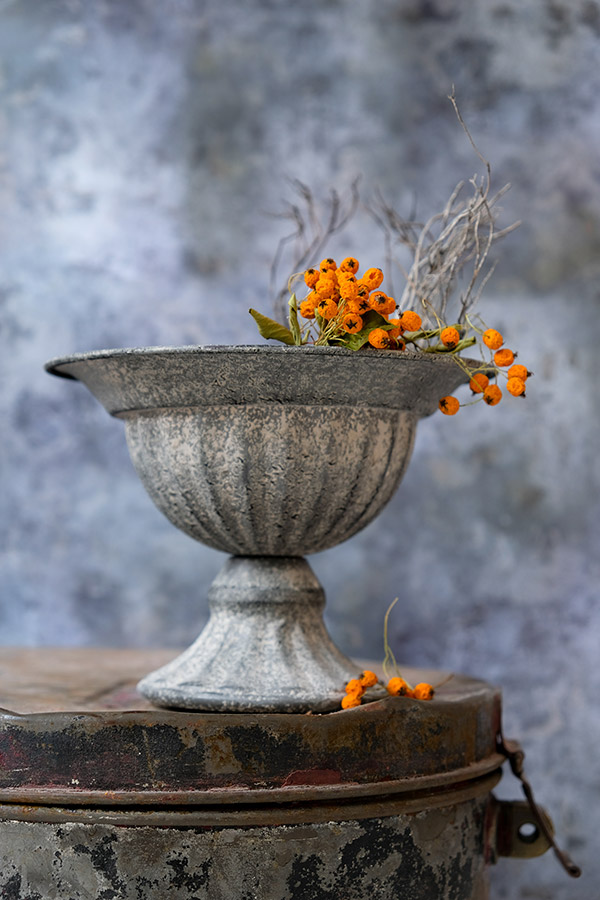
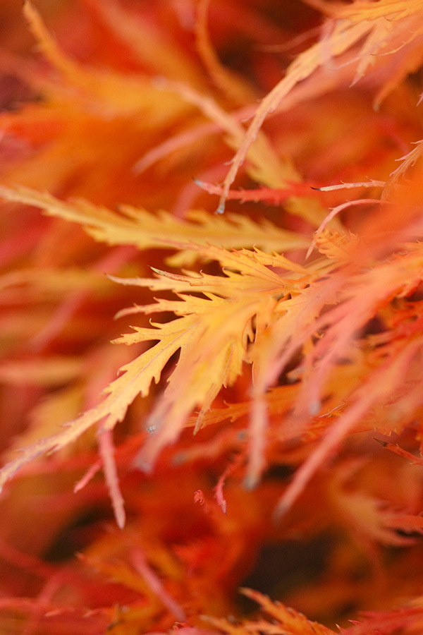
Red and red/violet sit next to each other on a traditional colour wheel and are considered analogous. Image: Tracy Calder
Using an artist’s colour wheel
A traditional artist’s colour wheel uses the additive colour system, which has three primary colours: red, yellow and blue, placed equidistant from each other. Colour wheels that feature red, green and blue as their primary colours use the subtractive colour system. (You can learn more about both colour systems online.) When you mix two or more primary colours together you get secondary colours, which are placed on the wheel between the primaries.
When you mix secondary colours (or a primary and a secondary colour) you get tertiary colours, which fill the gaps between the primary and secondary colours. When you look at an artist’s colour wheel you can see the effect one colour has on another – and that’s where the fun starts. Most of the time, we make decisions around colour intuitively: when we get dressed in the morning most of us don’t consult a colour wheel before pairing up a top and trousers, for instance.
But by fine-tuning this instinct we can remove some of the guesswork and make conscious decisions about how we use colour to convey personal style as well as influence the moods and emotions of those people around us. This knowledge can be applied to many areas of our life – from fashion choices and home décor to, of course, photography.
Making the most of colour harmonies
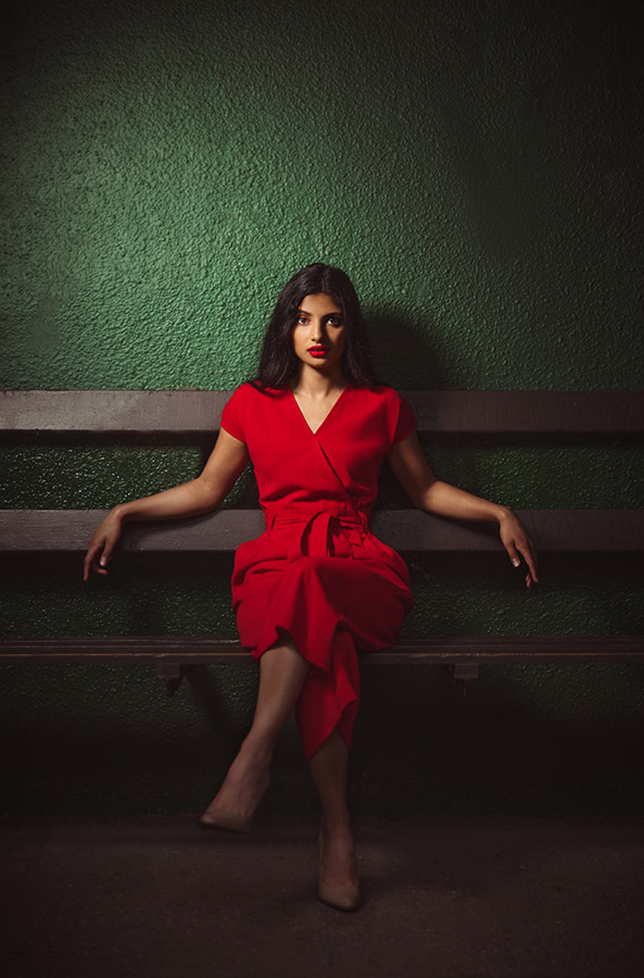
The first thing to note is that there are six easily identifiable colour harmonies on an artist’s colour wheel: complementary, analogous, triadic, split-complementary, tetradic and monochromatic. Complementary colours sit opposite each other on the colour wheel (red and green, for example) and when used together, they produce images with maximum contrast and impact.
Using just two complementary colours in a composition can result in pictures that pop. Analogous colours sit next to each other on the colour wheel (yellow and green, for example) and when used in a composition they tend to harmonise well. (There are plenty of examples of analogous colour schemes in nature – think agaves with their blue/green leaves.)
Triadic schemes comprise three colours that sit equidistant from each other on the colour wheel (yellow, red and blue, for example). These colours produce good contrast while retaining a sense of harmony. A split-complementary scheme uses one base colour (such as green) and the two colours on either side of its complementary colour.
In this example, the complementary colour would be red, so the two colours either side would be orange and violet. This scheme results in relatively strong contrast, but the visual tension is much lower than that seen in designs that use just two complementary colours.
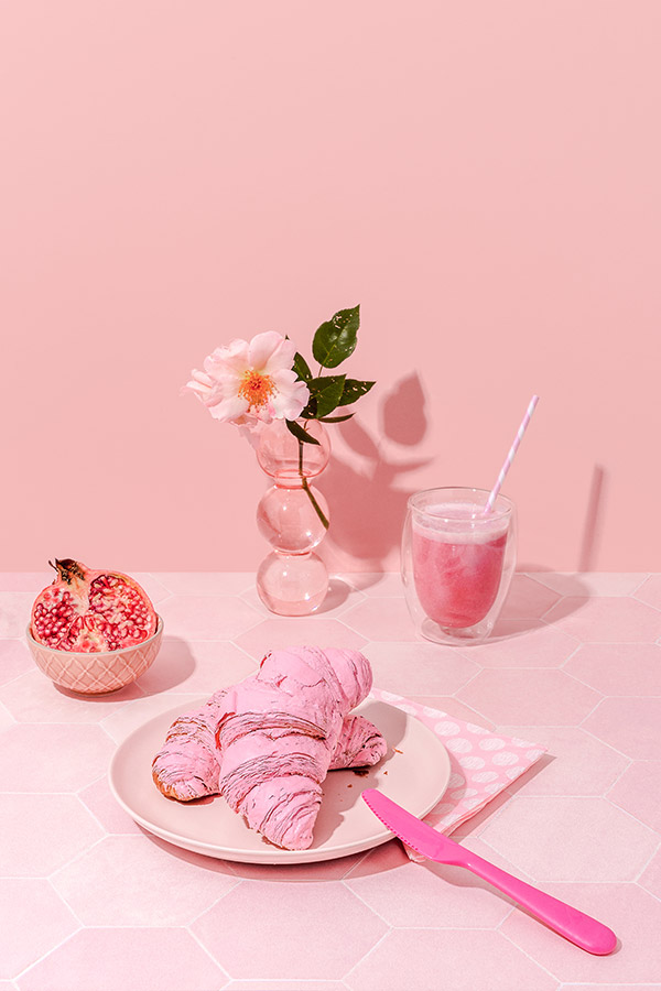
Tetradic is used to describe a scheme that features four colours arranged in complementary pairs on the wheel (blue-green, red-orange, violet and yellow, for example). Balancing such contrasting colours can be challenging, but if you allow one colour to dominate it can be an effective strategy. Finally, monochromatic schemes contain tints, shades and tones of the same hue (green in all its guises, for example).
These schemes can be very soothing to the eye due to the lack of contrast. So, whether you decide to trust your intuition, consult a colour wheel or take inspiration from the pioneers of colour photography, having a basic understanding of colour psychology and theory will greatly boost your creative toolkit.
Product and brand photographer: HiyaMarianne
www.hiyamarianne.com, Instagram @hiyamarianne
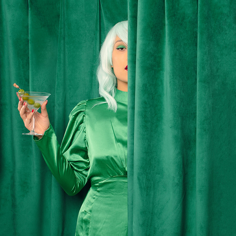
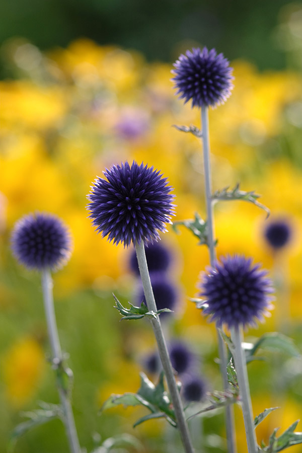
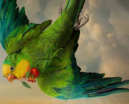
Wallflowers in the Wild (see the whole series at hiyamarianne.com). 1/100sec at f/4, ISO 100. Image: hiyamarianne
‘To me, colour is the most obvious component of putting together a photograph, and I tend to struggle when I get a brief that requires something more neutral. Colour can influence our moods and emotion, too. I think pairing up colours is definitely instinctual, but I’m always finding new combinations that inspire me. I collect colour palettes on the Pantone colour app – this allows me to point my phone’s camera at any scene and create a palette out of the colours.
On Pinterest, I have dedicated boards for some of my favourite colours and also for colour combinations. When I find a new combination, I start a new board to collect visual samples, and then start playing with the combination in the studio.
‘Colour is definitely something that you can train your eye on. Just let go of the notion that you need to be “brave” to love colours. Finding colours that resonate with you will help you to develop a distinctive style. Even though I love the hot side of the colour wheel with its reds and yellows, I tend to stay in the pastel end of the shade spectrum, which cools things down.
I also tend to stay away from primary colours. I don’t use a physical colour wheel, but I’m aware of where colour combinations sit on it. I decide whether to go for an analogous palette or monochromatic palette or a complementary palette etc, but it’s definitely become intuitive. If you’re just starting out, Adobe Colour has a tool to help you create different types of colour palette (color.adobe.com).’
Marianne’s top tips for using colour
- Plan your image and palette – I sketch my images in Procreate. It’s easier to experiment with different colour combinations at this stage rather than doing it in the studio. It also makes it easier to source backdrops and props.
- Use consistent lighting. Make sure your flashes have the same colour temperature and light quality, so you don’t end up with mixed light muddying your colours.
- Use a colour checker tool to help you calibrate your colours when editing.
Photographer and retoucher: Nigel R Glasgow
www.nigelrglasgow.com, Instagram @nigelrglasgow
‘As a tour manager and sound engineer travelling around with bands and musicians, I was hit hard when travel and mass gatherings were postponed due to Covid. I didn’t want to make banana bread, and I’d always had an interest in photography, so I decided to dive in and use my time to learn about cameras, lighting, Lightroom etc.
People say that I’ve learnt quickly, but I still put the hours in. I still watch videos on how to use my camera etc – sometimes for 12-16 hours a day! There are no excuses, you’ve just got to get on with it. ‘I’ve always been fascinated with light and I got very into Edward Hopper (his painting Nighthawks fascinates me) and Rembrandt, and I started to learn about colour theory.
I bought myself a colour wheel for £1, which I keep in my bag and still refer to now and again. I learnt how to use the Colour Grading panels in Lightroom and Photoshop and I tried to kind of grade pictures before I took them (as a tour manager I’m used to planning!). I also started using the 3D modelling software Elixxier, which allows you to create lighting set-ups on your computer ahead of a shoot.
‘I like to gamify things and make them fun – if it’s not fun, then what’s the point? I do a lot of 30-day challenges, for example, and sometimes I will limit myself to a 2MB memory card so I can shoot as though the camera is loaded with a roll of film. I’ve gone through phases (or fashions) when it comes to colour – I had a huge orange and green phase and an orange and teal phase too.
If we use the woman in the green beret as an example, for that shoot I started to look out of the window and observe nature, and I fell in love with the colours of autumn. I thought wouldn’t it be great if I put a lady with red hair among the foliage, wearing a green beret to create maximum contrast (see below). I am still learning/experimenting and always will be.’
Nigel’s top tips for using colour
- Look outside photography for inspiration. I’m drawn to the work of Edward Hopper and Rembrandt, but you might also find inspiration in music or other art forms.
- Be a lifelong learner. If you don’t know something, then look it up. I grew up in a time before the internet, now it’s easier.
- Look at stuff you hate. Whether it’s music, photography or painting, ask yourself why you hate something and think about how it makes you feel.
Five crucial colour tips
Use hot colours sparingly
Warm colours such as red and orange attract the eye, even in very small quantities. The artist Henri Matisse once declared, ‘a thimble of red is redder than a bucketful’. As a result, these ‘hot’ colours should be used sparingly in a composition.
Think about visual weight
Certain colours have more visual ‘weight’ than others. Pure yellow, for instance, is perceived as visually light, whereas blue and red are deemed visually heavier. The ‘weight’ of a colour will affect how dominant or recessive it appears in an image.
Experiment with pure hues
‘Hue’ describes a pure colour that has not been mixed with black, white or grey. By using two or three pure hues in a composition – think brightly-coloured spices at a food market – you can create images that have serious, and instant, visual impact.
Limit your palette
When you use shades and tones of the same hue, the effect can be soothing on the eye, because of the lack of contrast. Tint is a hue with white added, shade is a hue with black added and tone is a hue with grey added. Sometimes, less is more.
Aim for maximum impact
For maximum contrast and impact, include colours that sit opposite each other on an artist’s colour wheel (complementary colours). Just remember that the strength of this combination may well overpower subtler details in the composition.
Your Guide: Tracy Calder
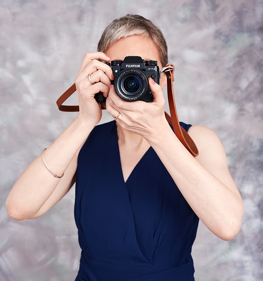
Tracy has more than 20 years of photo industry experience and co-founded Close-up Photographer of the Year. She has written many photography books and is a regular teacher at West Dean College of Arts & Conservation. Instagram @tracy_calder_photo
Further reading:
How to get perfect colours – white balance explained
Photo editing masterclass: how to enhance colours

