According to US superstar Taylor Swift, her fifth studio album, titled 1989, was inspired by ‘listening to a lot of late ’80s pop. I really loved the chances they were taking, how bold it was’. It was originally released on 27 October 2014, by Big Machine Records, and saw Swift switching her musical direction from country to mainstream pop music.
The album was titled after Swift’s birth year, mainly to signify her symbolic artistic rebirth, and was supported by seven singles, including three US Billboard Hot 100 number ones – Shake It Off, Blank Space and Bad Blood.
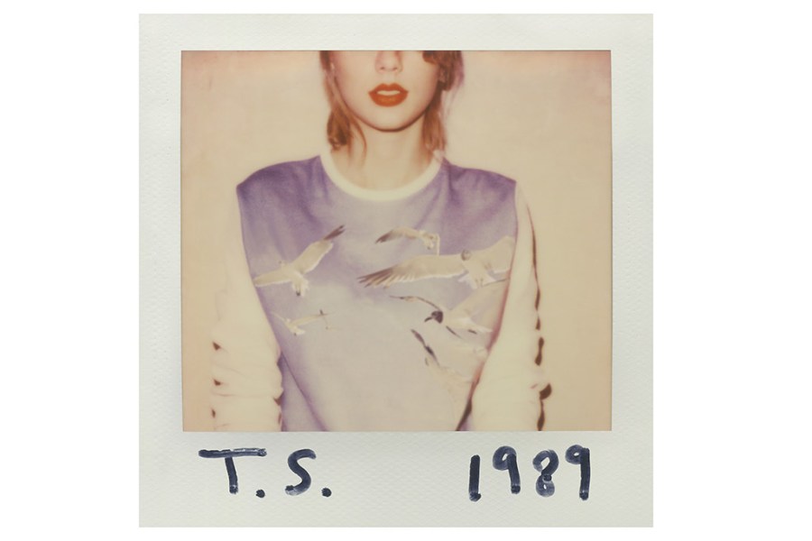
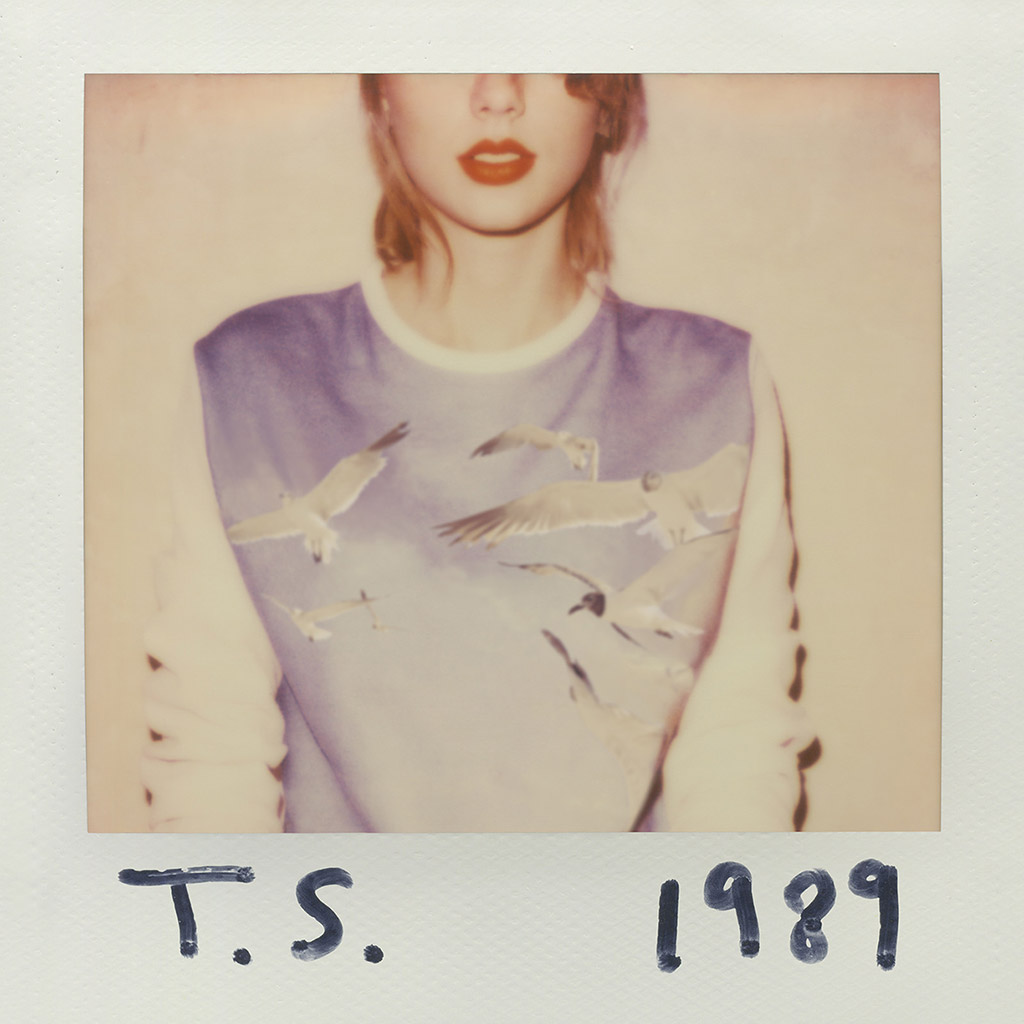
The fact that Swift named 1989 after her birth year also tends to corroborate the influence of 1980s synth-pop on the record. As creative director, Swift insisted the record’s packaging included pictures taken with a Polaroid instant camera – a photographic method that was significantly more popular in her birth year of 1989 than in the year of the album’s release, 2014, in the age of smartphone cameras and digital images on social media.
The alleged inspiration of the musical work of Peter Gabriel also seems fitting as, like Gabriel with his 1980 album Peter Gabriel III (aka ‘Melt’), Swift chose to depict herself on the cover by using a Polaroid image as the main visual. In addition, similarly to what Gabriel and his art creatives Hipgnosis did on the cover of the ‘Melt’ album, she made the artistic decision of not showing the whole of her face.
Cut-off head
Swift said the choice of image for the cover was intended to bring about a sense of mystery. She explained, ‘I didn’t want people to know the emotional DNA of this album. I didn’t want them to see a smiling picture on the cover and think this was a happy album, or see a sad-looking facial expression and think, “oh, this is another breakup record”.’
The Polaroid cover of the album is a colour portrait of Swift, but it deliberately cuts off her face just below the eyes with her T.S. initials at the bottom left and 1989 at the bottom right in black marker pen. Swift has red lipstick on and is wearing a sweatshirt featuring flying seagulls, which some people have speculated is a reference to the British band A Flock of Seagulls, who had huge success in the US in the 1980s. Swift revealed, ‘Having been born on 13 December 1989, this album is called 1989. That photo you are seeing is a Polaroid we took, we took the album photos on Polaroids. It was kind of an accident, so I figured why not make that photo the album cover?’
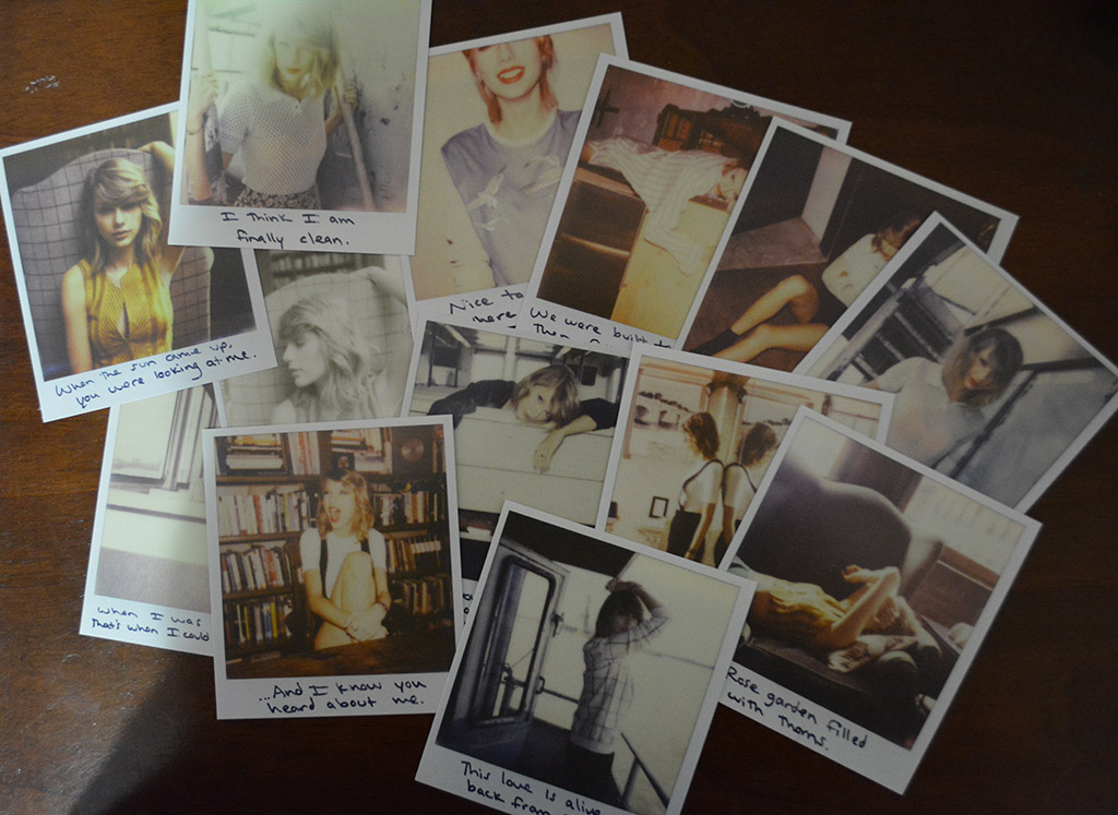
Each CD copy of the 1989 album included a packet of 13 random Polaroid pictures (one of five available sets), chosen from 65 different pictures. The shots portrayed Swift in various settings, such as backdrops of New York and recording sessions with the producers. The photos are out-of-focus, off-framed, with a sepia-tinged treatment, and feature the 1989 song lyrics written with black marker on the bottom.
Photographic duo
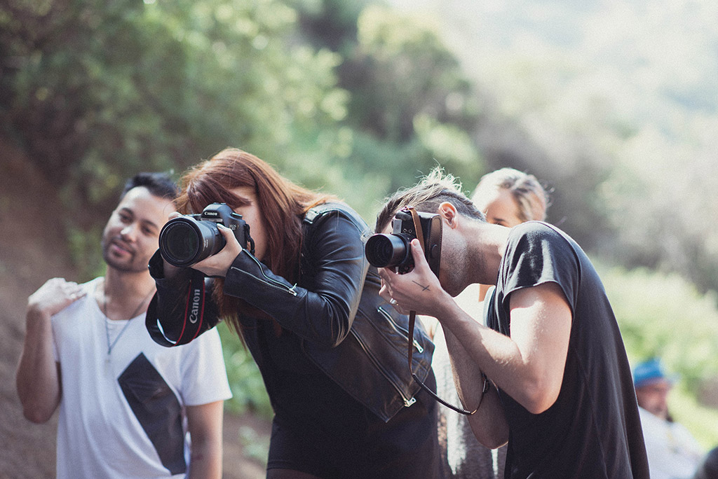
The US photographers behind the 1989 album cover shoot were Sarah Barlow and Stephen Schofield, who are based in LA and are known professionally as Lowfield. Barlow and Schofield had originally met in Nashville, with Schofield seeing potential beyond Barlow’s normal wedding photography work; this led to a collaboration that is ongoing. Both Barlow and Schofield had befriended Swift independently of each other and their first official paid job together was to shoot the cover of Swift’s 2012 studio album, Red.

In a similar way to the subsequent 1989 album cover, the front of the Red album also somewhat obscured Swift’s face, but it was simply a case of a shadow falling across the singer’s face because she was wearing a hat. In an interview, Barlow told Musicbed, ‘One of her background singers needed headshots. When Taylor saw them a few months later she came to me and was like, “Liz showed me the shots you took of her, and I need my album to look exactly like that.” Clearly this was a no-brainer. I said, “OK!”.’
In the Musicbed interview, Barlow revealed that the 1989 shoot ‘was like a Polaroid and digital mix. I think we end up shooting 460 Polaroids… [an] insane number of Polaroids.’ The idea behind the shoot was to purposefully mimic an image you might find in an old photo album or the type of candid shot you might take of a friend or put on social media.
Boost for Polaroid
The then-Polaroid Corporation CEO, Scott Hardy, reported that the Taylor Swift 1989 Polaroid album cover concept propelled a revival in instant film, especially among the hipster subculture who valued the ‘nostalgia and retro element of what [their] company stands for’. It also saw many Taylor Swift fans rushing out to buy Polaroid cameras to experience the fun and joy of creating instant images.
In a 2015 interview with website Digital Spy, Scott Hardy revealed how creating the cover of the 1989 album came about. ‘Taylor Swift’s camp approached us and told us about her upcoming album, 1989, which was the year she was born. They said they would love to do something with Polaroid, and so we did a nice collaboration effort with her, and she bundled 12 Polaroid photographs with that special edition album.
‘With a Polaroid picture you have that space to write underneath what it is, and so she personally hand- wrote what’s going on, chose the photographs and then we bundled them in. It was one of the most successful album launches in history. That was a proof point that showed that younger demographic know Polaroid, they want Polaroid products and they love what we stand for.’
A final twist
The 1989 LP was marketed as Swift’s first ‘official pop’ album, following her earlier, more country-style work. To bolster sales, Swift and Big Machine Records implemented an extensive marketing plan with Swift adopting a zany aspect for her 1989 persona. She had already used social media extensively to communicate with her fan base, showcasing her personal life to make young fans feel engaged with her.
A final twist to the 1989 cover story came in late October 2023 with the release of ‘Taylor’s Version’ of the 1989 album. After leaving Big Machine Label Group, in 2018 Taylor Swift had subsequently negotiated to own the master rights to all the new music she created. By re-recording the 1989 album she now owns its rights moving forward.
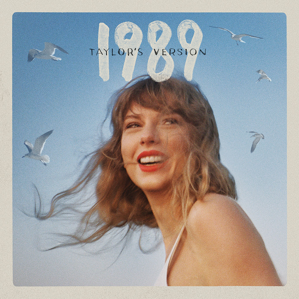
The re-recording of 1989 heralded a fresh album cover, with a more conventional portrait of Taylor Swift shot by Beth Garrabrant. In a nod to the original 1989 album cover the 1989: Taylor’s Version imagery features flying seagulls in the background, but shows a head and shoulders portrait of Swift. Garrabrant had previously shot the black & white cover of Swift’s 2020 lockdown album Folklore, which shows the musician sleepwalking
in woodland in a nightgown.
Such was the initial worldwide reaction to the original Taylor Swift album cover that, in March 2022, the US music industry bible Billboard ranked the 1989 cover artwork as number 50 in its countdown of the 50 greatest album covers of all time. Despite its comparative newness, 1989 has clearly already carved out its own unique niche in album cover history.
Taylor Swift, 1989 – Quick facts:
- Released: 27 October 2014 (Big Machine Records)
- Best chart performance: No. 1 in 13 countries, including the US and UK
- Sales: Over 10,000,000 certified sales worldwide
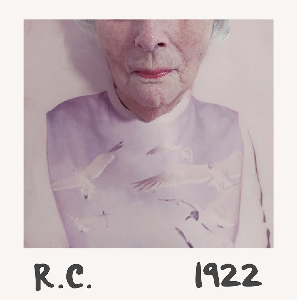
- Fascinating fact: The cover concept and execution for the album quickly gained plaudits and spawned a host of parodies and imitators. One of the most entertaining was by the residents of Sydmar Lodge Care Home in London who, during the first 2020 Covid lockdown, recreated several iconic album covers. The Taylor Swift cover was mimicked by resident ‘R.C.’ with 1922 replacing the 1989 birth year. The project was masterminded and creatively directed by Robert Speker (activities co-ordinator at Sydmar Lodge), with sales proceeds going to the Alzheimer’s Society and the residents. See carehomealbumcovers.com
Lowfield
Lowfield is the professional name for the photography and directing duo of Sarah Barlow and Stephen Schofield, who are based in Los Angeles. They originally met in Nashville with Schofield seeing potential beyond Barlow’s wedding photography work. Lowfield’s first official paid job was shooting the cover of Taylor Swift’s 2012 album Red. The duo has subsequently also shot record covers for Pharrell Williams, Wilder Woods, Grace Mitchell and Hailee Steinfeld. www.low-field.com
Panel feedback:
Andy Cowles: ‘Taylor Swift is famous for her sense of control. This cover might suggest a casual approach to stardom, but nothing could be further from the truth. The handwriting is cute, but the power comes from the crop. The only thing that matters here are her lips. These are what we are being invited to buy into.’
Kevin Cummins: ‘Though this cover is well-crafted and glamorous, it has a DIY feel. It’s as if it was shot on a cheap Polaroid as a reference print for continuity on a video, rather than an expensive album sleeve shoot. I love the framing of the subject and the scribbled Sharpie title. It intrigues. It’s the perfect package.’
Rachael Wright: ‘The Sharpie-written title makes it feel personal; in keeping with Swift’s “Dear Diary” song-writing style. The choices reflect her growing confidence as an artist – the use of initials, the loose sweater, the undone hair and the face crop, which draws viewers’ eyes straight to her signature red lipstick.’
Leading lights of photography, music and design chose their favourite album covers. The panel includes: Janette Beckmann, Jason Bell, Harry Borden, Ed Caraeff, Andy Cowles, Kevin Cummins, Dr Andy Earl, Jill Furmanovsky, Christie Goodwin, Peter Hook, Simon Larbalestier, Gered Mankowitz, Dennis Morris, Peter Neill, Aubrey ‘Po’ Powell, Rankin, Jamel Shabazz, Mat Snow, Howard Wakefield, Kirk Weddle, Rachael Wright.
Further reading:
- Nirvana’s Nevermind album cover voted ‘most iconic of all time’
- Greatest Album Photography: Sgt. Pepper’s Lonely Hearts Club Band by The Beatles
- Greatest album photography: Sticky Fingers by the Rolling Stones
- Greatest album photography: Quadrophenia The Who
Follow AP on Facebook, Twitter, Instagram, YouTube and TikTok.