Last year we decided to hold a competition asking readers to provide an image for the cover of the Christmas issue. After announcing it, we crossed our fingers and hoped that something usable would be forthcoming.
After all, to be suitable for the cover an image needs to be more than just a good photo. It also needs to be simple and uncluttered, so that cover lines can be easily read, and with enough room at the top for the AP masthead. Most people only look at a cover for a second or two on the newsstand, so the cover image needs to immediately convey what it’s representing. For our needs, the photograph would have to convey the theme of Christmas without being too cheesy or obvious.
Fortunately, we needn’t have worried – we were inundated with great images and in the end were spoilt for choice. So this year, emboldened by our previous experience, we did it again. We were still just a tiny bit nervous – what if last year was a fluke?
Well, I’m happy to report that it wasn’t. This year we invited readers to post either to our website gallery or into our new Flickr pool, launched earlier this year, and between them we had more than 650 entries.
Choosing the Cover
Having gone through all the images, we chose about 20 to mock up as covers. These were then whittled down to a final five, which were then tested for impact by placing them on our magazine rack in the office, among a selection of other covers.
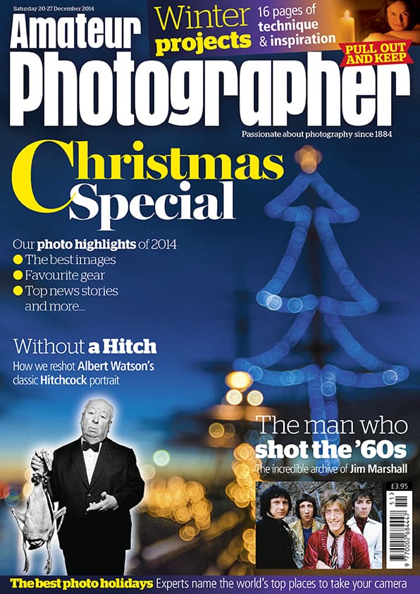
Finally, we settled on a great cover shot by Pauline Hatcher. It has everything we want from the cover image: colour, a Christmas theme and lots of space for cover lines.
It’s also a great example of the difference between a good image and a good cover image. Had this picture been submitted for a regular photo competition on the theme of Christmas, it may have been penalised for its unbalanced composition and areas of dead space, but for our needs these were positive attributes.
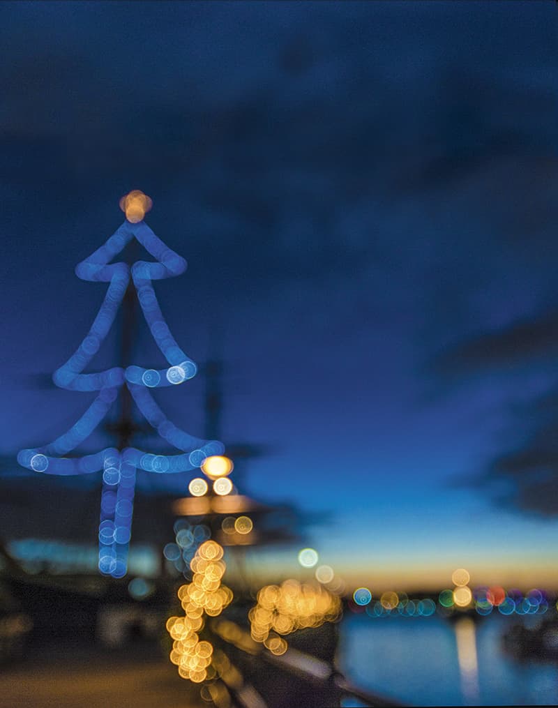
Here is Pauline’s winning shot, before we flipped it horizontally for use on the cover:
And here is the final cover (issue available now!)
Pauline Hatcher, from West Sussex, took the winning shot during a shopping trip to Portsmouth in Hampshire last Christmas.
‘The lights are on the mast of HMS Warrior, in the Historic Dockyard,’ she explains. ‘I took a sharp image of it too, but I preferred the bokeh and shapes in the out-of-focus one.’ She took the picture on her Nikon D5200 and 12-24mm lens.
So what will Pauline be spending her prize money on?
‘Well my husband just bought me a Panasonic Lumix DMC-GX7, so I’ll be putting the money towards a prime lens for that,’ she says.
Other entries
Though we loved Pauline’s shot, picking it as the winner wasn’t an easy task simply because there were so many great entries. Here are a few that missed out on the grand prize but we loved enough to share…
Tinker Tail
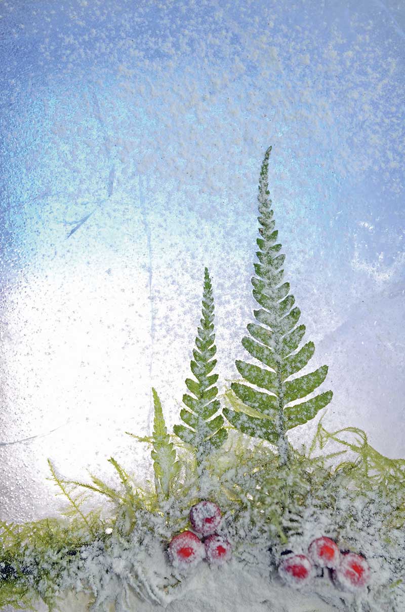 User “Tinker Tail” submitted this clever little graphic scene. Note the prominent negative space in the upper section, which is ideal for a magazine cover.
Ego Photography
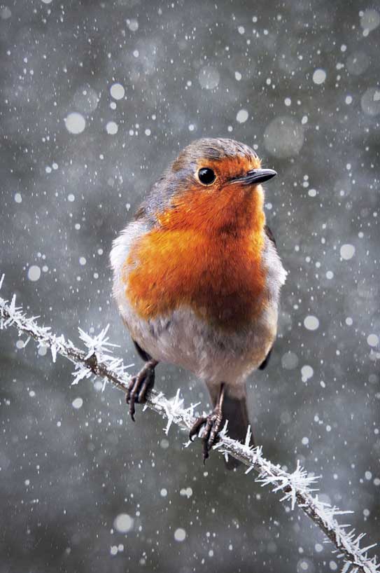 User “Ego Photography”gave us this wonderfully Christmassy scene, the robin’s red breast providing a vivid splash of colour against a grey and blurred background. Excellent work.
Raymond Tambunan
 Raymond’s shot caught our attention straight away, as you might well imagine! He’s taken what is arguably the visual symbol most readily associated with Christmas – the decorated Christmas tree – and photographed it in a way that completely avoids cliché. Nicely done!
Felicia Simon
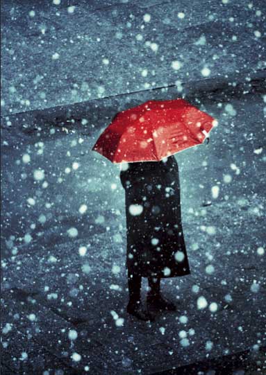 Felicia’s beautiful, painterly shot gives us a less idyllic view of Christmas than many of the other entries. The loneliness of the figure, placed just slightly-off centre, reminds us that not everyone has a loving family to spend the day with come December 25th. A sobering thought, but one that’s worth remembering.
Bravocharlie
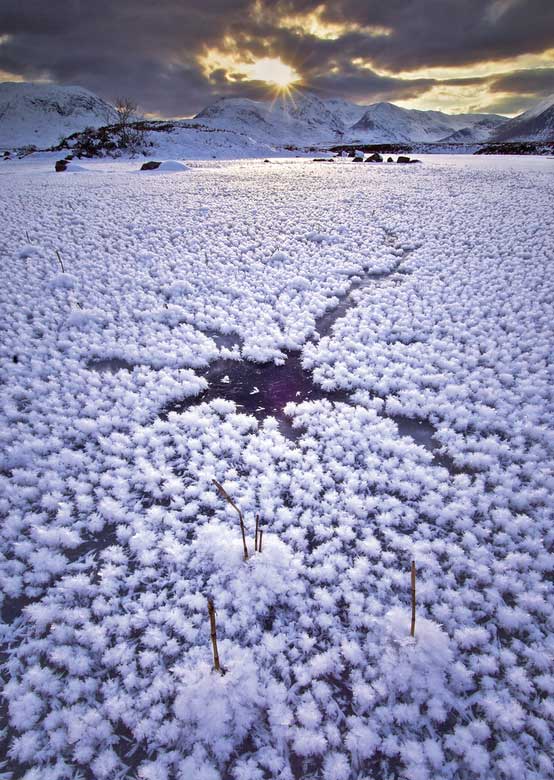 A wonderful shot submitted by user “Bravocharlie” – the wintry sun peeking through the cloud casts a lovely golden light over the scene.
Shane Butler
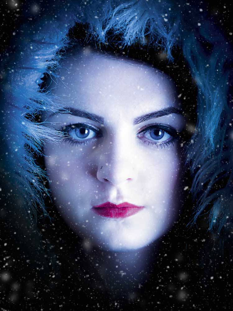 We made it clear in our brief that we weren’t just looking for Christmas clichés, and many of you rose to the challenge admirably. We particualrly enjoyed Shane’s crisp portrait – those expressive eyes are hard to tear yourself away from.
Robert F.
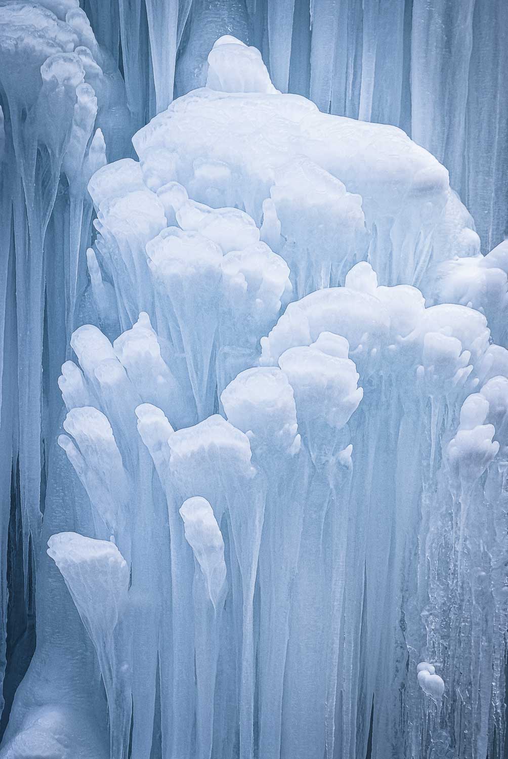 Robert’s simple but effective composition caught our eye during the selection process.
Matt P. Woodhouse
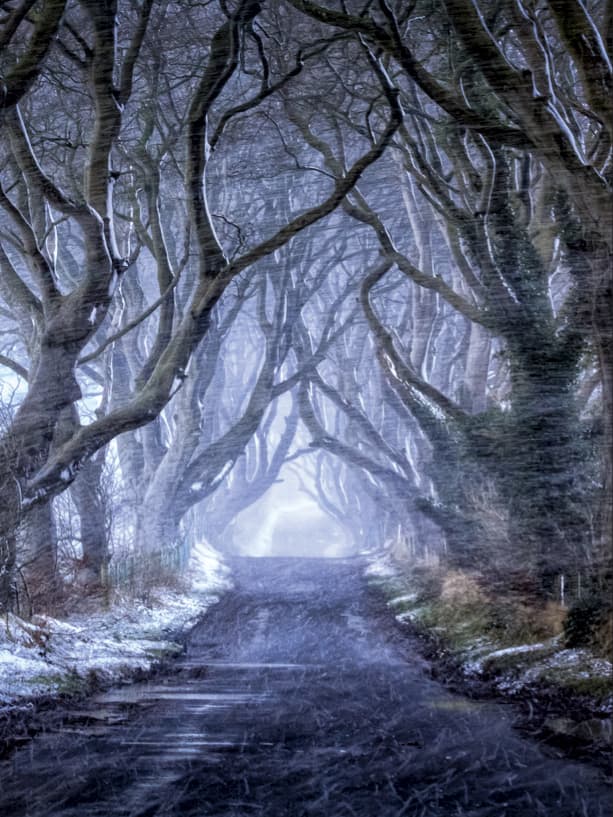 We loved the wildness of Matt’s shot of a wooded path, with the gnarled branches forming a skeletal canopy.
Mike Pinn
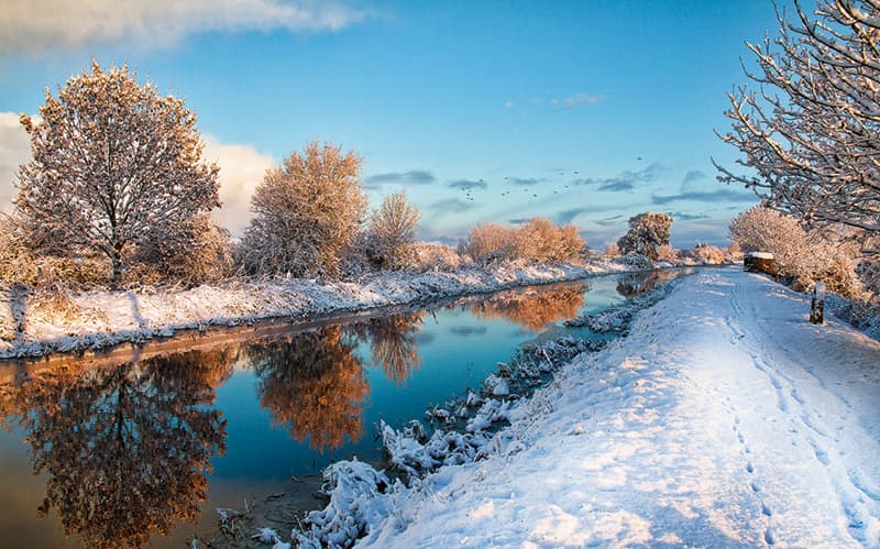 Though we asked for images in portrait format, we found that a crop into the right hand side of Mike’s shot worked rather well, with the footprints in the snow leading the viewer’s eye up through the image.
Ann O’Hagan
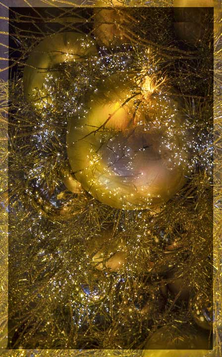 Ann’s stripped down detail shot of what appears to be a fibreoptic tree works brilliantly, with the unmistakeable bulk of the bauble dominating the frame.
Clyde242
 Clyde242 submitted a very sensible composition for a magazine cover, with lots of space where we could insert coverlines without obscuring the main subject.
Special commendation
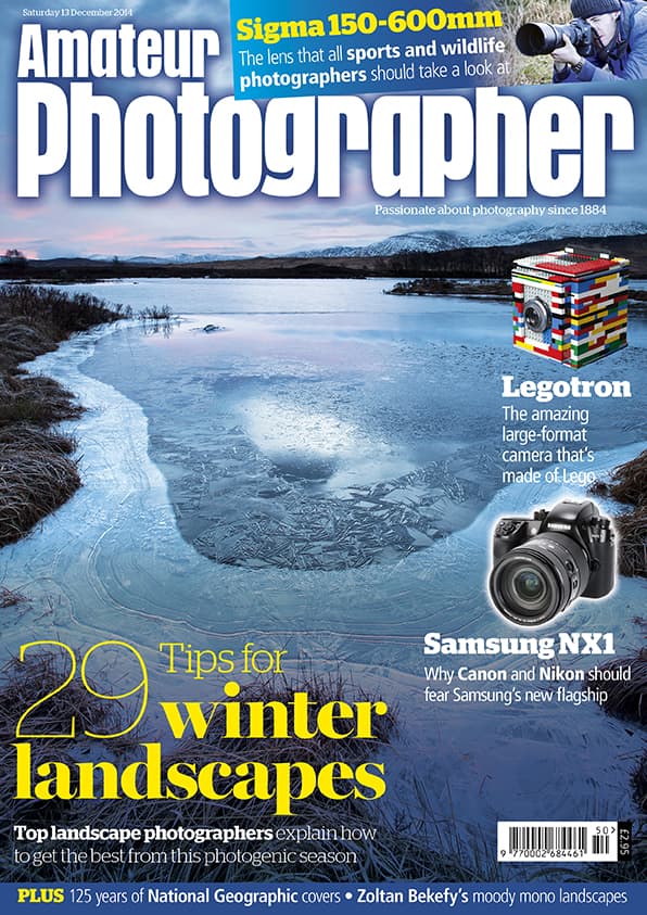
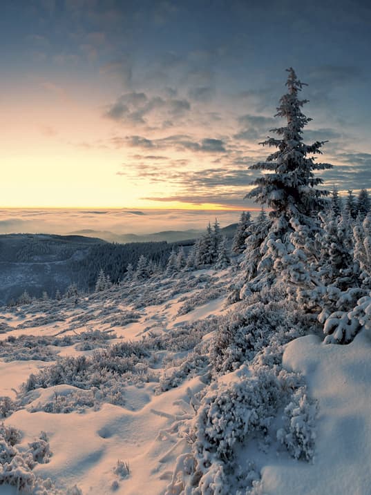
As you may have noticed, we received a fair few winter landscapers, and a lot of them were so good that we felt it a shame not to use any. Fortunately, the previous week’s issue led on that very theme, and a lovely image by Edward Rhodes fitted our needs perfectly…
Student entries
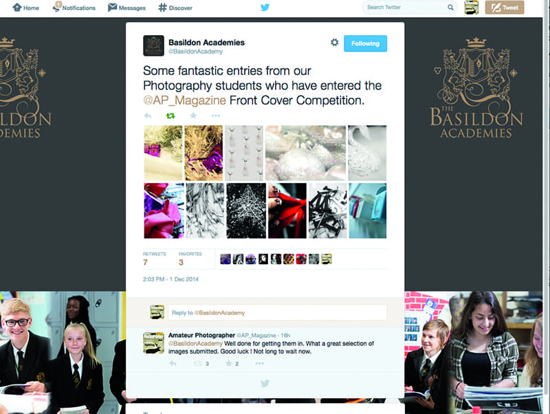
We couldn’t write about our cover competition without mentioning Basildon Academies, whose students entered en masse. They weren’t successful this time, but there were some really imaginative interpretations.
Cover tips
Like the sound of having one of your images adorn a magazine cover? Here are a few tips for making that happen:
- The job of a cover image is to stand out from the other covers on the shelf. Before submitting an image, look at your shortlist as thumbnails in an image browser, such as Adobe Bridge. Which images draw your attention and stand out from the rest? These are likely to be the ones that will make the best cover photos.
- It sounds obvious but magazines are mostly portrait format, so shoot in portrait orientation. Although it’s possible to crop from a landscape-format image if the resolution is high enough, it’s best to use all the available pixels where possible. Remember, we need around 3600 pixels on the vertical axis.
- Don’t crop in too tightly, leave lots of space for cover lines. Busy images with lots of detail are generally unsuitable as cover images, as they make superimposed text difficult to read. There should also be plenty of space at the top for the magazine masthead.
- If shooting especially for the cover, try various angles and subject placements, with the main focal point to the left, the right and centre, to give the art editor lots of options for where to put the cover lines.
- If you’re submitting a portrait, it’s generally best to have good eye contact, with the subject looking directly into the lens. Covers where the subject has a strong gaze tend to draw the viewer’s attention much more than covers where the subject is looking away. Also, the eyes should be pin-sharp.
- Remember, magazines work well ahead of the publication date – especially monthlies – so if you are submitting seasonally dependent images (such as spring flowers), you will need to send them four to six months before the issue comes out.
So that’s that! Congratulations to Pauline, Edward and everyone who entered. We’ll hope to see you again for next year’s competition…

