Deputy editor Geoff Harris has a good old rant about the often-bewildering design of camera menus, not to mention how easy it is to turn on features by accident. Is it time to think about voice controls for cameras, as we get with some smartphones. “Ok Nikon… make me McCullin!”
What do you dislike the most about digital cameras?
Two things get my goat: some of their batteries have a lower life expectancy than a 19th century Romantic poet on opium, and then there are the camera menus. The battery problem you can get around with cheaper third-party spares or a grip, but the menus you are often stuck with.
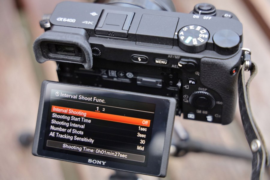
The worst offenders in my experience are the company formerly known as Olympus, and Sony, but having recently borrowed a Nikon Z6 II, I also found myself fumbling for key settings on an otherwise great camera. There are just too many choices when you are in a hurry, too many sub folders, too many esoteric symbols that make the hieroglyphics in the Great Pyramid of Cheops seem as easy to understand as a no-smoking sign.

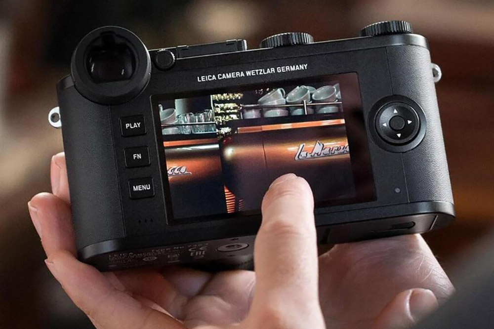
Leica’s elegant and intuitive menu and interface design is one of the better examples
And then there are the on-body buttons and settings you activate by accident. Pulling a full-frame DSLR out of my bag on a trip to Venice a few years back, I managed to switch to APS-C crop mode, only realising when I looked at an image of a picturesque glass blower and saw I’d lost the business end of the vase he was blowing. ‘Naval’ language ensued. I do sympathise with interface designers on higher-end cameras as they can’t please everyone and they’d be lambasted for dumbing down their menus, but I think more thought needs to go into the process.

The Sony Alpha A6400 – features Sony’s older menu system. However good the cameras from several big makers, the menus can sometimes be arcane and bewildering
And yes, you can customise buttons with your most commonly used functions but I reckon a lot of photographers are like me and well, just a bit lazy. Also in defence of the camera companies, some have built-in help, and all good cameras now let you customise a “My Menu” section, where you can add quick access to your favourite menu items, but even with this, it isn’t always as intuitive as it should be. Of all the big companies, Leica is the company that seems to have the clearest, most elegant menu design, as you’d expect from such premium-priced cameras.
All of this got me thinking. Many of us now have voice-activation features on our phone, or regularly use Alexa or the Google Assistant to check the time or enjoy our Bonnie Tyler playlist. It’s an attractive idea in principle – ‘Canon, set my ISO to 1600.’ But there are potential drawbacks. It wouldn’t work so well if you were trying to avoid drawing attention to yourself during street photography or avoid disturbing fellow bird photographers in a hide. Maybe a function best left for solo landscape photography, but it wouldn’t surprise me if we see this more and more in the future.
Even a simple built-in search feature could help make it easier to find menu options. Meanwhile, I have go to back to figuring out what that ‘pencil’ icon means…
The views expressed in this column are not necessarily those of Amateur Photographer magazine or Kelsey Media Limited. If you have an opinion you’d like to share on this topic, or any other photography related subject, email: ap.ed@kelsey.co.uk
Further reading:


