When framing landscape pictures, rules will get you only so far. Niall Benvie describes how thoughtful composition can improve the power of your landscape photography.
Landscape photography: Think about the foreground
‘The big foreground’ is a favourite compositional device among landscape photographers. With a wideangle lens fitted, the photographer moves in close to a foreground element, giving it prominence and exaggerating perspective.
If the lens is (35 mm-equivalent) 20mm or wider, the effect is almost always impressive. Nevertheless, the technique is much over-used on subjects that don’t merit it. If you are drawing the viewer’s attention in the first place to the foreground, make sure that it is at least as interesting as what is in the background.
Many of these landscape shots fail because all the foreground has to offer is an insignificant pebble or dead stick while a fascinating mountain range or sky in the distance is diminished. If that is where the real interest lies, focus on it.

Here, I got in really close to the life belt, being careful to make a secondary framing of the rugged island of Tindholmur through it. The belt’s colour qualified it for star treatment. Since it was almost dark, I added further drama by underexposing the rest of the view by one stop then lighting the ring with flash.
Nikon D2x, 1/6 second, f/11, ISO 100, 12mm. TTL flash at -1 ev.
Landscape photography: Follow the line
In a two-dimensional medium we have to be clever if we want to give the viewer the sense of three dimensions.
The secret is to tap into our perception of perspective and let the viewer’s mind construct the depth from the clues we provide.
One way is to ‘lead’ the viewer’s eye into the picture with a strong line, but only if it is leading somewhere or is interesting enough in its own right.
Again, consider the implication of light and dark: a line that leads upwards towards the light gives the picture a more positive feel than one that leads downwards towards somewhere dark.
Pictures shot with telephotos are even more in need of depth creation, and a line to follow can help relieve the effects of compression.
Those of us who use the Roman alphabet may be more comfortable following a line that goes from left to right.
Landscape photography: Harmonious thirds
For photographers the notion of harmonious balance is expressed in the rule of thirds. If a frame is divided by equidistant pairs of lines, two horizontal and two vertical, the points at which the lines intersect represent the most ‘powerful’ locations in the frame.
The rule dictates that these are the places to put the subject for the most appealing composition.
If the theme of your landscape photography is harmony and beauty and other positive things, a rule of thirds composition makes sense. But if the picture is about struggle, disturbance, displacement or marginalisation, why use the same compositional structure as for a positive image?
Composition is about more than simply ‘orchestrating space’; it can be a tool to tell the viewer something more about the subject or your feelings about it. Empty or ‘negative’ space also has a role in letting the subject breathe – tight framing doesn’t always flatter a subject.
Landscape photography: Frame your Image
While the edges of the viewfinder naturally define the limits of a composition, using frames as part of the composition itself conveys a different feeling.
Frames are ambiguous: depending on the other clues you supply the viewer with, you can suggest a sense of claustrophobia or comforting embrace, of protection or threat.
Lighting is a significant contributor to mood too. shoot out from a cave – from dark to light – and you’ll impart a more positive feeling than a composition that frames a dark, mysterious space within a bright frame.
Landscape photography: A tale of two halves
There is no doubt that a lot of landscape photography pictures just look better when the main subject is off-centre and conforms to the rule of thirds.
Whether this is cultural conditioning or a deeper response is hard to determine, but what is apparent is that a symmetrical subject placed off centre doesn’t look quite right.
What’s more, a round symmetrical subject is very hard to place satisfactorily in a rectangle, hence the traditional popularity of a square format for portrait photography.
For most of us today, the alternative is simply to crop. If you do place a symmetrical subject to the side you set up tension which, depending on the subject, may or may not be desirable.
Equal divisions in the composition suggest harmony and tranquillity, encouraging the viewer to explore the whole frame rather than head straight to the points of power. While it is not too hard to make symmetrical pictures of reflections, ‘vertical’ symmetry in the natural world is more elusive.
Landscape photography: Use Tele-Zoom Lenses
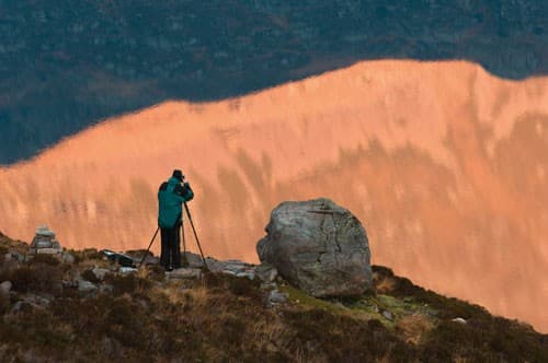
Use a telephoto lens for your landscape photography and the viewer has the sense of being at your shoulder, of being involved in the scene. In the absence of a close foreground, he or she feels more like an observer rather than a participant. But that is not necessarily a bad thing: these long-range landscape pictures often have a less literal feel to them – this is not, after all, how we see landscape – and therefore offer more scope for personal interpretation.
These are landscape photographs in summary: the photographer selects elements that represent the whole, and in doing so, paring away uninteresting or irrelevant parts of the scene.
A telephoto also brings the advantage of compressing perspective, reducing the apparent distance between near and distant. This is a boon if you want to abstract certain parts of the landscape and represent them as a pattern. If, however, you want to maintain some sense of depth you will need to rely on light and shade or topographic features – such as overlapping hill slopes – to suggest three dimensions.

We circled the saltmarshes near Cadiz in southern Spain for about half an hour making many different compositions of the complex, convoluted drainage channels. Most of that work was done at quite a low altitude but when the pilot pulled us up an extra couple of hundred feet, the river started to reflect the brilliant blue sky. For this sort of work, a fast shutter speed – at least 1/1000 second – and zoom are essential.
Nikon D3, 1/1250 second, f/5.6, ISO 800, 200mm
Landscape photography: Looking high and low
Rarely is the best viewpoint for landscape photography from eye level. Flat landscapes can be a real challenge and you’ll probably start hunting around for an interesting foreground around which to build a wideangle shot.
Or a high viewpoint to shoot from, such as a hill, wall or a climbable tree.
A more exciting, albeit costly, option is to get above it in a balloon or small plane. This approach is especially productive in richly patterned environments such as river deltas where the reflection of the sky comes into play too.
If ground-bound, consider shooting the scene from very low down to give prominence to whatever relief exists.
Another alternative is focus on a small area and shoot it from above with a wide angle, which will exaggerate its extent. This approach often works well in woodland but be careful to exclude any windows of sky or you’ll spoil the illusion of a closed, endless forest.

Understorey of mixed Norwegian forest. Here I took a high viewpoint over a small part of a colourful autumn forest scene and exaggerated its extent with a wideangle treatment.
1.6 seconds @ f/16, ISO 100
AUTHOR: Niall Benvie


