We’re used to seeing regular improvements and tweaks to Photoshop throughout the year – after all, as subscribers that’s what we pay for. Each autumn, however, we’re treated to a major new version of the application with significant updates, new tools and helpful workflow fixes. Over the next few pages we’ll take an in- depth look at the key new features in Photoshop CC 2019. There’s the excellent new Content-Aware Fill command, which takes what was already a magical command and further refines it. Then there’s the all-new Frame tool for making helpful image boxes in your designs. And yet another feature that’s sure to raise a few smiles is Symmetry Painting, which lets you paint in several places at once.

The Content-Aware Fill command has seen big improvements. Credit: James Paterson
Alongside these new features are a whole raft of minor tweaks and improvements, from new Layer Blend Mode previews to better text controls and a couple of shortcut switcheroos that may prove to be as irksome to some as they are useful to others.
The Content-Aware Fill command
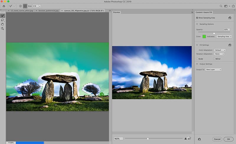
Credit: James Paterson
This has long been a powerful tool for removing objects or messy areas from photos. It works by analysing the image and generating new pixels based on details and colours found elsewhere in the frame. But like all automated tools it can sometimes fail, or only get half the job done.
Now there’s a new dedicated command that refines the process and gives you greater control. The key feature of the command is the ability to exclude areas from analysis. Often this means excluding your subject, or forcing the tool to sample from the background instead. In effect it means we can tell the command ‘which part of a photo to look at’, which can sometimes yield better fill results.
Further control

Credit: James Paterson
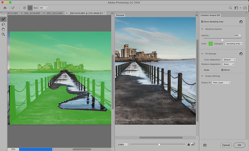
Credit: James Paterson

Credit: James Paterson
The new Content-Aware command features several useful settings that let you further refine how the tool behaves. Three features stand out. First there’s a ‘Color Adaptation’ option. This lets you choose a strength setting from None to Very High, thereby allowing you to control how much the colours are altered in the filled area. For example, a high setting will make the command attempt to match the surrounding colours. The second useful control is Mirror. This is a good option for symmetrical images like our sea scene here, as it mirrors content from one side of the scene or object in order to fill in the problem area (in this case, we want to remove the puddle in the foreground, so the command targets detail from the opposite side of the path). Third, the Rotation Adaptation option is helpful for images with circular content like a flower, as it uses detail from other parts of the circle to fill in the problem area.
Begin filling
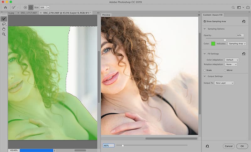
Credit: James Paterson
Before we begin using the new Content-Aware Fill command, we must first make a selection using any selection tool. If you need to loosely define part of your image, then the Lasso or Polygon Lasso tool is ideal, but if greater precision is needed then the Quick Selection tool may be a better choice. Once the selection is made, we go to Edit > Content-Aware Fill. A dialog box displays the original image on the left and a preview of the finished fill effect on the right. The dividing line can be dragged either way to resize the windows. Here you can see Photoshop’s initial effort at filling in the problem area is no good. It mistakenly includes areas of the subject in the fill.
Add or subtract
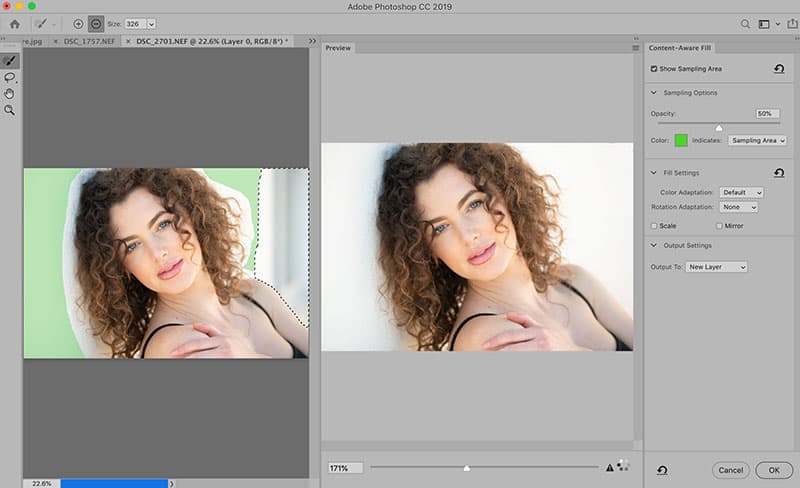
Use the Sampling Brush tool to subtract or add areas. Credit: James Paterson
The green area in the left-side window is the key feature of the Content-Aware Fill command. It indicates the areas that are being sourced to create the fill. If the initial fill has gone wrong by replicating messy details from the subject, then we simply paint with the Sampling Brush tool to subtract those areas from analysis. If we need to add any parts back in, we can hold Alt and paint, or switch between add and subtract at the top of the screen. As we paint, the preview on the right updates to display the resulting fill. Once we’re happy, we can choose to Output to: New Layer, which keeps things non- destructive by creating the fill pixels on a new layer above the original image.
Symmetrical painting
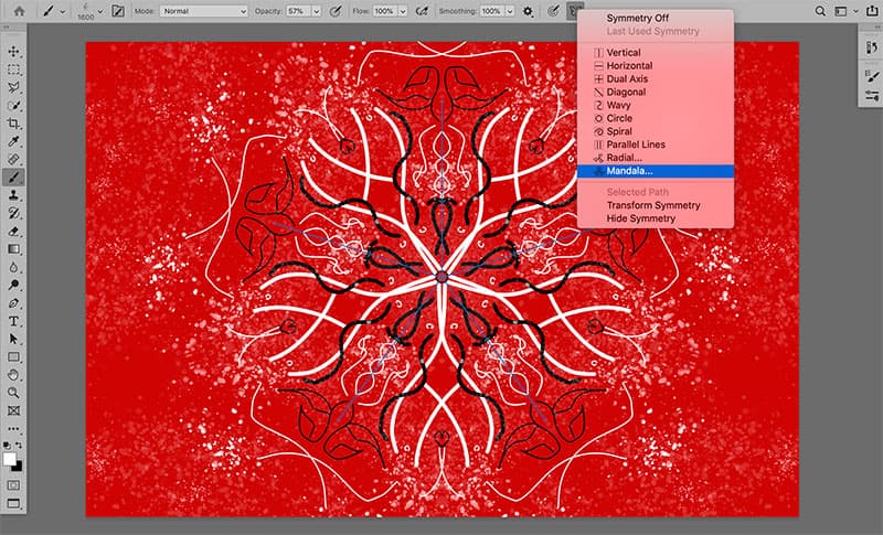
Select the Mandala setting to create wonderful symmetrical spiral shapes; a pen and tablet will be handy. Credit: James Paterson
This is a fun new painting feature found within the Brush tool options. It lets you paint in several places at once, as if holding a mirror up to your canvas – or several mirrors. Select the Brush tool (B) then go to the butterfly icon in the tool options along the top of the interface. Here we’ll find an array of axis options to play with. The Mandala setting used here (see above) lets us create wonderful spiral shapes.
It’s also worth experimenting with the myriad brush options found in the Brush Panel (Window>Brush). Here we can increase scattering or set opacity and colour jitters for a random brush effect, as well as choose from Photoshop’s immense arsenal of different brush tips. Used in combination with the symmetry Painting setting, we can create all manner of beautiful paintings and designs. It helps if you have a pen and tablet, but if you must paint with a mouse then try increasing the smoothing setting in the Brush tool options, as this makes the mouse movements more graceful and produces better curves.
The new frame tool explained
Credit: James Paterson
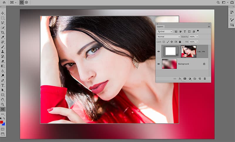
1. Drag a frame
The Frame tool can be found in the Photoshop toolbar (grab the rectangle icon with a cross or hit K). First highlight the layer you’d like to add a frame to, then choose from a circle or rectangle in the tool options at the top and drag out the frame over your canvas.
Credit: James Paterson
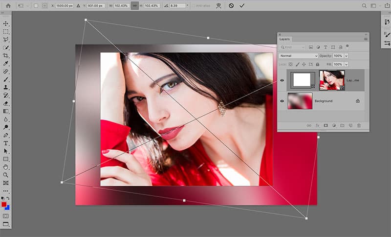
2. Adjust the position
The layer will be con ned to the shape of the new frame. You can drag inside the frame to change its position, or hit Cmd/Ctrl+T to transform and resize it. By contrast, clicking on the edge of the frame enables you to edit the size of the frame rather than the image within.
Credit: James Paterson
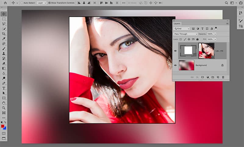
3. Edit the frame
A new frame thumbnail will appear on the layer in the Layers Panel. You can highlight either thumbnail to edit them independently. Or double-clicking within the frame will toggle between the option to either drag the image inside, or move both the image and its frame.
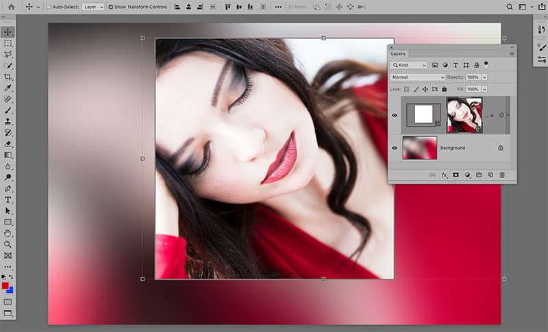
Credit: James Paterson
4. Place images
By default the frame tool applies a frame to the currently selected layer. But if you like you can drag and drop images from other applications, such as Lightroom or Bridge, into a frame. Alternatively, you can use File > Place Embedded to choose any on-file image.
Credit: James Paterson
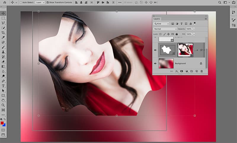
5. Make custom frames
You can create your own frames using any shape layer, path or type layer. First define the shape, then go to Layer > New > Convert to frame. Once done you can drop in an image of your choice (see tip 4); however, you won’t be able to edit the shape of the frame.
Credit: James Paterson
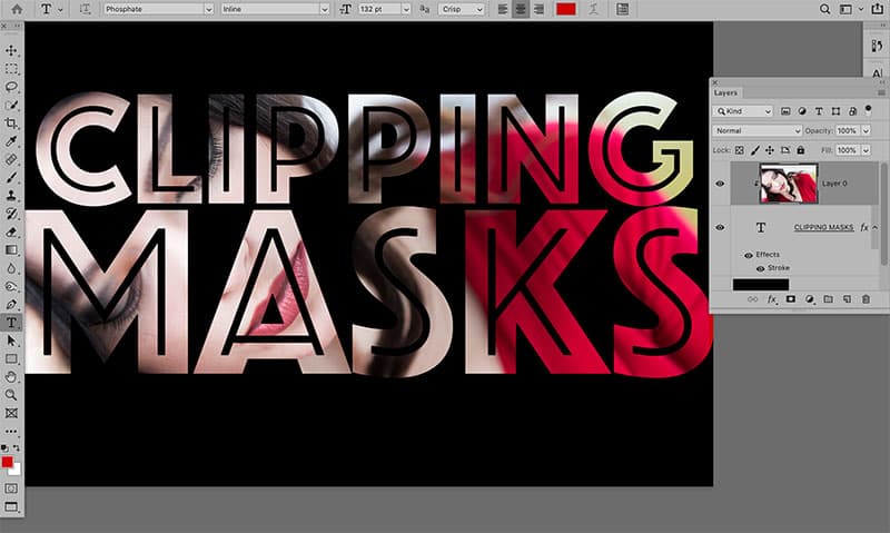
6. A better option?
An alternative to the Frame tool is Clipping Masks, which are arguably superior as the shape – in this case, the text – remains editable. To add a clipping mask, Alt-click the line between two layers. The upper layer will be con ned to the shape of the layer below.
Tweaks and improvements
Credit: James Paterson
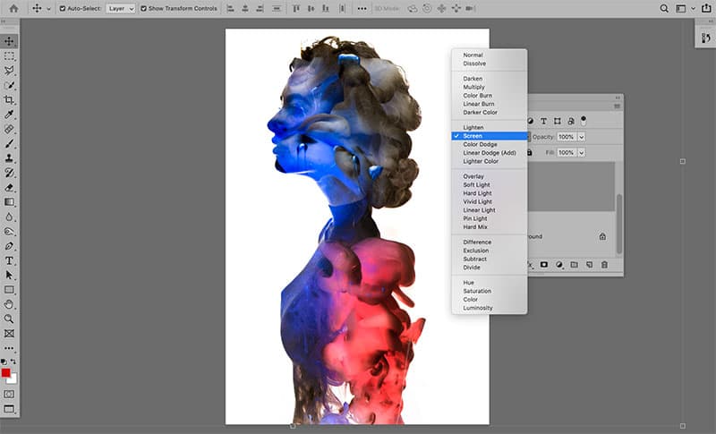
Blend Mode previews
There’s a welcome tweak to the Blend Mode options in the Layers Panel. Now, when you hover over any of the blend modes in the list you’ll see a preview of the effect over your image, making it much easier to choose the mode that suits your needs. Here, right, the Screen Blend mode gives us a double- exposure effect.
Changed Undo shortcuts
The shortcut Cmd/Ctrl+Z now lets us undo continuously (bringing it in line with Illustrator and InDesign). If you’re used to the old shortcut – Cmd/Ctrl+Shift+Z – to undo several steps then it can be annoying. But if you like you can revert back under Edit > Keyboard Shortcuts > Use Legacy Undo Shortcuts.
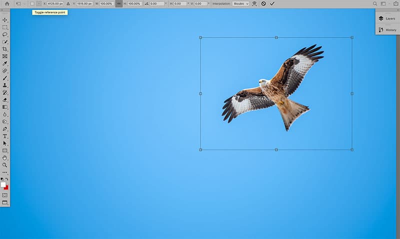
Centre point
There’s another tweak to the Transform controls too. By default there’s no centre point to the bounding box (this is the point used to set the centre for rotating or scaling). Instead the point can be toggled on or off with a checkbox in the top-left corner when transforming.
Credit: James Paterson
Transform tweaks
Previously, when scaling a layer up or down we had to hold Shift to constrain the proportions, so the layer wouldn’t be squashed or stretched. Now, the proportions are locked by default when scaling, and holding Shift does the opposite by unlocking them. It makes sense, but takes a little getting used to.
Maths calculations
Text fields now support maths, so for example if you need to quickly work out half of 29.7cm for a crop then you can just type 29.7cm/2in the crop tool options rather than having to do the maths in your head. It works across different units too, so you can type things like 60cm/5in (4.724cm, if you’re asking).
Type changes
It’s now easier to commit changes to things like type simply by clicking off the area. Type can also be edited by double-clicking it with the Move tool, and by default you’ll see placeholder text ‘Lorem Ipsum text’ appear when you initiate new type.


