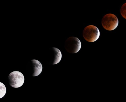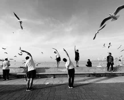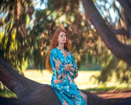
Credit: James Paterson
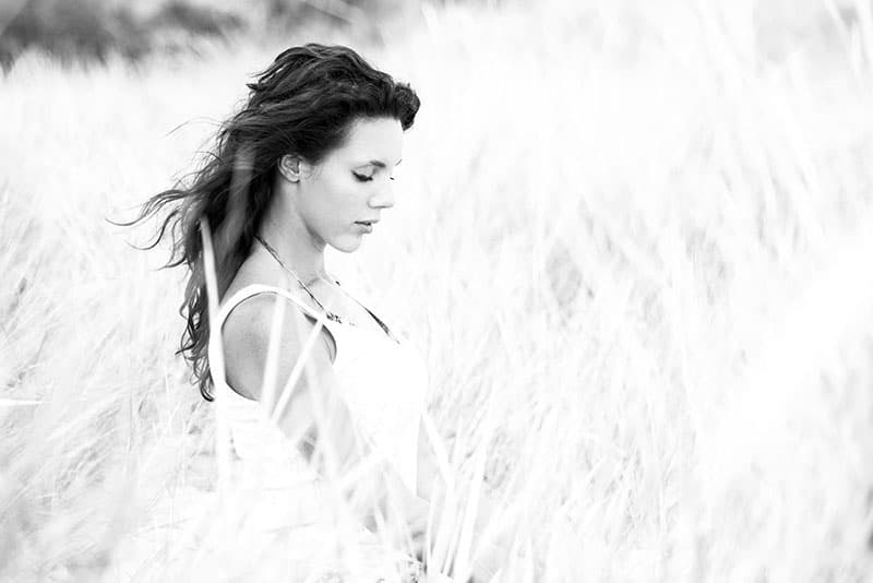
1. Don’t worry about clipping
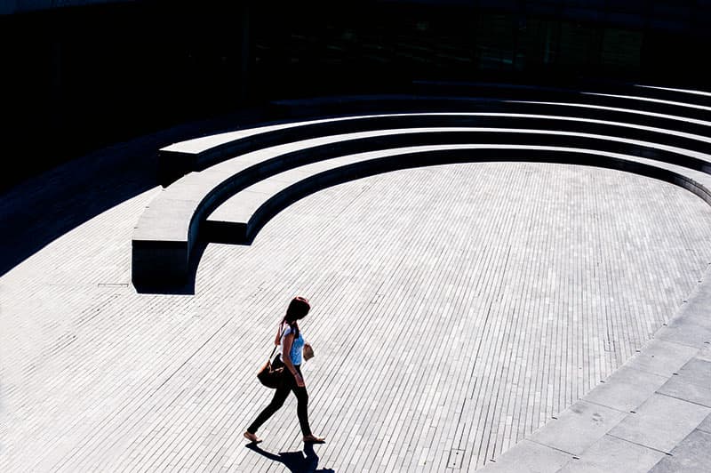
Clipped shadows or highlights mean that parts of an image will be totally white or black, and therefore completely lacking in detail. This is usually a bad thing, especially if the bright part of a sky is blown out. But photographers can be a little obsessive about detail. Differences in contrast play a very important part in composition. So if it suits the composition to have part of the frame totally white or black in order to complement the detail elsewhere, then this shouldn’t be a problem.
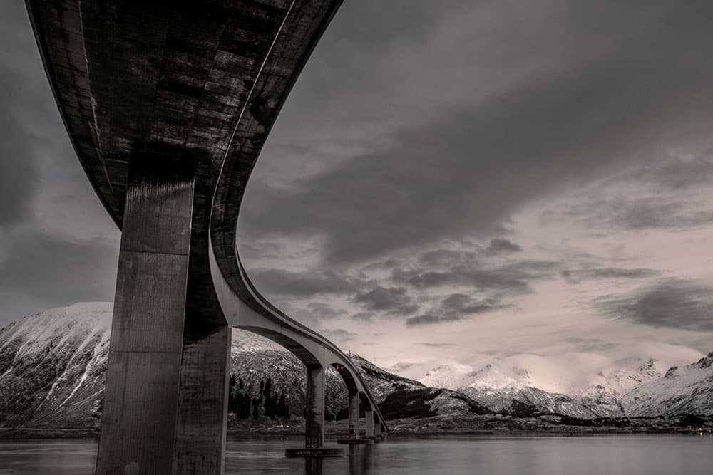
Before. Credit: James Paterson
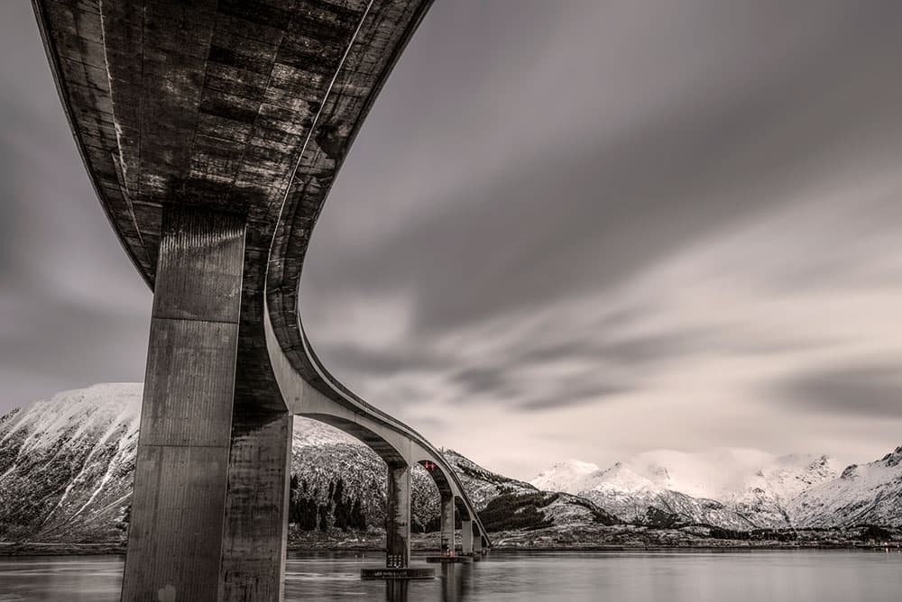
After. Credit: James Paterson
2. Accept Photoshop
Photoshop is just cheating, isn’t it? Many believe this, but it shouldn’t be a question of right or wrong, rather simply a technical choice like any other. Besides, if we shoot raw then post-processing is an essential part of the workflow, and even black & white is an ‘effect’ of sorts. As long as, in Photoshop, we don’t try to deceive and pass off an image as something it’s not, then what is the harm with digital enhancement, or HDR, or even a touch of added cloud blur like this?
Credit: James Paterson
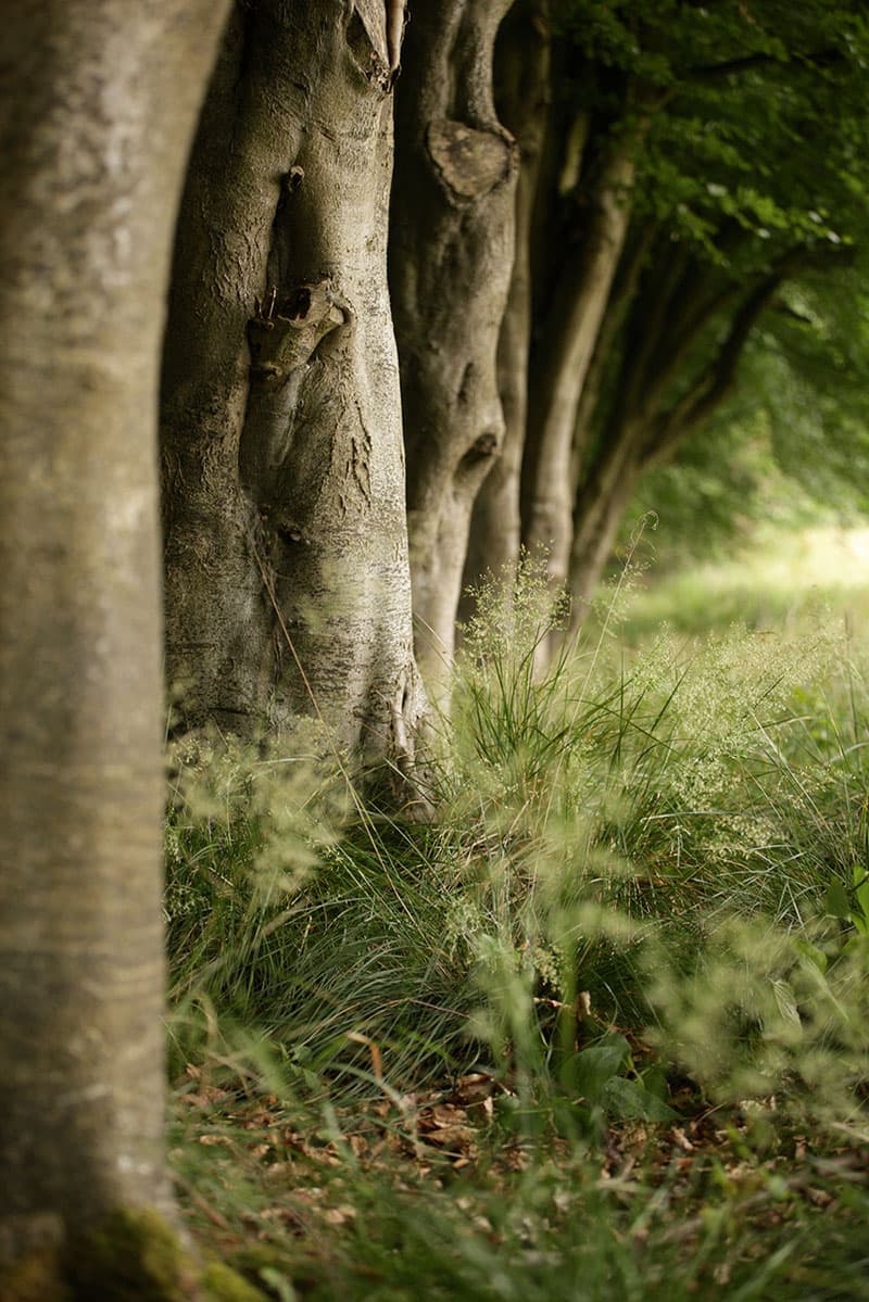
3. Shallow-focus landscapes
A solid stock-exposure setting for landscapes is to use aperture priority at f/16, ISO 100. This way there’s usually enough depth of field to ensure front-to-back sharpness, and the low ISO ensures maximum image quality. However, like all stock settings, it shouldn’t necessarily be the default. At times f/16 is unnecessarily narrow. When there are no objects too close to the camera, f/8 may suffice. And as a bonus a mid-range aperture will often be closer to your lens’s sweet spot for maximum sharpness. What’s more, there could be times when minimising depth of field results in a more creative image by allowing you to isolate parts of the frame and blur the rest.
Credit: James Paterson
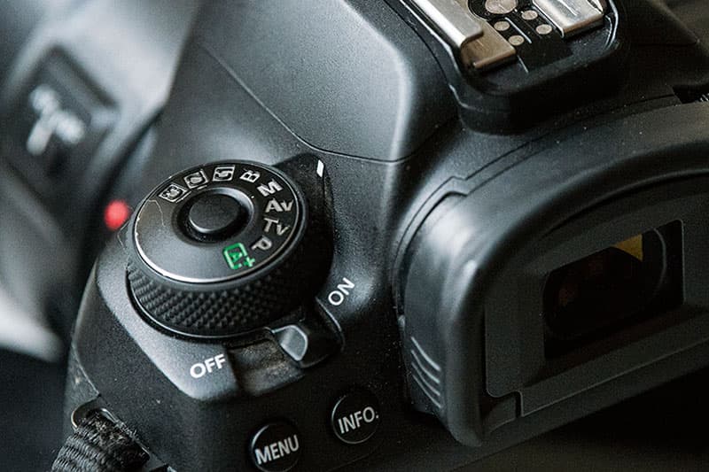
4. Free your exposure settings
All too often we equate technique with quality, as if it’s the nuts and bolts of the image (i.e. the exposure, lens and camera sensor) that matter. Of course, good technique is important, but what matters most is the picture, not the tools. For example, we’re told that in order to fully get to grips with exposure, we should shoot in manual for full control. This is a great way for beginners to learn the fundamentals. But if you’re happy shooting in full-auto mode and it works for you, don’t let anyone tell you otherwise.
Credit: James Paterson
5. High ISOs
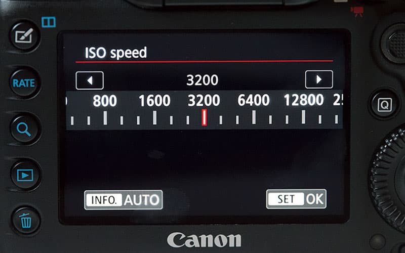
Some of us get queasy at the thought of noise-inducingly high ISOs like 3200 or more, but it shouldn’t always be a problem. Aside from the fact that low-light performance in cameras is rapidly advancing, we should also consider an image’s final destination. Yes, ISO 3200 may be noisy, but does it matter if, after applying noise reduction, the aim is to make a small print or view it on-screen?
Credit: Getty Images – Alexandros Maragos
6. Include man-made objects
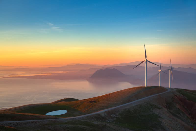
Is there anything more annoying than a stray telegraph pole in an otherwise untouched landscape? Distracting details like this can detract from the natural beauty of a scene. But not every image has to be perfect. Including man-made objects in a harmonious way can add to a composition, especially if the stark shapes contrast with the natural surroundings.
Credit: James Paterson
7. Tilt the horizon
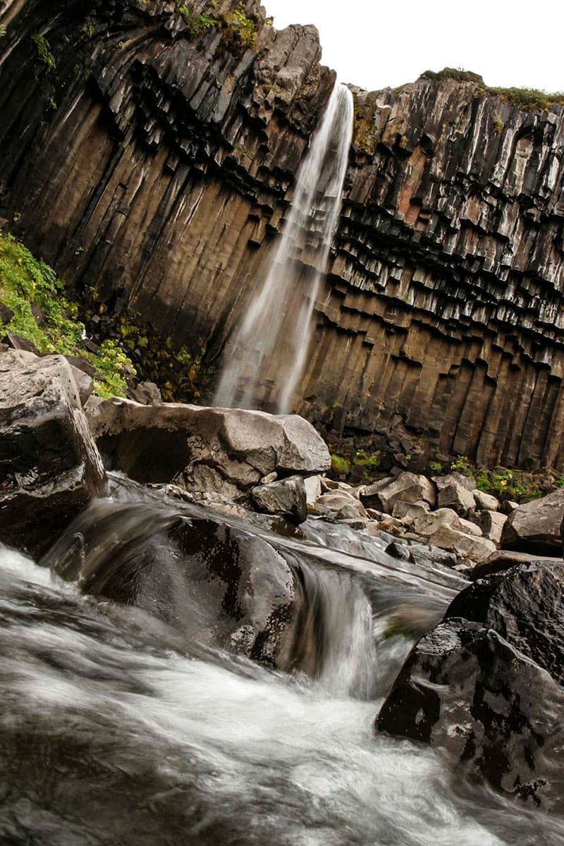
If you’ll excuse the pun, a wonky horizon is wrong on several levels. But there’s a difference between a slightly skew-whiff horizon – which is never a good thing – and intentional tilt. Diagonal lines within a frame are often pleasing to the eye, so a little creative tilt can work very well for certain scenes.

Credit: James Paterson
8. Cut into the head
Unless you’ve adopted the ‘passport photo’ approach to your portraits, a crop into the head is often a good thing, as you can come in close to an expression, emphasise the eyes and fill the frame. If we’re being specific, the crop should be into the forehead and not too close to the eyes. But then again, that’s just another rule worth breaking from time to time.

Credit: James Paterson
9. Crop unconventionally
Cropping is as much about what’s left out as what’s included in the frame, so sometimes a daring crop can give an image extra impact. It’s one way for a photographer to leave a definitive stamp on the image, and it can draw attention to certain parts of the subject, like the eyes and hair here.

Credit: James Paterson
10. Embrace the blur
Nobody wants to be accused of pixel-peeping, but we can get carried away with image sharpness and detail. Instincts tell us that a soft image should be binned. But sometimes, a lack of detail can be refreshing. Expanses of intentional blur can transform a scene into an abstract array of colour and tone without distraction.
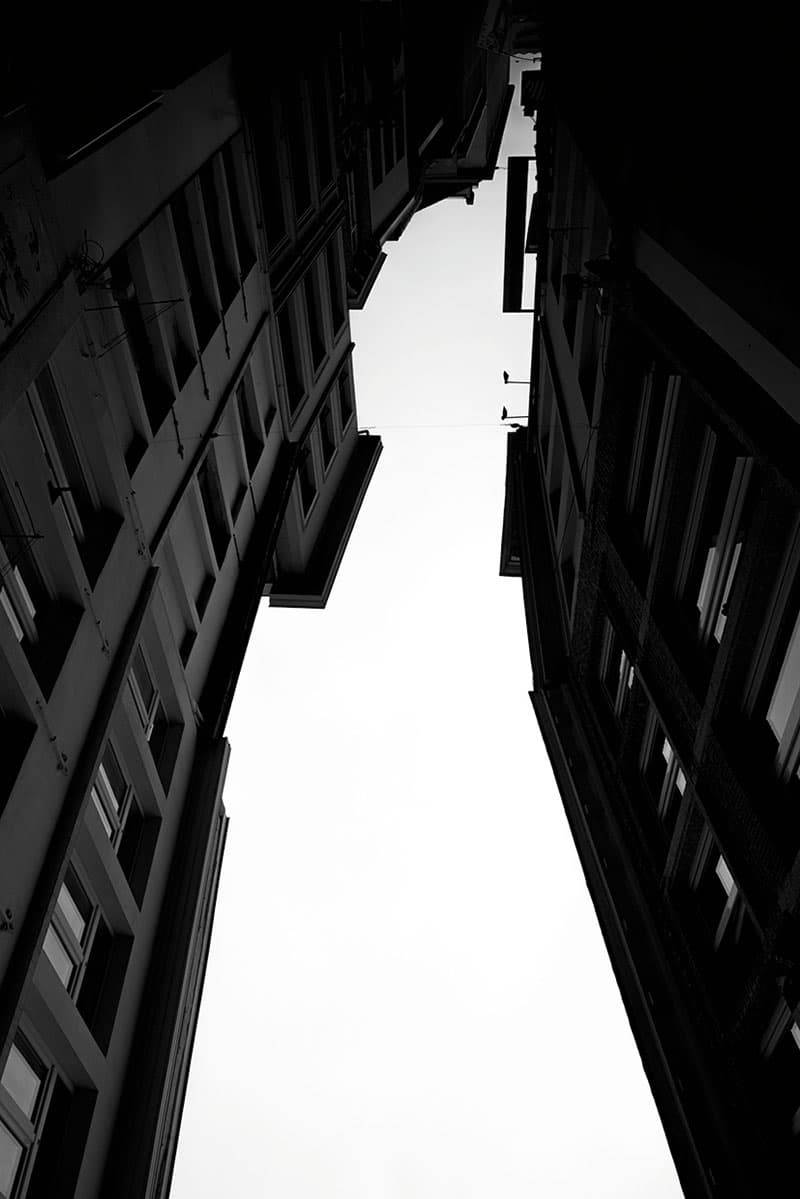
Credit: James Paterson
11. Flip the frame
Of all the recognised masters of photography, Henri Cartier-Bresson was arguably the greatest at composing a frame. When scrutinising a composition, his advice was to flip the image upside-down. The idea is that it’ll help you to view the image as a series of harmonious shapes while playing down its content. It’s a trick that really works, and if an image looks good upside-down, why not keep it that way?
Credit: James Paterson
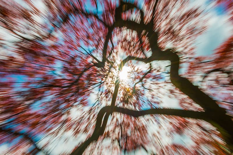
12. Shake the camera
Any camera movement during an exposure will result in a soft image. We’re told to avoid shake but as a visual effect, blur can be beautiful. So why not try turning a scene into a series of blurred streaks by prolonging the shutter speed then panning or twisting the camera, or even zooming?

Credit: Getty Images – Tim Grist Photography 2017
13. Shoot at midday
Midday is usually thought of as a photographer’s no-go zone. The magic hours around sunrise and sunset are the best times to shoot outdoors, so what’s the point of going out when the sun is high and the light uninspiring? Midday is certainly a challenging time to photograph, but if we can look for the right pockets of light or angle our subject so that the light from directly above falls on them in a pleasing way, it doesn’t have to be siesta time for our cameras.
Credit: James Paterson
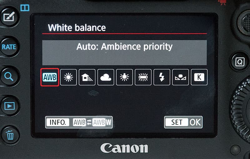
14. No need for white balance
If you shoot in raw then you can change white balance in a raw editor (such as Lightroom or your camera’s own raw processor), and achieve exactly the same results as if it had been done in-camera. Many photographers are happy to leave white balance to auto, then tweak things later if necessary. As such, setting the correct white balance in-camera is best practice, but by no means essential.
Credit: James Paterson
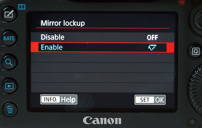
15. Don’t bother with mirror lockup
We’re told that the clunk of the mirror can cause camera shake during a long exposure. But in reality, as long as you use a solid tripod, it will only cause a problem for shutter speeds in the range of about 1/40sec to 3sec. For speeds longer than this the moment of shake isn’t significant enough to have a noticeable effect on the exposure.
Credit: James Paterson
16. No foreground interest
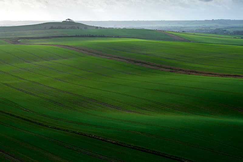
We’re often told with landscape photography that it’s visually pleasing to include foreground interest – that is, objects that will add to the balance of a composition and help draw the eye onwards to the distant elements in the frame. This can be a fantastic compositional device, but it can also lead to lazy composing. If all we do when confronted with a new scene is look for a rock to stick in the foreground, we’re not necessarily going to find the best angle, and besides, all our landscapes will end up looking the same. So why not try forgoing the foreground interest entirely? You might find a composition that more completely captures the essence of a place.

Credit: James Paterson
17. Mix your focal lengths
Certain subjects are conventionally suited to certain focal lengths. For instance, we’re used to seeing wildlife pictures taken with long lenses, landscapes with wideangles and portraits with mid-range lengths. But why not play with this convention? The distorting nature of a wideangle isn’t necessarily flattering, but it can result in an amusingly in-your-face portrait.
Credit: James Paterson
18. Use dead space
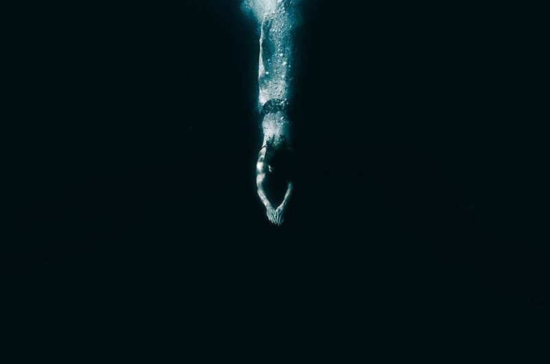
Filling the frame is a good way to exclude unimportant details, minimise a cluttered backdrop or draw attention to your subject. But sometimes dead space can help to tell a story or add to the mood of an image. Here it emphasises the sense of diving into unknown waters.
Credit: James Paterson
19. Don’t focus on the eyes
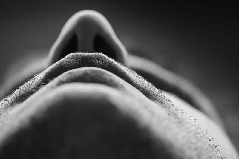
The eyes are the gateway to the soul, so it stands to reason they should always be sharp. In general, this is a rule worth following for portraiture, because it usually doesn’t matter if everything else is soft as long as the eyes are sharp. But at times, focusing elsewhere can yield creative results.

Credit: James Paterson
20. Forget the rule of thirds
The idea with this rule is that we divide a frame into thirds both horizontally and vertically, then compose the scene to place points of interest along those lines. It’s a useful compositional trick to keep in mind, but the fact that it’s easy to remember means it can become something of a default for all compositions – a starting point that may lead to laziness or missed opportunities for more interesting framing, such as the centrally framed subject here. The composition should be arranged to suit the subject, not the other way around – although that’s another rule that may sometimes be worth breaking.

