In our latest technical masterclass, James Paterson gives us his 20 essential tips on how to get to grips with the most powerful tone curve tool that Lightroom has to offer.
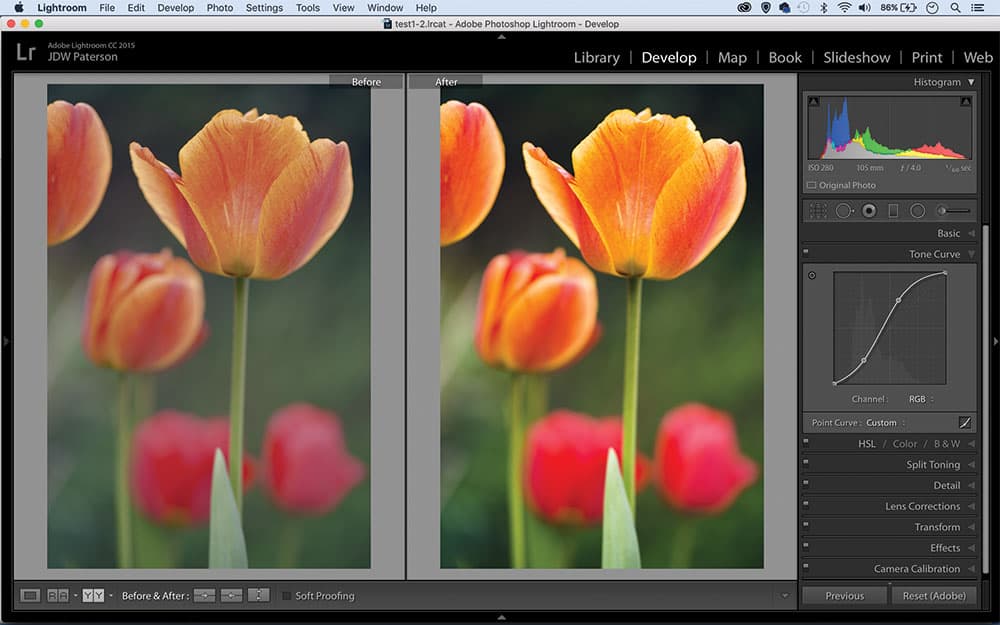
1. What is the Curves tool?
Curves is one of the most powerful tonal tools in Adobe software, or in any other image editor. In Lightroom, the Develop Module’s Tone Curve Panel offers two Curves controls – the Point Curve or the more beginner-friendly Region sliders. Click the square icon at the bottom right of the Tone Curve Panel to switch between the two.
2. Getting started? Use sliders
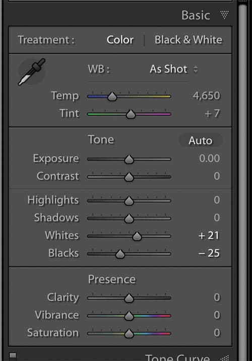
Curves isn’t the most intuitive tool for beginners, so try the Region curve sliders. These let you alter Highlights, Lights, Darks and Shadows. Along the bottom of the box, three arrow points let you alter the tonal range areas that each slider will affect.
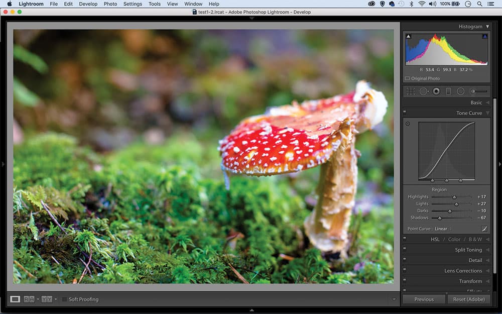
Note how each of the Region curve sliders affects the curve line
3. Straight or curved?
It might seem slightly odd that the curve line initially isn’t curved at all, but a straight diagonal. The straight diagonal represents the image in its current state. At any point where we push the line above its original diagonal position, that part of the tonal range will get lighter. Push it below, and things get darker.
4. Set whites and blacks first
Before going to Curves, first use the Basic Panel’s Whites and Blacks sliders (Alt-drag each for a view that shows clipped pixels) to ensure a good range of tones. In effect, the two sliders represent either end of the Tone curve line – the Blacks slider sets the bottom-left point, while the Whites slider sets the top-right point.
5. How many points?
The more advanced Point Curve lets you add control points to the curve line, either to anchor it in place, lift or lower the tones in different parts of the tonal range. You can add up to 14 anchor points, but rarely will you need more than four.
6. Reset the line
You can’t drag control points out of the box to remove them. Instead, right-click directly over them and ‘Delete Control Point’. To reset all points, right-click and ‘Flatten Curve’. Note that this affects only the chosen channel – to reset all channels, double-click on ‘Point Curve’.
7. Contrast slider vs Curves
We often use Curves to add punch and contrast, but why not use the simpler Contrast slider instead? Curves gives you more control, as not only can you plot an S-shape for contrast, but you can also set a point for the midtones or make the S top or bottom-heavy to shift the balance between highlights and shadows.
8. The amazing S-curve
To add extra punch, plot a simple S-curve. Drag one control point upwards near the top right of the line, and a second downwards near the bottom left. The more pronounced the S, the greater the contrast and colour saturation. An optional third point in the middle lets you anchor the midtones.
Increase contrast and colour with an S-curve
9. Solarisation effect
Drag the bottom left point all the way to the top left, and the top right point down to bottom right to invert all the tones for a negative effect. We can also create an authentic solarised effect by inverting just half of the tonal range – simply by plotting a V shape, or an inverted V.
Invert tones for a solarised effect
10. Get the retro look
The faded retro look is all the rage at the moment. It’s easily done with curves. Simply drag the top right point on the RGB curve line directly downwards by a small amount, then drag the bottom left point slightly upwards. This reduces contrast. Why not complement the effect by experimenting with colour channel shifts too?
Continues below…
[collection name=”small”]
11. Punchy blacks & whites
Often when you convert an image to black & white it can look a little flat. A boost in contrast is the answer, and no tool does it better than Curves. Plot an S-shaped curve line, then go on to add more points to control the brightness of the shadows, midtones and highlights.
To add contrast to mono conversions, plot an S-shaped curve
12. Split tone with Curves
In many ways, the Tone Curve supersedes Lightroom’s dedicated Split Toning panel. After converting to monochrome, try dragging the top or bottom points on the Curves colour channels to add subtle shifts to the highlights or shadows. Here we can introduce red shadows and yellow highlights by altering the blue and red curve lines.
Drag points on the Curves colour channels to add a split tone treatment
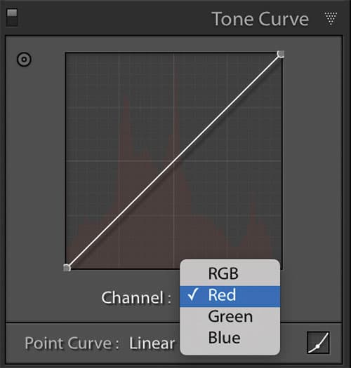
13. Control colours
The Channel dropdown lets you target the red, green and blue channels for precise colour changes. Dragging the red curve upwards adds more red, while dragging it down adds cyan – the opposite of red. Similarly, moving the green line down introduces magenta, and dropping the blue line increases yellow.
14. On-image control
Toggle on the target icon at the top left of the Tone Curve panel for on-image control. When you hover over parts of the image, a corresponding control point moves along the curve line. Drag up or down to lift that region of the tonal range, or use the up and down arrow keys (hit Shift for greater increments).
15. Read the histogram
For informed curves editing it’s important to know how to read a histogram. Imagine each pixel in your image is given a brightness value on the scale of 0 to 255. Now imagine all those pixels with the same values are stacked on top of one another like a tower, with the darkest stacks on the left and lightest on the right. In effect, this is a histogram.
16. The blown-out look
If you like the high-contrast blown-out look you’ll be pleased to hear it is really easy to achieve with Curves. First, plot a pronounced S-shaped curve. This vastly increases contrast, but it also pushes colour saturation – especially the red tones we see in skin. To combat this, select the Red Curves channel and then drag down to introduce a touch of cyan.

To balance red in skin tones, drag the red curve channel down to add cyan
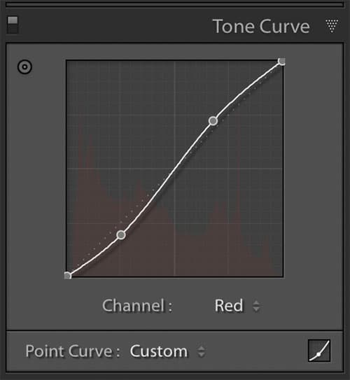
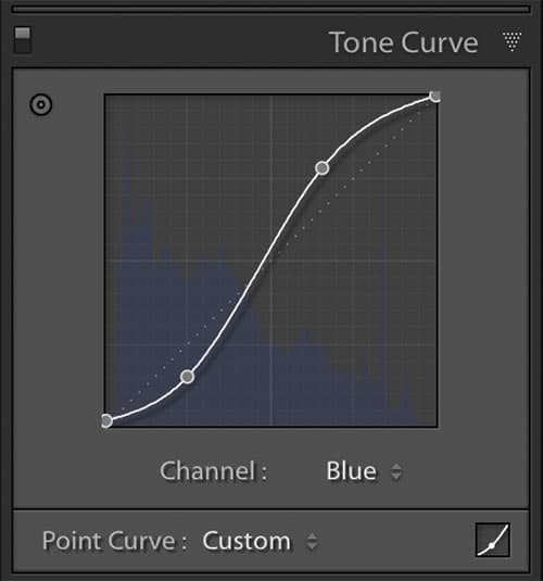
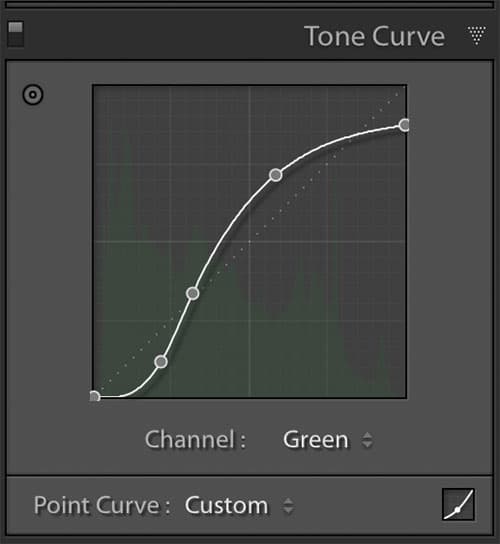
17. Cross-processed effect
Traditionally in film photography cross-processing a negative in slide-film solution, or vice versa, resulted in some unusual colour shifts. We can replicate this film effect with Curves by plotting an S-shaped curve on the red and blue channels, and a shortened S-shape on the green channel.
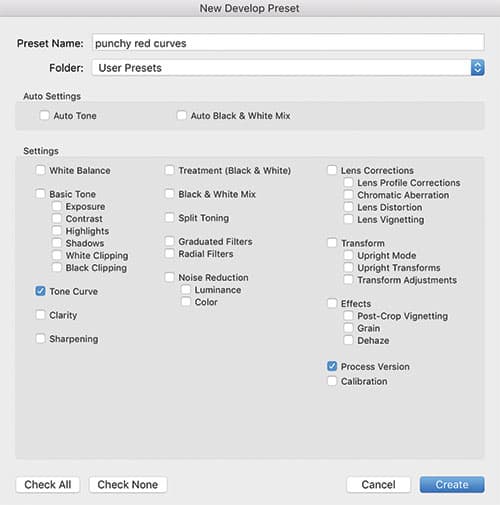
18. Tone Curve Presets
It can be tricky to recreate a Tone Curve effect, especially if you have placed multiple control points on different channels. So save your favourite curves as presets. Go to the Preset Panel on the left of the Develop Module and click the plus icon. Hit ‘Check None’ and then check just the Tone Curve box. Name your preset and hit OK.
19. Channel choices
Of the three colour channels, the blue channel usually seems to offer the most interesting colour shifts – either by pushing your tones towards yellow or blue. The green-magenta curve line is often the least useful, although of course this depends on your image and the effect you’re after. It’s always worth experimenting with.
20. Inverted S for flat effect
An S-shaped curve line boosts contrast and adds punch, but sometimes you might require the opposite effect. Instead, plot an inverted S shape, thereby lightening the shadow tones to the left side of the graph and darkening the highlights to the right.
Plot an inverted S-shape curve to decrease contrast
James Paterson
James is as skilled a photo editor as he is a photographer. His work has appeared in countless magazines and books, and in 2014 he was appointed editor of Practical Photoshop magazine. His subjects range from portraits to landscapes, architecture and underwater scenes. For James, Photoshop is more than just a work tool. Visit www.patersonphotos.com.