Just because we are surrounded by a world of colour it doesn’t mean our photographs are going to express the scene as our eyes first saw it. Read on for John Freeman’s guide to colour.

Saturation
Good colour pictures can be found in situations where the camera is often put away. When we are about to take our shots, we always consider the quantity of light, but many of us never really consider the actual quality of the light available.
The quality of light changes throughout the day. The rising and setting sun on a clear day can have quite a warm red colour. When the sun is at its highest at midday, the light is bluer, or ‘cooler’. This variation in the appearance of light is measured on a scale known as degrees Kelvin (°K). In photography it is called colour temperature. An average domestic tungsten bulb is about 3,000°K.
On most digital cameras we can select an icon from the camera’s white balance such as Sunny, Overcast, Tungsten; while on more sophisticated cameras we can choose from K settings. If your camera is continually set to AWB – auto white balance – certain scenes (such as sunsets) can get neutralised and the atmosphere will be lost.
 Natural Frame
Colour can be used to make a natural frame, such as in this portrait of a young girl. The shot is made stronger by the contrast of the red outfit that she is wearing.
Changing The Light with a Polarising Filter
Fitting a polariser to the lens will enhance a blue sky and make the clouds stand out more. Increase your exposure by about one and a half stops, keep the sun at right angles to the camera and choose a time of day – usually mid-morning – when it is at about 45º. If you shoot towards the sun or if the sun is directly behind you, this filter will have no effect. Remember that with extreme wideangle lenses the coverage of the polariser is only partial – one side of the frame has a deep blue sky, while the other is unaffected.
Colour Balance
In most situations, I use an 18% grey card called a Qpcard. This card also has a white and a black area. When I have established my lighting I take a shot of my subject with this card facing the camera and shoot a frame. I then take my shots in the normal way, but without the card present. After I have downloaded the shots into the computer I can look at the one with the card in it in Photoshop. Choosing Image > Adjust > Curves then using the grey pipette I can neutralise the image on the grey area of the card. I can then save this as an ACV profile, to be applied to the other images. Of course, though the profile might be a ‘correct’ assessment, I might prefer it if the shot was warmer or cooler, particularly when it comes to skin tones.
 Complementary Colour
By placing this slice of lemon on a blue plate I have created an interesting picture using two complementary colours. The use of a colour wheel can help you understand the relationship between complementary and contrasting colours.
 Isolating Colour
The material that these two people are draped in is enhanced by being shot against a neutral background. The spatial element between the two figures adds to the compositional quality of the picture.
Enhance Skies
Polarising filters are excellent for enhancing skies and cutting down on haze. Compare these two photographs. The left hand one was shot without a polarising filter, and the blue sky is slightly flat. The right hand one was shot with a polarising filter. Notice how much deeper the blue of the sky is. You can also use these filters to cut down on reflections in glass and water. However, when using them with ultra wide lenses the effect will be uneven on blue skies.

White Balance
If colour plays an important part in your composition, then you should take the trouble to make sure that the colours are accurate by setting the correct White Balance. If the preset settings do not offer enough fine tuning then take a custom reading from the scene, using a white or neutral surface to take the reading from (a folding white reflector would be ideal for this purpose).
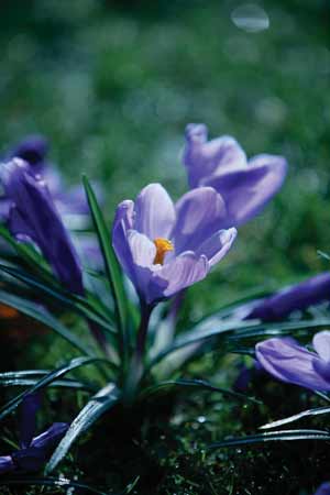
 Telephoto Flower
By using a 200mm telephoto lens and a wide aperture of f2.8, the background in this picture has been put out of focus. This has resulted in an attractive mottled green background where the various hues blend together and highlight the purple flower.
Guide to Colour – John’s Top Composition Tips
- 1. Use a grey card in a test shot to create a neutral profile for the particular lighting conditions that you are working under.
- 2. Polarising filters will change the depth of blue in skies. Always have one with you.
- 3. Try to use the camera’s W/B setting on manual. This will help you to achieve greater atmosphere in your shots.
- 4. Remember that daylight is constantly changing. It is much warmer at the beginning and end of the day than it is at midday.
- 5. Make sure that your computer screen is properly calibrated so that what you see is what you get.