Every time we walk down the street we are surrounded by typography, from road signs and shop fronts to advertising and car number plates. Unless it’s relevant to us we usually ignore this visual language. However, if we head out with the intention of photographing what we see we tend to walk more slowly, and take the time to notice the size, colour and shape of each letter and word, rather than becoming fixated on what is says or means. Certain typefaces, for example, give clues to the age and even the purpose of a building. Certain colours (such as red) tell us how important a piece of information is to us.
You don’t need to travel far to embark on a typography treasure hunt, just step out of the door and enjoy reading the urban landscape.
- Many people have drawn inspiration from the typography of the urban landscape. Walker Evans created some wonderful shots of streets, cafés, signs and billboards. Spend an afternoon studying his work.
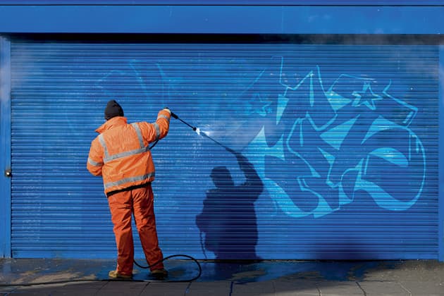
- Look for amusing juxtapositions between words on the street and those walking past them – a dog in a pushchair being wheeled past a Walk4Life poster, or a guy sitting in front of some interesting graffiti.
- Shooting typography requires awareness of what’s going on at the edges of the frame. Once you’ve lined up your shot, scan the edges of the viewfinder to make sure that you are not cutting off any words or letters in half.
- Create your own alphabet by isolating letters and forming a montage in post-production. Then try making a new alphabet out of objects that have the appearance of letters, such as pipes that form an ‘L’ shape.


