Angela Nicholson explains how to take control of colour in-camera using the tools available on cameras from the main manufacturers
Taking control of colour in your images can be achieved in-camera at the shooting stage
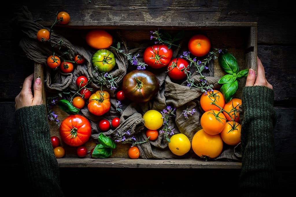
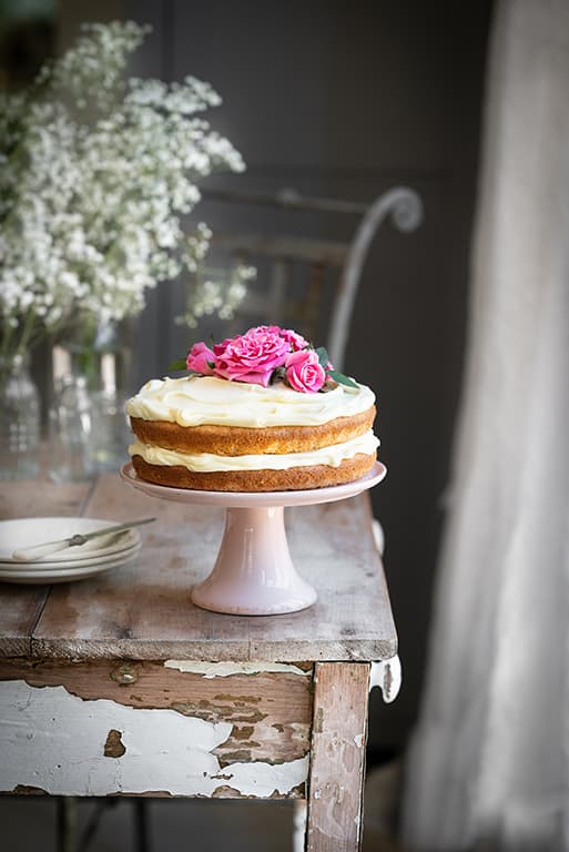
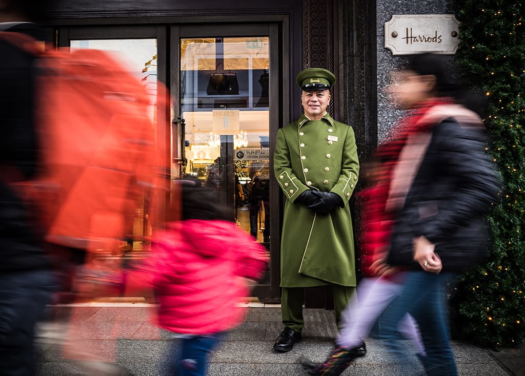
Nikon D750, 50mm, 1/10sec at f/5.6, ISO 200
Colour is a very emotive aspect of photography; we can use it to enhance the atmosphere and convey the mood of a scene and even underline our story. Film photographers can select the emulsion that gives them the results that they want, but with digital photography the decisions about colour are often made post-capture.
However, there are tools available on the average digital camera to enable images to be close to perfect at the shooting stage. Just like film emulsions, different camera manufacturers use different colour science for the JPEGs that their cameras produce. This means that in the default settings, one camera can produce images that look quite different from another.
Most digital cameras offer a selection of settings such as Picture Styles, Picture Controls, Film Simulation modes or Picture Modes that give JPEGs a particular appearance. While these colour settings are applied to JPEGs, they are also usually saved with the raw files so that when they’re opened in an image-editing software package, you see the effect.
However, it’s normally possible to switch between the various colour modes at the processing stage. There are usually modes that are specific to the software as well as some that mimic the camera manufacturer’s JPEG colour profiles. Another important setting is the colour space, which can usually be set to either Adobe RGB or sRBG in-camera.
Adobe RGB has a larger colour gamut, which captures a wider range of hues and tones, so it’s natural to assume it would be a better choice. But in fact, most cameras record the same colours in their JPEGs regardless of this setting. However, sRGB is often used by online labs, so if you plan on ordering prints of your JPEGs without processing them, set your camera to sRGB.
Likewise many web browsers assume image files are sRGB, so if you upload Adobe RGB files the colours may look dull and faded. Raw files don’t have an assigned colour space. Instead, they’re captured with the full colour information available from the camera. They are given a colour space as part of their processing to make them sharable or printable.
White balance
White balance plays a key role in determining the colours in an image. If the ‘wrong’ white balance is set there can be a significant colour cast that, while relatively easy to correct in raw files, can be problematic for JPEGs. The auto white balance (AWB) setting is the most convenient option to use as it’s designed to adjust to different lighting conditions.
However, different systems do this with differing degrees of success. Shaded conditions can be tricky with many cameras producing images that either look too cool or just a bit dull. In some cases, switching to the sunny or daylight setting can improve things, but often the dedicated ‘Shade’ or ‘Cloudy’ settings result in images that look too warm.
One alternative is to set a Kelvin value by eye. This is easier to assess with a mirrorless camera as you can check the impact in the viewfinder which, unlike the screen on the back of the camera, is shielded from the ambient light. Another option is to set a custom white balance setting using a white or grey-white balance target.
Canon
Canon has a strong reputation for its colour science and auto white balance systems
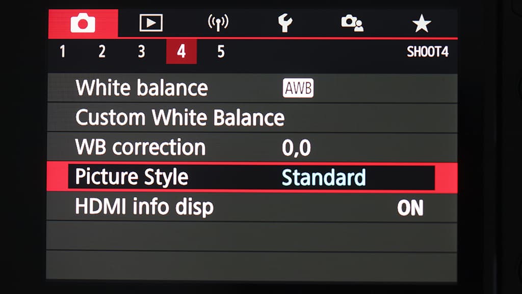
The colours produced by Canon’s cameras are generally popular and its automatic white balance systems are very good. Canon calls its in-camera colour profiles ‘Picture Styles’ and the most recent cameras feature Auto, Standard, Portrait, Landscape, Fine Detail, Neutral, Faithful, Monochrome and User Defined Picture Styles, which are selected via the main or Quick menu.
The Auto setting uses the camera’s Scene Detection system that analyses shooting conditions automatically, considering aspects such as a subject’s face, brightness, colour, movement, contrast and focus distance to tailor the contrast, colour tone, sharpness, and saturation to suit the scene. It’s programmed to make colours look vivid, especially blue skies, greenery, and sunsets.
There are also three User Defined settings. When any of these are selected, you can select one of the standard Picture Styles as the base and then adjust the sharpness, contrast, saturation and colour tone of colour images or the sharpness, contrast, filter effect and toning effect when the Monochrome Picture Style is set as the starting point.
Once you’ve selected the sub-settings that you want, they are selected every time that User Defined Picture Style is selected – unless you make more changes. Additional Picture Styles Using Canon’s free EOS Utility software (downloadable from here), it’s possible to download a selection of other Picture Styles to be installed as one or more of the User Defined options.
The available Picture Styles include Nostalgia, which gives images an amber tone with desaturated blues and greens. Then there’s Clear, which increases contrast and clarity. Twilight is designed to enhance the colours at twilight and Emerald produces bright and vivid greens.
Autumn Hues emphasises the reds and browns of autumnal scenes, while Studio Portrait is ideal for flattering skin tones. Snapshot Portrait is similar but with boosted contrast. The Video Camera X Series Look reproduces the results from Canon’s X-series digital video cameras and has softer contrast than the Standard Picture Style.
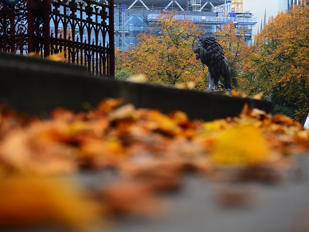
Canon EOS 6D, 24-105mm, 4 sec at f/14, ISO 100
Pro Insight: Beata Moore, Photographer and author
I shot this as a raw file in the Standard Picture style with the white balance set to Automatic, but I fine-tuned the white balance using Canon’s Digital Photo Professional 4 before making some other minor adjustments in Adobe Photoshop. While blue is generally thought of as a relatively cool colour, in fact it can be either warm or cool.
Shades with a green bias are cooler, while softer and aquamarine tones are relaxing and mood-lifting. The factor affecting the way we see the blue colour here is the second colour evident in this photo – red. See beatamoore.co.uk
How to upload a Picture Style to your camera
1 Use the supplied USB cable to connect the camera to your computer and power up the camera.
2 Start EOS Utility on your computer. If necessary, confirm the camera model.
3 Select ‘Camera settings/Remote shooting’.
4 Click on the red camera icon followed by ‘Picture Style’.
5 Select one of the ‘User Def.’ options from the menu followed by ‘Register User Defined style’.
6 Click on the ‘File Open’ icon.
7 Find and select the Picture Style file you previously created or downloaded then click on ‘OK’ to transfer it to your camera.
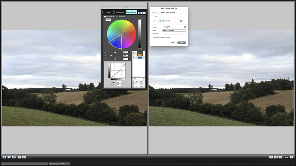
Picture Style Editor
Canon’s free Picture Style Editor software enables you to create your own Picture Styles with some fairly advanced options such as the ability to change the hue, saturation and luminosity of specific colours. These can either be uploaded to the camera as a User Defined Picture Style via EOS Utility to be applied at the shooting stage, or later when editing raw files on a computer.
Fujifilm
Fujifilm’s Film Simulation Modes have something for every scene and style
As it’s a film manufacturer it makes sense that Fujifilm has based its cameras’ colour modes on its past and present film emulsions and traditional processes. Fujifilm has a total of 19 Film Simulation modes but only the Fujifilm GFX100S has all of them.
The Fujifilm X-T4, X-S10 and X-E4 have 18: Provia/Standard, Velvia/Vivid, Astia/Soft, Classic Chrome, Pro Neg.Hi, Pro Neg.Std, Classic Neg, Eterna/Cinema, Eterna Bleach Bypass, Black&White, Black&White+Ye Filter, Black&White+R Filter, Black&White+G filter, Sepia, Acros, Acros +Ye Filter, Acros +R Filter, Acros +G Filter.
The additional mode brought by the GFX100S is Nostalgic Negative. Each of these Film Simulation modes gives JPEGs a different look, but the results can be further customised using the usual Tone Curve Color (Highlights and Shadows), Sharpness and Clarity settings as well as the more exotic Color Chrome Effect and Color Chrome Effect Blue settings.
When Tone Curve is selected, the Highlights and Shadows can be adjusted separately from -2 to +4, with half-steps in between. As the value is adjusted, the camera shows the shape of the tone curve adjust to help you visualise the impact to the adjustment. Fujifilm’s Color Chrome Effect was inspired by the Fujichrome Fortia reversal film that was available in Japan from 2005 to 2007.
It’s found on the company’s enthusiast and high-end cameras and is designed to deepen reds and yellows and, to a lesser extent, greens. It produces a wider range of tones in images of subjects such as flowers and landscapes which can easily become oversaturated in high-contrast conditions.
Color Chrome Effect Blue is similar, but it targets blue in a scene, making it a deeper shade, which means on skies it can look like a moderate polarising effect has been applied. Both of these effects can be set to weak or strong (or turned off) and applied separately or in combination, for example to bring out the warm tones of the late afternoon sun hitting a scene under a deep blue sky.
Post-capture adjustments
While Adobe Camera Raw and Lightroom have the necessary profiles to apply the Film Simulation mode effects to raw files, you need Fujifilm’s X Raw Studio to apply the Color Chrome Effect and Color Chrome Effect Blue. This software is available for free and unusually, it uses a Fujifilm camera’s processing power when working on images – even though they’ve already been downloaded to the computer.
That means that you have to connect your camera via a USB cable before you can process any images.
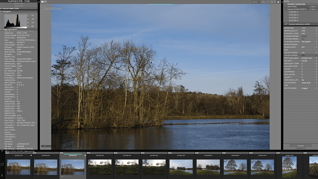
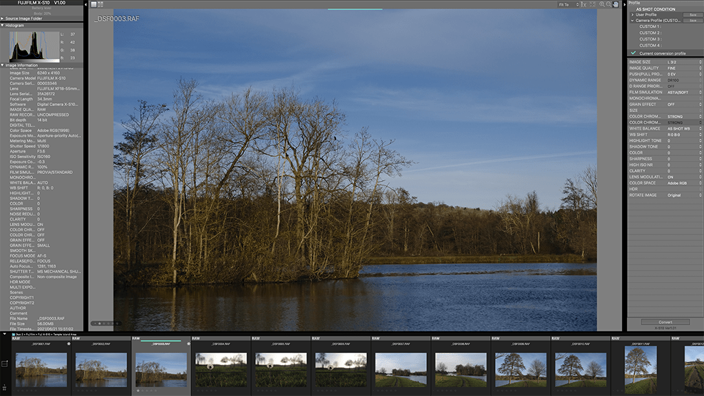
The original scene above, and below, the Colour Chrome Effect and Colour Chrome Effect Blue. Both are set to ‘Strong’
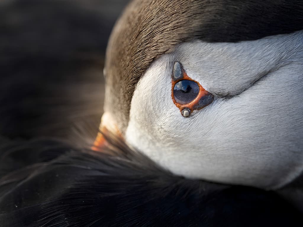
Fujifilm GFX 50S, 63mm, 1/4000sec at f/2.8, ISO 100
Pro Insight: Kevin Mullins, wedding photographer and Fujifilm X Photographer
I find the white balance system from Fujifilm’s X-Trans sensors and X Processors very reliable, so as a rule I usually set the white balance to Auto unless the light is very consistent. When I’m shooting monochrome images, I love to use the Acros+R Film Simulation and for colour I go for Pro-Neg-Hi or the newer Classic Neg, which gives a wonderful filmic look. See www.kevinmullinsphotography.co.uk
Nikon
Nikon’s Creative Picture Controls can turn an average image into a head-turner
Nikon calls its main colour controls ‘Picture Controls’ and in addition to the Auto, Standard, Neutral, Vivid, Monochrome, Portrait, Landscape and Flat options that have been around for ages and that are broadly like those offered by other camera manufacturers, more-recent cameras have a collection of 20 Creative Picture Controls.
These are called things like Morning, Somber and Bleached. Bleached is favourite of mine, but there are some options that can help to create an interesting image from a photogenic scene when the light is less than perfect. The Creative Picture Controls also dovetail nicely with Nikon’s SnapBridge technology that enables files to be shared automatically to a paired smartphone.
It can really liven up your Instagram grid. If you shoot raw files, it’s possible to process your images in-camera and as part of that, you can change the Picture Control and tweak key parameters such as the sharpening, clarity, contrast, brightness, saturation, and hue of the ‘standard’ Picture Controls. W
ith the Creative Picture Controls, there’s also a ten-step control over the level of the effect that’s applied. Picture Control Utility 2 Picture Control Utility 2 is a free software package that allows Nikon photographers to use the same controls as there are in-camera to edit the Picture Control that’s applied to an image.
Once you’ve created a look that you like, you can save it as a new Picture Control and access it in NX Studio – Nikon’s new image-editing software package. Alternatively, it’s possible to save the Picture Control to a memory card in a card reader connected to the computer to upload to your camera.
To do this, press the camera’s menu button and select Manage Picture Control > Load/Save > Copy To Camera. Once that’s done, the new Picture Style is ready for use in the future at the shooting stage or during raw file processing.
This scene has Nikon’s Bleached Picture Control applied in-camera
White balance options
Digital cameras used to have just one automatic white balance setting, but it’s becoming more common for them to have more. These modes are designed for use in a more restricted range of lighting than the regular Auto setting and they help the camera deliver the result you want. Nikon has the most impressive array of auto white balance settings, with four or five depending upon how you look at it.
The basic WB A [Auto] setting is designed for use in most types of light and if a compatible flash is used, the camera will adjust to take that into account. There are also three WB A number settings that are designed for use in a colour temperature range of 3500-8000K. WB A0 [Keep white (reduce warm colours)] removes the warm cast of incandescent lighting while WB A1 [Keep overall atmosphere] preserves some of the warm colour cast produced by incandescent light.
Lastly, WB A2 [Keep warm lighting colors] retains most of the colour cast. In addition, there’s the Natural Light Auto setting which is designed for use in 4500-8000K light. This tends to produce more natural-looking colours in natural lighting than WB A, which makes it a good choice in most natural light conditions. The best way to decide which white balance setting to use is to look in the viewfinder of a mirrorless camera, or shoot an image with a DSLR, with each setting selected.
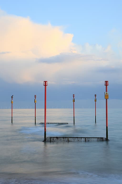
Nikon Z 5, 85mm, 1/125sec at f/3.5, ISO 200
Pro Insight Donna Crous Food photographer, Nikon and Rotolight ambassador
I keep it simple and shoot raw files using the camera’s auto white balance setting. If I need to, I adjust the Kelvin setting in camera using the ‘Choose color temperature’ option in the white balance section of the ‘I’ menu. I also use my Rotolights’ Kelvin setting and make final adjustments in Lightroom. See www.donnacrous.com
Olympus
Olympus cameras produce great colours and have some useful Art Filters
Olympus cameras have an excellent reputation for the colours that they produce. They excel with natural hues. However, there’s a selection of Picture Modes and Art Filters available to tailor the results to your preferences. The Picture Modes are the usual JPEG-processing modes with profiles that can be applied to raw files or not as you prefer at the processing stage.
The Art Filters, however, are a little different. They are only applied to JPEGs and if you shoot raw and JPEG files simultaneously, you get a ‘clean’ raw file as well as the JPEG with the filter. There are 15 types of Art Filter available but several of them have two or three variations.
In addition, there are a few effects that can be applied such as Soft Focus, Pin Hole, White Edge, Frame, Star Light, Blur (top and bottom or left and right). The options available depend upon the selected Art Filter, and you can only pick one effect from the list, but the Filters and the effects can be combined with the available aspect ratio options (4:3, 16:9, 3:2, 1:1, 3:4).
It can be a fun way of creating Instagram-ready images at the shooting stage. Olympus cameras have an ‘Art’ setting on their mode dial, which gives a quick way of using the Art Filters, however, the exposure is set automatically and can only be adjusted via the exposure compensation control.
Fortunately, the Art Filters can also be selected from the same list as the Picture Modes in the Super Control Panel that is accessed by pressing the OK button. Art Filter bracketing With so many Art Filters available, it can be hard to decide which ones you like, and which work well with a particular scene.
However, the OM-D E-M1 Mark III and OM-D E-M5 Mark III both have the option to bracket the Art Filters. This is activated via the main menu, and you can select which of the Art Filters you want to capture with a single press of the shutter release.
If you want, you can capture them all, including the different variations, and if you shoot raw files, you’ll get a JPEG for every selected Art Filter, plus a clean raw file. Color Creator Olympus’s current cameras feature a Color Creator setting which is also found among the Picture Modes and Art Filters.
This can be used to set the overall colour of the image by adjusting any of 30 hues across eight saturation levels. When it’s selected, the adjustment controls are accessed by pressing ‘OK’ to open the Super Control Panel and then selecting ‘Color/Vivid’. Then it’s just a case of rotating the camera’s front dial to select the hue and rotating the rear dial to adjust the saturation. You can restore the default values by pressing and holding the OK button.
There is a variety of Art Filters available in-camera, which is ideal for shooting Instagram-ready photos
Olympus E-M1 Mark II, 40-150mm with 1.4x teleconverter, 1/200sec at f/4, ISO 400
Pro Insight: Tesni Ward, Wildlife photographer and Olympus ambassador
My preference is to shoot with a custom white balance which usually sits between 4500K and 6000K depending on the light and conditions. I often look for a neutral colour in the scene to judge the most appropriate setting. As I shoot raw files, I will usually add some vibrance in post processing to make the colours pop. See www.tesniward.co.uk
Panasonic
Panasonic makes it easy for photographers to create their own colour settings in-camera
In addition to a collection of Photo Styles, Panasonic’s Lumix cameras have a collection of Filters that can be used to give JPEGs a particular appearance. They haven’t really captured the imagination in the same way as Olympus’s Art Filters and there aren’t as many options or as much control, but they’re a handy way of creating more interesting images in-camera.
To select a filter effect, navigate to ‘Filter Settings’ in the camera’s main menu, highlight it and press the Menu/Set button. Then scroll down to ‘Set’ to see the range of filter effects available. As you scroll through the options, the camera shows a preview on the screen or in the viewfinder so you can pick the one that works best with the scene.
If you’re shooting raw and JPEG files simultaneously, the filter effect is only applied to the JPEG. If you’re just shooting JPEGs, there’s an option in the menu below ‘Filter Effect’, to set the camera to simultaneously record an image without the filter. This is greyed out if you’re shooting raw files.
Once a filter is set, tapping on the artist’s palette icon on the camera’s screen reveals an adjustment that can be made to the treatment. This varies depending upon the selected filter – for the Mono filter, for example, you can apply a sepia or blue tone and there are two strengths available for each.
With the Dynamic Monochrome filter, the contrast can be reduced or increased and with Cross Process it’s possible to shift the colour cast by tapping on one of four colour swatches. Photo Styles Provided that the Filter Settings option is set to ‘Off’, Lumix cameras give you control over the Photo Style – the usual JPEG colour controls.
The settings are available via the main or Quick menu, but if you want to tailor the sub-settings to your preferences, use the main menu. Simply select ‘Photo Style’ in the main menu and then scroll right or left to switch between the different Styles. Then, tap on any of the adjustment parameters below and scroll through to change the value. Once you’re happy, pressing the ‘Set’ button returns you to the shooting mode with your preferences applied. However, tapping ‘Disp. Save’ enables you to store the settings as a Custom Photo Style that can be used at any time in the future.
Photo Styles with raw files As with similar JPEG profiles from other manufacturers’ cameras, Panasonic’s Photo Styles can also be applied to raw files at the processing stage in Adobe Camera Raw or Lightroom. To access the options in Adobe Camera Raw, open the raw file in the software and click on the dropdown arrow to the right of the profile at the top of the control panel on the right of the screen.
Then click on ‘Browse’ and if necessary, click on the arrow next to ‘Camera Matching’ to reveal the options before clicking on the one that you want to apply. You can then use the usual Adobe Camera Raw controls to make further edits if you wish.
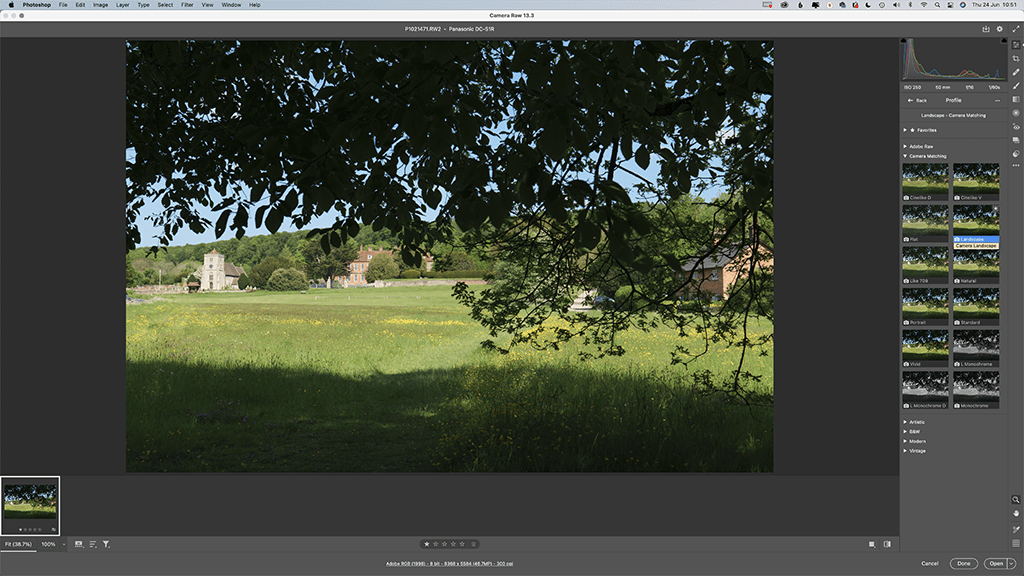
Panasonic DC-GX9, 15mm, 1/13sec at f/4.5, ISO 200
Pro insight: Ross Grieve, commercial, portrait and street photographer and Panasonic Lumix ambassador
With street photography, the colour and tone is very important to the impact of the image and there are so many variables that my settings change from shot to shot. I shoot raw files with the white balance set to Auto and I use one of my own custom presets in Lightroom to give my images a gritty look. It’s important to have a signature look to your imagery so people will recognise your work. See www.rossgrieve.com
Sony
Whether you shoot stills or video, there’s plenty of control over colour with Sony Alpha cameras
With Creative Styles, Picture Effects and Picture Profiles, it’s easy to get confused about the colour and contrast controls offered by Sony Alpha cameras. Creative Styles are aimed at photographers, and the settings are ‘baked-in’ to JPEGs but can be applied to raw files post-capture.
They can also be used for video if you want to get it all done in camera and not get involved with grading. Conversely, although they can be applied to stills, Picture Profiles are intended for use with video. Whereas Creative Styles give you sub-setting control over contrast, saturation and sharpness, with Picture Profiles you’re dealing with aspects such as black level, gamma, black gamma, knee, colour mode, saturation, colour phase, colour depth and detail.
As well as enabling a video to have a particular style, these settings can be used to capture the maximum amount of information ready for the footage to be graded post-capture. The video is often made to look ‘flat’ and colour and contrast is manipulated post-capture. Sony’s Picture Effects are JPEG-only filter effects, and can only be used if the camera is set to capture just JPEGs.
That rules them out for many photographers as there’s no safety net of an unfiltered file.
Creative Styles
Creative Styles include Standard, Vivid, Neutral, Clear, Deep, Light, Portrait, Landscape, Sunset, Night, Autumn Leaves, Black & White and Sepia. Of those, I recommend using Standard, Neutral or Portrait, depending upon the subject, and Autumn Leaves or Sunset when warm colours need prioritising. Landscape can be useful for boosting greens and blues, but it often looks a bit too strong.
Custom white balance
All the camera manufacturers allow you to set a specific white balance setting either by dialing in a Kelvin value or by photographing a neutral subject to calibrate the camera’s custom value. The basic principle is the same for all cameras, with the exception of Canon that requires the image to be shot before selecting the custom white balance setting control. The rest employ a very similar procedure to Sony, explained here:
1. Open the main or Function menu and navigate to ‘White Balance’.
2. Scroll down to the Custom Settings and if there’s a ‘Set’ option, select that. Alternatively, pick one of the available custom settings and scroll right to highlight ‘Set’ before pressing the button at the centre of the navigation pad.
3. Ensuring that your white or grey target is in the same light as your subject, point the camera at it and make sure that the area indicated at the centre of the screen or viewfinder is filled by the target.
4. Press the centre button to capture the white balance data.
5. Check that you’re happy that the target looks neutral and press the centre button again to confirm the white balance value.
6. Make a mental note of the Custom setting that you saved to, because you can use it again whenever the the lighting conditions are the same.

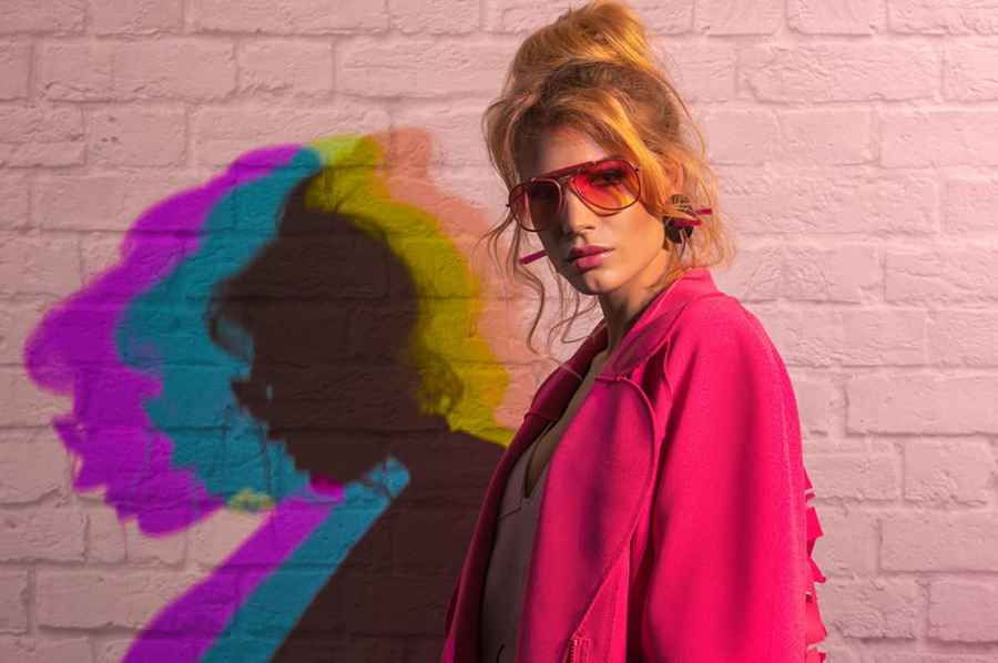
Pro Insight: Robert Pugh Wedding and portrait photographer
When I’m shooting with flash, I always set the white balance to 5600K, which is the same as daylight and it matches the colour from most flash units. With this image I was painting with light with different colours just like you mix paint at B&Q – but I was blending three colours to make white. The model is lit with the white light as all three colours are directed towards her but as the lights were offset from each other, the shadows have different colours. See www.rpphotographybydesign.co.uk