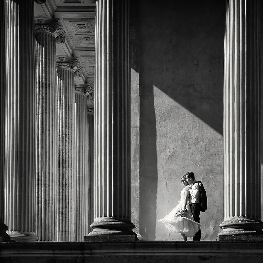
This shot demonstrates the use of shapes in a composition, here enhanced through the repetition of lines as well as the contrast provided by the strength of light. All images by Kate Hopewell-Smith
At the beginning of their photography journey, many people become obsessed with f-stops, shutter speeds and ISO sensitivities, thinking that mastering exposure will result in images with impact. However, this approach deals with the technical side of photography rather than the ideas and creative side.
What’s missing is knowledge about composition and visual perception, which relates to how our eyes and brain work together to understand the visual whole. I studied history of art at university, learning the principles of design and critiquing many different genres. This process resulted in a strong understanding of composition techniques and a visual language that was easily transferable to the medium of photography. So the good news is that these objective principles and skills can easily be learnt and applied, resulting in significant improvements to a photographer’s portfolio.
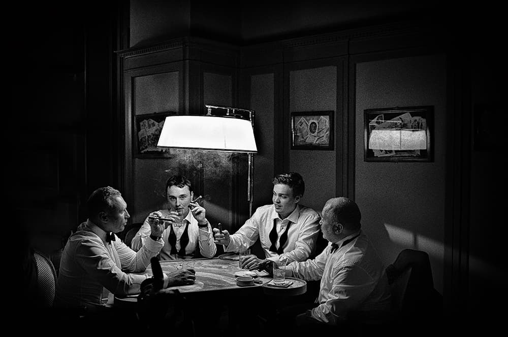
The strength of this image lies in the strong contrasts of light and dark, as well as the mood and atmosphere that the lighting provides
External influences
The elements of composition you use the most will be influenced by what and where you shoot. It is easier to control the final composition when you work in a studio because you begin with an empty canvas and build the image. For those, like me, who work on location, we start with a full canvas and have to make decisions about what to include and exclude from the frame. Quite often the lens I choose will be directly related to the composition that I am striving for.
When I photograph people on location, I often use a long focal length and the resulting compression to create soft, textured backgrounds, which helps to draw attention to the subject (texture can be a very effective compositional device – so useful because it can be revealed through lighting and also explored through reflection, or the lack thereof).
Whenever I find myself shooting in an urban environment, I usually have to use many more compositional techniques to create images with impact, because it can be difficult to find locations without any distractions.

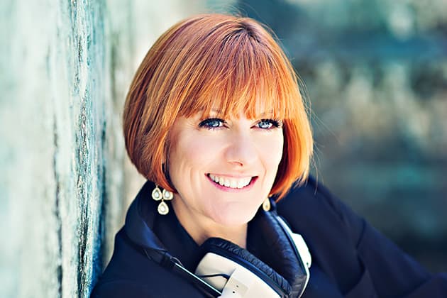
When I was asked to provide some headshots for this voiceover artist, it was an easy decision to use a location that provided the perfect complementary colour to her beautiful hair
Reading the image
The general definition of composition is ‘putting together using conscious thought’, and when discussed specifically in relation to photography this means ‘the arrangement of visual elements within the frame’. Critically, both imply an active and intentional role for the photographer, who must make decisions about what to include in the frame and where to place things relative to each other.
If you ever find yourself, or others, tilting your head when reviewing one of your photographs, this means the brain is struggling to ‘read’ the image successfully.
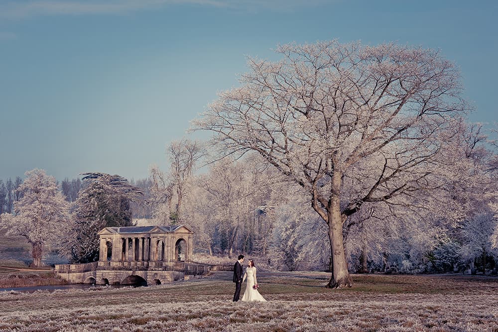
The use of leading and converging lines here gives a strong sense of depth and perspective
Visual elements
At the heart of composition lie visual elements – things you can see that make up the properties of art. The simplest elements are single points in the frame – for example, a person in an otherwise empty space. When a number of points are found together, they can easily be joined, perhaps unintentionally, by the eye to imply lines and shapes. The three most common shapes found and used in photography are rectangles, triangles and circles, and in all cases these can be real or implied.
So it follows that lines are one of the most basic elements of art and can also be one of the most dominant and potentially distracting in terms of composition. It is relatively easy to make decisions when there is only a single dominant line, but in reality you will often be faced with a large number of lines that intersect at different angles and prevent the image having stability or a primary focus point. A very useful technique is to include leading lines to control the eye movement of the viewer and draw their attention to the point of interest rather than leading the eye away.
Another great technique involves using converging lines to suggest depth and perspective – which is a critical skill in successfully translating our 3D world into a 2D graphic image. The angle that you stand at, compared with the lines in the frame, will have a considerable effect on perspective. This sometimes means that making changes in your position or choice of lens will make a big difference to the success of the final composition.
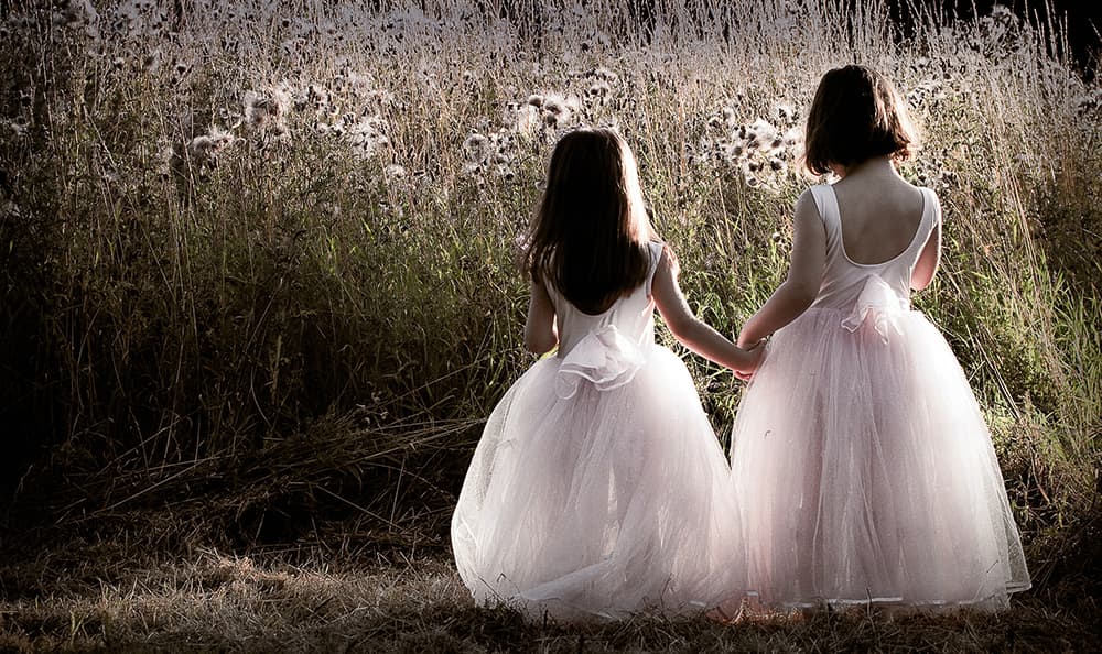
This is largely about contrasts of texture revealed through one strong shaft of sunlight to the right of the camera. I placed the girls on the right-hand side of the frame for a less predictable image
Harmony
There are also a number of principles that involve using the visual elements described above to create a strong compositional technique: division and emphasis; contrast, pattern and repetition; balance; symmetry; depth; perspective.
For centuries there has been an understanding that harmony can be created through the careful division of the frame. Instinct tends to mean people put things in the middle of the frame and while there is nothing wrong with this approach, it is predictable. I only tend to position the key subject centrally (thus dissecting the frame in half horizontally or vertically) if there is symmetry and the visual effect I am striving for is one of harmony. Once you take the step to move the main point of interest away from the centre, you have to make a decision about where to put it.

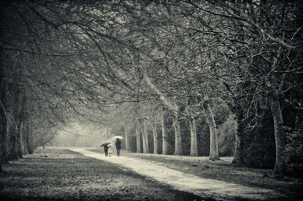
Shooting in woods can be difficult due to the number of potentially distracting lines. I used the rule of thirds for placement of the subjects. this location took some finding as I wanted it to be backlit
Rule of thirds
The most basic and easy-to- use method of division is the rule of thirds, which is all about creating emphasis through placement, and is subsequently believed to result in more dynamic compositions. The guideline suggests that the frame should be divided into nine equal parts and important elements should be placed along the lines or at the intersecting points. It is worth remembering that if the composition includes people, then their eyeline or direction of movement should be into the larger remaining section of the frame.
A particularly effective technique or principle is the use of balance and visual mass. This involves creating an active relationship between key elements in an image by distributing the relative ‘weight’ of objects across the frame. Visual mass is the principle that some elements in an image will draw greater attention despite the fact that they may be smaller than others. This is often the case when there are people or animals present in a composition – a viewer will usually give greater visual weight to these subjects. Successfully balancing the subject with other elements in the frame will provide some compositional balance and visual interest.
The lines here create a very strong graphic element in the frame. It was then down to timing and placement of the key subjects to make a dynamic final composition
Chiaroscuro
While photographers can use colour contrast in their images, we also have tonal contrast to play with and I particularly love to explore this through a technique known as chiaroscuro, which literally translates to mean light/dark.
I first studied this through the medium of painting, although it is just as relevant for photography and refers to the use of strong contrasts of light and shadow to enhance the modelling of objects or subjects.
I love to shoot in high- contrast light and many of my favourite images use this technique regardless of the direction of light relative to the subject. The biggest tip that I can offer in relation to this technique comes from a Francis Bacon quote: ‘In order for the light to shine so brightly, the darkness must be present.’
Rarely is only one visual element or principle found – often an image with impact will be constructed using a variety of compositional techniques and you might find it very useful to look back over your portfolio with this in mind. You will probably have a better understanding of why some images seem to just ‘work’ while others fall frustratingly short. Like any photographic technique, it takes practice and patience to become consistently good at composing images.
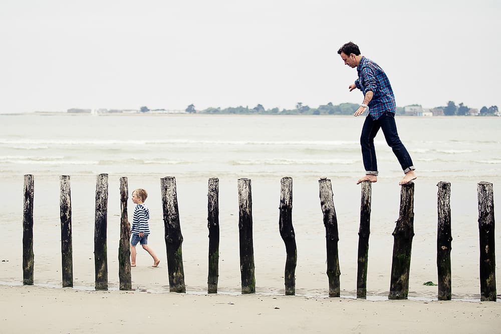
Often, photographers struggle to know where to place people in a big environmental shot. Triangles can be very useful in such situations, and the shape can be implied by using two additional points in the frame
Colour
A key photographic element is colour, and many photographers are familiar with the three psychological dimensions of colour – hue, brightness and saturation – but understand less about how colours work together.
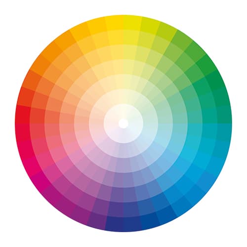
Everyone should understand which colours are complementary (opposite each other on the colour wheel and, when seen together, provide the greatest contrast, intensity and impact), and which ones are analogous (those that are grouped next to each other on the wheel resulting in more gentle and harmonious compositions). They should also know the importance of colour-harmony ratios for balance in the frame.
For example, you should consider taking a child in a yellow dress into a field of lavender, but not one dressed in purple into the middle of a field of rapeseed. This kind of knowledge means that decisions about wardrobe and locations can be made with confidence and lead to the creation of images with impact, or ones that have a soft, harmonious palette.
Why this shot works
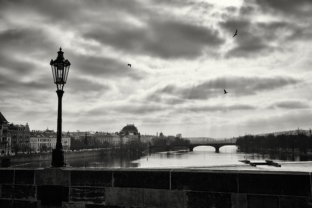
While this shot of Prague in the Czech Republic looks simple, there are a number of compositional techniques working together to create a successful image. I divided the frame according to the rule of thirds and used the lamp in the foreground to balance the bridge in the background. There are a number of leading lines to the bridge, including the rays of sunshine, the architectural feature on the weir and the converging lines of the riverbanks. These, together with the three birds in the sky, result in a gentle circular movement for the viewer within the frame. The light and the location also result in a high-contrast, dramatic image tonally.
One that nearly worked
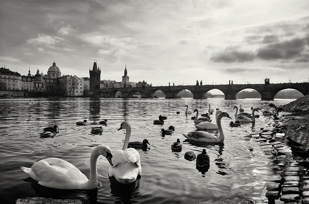
This image just falls short compositionally, which I find quite frustrating because I wanted it to be a better photograph! I like the way the curve of the bridge is mirrored in the swans’ necks and I like the light, but fundamentally there is just too much happening in the frame – the number of birds in the lower half is distracting and leads to visual unbalance.
One that didn’t work
 The above image demonstrates a composition that simply doesn’t work. The horizon line is not in the middle or on one of the thirds. The bridge is too near the frame edge, the weir results in a leading line directly to the white building, which becomes a distraction, and the boat is moving towards the right-hand side of the frame, therefore leading the viewer’s eye out of the image.
Kate Hopewell-Smith worked in creative industries and following a move out of London to raise her children, she studied photography as a hobby, which developed into a full-time business. She is a Nikon UK Ambassador and from September 2016 will be leading an intensive six-month professional photography foundation programme. www.trainingbylumiere.co.uk