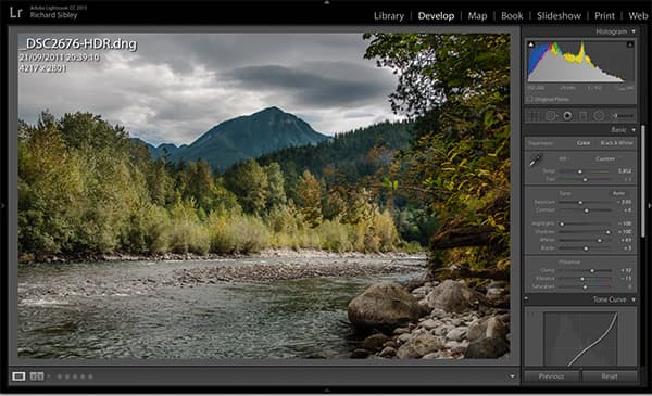
1. Histogram
The Histogram is fairly self-explanatory. As well as showing the tonal range, it shows the range of each different colour, which is helpful in that it allows you to make a quick visual assessment of the colour balance, or to see if any particular colours are blown out.
Clicking on the arrows at the top left and top right of the Histogram show the areas that are in total shadow or completely blown out. By default, these are shown in blue and red. This makes it easy when setting the Black and White points. Generally, you’ll always want some black in an image, and just a few specks that are completely white. While there are sliders for the various Black, White, Highlight and Shadow adjustments in the Basic tab, you can also adjust these by clicking, holding and sliding the respective area on the Histogram.
One final Histogram tip: if you click on ‘Original Photo’ you’ll have the option to create a Smart Preview of the image. This allows you to edit the image, even if the hard disk drive it’s on isn’t attached.
2. Exposure, Contrast, Highlight, Shadow, White and Black
It’s best to alter the Exposure, Contrast, Highlight, Shadow, White and Black controls simultaneously. There are a few key tips here, and the first is to think of the Exposure control as a midtone adjustment. When adjusting this, don’t worry too much about whether it makes the highlights or shadows too dark. Second, adjust the White and Black points. As discussed in the Histogram, make sure you have some black and, usually, some white in the image, but avoid very large black or white areas. To check this, use the Histogram clipping arrows, or hold down the Alt key when making any adjustments.
With the Exposure and Whites and Blacks set, it’s time to adjust the overall look of the image. Move the Shadows and Highlights controls to reveal or hide more detail, and then tweak the Contrast to select the look of your image. Once the contrast is set, you may need to go back and refine the Shadows and Highlights.
3. Clarity, Vibrance and Saturation
These three sliders are surprisingly straightforward. Clarity adjusts the local contrast and lowering it can soften the fine details in an image, which helps to reduce noise and pixelation. Increasing the Clarity increases local contrast, which can add a perception of sharpness.
Saturation increases the saturation of all colours equally, but Vibrance will only increase the saturation of more muted colours, so it doesn’t push up colours that are already nearly completely saturated. As a result, Vibrance is better for skin tones and for more realistic colours in landscape images.
4. Tone Curve
If you have used the sliders in the Basic panel correctly, then you shouldn’t need to do much, if anything, with the Tone Curve. However, like the Curve adjustment found in many editing software packages, it can help tweak the brightness of the image in specific areas.
5. HSL
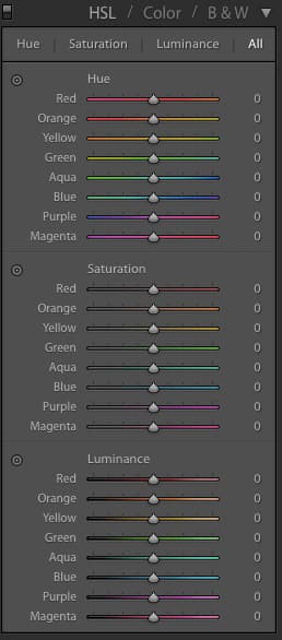
Individual colours can be adjusted to your taste
If you want to tweak specific colours, then the Hue, Saturation and Luminance panel is the best place to do so. Each colour channel has a slider where the Hue, Saturation and Luminance (brightness) of the colour can be adjusted. For specific adjustments use the Color Picker at the top left of the panel. Click on a colour in the image and then simply push up or down to increase or decrease the Hue, Saturation or Luminance – the software will detect the selection and adjust the relevant colours. This is handy if, for example, you want to adjust a blue sky. With the Luminance Color Picker selected, click on the sky and pull down to darken. Then select the Saturation Color Picker and push up to increase the saturation. This can help to create a polarised effect.
Alternatively, use it to make grass greener or duller, or to increase the saturation of the iris in a portrait.
6. Black & White
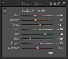
Adjust the grey tone by altering the colours
The Black & White panel is very straightforward. Like the HSL panel, it has a Color Picker. Use this Picker on a particular spot on your chosen image to increase or decrease the colour that’s selected. Increasing or decreasing a particular colour adjusts its brightness within the image and moves its appearance closer to white or dark grey/black. Think of it pretty much like using the colour channels in Photoshop, or using black & white filters.
Martin Evening’s expert tip
Clicking on the graph button in the bottom-right corner of the Tone Curve panel switches you from the Parametric to the Point Curve editing mode, where you can also choose to edit the individual red, green and blue colour channels, just like you can using the Curves adjustment in Photoshop. These extra colour controls can be used to apply strong colour adjustments to any image.
7. Split Toning
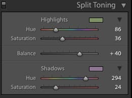
Split Toning is mostly associated with black & white images, and in this case it’s often used to replicate the look of certain toners or types of paper. However, it can be used on colour images. If you plan to use it on colour, bear in mind that it tends to work best when applying a very subtle tone to just the Highlights or Shadows – perhaps by using an orange or blue hue to make them feel warmer or colder.
If you up the Split Toning effect you may find that the image takes on the vintage film and print looks that are currently popular on smartphone apps like Instagram.
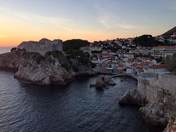
Before
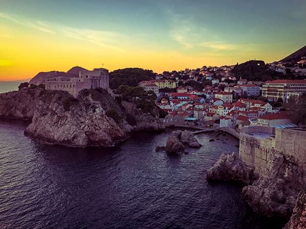
After: Split toning can also be used on colour images with dramatic effect
8. Detail
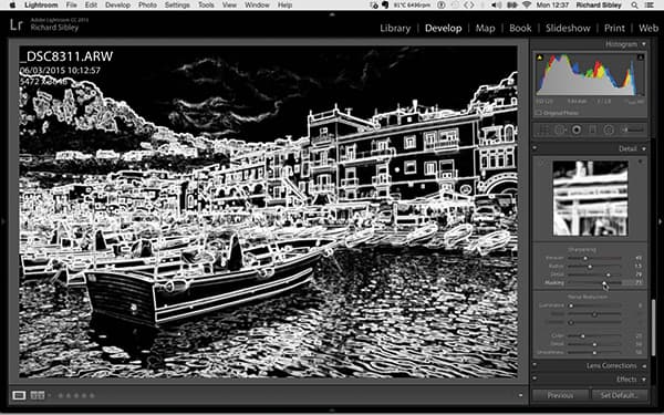
Holding down the Alt key when using the sliders in the Detail tab displays a preview
The key to successful noise reduction and sharpening is to keep the image looking natural and realistic. Over-sharpened photos with heavy noise reduction can be spotted a mile away, so err on the side of caution when applying these effects.
Sharpening has four sliders. The first is the Amount, which is the strength of the sharpening. How much you set this to will depend on the image and your taste, but between 15 and 40 is a good working range. The Radius slider determines the area around an edge pixel that is to be sharpened. Again, use restraint with this setting and aim to work in a range of about 0.5-2.0. The Detail slider controls the finer edges that are in the image, so this can usually be set quite high. Finally, the Masking slider acts as a threshold, allowing you to control where the sharpening should take place. Slide it to the right and you reduce the areas of the photograph that sharpening will occur, by ignoring less important edges and only sharpening the more obvious ones.
If you have lots of fine detail you’ll want to set the mask low on these areas. If you have very smooth areas with already hard edges that will respond well to sharpening, then use a higher amount of Masking. Using the Alt key shows a live preview of the mask. Make sure you always hold it down while using the Masking slider so you can see which areas are being sharpened.
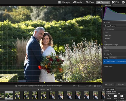
9. Lens Corrections
Original
The Perspective Distortion control can be too effective when set to full. Use Auto instead
In its current version, and a number of previous versions before that, Lightroom offers the option of automatic lens corrections. If Lightroom knows the lens an image was taken with, and has a profile for it, Lens Corrections can be automatically enabled. In fact, it can be a good idea to apply this setting when you’re importing an image. To enable the lens correction, select Profile and then simply Enable Profile Corrections.
The lens used should be automatically detected from the Metadata, and any vignetting or curvilinear distortion will be corrected. You can tweak these further using the respective sliders just below the Lens Profile details.
Chromatic aberrations can be removed with just a click in the tick box under the Color Panel, while purple fringing can also be removed. One trick here is to use the Color Picker tool on an area of purple fringing. Using the Amount slider will target this colour specifically when it’s next to any areas of high contrast, and it’s a very effective tool.
A fairly recent addition to Lightroom is its ability to auto correct and straighten any perspective distortion. This is found under the Basic panel. When used with a Profile correction, curvilinear distortion can be corrected, as well as any tilting angles in the images. There are three options: Level, Vertical and Full. Level straightens the horizontal lines, Vertical corrects the vertical lines, while Full corrects both of these at once. However, just how well this works depends on the specific image. If you want to have a go yourself, the various corrections for perspective can be found in the Manual tab.
10. Brush Effects tool
One of the biggest advancements in Lightroom has been the introduction of localised adjustment brushes. These allow many of the Exposure, Colour and Contrast effects to be painted onto certain parts of an image. It also allows some basic, localised, sharpening, noise reduction, de-fringing and moiré control.
To use the effects, simply select an appropriate brush size and make sure the image is displayed on screen at an appropriate size. While the Size control is obvious (it makes the brush bigger or smaller), the Feather control affects how soft or hard the edge of the brush is. The Flow control determines the strength of the brush, and the Density control regulates its maximum effect. For example, if the Exposure is set to +1EV and the Density is set to 50, the maximum effect that can be built up by the brush is 0.5EV.
It’s always good to bear in mind that with any of these effects, it’s worth starting lightly and building up as you go, in order to control the overall look. The great thing about these controls is that all you’re doing is choosing, and ‘painting’, one area to be affected. Happily, if you feel you’ve overdone a particular brushed effect, you can simply go in and alter the strength, rather than having to delete it and start again.
Finally, the AutoMask setting detects edges and makes it easier to mask certain areas. While this setting can be very useful, it may create a halo effect on edges if you use it too heavily. Instead, it’s worth going at it very carefully and using a feathered brush. Any very complex masking, such as around a subject’s hair, is still much better done in Photoshop than Lightroom.
11. Gradient and Radial Gradient
Both gradient effects apply a graduated mask. This feathers any of the effects from 100% to 0%. Used on landscape images it can replicate a graduated filter, and as well as changing the image’s brightness, it can also adjust the white balance, local contrast, highlights, clarity etc. The Radial Gradient creates a circular gradient, which is useful for applying an off-centre vignette or to lighten part of an image.
12. Presets
If your image has a certain style, it’s worth saving as a Preset so the adjustments can be applied to other images and even automatically as the images are imported. Remember that any exposure adjustments you make may not work for other images, so it can be best to stick to colour and effects adjustments when creating your Presets.
Other options
Sync
If you’re happy with the effects you’ve applied to your image, you can save time by syncing these settings with those of similar images. Simply click and hold down Shift to select a group of images, then press Sync and a menu showing all the items you can sync will appear. Select your settings, which will be applied to all images in the selection.
Create a Virtual Copy
If you right-click on any image, the menu will give you the option to Create a Virtual Copy. This creates another version in the Lightroom Catalog, but doesn’t create another file on your hard disk. This is great if you’d like to have a black & white as well as a colour version of the same image, without taking up twice the space on
your disk drive.
Martin Evening’s expert tip
Whenever you use the Graduated filter or Radial filter tools to add a localised adjustment, you can use the Brush edit mode in Lightroom CC or Lightroom 6 to edit the mask. The best way to do this is to enable the mask overlay, select the Brush edit mode and use the ‘add’ or ‘subtract’ brushes to refine the mask. Such edits remain independent of the gradated adjustment settings. This means you can brush-edit the mask effect, but also independently edit the gradated-effect settings to refine the filter gradation settings or the area covered. This is a great technique to use when you wish to darken the sky but there are objects jutting in to the graduated area.