Michael Freeman’s latest book, On…Composition, combines lots of newer and more classical approaches to help master this vital skill. Geoff Harris finds out more
The art of composition remains a challenging one for many photographers. It is not something you can buy, or master on a one-day workshop, but something that has to be developed through visual education, practice and perseverance. If you’re struggling with composition, or keen to try approaches beyond the rule of thirds, a new book by Michael Freeman, one of the UK’s most prolific photography writers, is likely to prove helpful.
In the book, Michael Freeman On… Composition, Michael asserts that ‘composition is the single most powerful tool in a photographer’s armoury. As the fundamental building block of image making, it’s a pure expression of individuality’.
The new book details both why and how theories of composition work and also uses eye-tracking technology to put these theories to the test. Teaming up with a company called iMotions, Michael put photographs through the latest eye-tracking technology to see exactly how viewers look at them – and whether the photographer’s ideas bore fruit.
‘It’s 15 years now since I wrote The Photographer’s Eye, which was all about composition, and in the time since I’ve thought more and been shooting more, to the point where there’s a new book’s worth of ideas,’ Michael explains.
Not about rules ‘As well as specific techniques, I’m showing how composition needs a purpose,’ he adds. ‘It’s absolutely not about rules, because there’s no such thing as a single “good” way to frame and compose. As I see it, there are three purposes for composition, not all at the same time. First, bringing some kind of order to the picture – that doesn’t mean a rigid order, but it does mean avoiding chaos.

Placement zones – an extreme corner placement of the man in a Nuba village, Sudan, helped to emphasise the context of the thatched houses as he faces in towards a pattern of triangles
Second, influencing the way the viewer will look at the picture, which might, for instance, mean a slight delay in getting to the point of the photograph. Third, simply to be interesting, to make it different and more enjoyable to look at.’
Michael honed his compositional skills through a mixture of experimentation (or learning by mistakes, as he calls it) and studying the work of other photographers. He is adamant that a good sense of composition, or ‘design’ as he prefers, is an absolutely fundamental skill-set that we all need for effective photography.
‘Put yourself in any situation, and while the lighting, subject or action may not be easy to do anything about, you can always compose differently, in your own way,’ he explains. ‘It’s the one guaranteed skill that can be personal to you.’
Michael describes his compositional style as precise, and favours neatness and order – yet he also encourages readers to follow their own temperament. ‘In a book like this, where I’m talking about what the ideas and actions really are behind each picture, I need to use my own work in order to be truthful and accurate.
So, at the same time I went to as much trouble as I could to embrace styles that are opposite to mine. And I actually have experimented over the years with different approaches, including “looser”. There’s quite a wide range in the book, and I’m offering this for readers to choose from as starting points, according to their feeling. It’s a kind of toolkit of possibilities.’
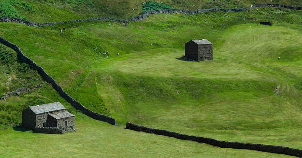
By facing into the image from upper left, the second stone building identifies the expanse of green as an element in its own right – ‘so that the two of them are in an unresolved balance that is still, to most eyes, acceptable’
Art of gold
The book also introduces a lot of concepts from fine art, as Michael is a passionate believer that all photographers can benefit from studying some of the techniques of great painters and other celebrated visual artists.
‘If you take all representational art, up to the early 20th century, most painters were trying to do what most skilled photographers do – convey an impression of a scene or a person or a thing that was realistic or emotional or atmospheric in one way or another. To me, photography as capture is in that direct line of history, and there’s so much to learn from painters like Turner, Claud Lorrain, Caravaggio, Monet, and more.
The same goes for quite a lot of abstract painting. But note I said ‘capture’. None of this applies to conceptual art, but then I’m not really interested in conceptual photography. Plus, it’s healthy to step away from the narrow confines of just photography, because if you look only at the work of photographers you admire, there’s a risk of becoming a copycat.’
While many of the images in the book are travel and documentary themed, Michael believes strongly that the ideas he is proposing can be applied across different genres. ‘In fact, although the bias is toward travel and documentary, I include studio, architecture and interiors, all of which I work in. There’s a fundamental difference between these “managed” genres and the found, reactive shooting that most people go for. I’ve tried to show in the book how each can translate into strong composition.’

‘When faced with visual complexity and disorganisation we search for the simplest forms into which this can be interpreted,’ says Michael. Good timing enabled a graphic construction of a circle enclosing a standing figure in this image from the Maldives
Stay spontaneous
How would Michael react to readers who might say, ‘I apply a lot of the concepts in Michael’s book instinctively, and don’t need to read it all again as I will lose my spontaneity.’
‘That’s okay. Not everyone wants to study or delve too deeply into the underpinnings of photography, and if spontaneity is essential for someone, that’s the way to stay. But I always remember Saturday morning music listening classes at school. The teacher had a hard
time with us because we weren’t really interested in Mozart or Tchaikovsky, but he persevered, even with popular music.
He said, “You may think that learning how music works will spoil your natural enjoyment of it, but it won’t. It will help you understand more.”
Michael often refers to masters such as Cartier-Bresson in the book, but rates quite a few contemporary photographers when it comes to superb composition and image design, too.
‘The contemporary photographers I pay most attention to when it comes to composition are those who can handle complex situations rather than minimalist ones, because that’s much more demanding. And not only handle, but make interesting, imaginative, unexpected. So, in no order of preference: Alex Webb, Gueorgui Pinkhassov, Stuart Paton, David Alan Harvey. On the side of clean, precise simplification, Nadav Kander.’
Finally does Michael think that photographers today have become too reliant on cropping and ‘fixing’ composition in editing software, compared to the film days – when photographers strived to get it right in camera?
‘Yes, unfortunately. In fact, the power of processing and editing software has encouraged “fixing” across the board, not just in composition. But at the same time, software has enabled extending the picture frame by pan-and-stitch (see the images overleaf). To my mind that’s a positive contribution to composition…If it’s planned in advance. So, as with all things digital, there’s a need for balance. Composition is a skill that should be practised at the moment of capture, however.’
Pairing, decrowding, matchmaking
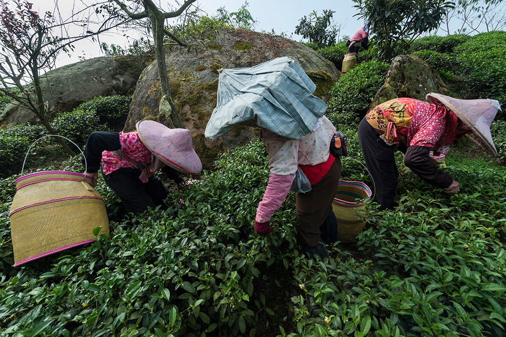
Potentially busy and messy when shot, this ‘decrowded’ scene has five subject elements that needed to be separated from each other in order to read well and be harmonious – in other words, resolved into a neat order, as here
For readers who want to apply some of Michael’s principles quickly with a fast-moving or fast-changing subject, he recommends pairing subjects (a couple at a music festival, for instance), along with decrowding. Decrowding includes finding a viewpoint and moment that lets you separate the different elements (such as several people), keeping them apart rather than having them overlap. ‘Another good approach is what I call matchmaking, which is looking for connections between things in the frame, like their shape or position.’
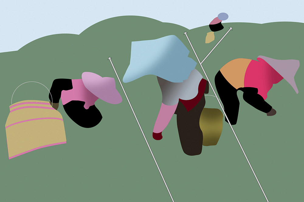
Salience & angular energy
‘Salience’ is one of the most important concepts in Michael’s book – basically, what the viewer will find important in a picture and so will catch their attention. ‘It’s a mixture of subject – faces, people, lettering – and graphics, such as shapes, and the contrast between anything and its background,’ Michael explains.
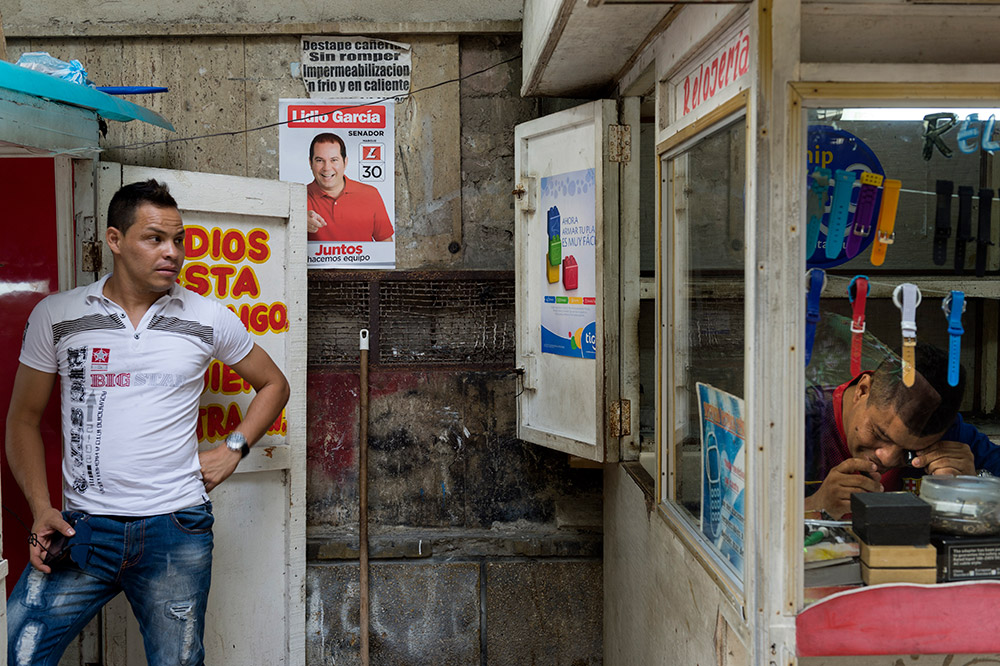
What’s most ‘salient’ about an image? Here the composition guides the viewer through the scene, starting with the face on the left, moving through the poster/lettering and then to the less-obvious face of the guy on the right
‘Some of the time you can use this natural effect to strengthen your picture, at other times it may fight what you want to do – such as signage distracting attention from what you want to be important.’ Michael is also eloquent when talking about angular energy. ‘Diagonals challenge and energise,’ he explains.
‘Multiples of diagonal lines usually reinforce each other, as you would expect, and if they are parallel, that’s fairly straightforward. However, if they’re at different angles, and particularly if they converge, there’s a stronger sense of movement and of drawing the eye.’
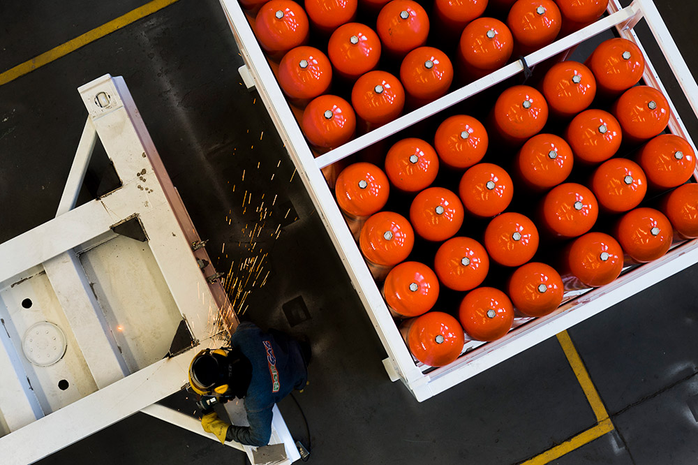
In this image of a factory making gas containers, Michael shot from overhead. ‘The diagonals bring energy and a counter-diagonal of sparks was an added bonus’
Thinking in triangles
Working an implied triangle into an image is another simple but effective tool. ‘The triangle is the simplest of all shapes, and any three prominent points suggest an triangle, unless they are in a straight line, because we have an innate tendency to “see” them given only a few visual clues,’ says Michael.
‘This visual urge is surprisingly widespread when it comes to triangles, more so than with any other shape. The “trick” is to make your suggested triangle interesting. That tends to mean unusual, or unexpected, coming together in a clever way. Complete triangles offer nothing to distract graphically and are simply subjects in their own right, but encouraging the viewer’s eye to imagine a triangle from a few clues adds an extra small layer of experience, and it makes the final image that bit more enjoyable.’
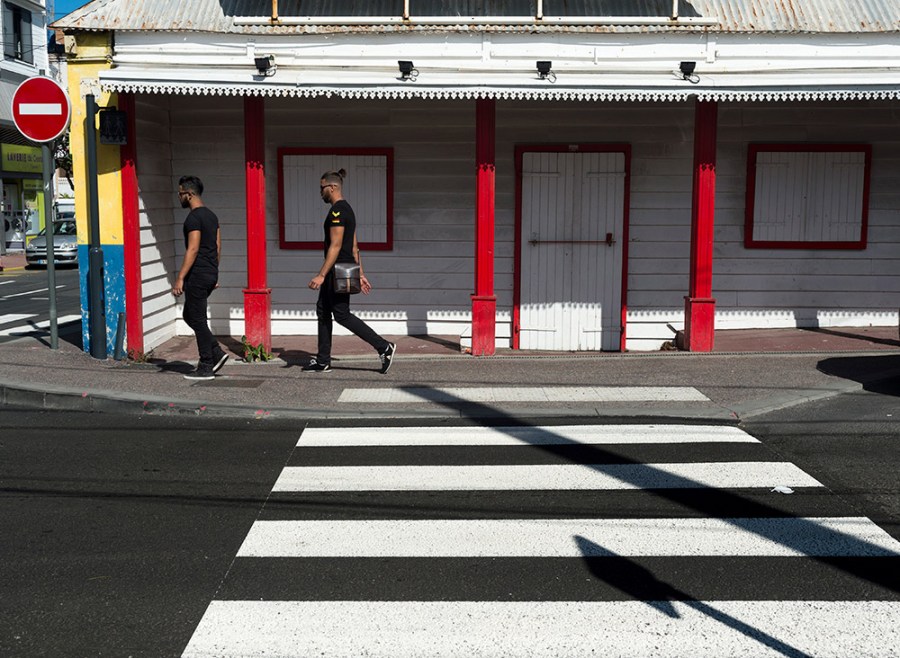
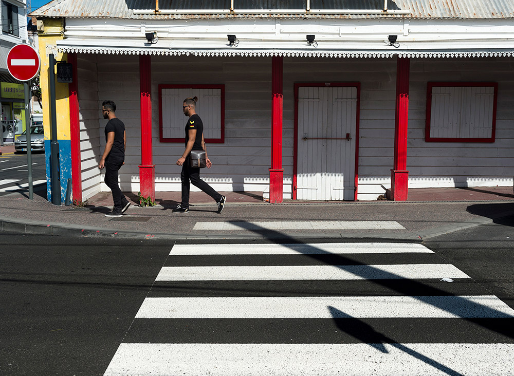
In this image, right, Michael was attracted by the splashes of primary colours and stark white and dark grey. ‘What raised the image a notch was the diagonal hard shadow of the lamp post, which went most of the way to adding a triangle as a graphic overlay. It needed a passer-by to complete it… as the second man reaches the apex of the almost triangle, his legs neatly do so.’
Using mirroring
‘Despite the many techniques for escaping the bad reputation of bullseye dead-centre composition, there are of course occasions to celebrate it and enhance it, and as long as they do stay occasional, they can be striking,’ says Michael. Mirroring is one of these, and as its name suggests, it relies on one half of the image being almost a mirror image of the other.

Shot in infrared, the view straight down between the rows of oil palms is strikingly symmetrical. ‘To make it more interesting compositionally, it was offset to the left in this pan-and-stitched image above. Versions with the man in a different position or absent were less effective.’
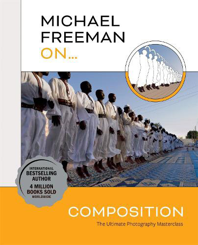
Michael Freeman on… Composition is published by Ilex Press with a price of £20. michaelfreemanphotography.com
ISBN 9781781578360
Get an exclusive discount on Michael Freeman… On Composition!
Special Price of £14.10 + UK postage £3.10 (£17.10)
Discount Code: MFOPMAY22
Discount expiry date: 30/06/2022
Please contact Hachette Distribution with the Discount Code, ISBN and delivery address to order with [email protected] or call 01235 759555 Monday to Friday 9am – 5pm
Further reading:
Beginners Guide to the Art of Photography and Composition
The secrets of photo composition

