Here are the top ten images uploaded to Photocrowd from Round Five, Architecture, with comments by the AP team and our guest judge. Be sure to enter the current round on Portraits, which is open now.
With so many of us living in towns and cities, architecture is a genre that’s open to the vast majority of photographers. It demands a precise approach, but it’s important to retain creativity and imagination, too. The top ten images here are all well seen, and often home in on the details of the scene, potentially creating something entirely new from the architect’s vision.
But, as is so often the case, it’s something fresh and original that has caught the judges’ attention, as can be seen from the winning image.
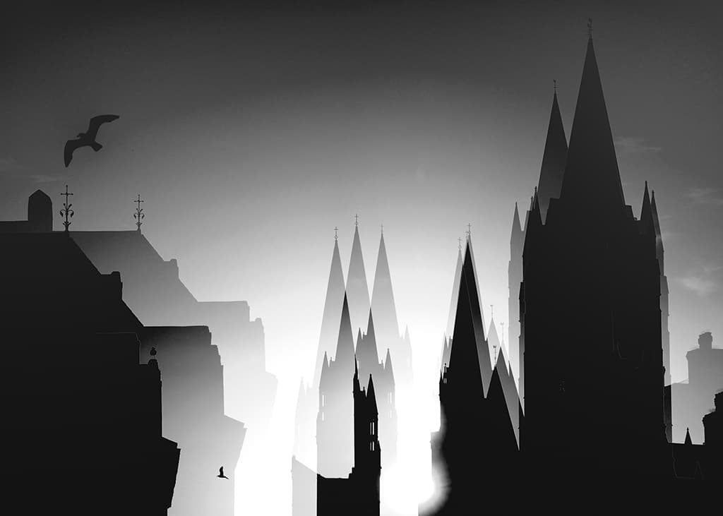
1 Roy Curtis UK
100pts Nikon D800, 80-400mm at 140mm, 1/2500sec at f/13, ISO 200
Guest judge David Clapp says: ‘This image is a double take. When I say that, I don’t mean the multiple-exposure technique that is handled so well, but the fact that upon first glance, it appears to be Charles Bridge in Prague. With gothic towers silhouetted against light, the positioning and subsequent overlaying spires (which create new spires in themselves) portray a mesmerising hat tip to this travel photography destination, astonishingly from the heart of Truro in Cornwall.
No photographic artist wants to appear indistinct, and Roy has achieved something truly unique and timeless from a UK destination. The seagulls, both airborne and observing, are so essential to the compositional balance, as too are the small vanes on top of all the roofs, adding another gothic feel, far from our modern lives. Perhaps some greater delicacy with processing (there are artefacts) could improve things further, but the concept, camera technique and visual impact held this image high above the rest.’
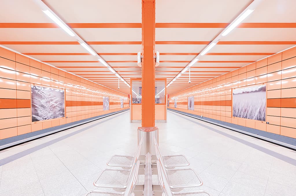
2 Helen Trust UK
90pts Canon EOS 5D Mark IV, 16-35mm at 16mm, 1/20sec at f/2.8, ISO 640
If you were to ask a photographer what they look for when shooting architecture, the answer is highly likely to include balance and symmetry. Helen’s image makes exceptionally good use of both these elements. Splitting the image straight down the middle goes against the rule of thirds convention, but it works beautifully.
To step even slightly to the right or left would have caused the composition to be completely off-kilter. The precision with which she has set up the shot is to be admired. It might have been tempting to wait until somebody came along in order to add some human interest, but without that added element, we are left with a superb, almost futuristic, result.
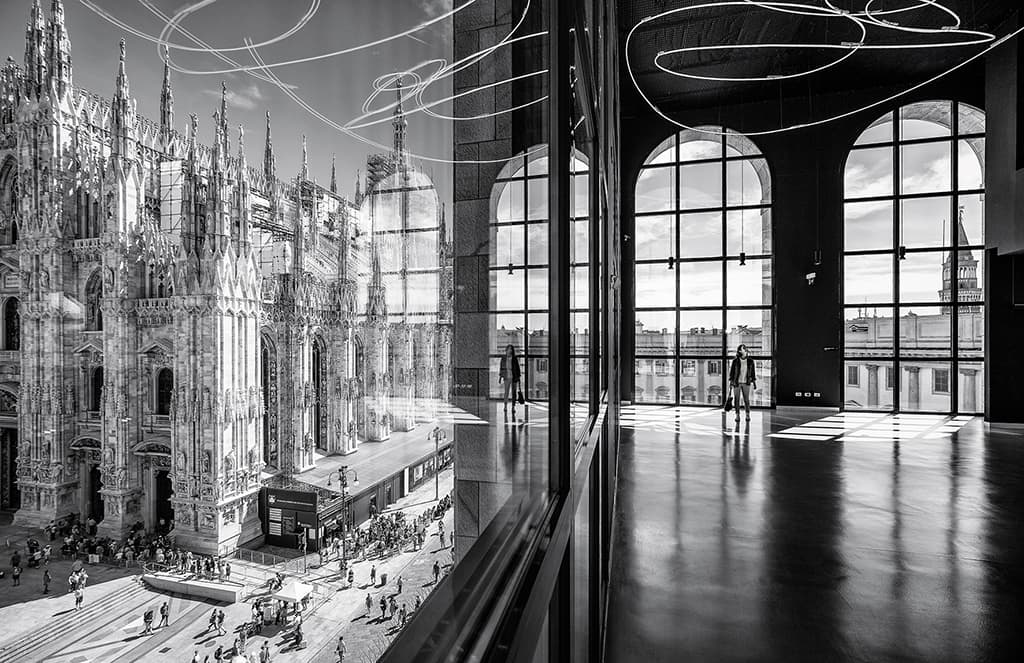
3 Marco Tagliarino Italy
80pts Canon EOS 6D, 16-35mm at 16mm, 1/160sec at f/5.6, ISO 100
Contrasting classic and modern architecture is a popular approach to the genre, and Marco has achieved an excellent result here, which is both imaginative and even a little surreal. Milan Cathedral stands proudly on the left, with the bustling hordes milling around the Piazza.
On the right, we have a solitary figure who is separated from the crowds by height and plate glass. Converting the image to black & white helps reduce any potential visual confusion that might be created by the swirl of light and its reflection. A tricky scene that has been well seen and shot.
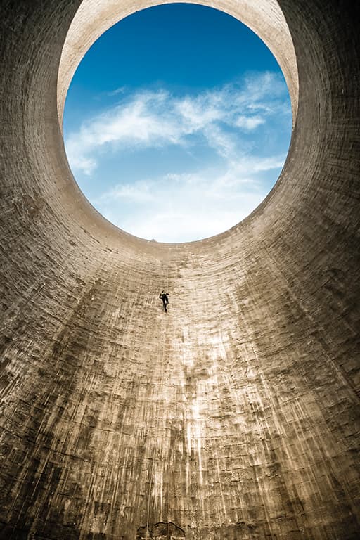
4 Fabio Sartori Italy
70pts Olympus OM-D E-M5 Mark II, 14-150mm at 14mm, 1/250sec at f/8, ISO 500
It can be a challenge to find a new way of approaching industrial architecture, but we have a spectacular example here, with Fabio’s image. At first, it appears to be a pretty simple composition, but then we see a great deal of care has been taken over it.
Cropping so that the circle of blue sky at the opening of the cooling tower is just short of the top of the frame is a bold and highly effective approach. We also want to ask who the figure is. An engineer? An abseiler? Whoever they are, the image would be all the poorer without them, because they add a sense of scale that is essential to the success of the shot.
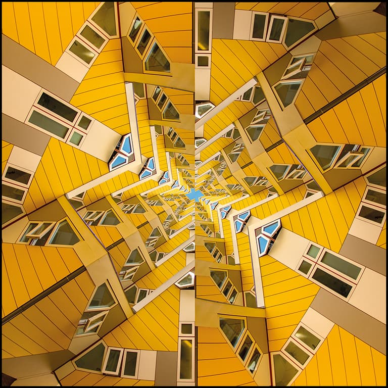
5 Darrell Godliman UK
60pts Nikon D7200, 8mm, 1/320sec at f/3.5, ISO 200
With this extremely well-executed composite, Darrell has taken what in real life is a single-storey building, and turned it into a playful and eye-catching digital image. He has been bold with his approach, but also controlled at the same time.
It would have been easy to go over the top and end up with a confused mess, but by concentrating on the effect of the multiple triangles leading the eye to the centre of the frame, he has created a graphic and engaging image. Retaining the blue elements is an important touch, as they give the eye something to rest upon within all the yellow. It’s a clever and inspired result.
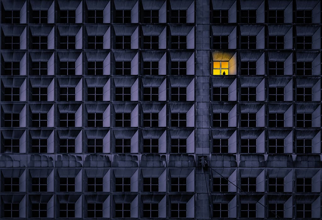
6 Claudio Sericano Italy
50pts Canon EOS 600D, 18-55mm at 30mm, 1/40sec at f/4.5, ISO 250
This image is rather like a still from a dystopian film. The steely blue-grey tones and the repetition in the buidings’ crosses and squares is compelling. Then, of course, we have the mysterious silhouette in the brightly lit window, bang on the intersection of the thirds. The whole thing is fascinating. Claudio doesn’t say so in his caption on Photocrowd, but the image appears to be a composite – and that’s absolutely fine. He has had a clear and powerful vision for an image in his mind, and has set about creating it in a skilled and imaginative way. Very well done.
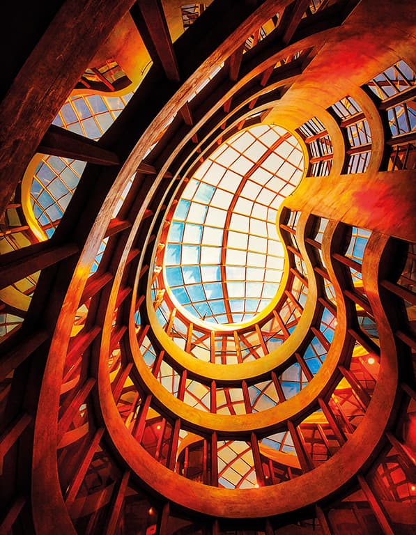
7 Roy Frankland UK
45pts Apple iPhone X,4mm, 1/100sec at f/1.8, ISO 32
Who wouldn’t want to photograph this ceiling, which forms part of the Gran Hotel Havana in Barcelona? Its shapes and dramatic orange colour cries out to be looked up and marvelled at. The sinuous curves have been placed well within the constraints of the frame, with the eye led neatly towards the kidney-shaped window at the top. Roy used an iPhone X to take this shot, and has demonstrated that camera phones are capable of more than just snaps.
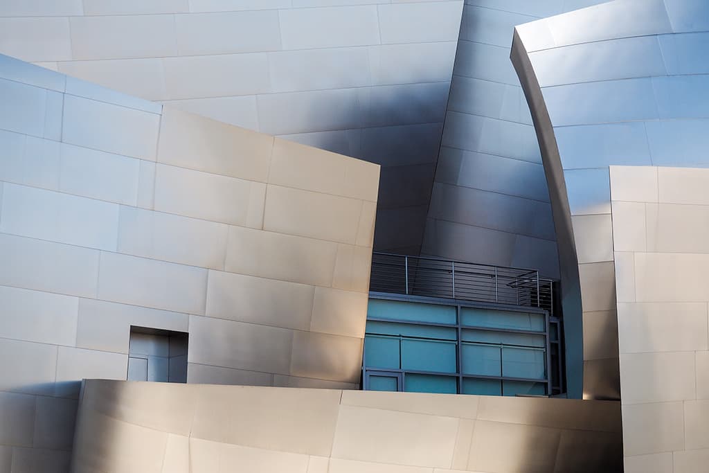
8 Neville Morgan UK
40pts Olympus OM-D E-M10, 14-42mm, 1/320sec at f/9, ISO 250
The Walt Disney Concert Hall in Los Angeles, designed by Frank Gehry, provides an embarrassment of photographic riches for anyone with a camera. Its sinuous curves and reflective surfaces make an appealing and challenging subject. The building as a whole is so dramatic, the temptation must have been for Neville to include it all in the frame.
However, he showed laudable restraint by homing in on only a small section of the structure. Within the constraints of the frame, he has managed to give the viewer a very clear flavour of the architecture, with a shot that has depth and interest throughout.
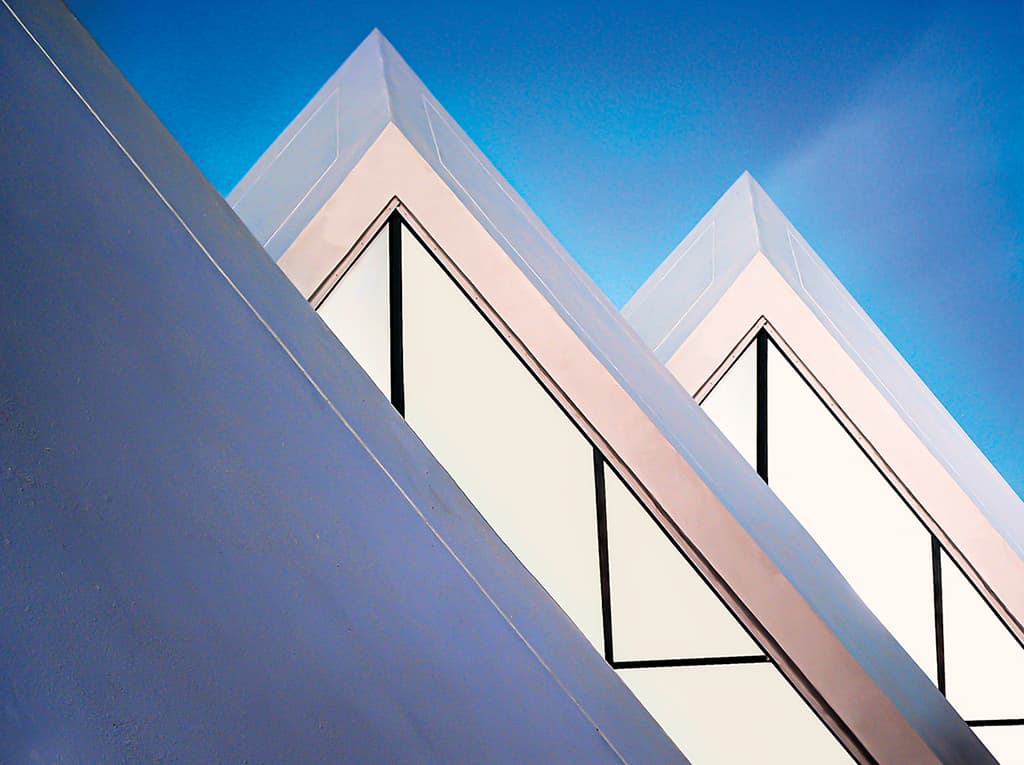
9 Ulrike Unterbruner Austria
35pts Pentax Optio A30, 7.9mm, 1/100sec at f/8, ISO 64
Many of the images in our top ten stand out for showing only a detail of the overall structure being photographed, and Ulrike’s minimal shot is another case in point. It’s almost like one of those challenges that ask the viewer to count the number of triangles in the frame. Every line and point has been placed perfectly, and it’s a rare case where a plain blue sky acts as the ideal foil for the main subject.
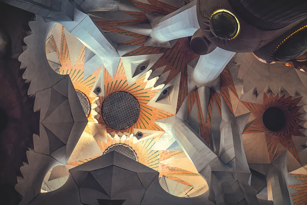
10 Andy Fowlie Germany
30pts Sony A7R III, 24-105mm at 105mm, 1/125sec at f/4 ,ISO 640
Light is as important in architectural photography as it is in any other genre. Here, Andy has used it to draw the viewer’s eye towards the sunflower-like pattern in the centre of this section of ceiling at Gaudi’s La Sagrada Familia cathedral in Barcelona. As with Neville Morgan’s image above right, the challenge here is to distil the essence of the scene within the photographic frame, and narrowing it down to this vignette would have been no mean feat. The shaded areas around the periphery of the scene have been well controlled, and there is plenty to keep the eye interested.
Round five winner, Young APOY
Hugo Begg Australia
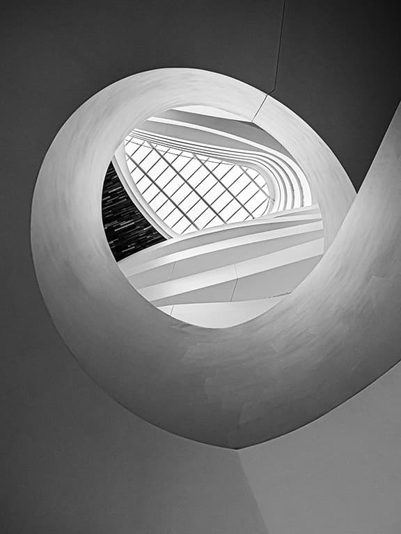
100pts Panasonic DC-G9, 12-40mm at 12mm, 1/160sec at f/5, ISO 320 Hugo submitted several very strong images to this round, but this was the one the judges unanimously felt should be awarded first prize. The spiral is a common subject in architectural photography, but Hugo has done a good job of making a particularly interesting image from this one. He has balanced his composition well, giving slightly more space at the bottom than the top, and has exposed the shot skilfully so that all the detail is retained, right through from bottom to top. The tones are beautifully rendered, and the image is neither too flat nor too contrasty. A measured and carefully composed shot.
The 2021 leaderboards
Pete Baker and Jayne Bond maintain their positions in first and second place respectively, with Marco Tagliarino coming out of nowhere into third, showing how much the rankings can change from round to round. There’s no change to the leader of Young APOY, either, but Hugo Begg’s winning image has seen him jump from fourth to joint second. In the camera club rankings, Truro have hopped from fifth to third place. Keep up the good work!

Winning kit from MPB
The gear our winners used can be found at MPB. Roy Curtis shot his intriguing, round-winning composite with a Nikon D800, which is renowned for its outstanding quality and high-resolution images, thanks to the 36.3MP full-frame sensor.
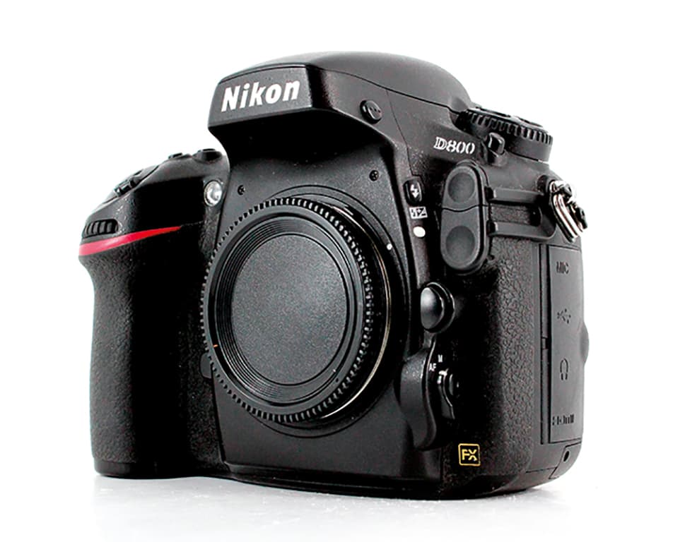
It is the sort of camera that particularly appeals to landscape and architecture photographers and, with the added feature of 1080p video, it is a great tool for helping push your photography to the next level. A model in excellent condition at MPB will cost you £669, or you can expect to pay £604 for one in good condition.
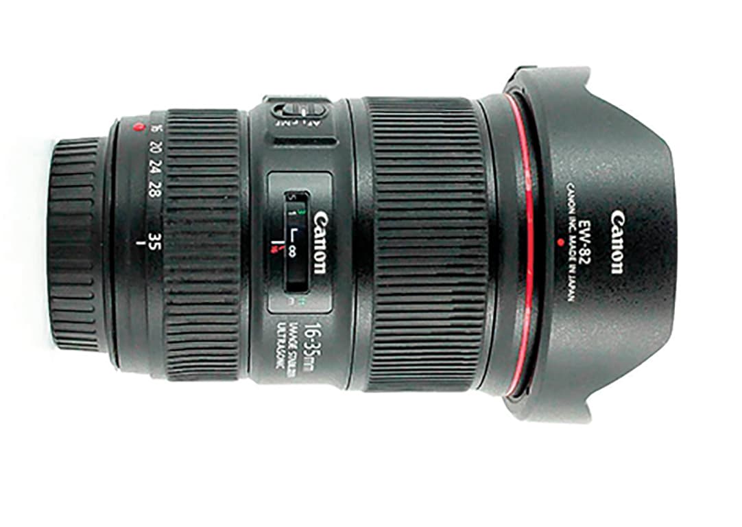 In third place, Marco Tagliarino used a Canon EF16-35mm f/4L IS USM lens to create his almost surreal shot of Milan’s Piazza Duomo. This pro-standard wideangle zoom is hugely versatile, outstandingly sharp, and with its wide constant aperture, gives the photographer huge scope for creative images. Pick one up in excellent condition from MPB for £709, or £644 for one in good condition.
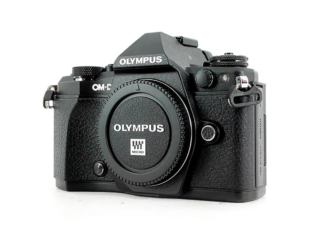
Coming in at fourth, Fabio Sartori shoots using an Olympus E-M5 Mark II. A mirrorless model that features up to 60fps and 5-axis image stabilisation, it’s the ideal tool for handheld photography. They go for £354 in excellent condition at MPB,
or £319 in good condition.


