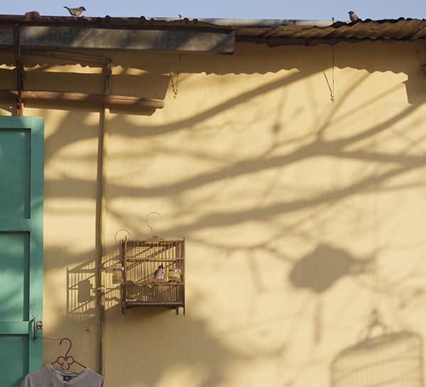
Photo: Three Birds
Taken by: Peter Dorman
Panasonic Lumix DMC-GF1, 20mm, 1/1600sec at f/2.5, ISO 125
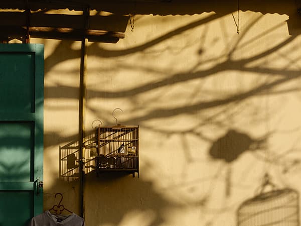
Peter says he was drawn to the shadows and the colour of the wall in this scene from a trip to Vietnam. The colours are very pleasing, and I love the shadow of the bird cage on the wall. For me, that is the most important element, and I want it to be one of the first things that people notice. As a result, while I like the title ‘Three Birds’, I’m going to sacrifice the two on the roof because I think they are a distraction.
Peter’s exposure has opened up the shadows so they blend with the midtones, but really we want them to stand out as a feature in their own right. I’ve created a shot that shows how the scene might have looked with about 11⁄2 stop less exposure, and you can see how the power has shifted towards the shapes of the shadows – making the cage more prominent in the frame.
Peter’s crop is neither square nor a proper rectangle, so I’ve made a suggestion about how he might have framed the scene differently. I’ve cropped out the sky and added some extra door to the left so we can have a 4:3 ratio image that is native to the Panasonic Lumix DMC-GF1 he used to take the picture.
This is a very well-spotted scene, and one that Peter has done well to capture the way he wanted it. We sometimes need to be braver with our exposure, though, and spend more time detecting distractions. It’s a great effort.


