Tamron SP 150-600mm f/5-6.3 VC USD review – Introduction
In the same way that all little boys want to be astronauts, all budding photographers dream of long lenses. Right? Well, perhaps not all, but the super-long lens is surely on the wish list of many who have yet to realise that they won’t actually need one.
Those, however, who become interested in sport or wildlife, or any other subject that is difficult to get close to, will rightly want a long lens to facilitate a hobby that simply can’t be successfully enjoyed without one.
The problem with long fixed-focal-length lenses is that they also tend to have long price tags of the type that exclude all but those who can earn money from ownership, those who are simply well-off, and those who are prepared to sacrifice holidays, mortgage payments and a new car to get one.
Even the cheaper of the two fixed 600mm lenses on the market retails for more the £7,000, and unless you are happy to gain the same reach from the £350 Panasonic Lumix DMC-FZ200 bridge camera, there are not too many choices available.
For some time, Sigma has produced a very popular 150-500mm f/5-6.3 lens, and has enjoyed something of an exclusive in the independent lens market for those going on a once- or twice-in-a-lifetime safari, but now that position is challenged by a lens that reaches just that much further.
The questions that remain are just how much of a compromise are we making when we buy one of these super-telephoto zooms, and how practical are they to use?
Tamron SP 150-600mm f/5-6.3 VC USD review – Build and handling

Image: Shooting at f/16 and ISO 400, I managed to handhold a shutter speed of 1/250sec with the help of Tamron’s VC system and an elbow resting on my knee
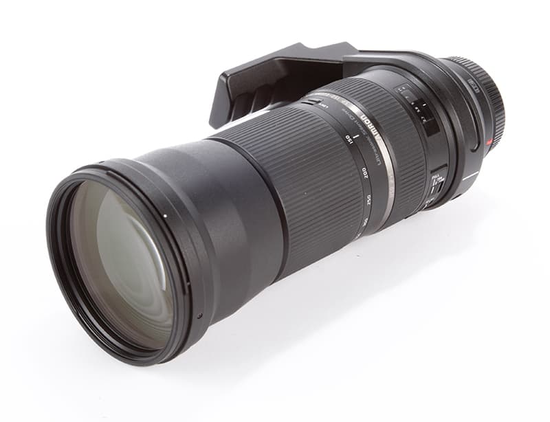
It would be unreasonable to expect a lens that extends from 150mm to 600mm to be anything other than large and heavy, so it should be no surprise that the Tamron SP 150-600mm f/5-6.3 VC USD is just that. Slightly longer than the Sigma 150-500mm f/5-6.3 lens, the extra 100mm of focal length adds 41g to the weight and 9mm to the diameter of the barrel – the filter size is 95mm instead of 86mm. Some of that weight and additional size comes from the physics of designing this lens to be 100mm longer while maintaining the same f/6.3 maximum aperture opening at that longest focal-length setting. Had Tamron used the same barrel diameter as Sigma’s 150-500mm optic, we would have expected a maximum aperture closer to f/8 – so the size is absolutely necessary for focusing systems to have a chance of seeing the subject.
Tamron has used 20 elements in 13 groups in this construction, and employs three LD (low dispersion) elements to maintain tight focusing of all colours – and to prevent what we see as coloured fringes on high-contrast edges. We are treated to the same excellent VC (Vibration Compensation) system that we have enjoyed in other recent premium Tamron lenses, such as the SP 24-70mm f/2.8, and Tamron’s still-new USD (Ultrasonic Silent Drive) motor that aims for both speed and low noise in the AF system.
What is new is what Tamron calls eBand lens coatings – eBand stands for Extended Bandwidth and Angular-Dependency. In short, this new coating is applied on top of Tamron’s standard coating layers to add extra strength to its anti-reflectance efforts. Light approaching from acute angles is encouraged to pass through the glass instead of reflecting off it – thus we should enjoy lower levels of flare, fewer internal reflections, better contrast and be able to suck more of the light from the subject into the barrel.
I’m quite a fan of Tamron’s move back to using wide-ribbed rubber grips on its zoom and focusing rings, and enjoyed the sure feel of the textured surface on this lens. Both rings feel the same, however, and are separated only by about 30mm of barrel; I found that with my eye to the finder I often turned one when I had hoped to turn the other. Time and use, I suppose, would make us all more used to this.
The lens is supplied with a non-removable, and substantial, foot that is used to attach the unit to a tripod – saving the lens from dragging the mount off your camera. The foot is well placed, and makes for a nice balance once there is a camera attached to the mount. A securing ring releases the barrel so that the lens can rotate, though there are no click-stops to let us know when we have reached 90° for a portrait, for example. A little guesswork is required, especially if the top of the lens is above head height.
The build quality of the lens is generally very good, and I suspect the unit will stand up to a good deal of wear. Tamron tells us that a rubber seal where the mount meets the camera forms a moisture-resistant barrier, so we don’t need to worry too much about a bit of rain.
Tamron SP 150-600mm f/5-6.3 VC USD review – In use

Image: On a bright sunny day, the camera and lens combination struggled a bit with fast moving gulls, though I did manage to catch this one in action
I used this lens with a Canon EOS-1D X to tone the muscles in my right arm and to ensure I was allowing the lens a premium AF system with which to display its worth. And it did well.
What we need to be careful of when buying a lens like this, and others that close to small maximum apertures, is that we don’t forget what we are using, what our cameras need, and the laws of photography. AF systems are not usually operating at maximum efficiency when they have only an f/6.3 aperture’s worth of light to work with, and inevitably they will find life hard. The EOS-1D X picked out stationary subjects nicely enough, but found flying geese quite a challenge when the lens was used at its longest focal length.
As well as a good AF system, you will also need a camera that doesn’t mind shooting at high ISO settings. When we set the lens to 600mm we need a shutter speed of at least 1/600sec, and if our aperture is f/6.3 we will need ISO 600 even on a bright day. Of course, few lenses perform at their best wide open, and with this model we need to close to f/10 for the neatest edges, so once more the ISO needs to head in the more sensitive direction. I found that long-end shooting meant settings of ISO 1600 to maintain a safe shutter speed without the use of a tripod – and that is on a nice day. That’s the physics and maths of the specification, before we get to how well the lens has been designed.
The built-in optical stabilisation system is of course a great help in the matter of reducing the ISO setting and keeping shutter speeds longer, but for best resolution at that long end, especially when photographing finely textured subjects, we should err on the side of safety, not risk.
It is some time since I used a focal length as long as 600mm, and I was surprised once more that it doesn’t actually get as close to small creatures as I had expected. Last time I was shooting lions and wildebeest, so blue tits and robins featured really quite small in the frame from a distance of five metres. Extenders are not really an option with super-zooms such as this, unless you are happy to focus manually through a dark viewfinder, but for cars, bikes, foxes and larger wildlife, the reach of the lens will be perfect.
Zoom lenses tend not to offer exactly the stated focal lengths marked on the barrel, and I was interested to compare the difference between the angle of view of this lens at 600mm and of Sigma’s 150-500mm optic at 500mm. The results show that there really is a difference between the two, and whether either is accurate or not, you gain significant extra reach with the Tamron.
Tamron SP 150-600mm f/5-6.3 VC USD review – Image quality

Image: f/8

Image: f/10

Image: f/16
We haven’t been able to put this lens through our usual lab tests, but it is easy to see that when used wide open, fur and feathers do not render brilliantly. Closing to f/10-16 produces the best results, and then quality tails off towards f/40. This isn’t a surprise, and I think most of us could have guessed that without even looking at the images. The softness at wide apertures is uniform across the frame at 600mm, but becomes an issue only when we’re shooting at 400mm and longer. At the long end of the zoom, f/6.3 is to be avoided if possible, in favour of apertures with better definition – starting with f/10 and running until f/16 and f/22. The difference in depth of field at normal distances between f/10 and f/22 is marked, and will suit different subjects equally well, and in practical terms the range between f/10 and f/22 should provide enough for all of us to get by.
For distant subjects I favoured f/16, and was very pleased with the results of silhouetted cranes against a setting sun. With the aid of the VC system and an elbow dug into my leg for extra support, I was able to achieve 1/400sec at f/16 and ISO 400 – and the lens rendered a very pleasing level of detail.
With as many elements as it is necessary to use in the construction of a lens of this type, flare and internal reflections are extremely difficult to deal with. Tamron has done a splendid job of it, though, and only when I shot almost into the sun did I experience anything that I would describe as reduced contrast. The shot, the seed head of a reed, still retains plenty of detail, and the main patch of flare is extremely well contained in a small area. The same shot shows the characteristics of out-of-focus highlights – not quite round at f/11, despite the nine curved iris blades, but pleasant enough for my liking.

Chromatic aberrations are also very difficult to deal with in a long lens like this, and for the most part Tamron has managed very well. The shot here, of birds flying against an orange sky, demonstrates clearly the success of the LD elements. The hard edges of the silhouettes in the centre of the frame are delightfully clean, while those on the left have a mild cyan edge, and those on the right an outline of red. But these coloured outlines are slight, and not nearly strong enough to destroy our images.
Yes, the lens suffers from corner shading, to a noticeable degree when shooting flying birds against a clean blue sky, and it delivers pincushion curvilinear distortion too – at both ends. But really, I’m not sure we all care too much about either of those two faults. If you intend to use a lens like this for document copying or architecture, you should expect all that is coming your way. In natural subjects, such as wildlife, these faults will go unnoticed most of the time, and if there were compromises to be allowed, the designers have chosen well.
Tamron SP 150-600mm f/5-6.3 VC USD review – Our verdict
Tamron has made a very good job of producing what must be an incredibly difficult lens to design and build. All lens design is a balance of one compromise against a host of others, but when dealing with a set of focal lengths such as this and trying to direct it all into a budget that will still appeal to the enthusiast pocket, the acceptable middle ground is mighty slim. It would take a miracle, and a couple of extra thousand pounds to make those wide apertures anything other than an opportunity to let light onto the AF sensors, and we shouldn’t expect to be able to use them for fine detailed work.
Even though this is a lens that costs all but £1,000, there is no getting round the fact that for the focal lengths it offers, it is a budget option. That we have to use f/10 and beyond for critical sharpness is just one of those things, and we will have to learn to live with it. When the lens is sharp it is sharp enough, and more than capable of producing excellent results. We have to tailor our conditions somewhat to gather enough light, and that might mean Kenya instead of Kent, but we have sunny days in the UK too. Tamron’s colour controls are admirable, and for the natural subjects we are all most likely to aim this lens at, the other aberrations are in the main insignificant.
That only leaves the physics of the specification, and as someone who did manage to become an astronaut famously reminded us from the control room of the Enterprise, there’s not much even Tamron can do to change that.