Creating a photo book can feel like tackling a three-dimensional jigsaw puzzle in your head. To ease the strain, Tracy Calder asked three book-loving professionals to spill the beans about costs, collaboration and content when making your own photo book
Keith Wilson
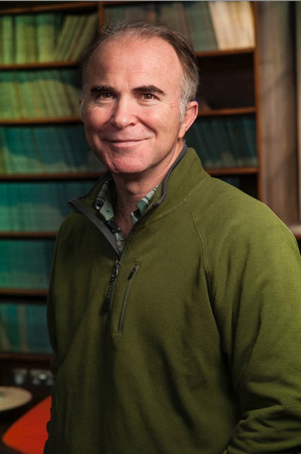
Keith Wilson is an award-winning photo editor, journalist and author. He is the co-founder of Photographers Against Wildlife Crime™, an international group of leading photojournalists and writers who have combined their talents to produce two highly acclaimed photo books about the illegal wildlife trade. Keith is also a Fellow of the Royal Geographical Society Visit www.keithwilsonmedia.com.
‘When I started in my journalistic career anything that was self-published was derided and labelled as vanity publishing,’ recalls Keith Wilson as we catch-up over Zoom. This idea seems laughable now as I admire the award certificates for HIDDEN and Photographers Against Wildlife Crime on the wall behind his desk.
‘Now, of course, a lot of the very best books are a result of self-publishing and crowdfunding,’ he confirms, as though reading my train of thought. In recent years the traditional book publishing model has changed dramatically, and photographers are often expected to help out with the cost of producing and/or marketing their book.
‘If they’re asking for your financial support in the first place then you might just as well do it yourself,’ laughs Keith. Self-publishing leads to a lot of hard questions and the first is whether or not your project is actually book-worthy. ‘The more original the idea is, the better,’ says Keith.
‘When I sit down with people the first thing that goes through my mind is, can I think of anything like this, on this particular subject, that’s been done before? If not, then it’s got a good chance of being noticed.’ The next step is to consider the size of your audience and how you will get your book into their hands.
‘It’s amazing how many photographers don’t give the same level of priority to marketing and distribution as they do to the design, layout and editing of their book,’ says Keith. ‘It’s in those areas, if you don’t do your homework, that you can really get your fingers burnt.’
Keith is accustomed to working with multiple contributors on a project (HIDDEN featured the work of around 40 photographers and Photographers Against Wildlife Crime featured more than 30), so I’m keen to know his thoughts on what makes a successful collaboration. ‘Give and take,’ he smiles. ‘You’ve got to trust in each other’s skills and experience, and you’ve got to respect each other.’
It also helps if the people that you work with truly believe in the project. ‘With both of these books, people got behind what we were trying to do,’ remembers Keith. ‘If you have the same purpose and want the same outcome then there really shouldn’t be a problem.’ It can be tempting to save money by taking on as many jobs as possible, but this can prove to be a false economy, as Keith reveals.
‘I encourage photographers to collaborate with people who are really good at what they do in terms of writing, designing and editing, because a single photographer does not have all of these attributes. You also need to consider other perspectives, or you run the risk of missing the obvious.’
Keith also advises finding a printer with an established reputation in printing photography books – he often uses EBS (Editoriale Bortolazzi Stei) in Italy – but he warns against visiting in person if you lack the appropriate experience. ‘If you’re going to go to a printer take a person who is an expert in post-production and on-press production with you,’ he urges. ‘Watch them, let them make the critical decisions and then learn from them.’
When you’re making an image selection and deciding on the sequencing of your book it’s a good idea to enlist help. ‘Find someone knowledgeable who you can trust,’ says Keith. ‘For one, it stops you from including pictures just because you like them.’ It’s also important to include a variety of viewpoints and subject matter.
‘You don’t want people turning the page because they think they’ve already seen that picture,’ warns Keith. ‘You have to be ruthless in your editing and recognise where the gaps are.’ It can help to think of sequencing a bit like writing a novel – you need to move from one frame (or paragraph) to the next without losing the flow or making the joins visible.
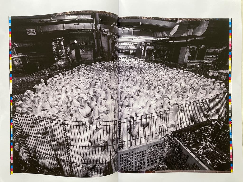
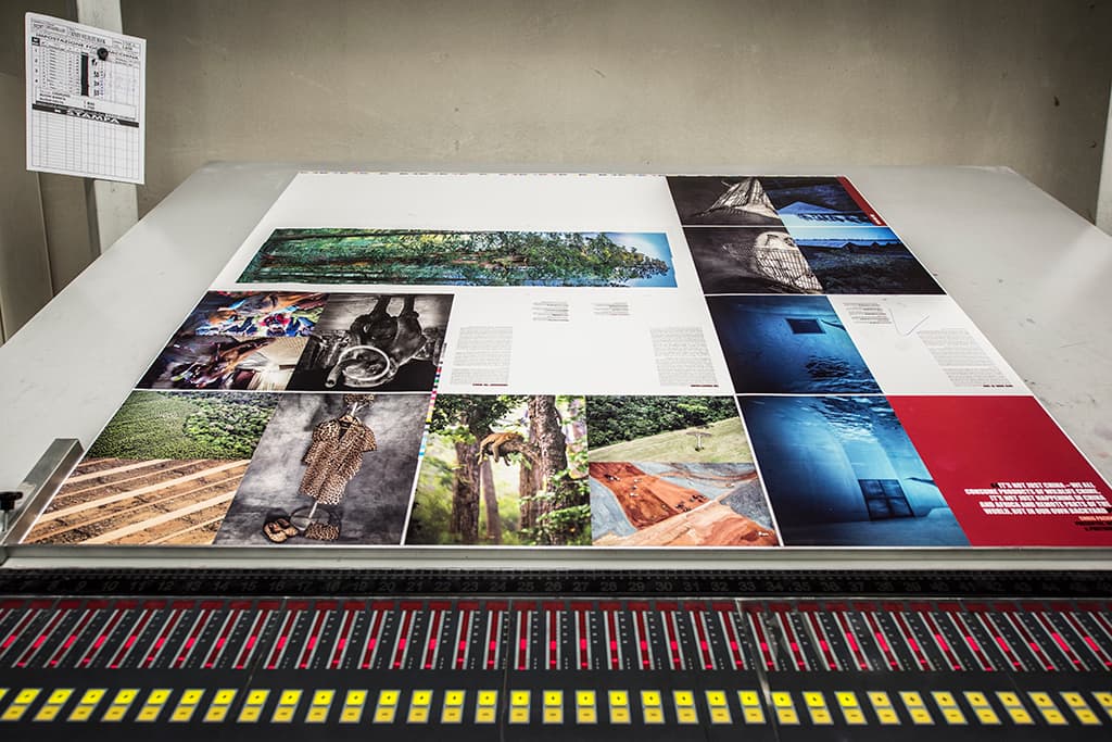
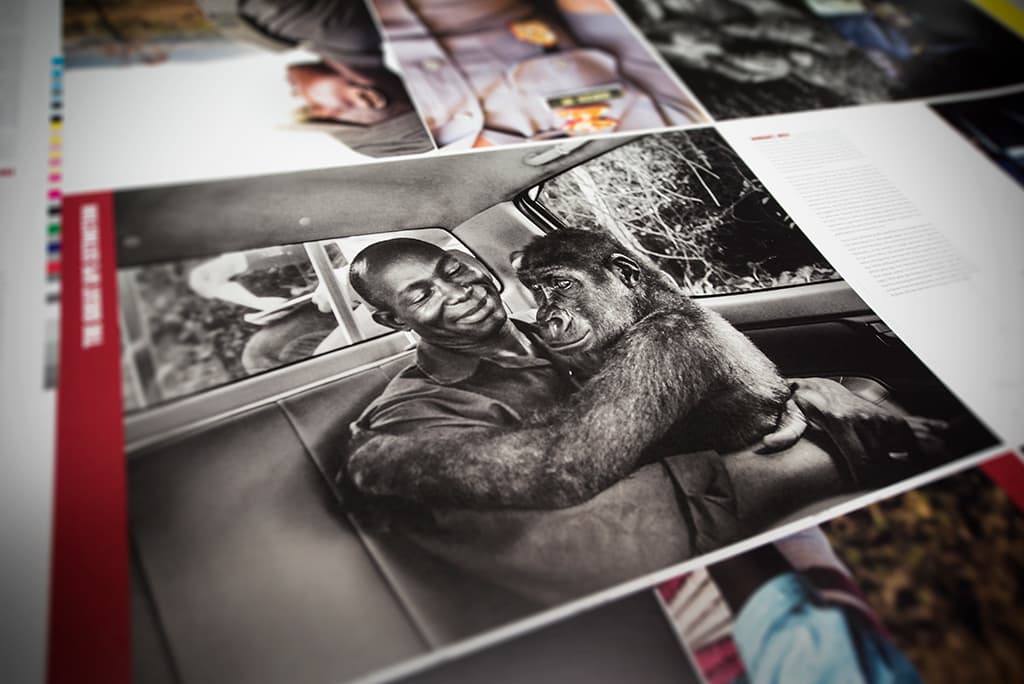
An Ozalid proof, taken directly from the plates prior to the start of printing HIDDEN: Animals in the Anthropocene
Many of the books Keith works on include text, and he’s keen to outline the benefits of providing context to your pictures in this way. ‘For me a powerful picture is one that asks questions of the viewer,’ he says. ‘If you’re looking at a picture, and you’re absorbed in it, but there are lots of questions in your mind, then you need answers.
The picture can’t always provide the answers and that’s where journalism is important – it supports the power of the picture. As a result, the worth of the picture increases and it becomes more relevant and valuable to whoever is looking at it.’ All of this must be carefully balanced, and every detail attended to. One false move and the message may be diluted or even destroyed.
‘Books can become very collectable and valuable if you’ve done your job properly,’ says Keith, ‘but get one aspect wrong and they can depreciate faster than a Fiat Panda, leaving you with hundreds of unsold copies.’
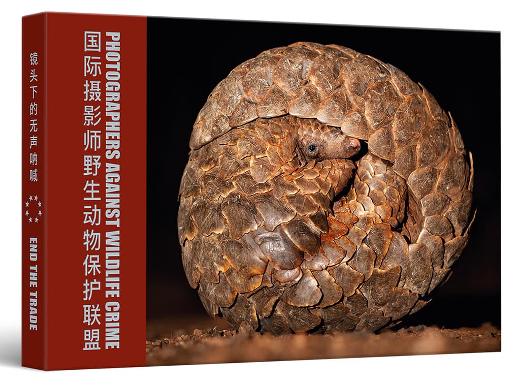
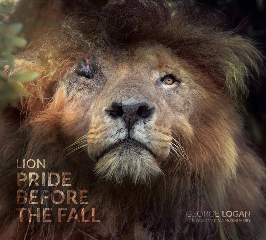
Cover of the award-winning second edition of Photographers Against Wildlife Crime, printed in Chinese and English
Keith’s top tips
l Find a way of making your photo book extra collectable: consider a limited-edition run with a signed print, a few books with different covers or perhaps a boxed version.
l When choosing your pictures and designing your book don’t think of it as an exhibition – it’s a completely different form of presentation. For one thing, a picture on a wall does not have a gutter down the middle!
l The more books you print the cheaper each copy is, but be realistic and avoid over-ordering. You also need to be aware of the cost of distribution, post and packaging.
Lizzie Shepherd
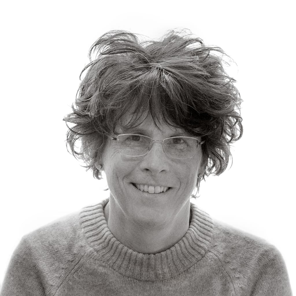
Lizzie is a professional photographer based in North Yorkshire who specialises in landscape, nature and travel photography. She runs small group photography workshops, offers one-to-one tuition and is a speaker and writer. Lizzie is currently working on a guidebook to the Yorkshire Dales and hosts workshops on making handmade photo books. Visit www.lizzieshepherd.com, Facebook: LizzieShepherd Photography, Instagram: @lshepherdphoto.
A handmade book is a tactile thing: the weight, smell, texture and sound of the paper combines to create a rich sensory experience. ‘I often think it would be fun if they were scratch and sniff,’ laughs Lizzie Shepherd as we settle down to chat. Lizzie became interested in handmade photo books after attending a workshop run by John Blakemore in 2015.
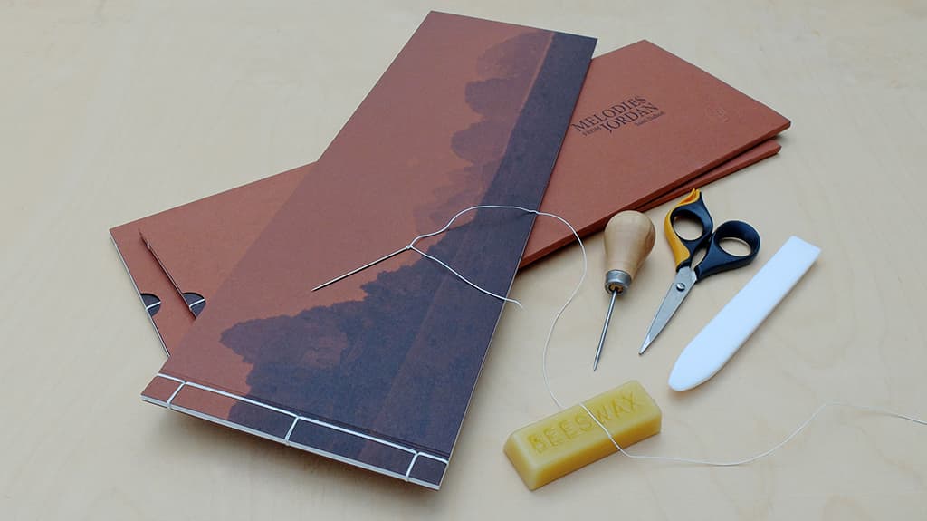
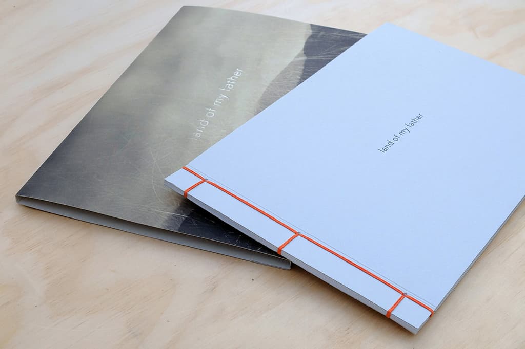
‘It was a great opportunity to meet and learn from one of our greatest photographers,’ she recalls. In the years that followed she found herself working away from home a lot, but her love for handmade books never waned and after attending a course on Japanese bookmaking (this time hosted by Joseph Wright) she was hooked.
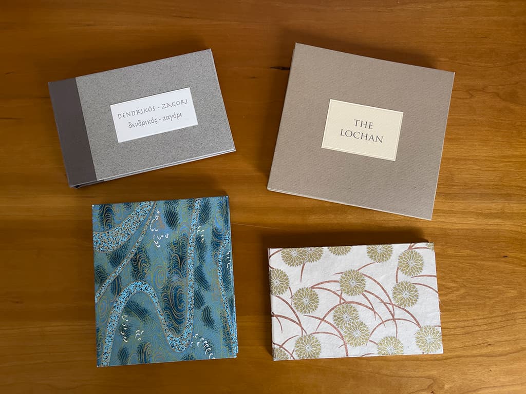
‘I love the fact that you have complete control over how the book looks, because when you send something off to a printer there is always an element of the unknown,’ she suggests. ‘Also, unless you’ve opted for one of those really expensive paper stocks there isn’t the same kind of bespoke feel to it.’
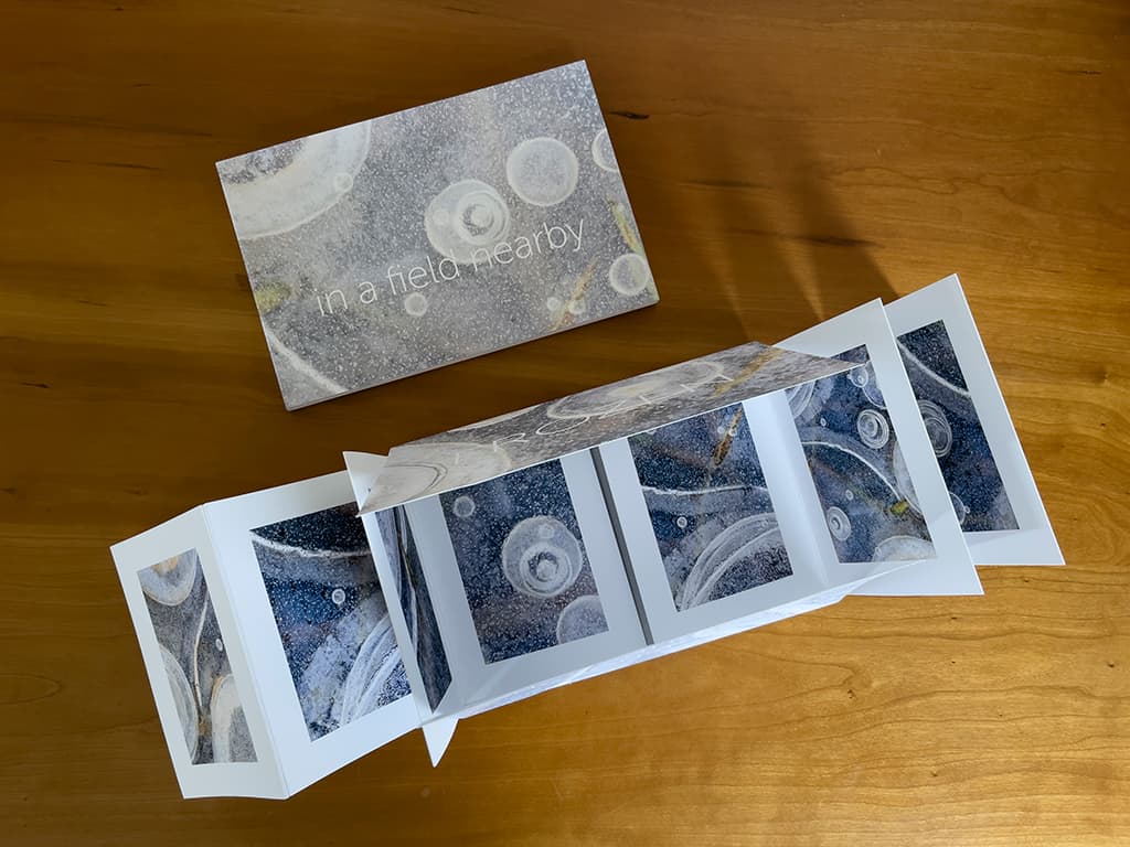
Lizzie’s favourite style of handmade book is the concertina. As the name suggests, these books are created by cutting and folding a single piece of paper, which can be collapsed or extended. ‘They are very tactile things,’ she echoes. ‘The paper and everything I’m using doesn’t look dissimilar to a print I might sell.’
One of the first concertina books Lizzie made is entitled The Lochan and features a series of beautifully composed intimate landscapes. Aside from being a lovely object, it’s also a great example of effective sequencing. ‘In the middle there’s a bogbean image that I wanted to use, but it didn’t fit in with the rest,’ she explains.
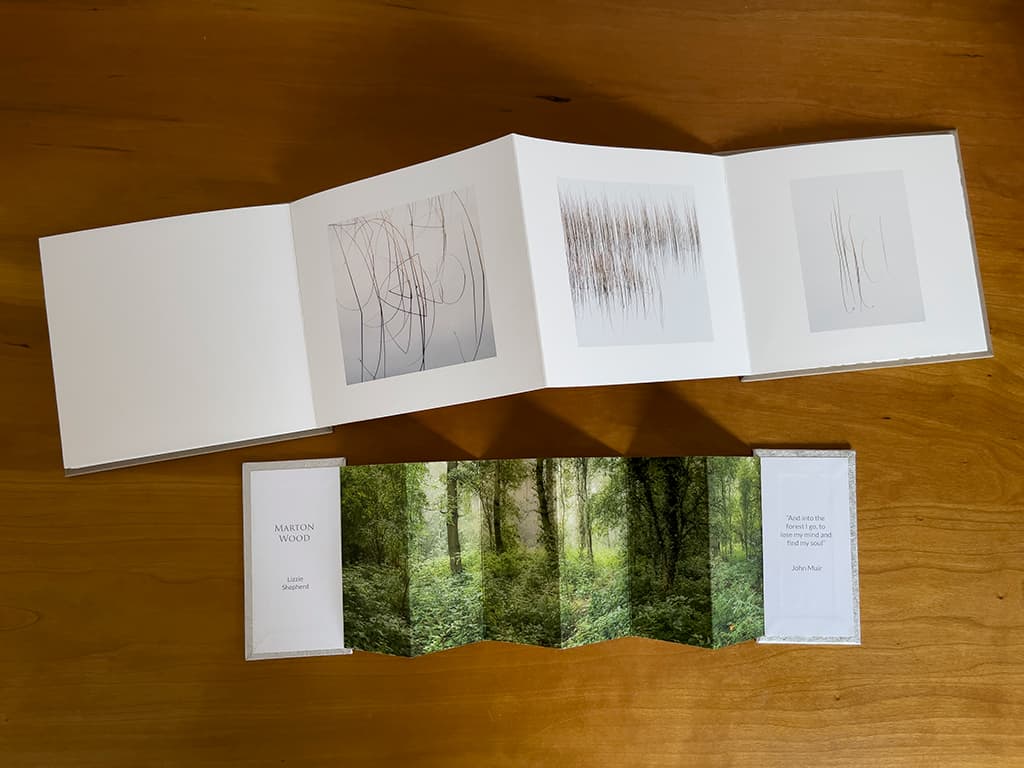
‘Tonally it worked, but it’s very much a different subject.’ To resolve the problem Lizzie physically separated it from the other images, giving it its own space. ‘Sometimes you can find a way to make something work when it feels like it won’t,’ she grins. Lizzie faced a similar issue with a book she made about the Atlantic. ‘I wanted to include a foggy seascape, but initially it didn’t fit in with the pictures I’d selected,’ she recalls.
After weeks of tweaking the flow she replaced a few pictures and then struck on the idea of including text on the page facing the foggy seascape – it worked like a dream. ‘It’s trying to think about all of these things as you go along.’ When it comes to sequencing there are a number of approaches.
‘You can order the images according to subject, chronology or visual flow,’ says Lizzie. What strikes me most about her approach to bookmaking is that the planning begins way before the first piece of paper has been cut. Working in Lightroom Lizzie creates collections and ‘dumps’ images into them as and when themes emerge.
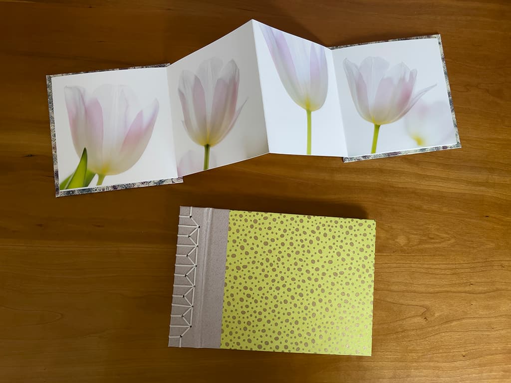
‘I will look at these collections, get rid of anything that doesn’t fit stylistically, and print out what remains,’ she explains. ‘I will then lay the prints on the floor and shuffle them around. I will live with them for a bit and see what happens.’ When it comes to visual content Lizzie is keen to stress that you can’t really go wrong, but if you decide to add text, it’s good to be cautious.
‘Once or twice I’ve not been happy with the font I’ve chosen and it has had quite a negative impact,’ she warns. Picking up a little book she turns to the title page and demonstrates how a font can overpower an image. ‘I knew it was too big, but I had already printed it and I didn’t want to do it again,’ she confesses.
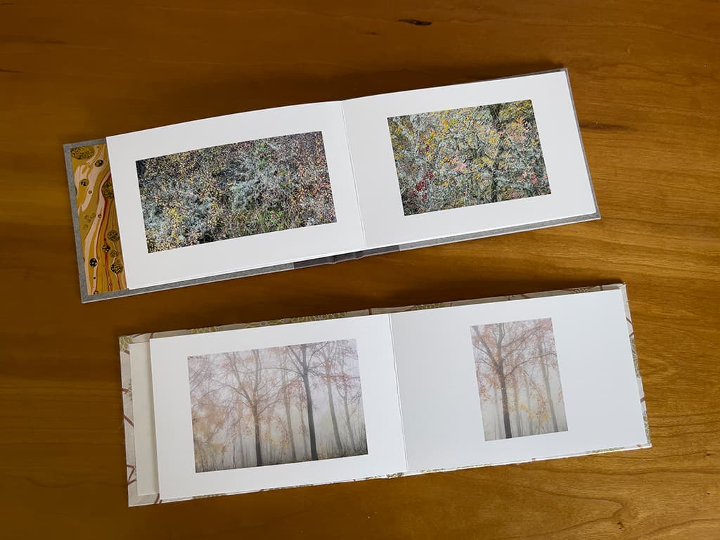
By way of contrast, she holds up a book where the text and images complement each other perfectly. The balance is spot on, but it’s hard to pinpoint why. ‘A lot of photographers are graphic designers, so I watch what they do with their fonts,’ says Lizzie. ‘I won’t pretend to have their knowledge but by observing them I’ve developed a pretty good idea of what looks good.’
According to Lizzie, most mistakes happen during construction. ‘If you rush or your workspace is a mess it’s easy to make mistakes when you’re measuring, cutting or gluing,’ she warns. ‘I still do it myself!’ Looking at her stack of perfectly executed handmade books I’m prompted to ask if she finds the process meditative.
‘The bits where everything is going well can be,’ she confirms, ‘but gluing can be quite the opposite!’ She also admits that stitching sections with a needle and thread is not really her thing. ‘I don’t even like sewing buttons on,’ she laughs. ‘I only want to take the craft side of things so far. You can make all sorts of amazing books, but they are almost more about the book than what’s in them. I’m definitely from the “content is king” school and I’m looking for the best way to dress that up.’
Lizzie’s top tips
l Express yourself. You’ll often come across people who try to dissuade you from using certain fonts. Don’t be deterred – if you like it, give it a go!
l Try before you commit. If your book is particularly complex, make a prototype out of scrap paper before committing yourself to any cuts or folds with your chosen paper stock.
l Don’t give up. If a picture doesn’t fit in a sequence but you really want to include it, try separating it from the others with blank pages or sensitively placed text.
Eddie Ephraums
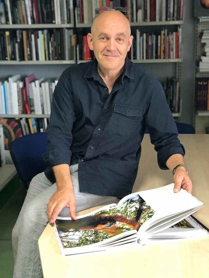
A highly experienced photographer, photo book maker and printer, Eddie is founder of London-based Envisage Books, his mentoring and publishing consultancy. Eddie works with both established and emerging photographers on a wide range of books from single-copy hand-made artist’s photo books to mainstream publications. He is a respected teacher and workshop leader. Visit
www.envisagebooks.com.
Before embarking on a creative collaboration with a photographer, Eddie Ephraums believes it’s important to ascertain what success looks like for them. ‘The currency of success isn’t just financial,’ he suggests. ‘Photographers need to be clear about what they want and what they are measuring success by.’
With decades of experience in bookmaking, Eddie has a refined sense of what makes a good book and a firm grasp on the financial implications of taking on such a project. As a seasoned pro he sees the same issues crop up time and again. ‘A lot of people struggle to get a sense of the scale of the project,’ he reveals.
Is it a book they should be printing 50 copies of and selling at a private launch or a local café (which can be great) or are they feeling more ambitious and trying to raise money for conservation, say, in which case they might commit to print 5,000 copies. It’s about judging the scale of the project and being clear about what you intend to do with it.’
Part of Eddie’s role is to explore, and explain, all of the known factors that might affect the success of a book before any work gets started. There are so many variables regarding production values, budget etc that sometimes the easiest place to start is at the end. ‘If a photographer is planning to sell a book, I start by asking them how much they hope to sell it for and work back from there,’ he reveals.
‘I’ll ask them how much money they want in their bank account at the end (or how big a deficit!)’ Eddie jokes, but there’s an unpalatable truth behind his comment – few people realise how expensive it can be to produce a high-quality photobook. ‘Most people have no idea what it might entail,’ says Eddie.
‘In their mind they upload a book to Blurb (for example), receive a hardback copy and pay £40 and they think that’s expensive. I, on the other hand, think that’s cheap!’ Another issue is that people often tend to underestimate the level of work and commitment involved. ‘The creative part can be a brief flurry at the beginning and then you’ve got to be in it for the long haul,’ advises Eddie.
Occasionally, photographers will come to Eddie with preconceived ideas, but some projects just aren’t suited to a book format, as he explains. ‘Sometimes I might be thinking well this project would make a great exhibition because you could see all the pictures at a glance in a room and you wouldn’t need to start in one particular place; but with a book there is a beginning, a middle and an end and you don’t see all of the pictures at the same time – the impact is quite different.’
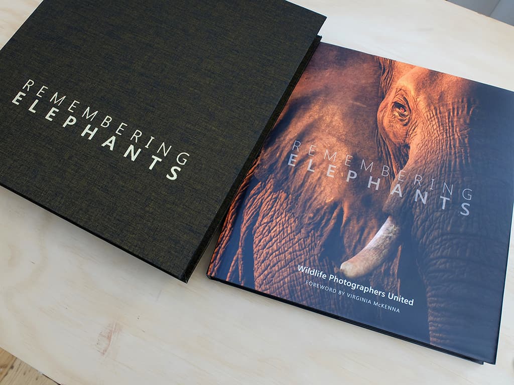
Some books, such as Remembering Elephants, have a clear narrative – in this case the lifecycle of an animal – but most books are less linear. ‘You also have to bear in mind that many people (myself included) pick up a book and open it at the back,’ laughs Eddie. ‘What’s that all about?’
With so much knowledge about the way people view images Eddie can sometimes decide on the sequencing of a set of pictures in ten minutes but he admits it usually takes him much longer and depends on the scale of the project. ‘With a self-published book containing, say, 20 images I place the files in a folder on my Mac and view them as large icons,’ he explains.
‘I move the files around – deciding what would make a good double-page spread etc – and order them within that folder. It’s like shuffling cards around!’ With the sequencing decided (and the size, format and number of pages already known) Eddie creates an Affinity Publisher document and drags and drops the images onto it.
‘I’ll then fine-tune the design depending on how much text there is, whether or not there are any captions, page numbers etc,’ he reveals.
When he’s positioning the images Eddie has to consider a number of things: how will the book be handled, for example, is it intended to be held or opened and laid flat? Where will the gutter fall? How is the book going to be stitched or glued?
‘You’re thinking about all of these different things and playing with a sort of mental three-dimensional jigsaw puzzle,’ he smiles.
One of the biggest decisions Eddie and a client will make concerns paper stock. ‘The paper is hugely important,’ echoes Eddie, ‘the feel of it, the sound of it, the smell of it, the way it holds, reflects and absorbs ink.’
Naturally, the relationship between paper and ink changes depending on whether you use an offset-litho printer or a digital-ink printer. ‘When you print on uncoated paper using an ink-based digital press the ink will sit more on the paper, compared to traditional litho where the ink will soak in and you will get a totally different look and feel,’ explains Eddie.
Technical decisions aside, I’m curious to know whether Eddie thinks we should ask ourselves if the book we’re creating adds value to the world before ordering hundreds of copies. ‘Yes, you have to be brutal,’ he agrees. ‘You have to look at your baby – this beautiful thing you’ve created – and say in what way is this going to add value, and if you can’t answer that then forget it.’
Eddie’s top tips
l Print it out. Never judge typography using a computer screen – it’s impossible. If your words are going to be appearing in a printed book, then you need to print everything out and create a dummy copy.
l Be there in person. Where possible, selling books face-to-face (perhaps through a gallery, café or exhibition) can be really effective. Using this method, you don’t have to cover shipping costs and having seen the work and talked to you, people develop a relationship with the book and are much more likely to buy it.
l Be realistic. Print enough photo books to cover your costs but don’t over-order. If you print 500 copies of a book on a really obscure topic and sell 450 that’s amazing, but human psychology dictates that you will look at that pile of 50 remaining books and feel like a failure.
Further reading


