Steve Fairclough investigates the inside story of the innovative and controversial cover of the Rolling Stones’ classic LP, Sticky Fingers…
Fact File: Rolling Stones’ Sticky Fingers
Musicians: Mick Jagger, Keith Richards, Mick Taylor, Charlie Watts and Bill Wyman. Other musicians who played on the album were Ry Cooder, Jim Dickinson, Rocky Dijon, Nicky Hopkins, Bobby Keys, Jimmy Miller, Jack Nitzsche, Billy Preston, Jim Price and Ian Stewart.
Released: 9 April 1971 (Atco/Atlantic Records – US release), 23 April 1971 (EMI – UK release)
Best chart performance: No. 1 in the album charts in the US, UK, Australia, Canada, The Netherlands, Norway, Spain, Sweden and West Germany.
Sales: Over 3,400,000 certified sales
Fascinating fact: Amongst all of the controversy surrounding the crotch front cover of Sticky Fingers it was banned in General Franco’s Spain as being ‘obscene’. The alternative design for Spain showed fingers in a can of treacle with a can opener below. It was designed by John Pasche – the then student who produced the original ‘lips and tongue’ Stones logo concept – and Phil Jude, who would later photograph the goat’s head for the inner sleeve of the 1973 Rolling Stones’ album Goat’s Head Soup.
In April 1971 the Rolling Stones released Sticky Fingers, which is arguably the band’s greatest ever studio album, given that tracks such as Brown Sugar and Wild Horses have become stone-cold rock classics. But equally memorable was the controversial LP cover – it showed a denim jeans-clad crotch, with what appeared to be a semi-erect penis underneath, and had a real, working zipper embedded on the cover cardboard. The zipper could then be pulled down to reveal another crotch underneath that was wearing white underwear.
The creation of the iconic album cover involved legendary pop art guru Andy Warhol and the design genius of US-born art director Craig Braun and his company, the Sound Packaging Corporation. Braun was known as a designer of sophisticated album packages, starting out with the 1967 Velvet Underground & Nico album cover, which was adorned with Warhol’s famous banana print – this could be peeled away from the album cover to reveal a suggestive pink banana underneath. Braun explains, ‘I started working with Andy [Warhol] about ’66 or ’67. Then I got involved with the Stones cover because their contract was up.’
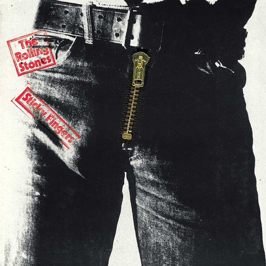
© Andy Warhol/Craig Braun/ Sound Packaging Corporation/EMI/ Rolling Stones Records. The UK version of the cover of the Rolling Stones’ 1971 album Sticky Fingers
In the wake of the 1969 sale of Chess Records the son of Chess co-founder Leonard Chess, Marshall Chess, was asked by Mick Jagger to run the new Rolling Stones Records company in 1970, which was formed after the band’s record deal with Decca and London had ended. Marshall Chess then negotiated a distribution deal with Atlantic Records – which was then run by the Ertegun brothers, Ahmet and Nesuhi, and Jerry Wexler – and the first album in that deal was Sticky Fingers.
Sticky Fingers design concepts
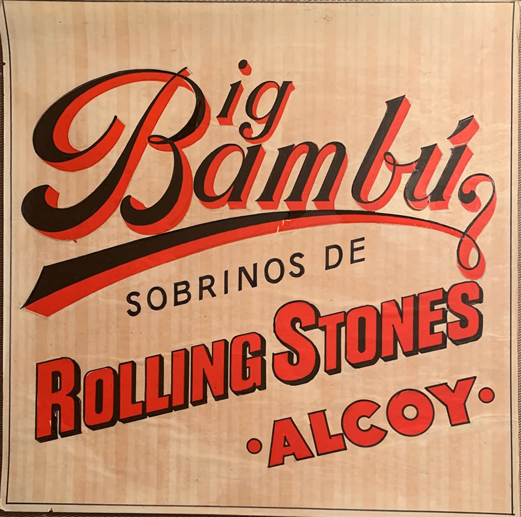
Braun’s creative company came up with a variety of design concepts for the Sticky Fingers album package such as basing it on Bambu cigarette paper, which was popularly used to roll joints. Braun recalls, ‘Another one was a chateau and I had it as a triptych, so there were three panels and die-cut skyline where the towers, chimneys and everything were. One idea was with heat-sensitive inks, so the cover was black and you put your palm on it and all of a sudden these iridescent greens and blues would come up eerily on the faces of the Stones.’
He adds, ‘They made the deal with Atlantic and then Marshall Chess called me and said, “I have to lay an idea on you. Mick [Jagger] told me that he got an idea from Andy Warhol about putting a real zipper on the front cover”. I said, “Wow! Great but with vinyl, that’s tricky man, but let me see if I can work it out.” It was basically going to be jeans with a zipper. It was Andy’s concept to put a zipper on that album cover.’ Marshall said, “Man, we’re locked in. Mick [Jagger] wants that [jeans] cover,” so we went forward with that design and construction dictate.’
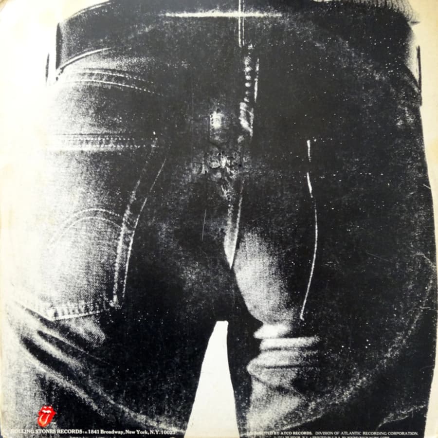
© Andy Warhol/Craig Braun/ Sound Packaging Corporation/EMI/ Rolling Stones Records. Back cover of the album
Braun adds, ‘I had my art department do some sketches to come up with the cover concept and then we tried various zippers’. Braun eventually sourced zippers from Cort and came up with the idea to die-cut an insert, corrugated card between the albums when they were packaged.
Polaroids from Warhol
He then contacted Warhol to show him the graphic imagery for the album design via mock-ups. Braun explains, ‘I was gonna try and mimic his silk-screen style in those days; posterisation. Polaroid pictures in those days weren’t sharp – they were like they’d been shot through nylon or through Vaseline.
They were basically grey, but there were various black and white tones. But with this posterisation technique you would take just dark of medium grey and force it to black and light of the medium grey tones in the Polaroid you’d force to white, so I had my team do that.’
He continues, ‘Warhol gave me about 10 or 12 Polaroids. They were all really shitty. I had weak photos to work with, but it wasn’t art that could be reproduced. I was trying to come up with a texture of blue jeans. I chose one, which we used. Then I said, “Let’s do a mezzotint line conversion, so that we can make the jean threads kind of ‘pop’”.
We’d already translated to a black & white image, in the style of Warhol, and I told Andy, “I wanna use your name,” and he said, “I have a stamp I can give you.” I said, “yeah, because we’re gonna sell a lot of albums with your name on it. Some people may even buy it for the artwork.”’
© Craig Braun/Sound Packaging Corporation. A Sticky Fingers cover concept – a variation of this was later used for a Cheech & Chong album
The Polaroid images used on Sticky Fingers are sometimes accredited to Billy Name but Braun isn’t sure that was the case. ‘Maybe he [Name] took the pictures, but I doubt it because Andy had always given me the impression that he did the shoot. I didn’t say to him, “Do you actually hold and shoot your Polaroid [camera]?” because I saw him four nights a week at clubs, social events and at my house for dinner, always shooting pictures of everyone with his Polaroid [camera] – he was a Polaroid addict.’
Warhol loved the front cover design and Braun then gave him a new task. Braun explains, ‘I had added another cover pane to protect the record from the zipper so I said, ”Get the same guy and tell him to play with his cock before you shoot these colour Polaroids because the guy’s got a semi hard-on on the cover.”
Andy said, “Oh, what a great idea!” So, he got the same guy or another guy – there’s a lot of discussion about whose “equipment” that was… if it’s Joe D’Allessandro or Mick Jagger, but it’s really Corey Grant Tippin’s equipment on that cover. Fred Hughes, who was Andy’s right hand guy, told me that.’
Lips and tongue logo
Aside from the posterised Polaroids and zipper, two other key ingredients of the album’s artwork package were the red stamps, set in Cheltenham type, on the cover saying ‘Rolling Stones’ and ‘Sticky Fingers’ and the iconic ‘lips and tongue’ logo, which the Stones still use to this day.
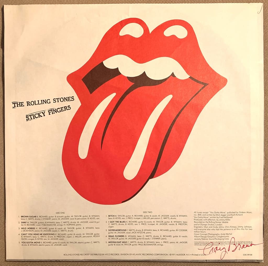
© Craig Braun/ Sound Packaging Corporation/Atco/Atlantic Records/ Rolling Stones Records. The US version of one side of the inner sleeve with the lips and tongue logo – this is signed by Craig Braun and credits Andy Warhol for the album’s photography
Braun and his design team adapted it from two sources, including a faxed silhouette of sketch work from Marshall Chess (which was barely one-inch high) that had been started by design student John Pasche in London. Deciphering it was challenging, so Braun remembered an image from Alan Aldridge’s 1969 book The Beatles Illustrated Lyrics for the Daytripper song, featuring a girl licking a lolly, so this ‘filled in the blanks’.
Braun adds, ‘Marshall [Chess] had sent me about 12 photographs of a black & white [band] shoot by Peter Webb. In one of them Bill Wyman had his finger in his nose and Mick [Jagger] was yawning, but I liked that. I picked that one and I said, “Bleed this off on all four sides of the inner sleeve and on the other side I want the logo maybe eight to 10 inches top to bottom and then we’ll put on the song line-up, all the credits and publishing details.” So, that’s what we did. We put that together on the inner sleeves and we just had to strip in my version of the logo in the centre.’
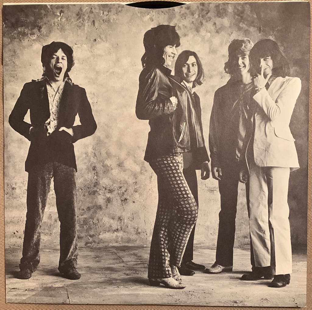
© Peter Webb. The band photo by Peter Webb that Craig Braun chose for the inner sleeve of Sticky Fingers. From left to right: Mick Jagger, Keith Richards, Charlie Watts, Mick Taylor and Bill Wyman
For the initial US vinyl release the album title and band name was smaller and at the top, on the belt, whilst for the UK release both the title and band name were in bigger letters with tilted stamps on the left hand side. Behind the zipper the underpants were seemingly rubber stamped with the script name of Andy Warhol, below which read ‘THIS PHOTOGRAPH MAY NOT BE – ETC’.
Braun sent one of his staff to London, to get sign-off on all of the mechanical artwork from Marshall Chess and Mick Jagger, with strict instructions not to mention a word about the version of the logo they’d done – Chess and Jagger signed it off. He reveals, ‘We had an OK on all the artwork and they loved it!
Andy [Warhol] was paid $4,000 for the Polaroids. I probably made no less than $300,000 by producing over three million album packages, but nothing for the album design and logo. This had got to have the utmost discretion because I knew it was a hot potato…. not just the logo but we were in the mouth of the gun time-wise for an early April release, but we got the approval and we started production of the handmade package.’
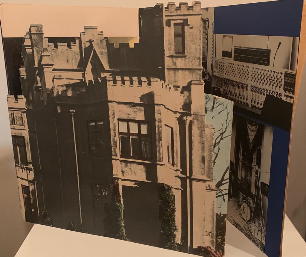
© Craig Braun/Sound Packaging Corporation. One design concept for the Sticky Fingers LP cover was a triptych, based around a chateau. In 1971 the Stones lived as tax exiles in Villa Nellcôte, Villefranche-sur-Mer, France
Zipper problems
With production starting, and shipments of the LP going out, that was far from the end of the story as issues surrounding the use of the zipper quickly arose. Braun explains, ‘When you have a zipper pull, there’s a round clip that holds the pull, and that’s why I had those corrugated inserts made. What I didn’t anticipate was they put something like 25 albums in each box and stack these boxes high in the trucks. A truck is riding hundreds of miles and these boxes are weighing heavily – the back of the zipper handle was damaging the Sister Morphine track on side two.’
Back at Atlantic Records Nesuhi Ertegun was getting very irate. Braun explains, ‘The album comes out on April 9th – the day of infamy – and after the first shipments I got a call from Nesuhi’s assistant at Atlantic, who said, “First of all the cover’s costing us much more and, secondly, he told you to print the zipper.”
I said, “Put him the phone.” So, I said, “Nesuhi, yes, you told me to print the zipper but I told you that that was the Stones’ deal with Ahmet [Ertegun] – Mick and Marshall’s idea – and it came from Warhol… they wanted an actual zipper; that was the concept for the thing. So, I’m not eating these f***ing albums.” It could have put me out of business.’
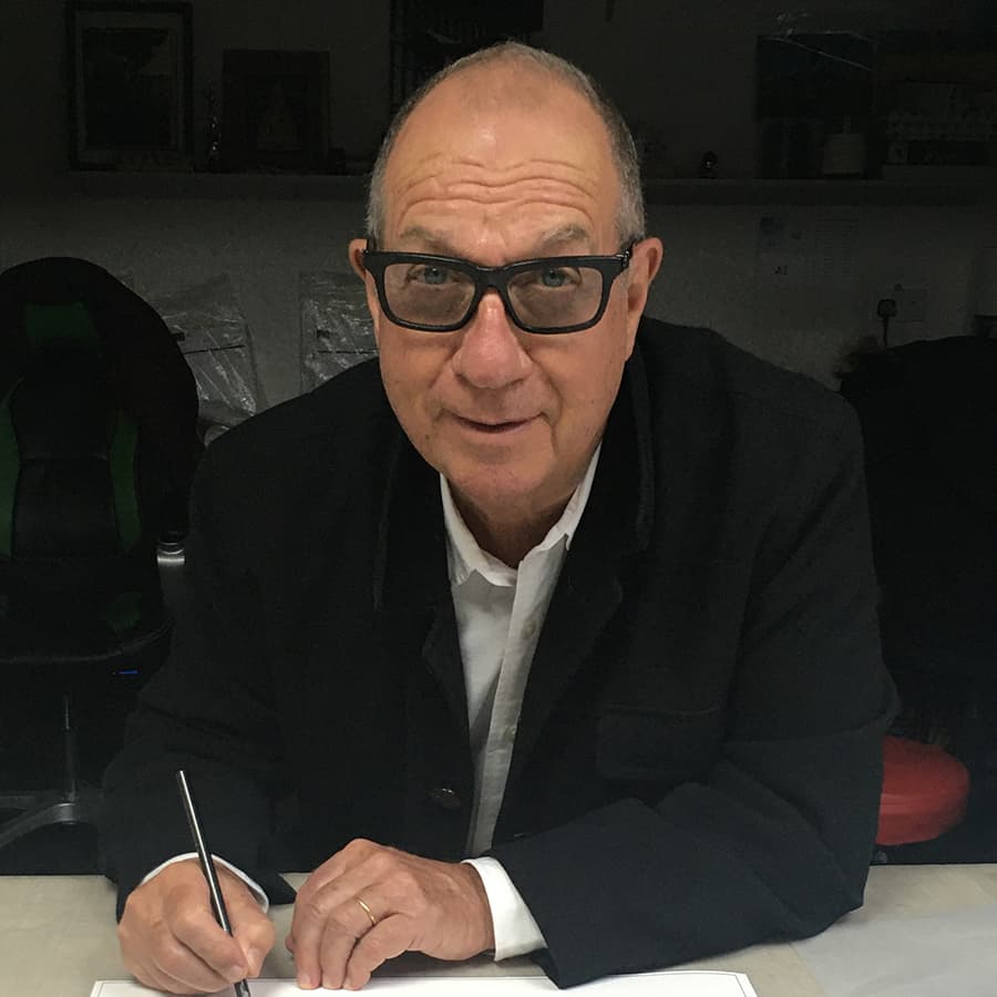
© Craig Braun. Craig Braun pictured in 2015 with some of his famous album cover work
Braun admits, ‘I was scared shitless. That same night I was in my office and I started playing with a couple of these covers. I realised if I pulled the zipper down to the centre of the album cover the zipper-pull would dent the centre disc label, which nobody cares about. I called Nesuhi [Ertegun] the next day and said, “I’ve got the solution. We’re gonna get extra, heavy-duty glue for the fabric that holds the zipper into the board and we’re gonna extend the conveyor belts in these four pressing plants so that the zippers have a chance to dry.
Then we’re gonna have little old ladies, just before it’s shrink wrapped, pull down the zipper so that the dent will now be in the centre disc label on the record.” Nesuhi said, “Do you think it will work?” I said, “Yeah, I know it’ll work.” I had my production guy call all the pressing plants and give them instructions on how to do it… and it did work.’
Much to the amazement of Braun, and many others in the music industry, the album design for Sticky Fingers lost out in the 1971 Best Album Cover Grammys to the album Pollution, which featured a photograph of a baby chick in a gas mask. Braun recalls, ‘That Sticky Fingers package is right up there in my personal pantheon. I designed and produced that whole package.
I put in my life, sweat and soul into it. Ironically, at the same time, I was doing The Carpenters [LP design]. Can you believe that? I was doing a logo and special package for The Carpenters at the same time as I did the Stones and they came out two weeks and 180 degrees apart.’
Andy Warhol
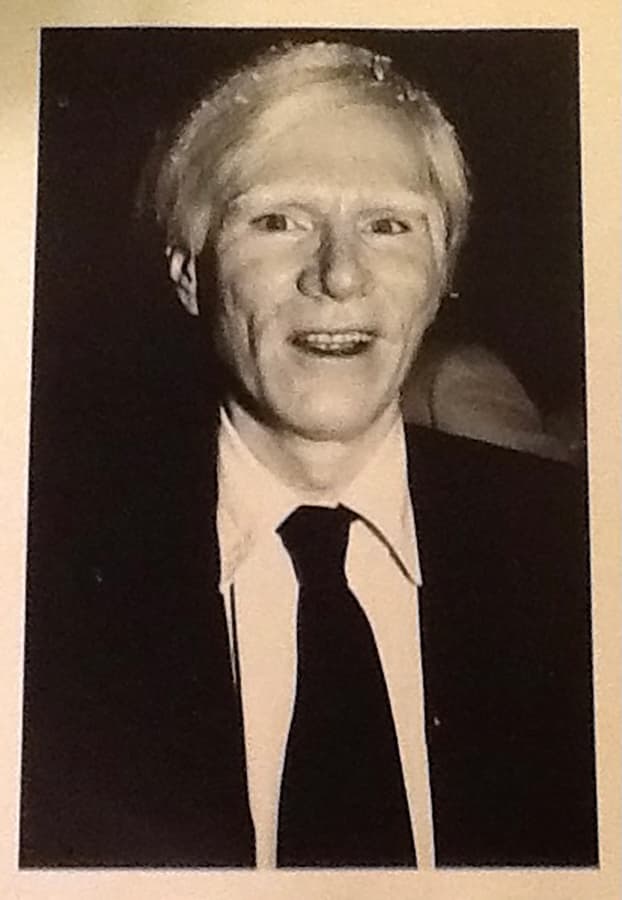
Many have credited the photography for Sticky Fingers to William George Linich (1940-2016) who was a US photographer, filmmaker and lighting designer known professionally as ‘Billy Name’. He was the archivist of Andy Warhol’s New York studio, The Factory, from 1964 to 1970.
However, on the Sticky Fingers album inner sleeve Andy Warhol is credited for ‘Cover concept/ Photography’. Warhol (1928-1987) was an artist, film director, producer and a leading figure in the ‘pop art’ movement. His involvement in album cover artwork included work for John Cale, Aretha Franklin, the Rolling Stones and The Velvet Underground & Nico. He died in 1987, aged 58, after complications following gallblader surgery.
The panel on Sticky Fingers
Jason Bell

As if the innuendo of the album title was not enough, the Stones then doubled down on it by using Warhol’s idea of a close-up crotch shot with a working zipper, which really kicked it up a notch. And the folklore around having to partially unzip it to stop vinyl damage just added to the titillation of it all.
Andy Cowles

This has to be the most outrageous album sleeve ever. It’s the picture doing the heavy lifting here – rarely has a highlight been used to such good effect. Combined with the title and the zip, it’s one helluva promise, whichever side of the cardboard you’re on.
Aubrey Powell
It’s a wonderful piece of erotic, androgynous pop art that entices the buyer to unzip the fly and see what’s inside. Clever. A masterstroke of design, photography and engineering. Anything that affronts the record company and the buying public and makes them sit up and think or, in this case, interact with the album cover, gets my vote. So many album covers in the 1970s were bland and safe, often designed by in-house record company art departments who were obliged to sit on the fence between the commercial desire of the company and the art director’s wishes to push the boundaries.
Our panel of judges
Some of the finest names in music, design and photography chose their favourite album covers for this series – they are:
Janette Beckmann
Jason Bell
Harry Borden
Ed Caraeff
Andy Cowles
Kevin Cummins
Dr Andy Earl
Jill Furmanovsky
Christie Goodwin
Peter Hook
Simon Larbalestier
Gered Mankowitz
Dennis Morris
Peter Neill
Aubrey ‘Po’ Powell
Rankin
Jamel Shabazz
Mat Snow
Howard Wakefield
Kirk Weddle
Rachael Wright
Further reading
Greatest album photography: Quadrophenia The Who