Photo: Light and shade
Taken by: Eric Begbie
Nikon D810, 28-300mm, 1/640sec at f/13, ISO 400
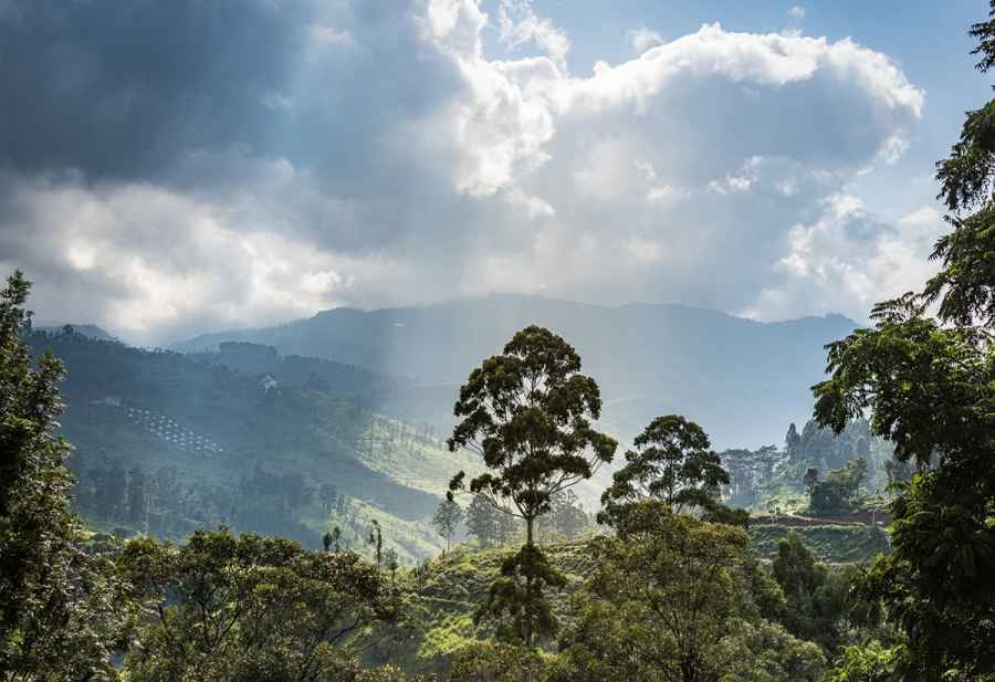
What a lovely tree Eric has spotted. It has a beautiful shape that he’s done well to emphasise by placing it in an area with a nice clean background. There is a good space above the top of the tree and the base is about as visible as we could hope, but there is also a lot of space to the left and the right that I’m not sure adds a great deal. I quite like the bookend effect of the tall trees at the right and left of the frame, but they are cut off enough that we can’t be absolutely certain that Eric intended them to be in the picture.
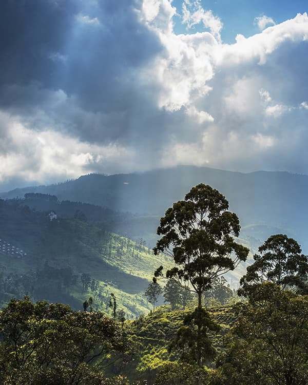
The most interesting part of the picture is the central tree and the beam of sunlight that’s picked out in the atmospheric haze, so that is what I have concentrated on with my upright version of the shot. I’d have liked to have more of the bookend trees, but in their current state I feel it is better to lose them entirely and to add some local contrast to the midtones to bring out the sunbeam a little more.
This is a wonderful view, and while there isn’t too much wrong with the way Eric has composed it, I think we all need a level of visual certainty to make us feel relaxed and comfortable enough to enjoy the scene.


