Photo: Karting
Taken by: Ben Leslie
Sony Alpha 350, 70mm, 1/40sec at f/22, ISO 100
It’s very hard to create a go-karting picture, or one of any motor racing on a track, that’s of interest to people not already involved in the sport. To the untrained eye, most racing just looks like lots of cars going around a predictable route very quickly. Unless you’ve never seen a car going fast, or you are intimately acquainted with the driver or the intricacies of how one achieves such speed and position, the whole event can seem a bit dull and repetitive.
Images tend to be quite factual, as most photographers attempt to demonstrate a technical superiority over the challenges of creating a sharp and detailed image in such circumstances. This often supplants photography’s primary aim of explaining the atmosphere of the occasion to those not there to witness it.
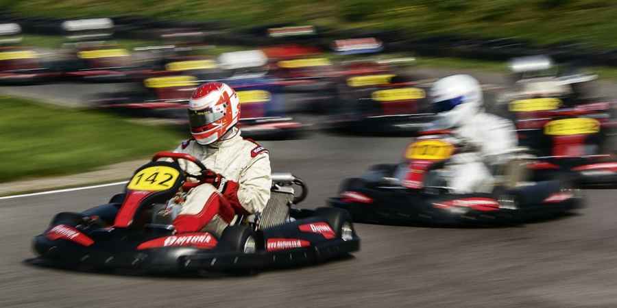
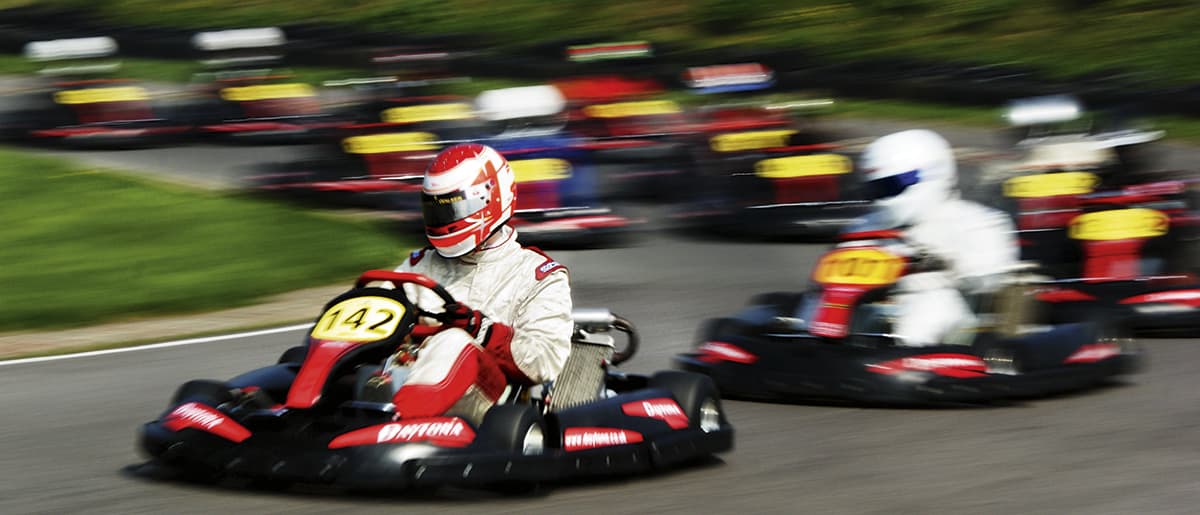
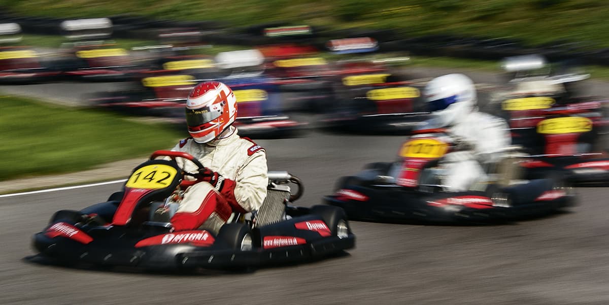
The collection of motion-blurred images that Ben has sent me is much more effective at relaying what it was like to be there, by presenting the speed and excitement in a way that no pin-sharp image can. By using a slower shutter speed, 1/40sec in this case, Ben gives us a real sense of the sport’s speed, power and daring.
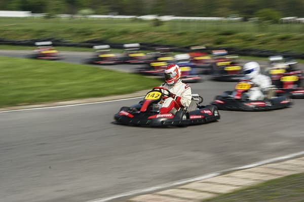
Ben has sent in his original shot along with his edit, so we can see how he arrived at his final composition. I think the crop was a very wise choice as it removes the boring background detail and allows us to concentrate on the action. Cropping the karts close to the edge of the frame also gives us a sense of pace and split-second timing – something clearly missing from the original frame.
My issues with the shot are that the crop looks like a crop because the proportions don’t correspond to any shapes we associate with photographs, and the contrast of the final image is such that shadows are lost to black and highlight to white.
I’ve gone back to Ben’s original and re-processed it via Adobe Camera Raw. I reduced contrast, pulled down the highlights and lifted the shadows to make more of the picture visible. I then added a curve to the midtones to create the punch and tonal separation that makes us look.
My edit is a slightly different shape as Ben has cropped to suit the content rather than using proportions that we are used to. I like his idea of using a letterbox-style frame, so I used 16:9 proportions to remove the excess of grass in the background and road in the foreground. Nice creative thinking, Ben.

