Amateur Photographer verdict
The Logitech MX Creative Console combines great hardware design with well-thought-out default button functions and customisable profiles. Unfortunately, it’s let down by glitchy software.- Small footprint
- Versatile two-part design
- Consistent operation between different programs
- Keypad is fully customisable
- Glitchy operation in Lightroom
- Intrusive account registration required
- Doesn’t work with Adobe Bridge and Camera Raw
If you do a lot of editing in programs such as Adobe Lightroom and Photoshop, you’ll know that operating them using a keyboard and mouse can get repetitive and uncomfortable. This is where editing consoles come in. By providing more precise dials for adjusting settings, along with an array of shortcut keys tailored to each program you work with, they aim to speed up your workflow and make editing more productive. The Logitech MX Creative Console is the latest addition to this market.
Logitech MX Creative Console at a glance:
- $199.99 / £199.99
- Two-part image editing console
- Works with Windows and Mac PCs
- Available in graphite or pale grey
- logitech.com
Designed specifically to work with Adobe Creative Cloud software, the MX Creative Console goes up against established devices from the likes of Loupedeck and Tourbox, but it brings its own unique spin on the concept. At $199.99 / £199 it sits in the middle of the field, pricewise. But how well does it work?
Design
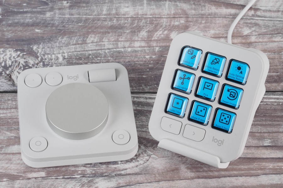
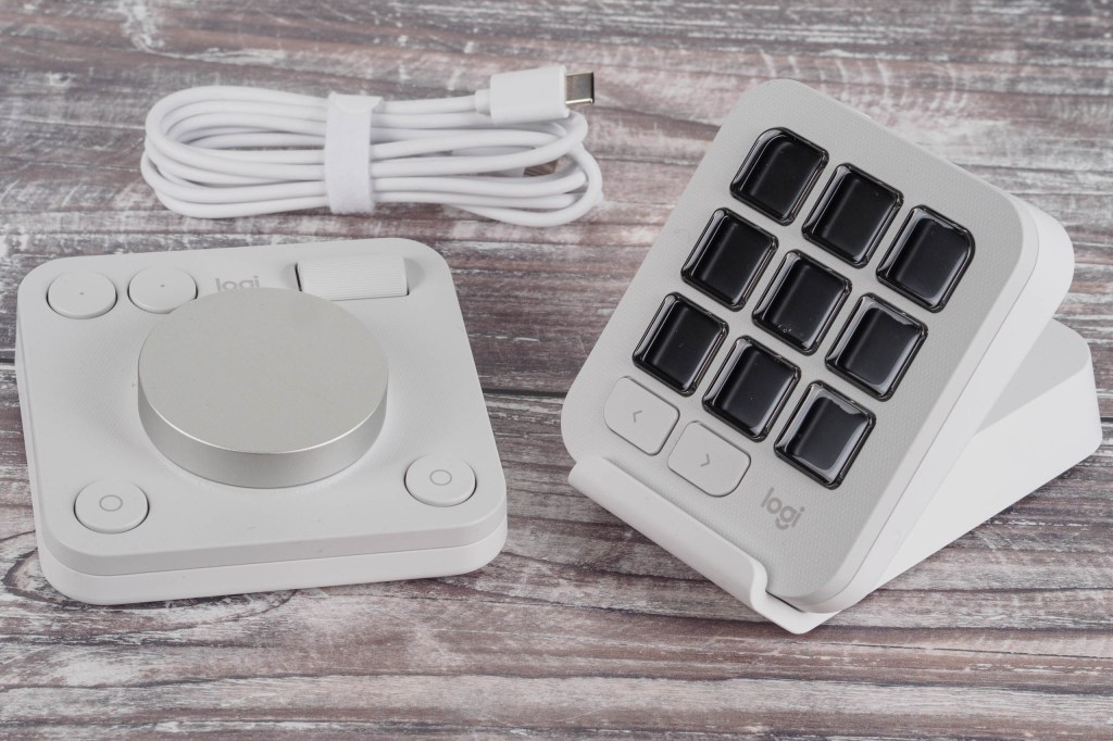
Unlike other editing consoles, the MX Creative Console comes in two parts, called the Dialpad and the Keypad. While either section can be used on its own, you’ll get the most out of the setup by using them together. They’re not designed to replace your keyboard and mouse, but instead complement them.
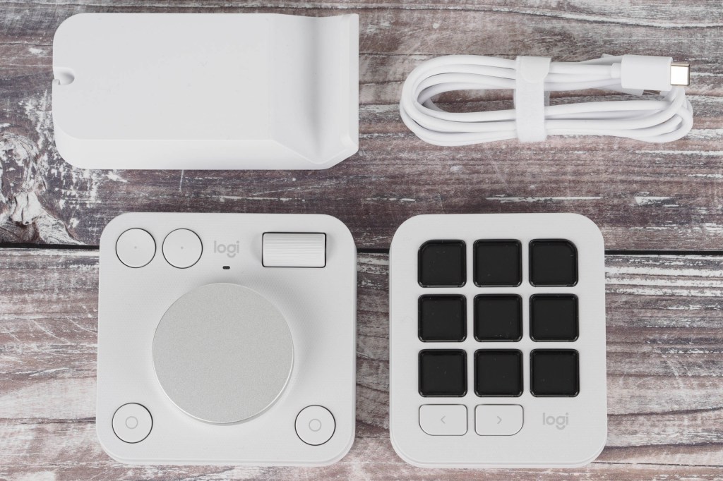
Looking first at the dialpad, this measures 9cm square, is powered by two AAA batteries, and connects to computers via Bluetooth. I say ‘computers’ because it can be paired with three different devices, selected using a small button on the base. It has one large main dial, a smaller horizontal roller wheel, and four buttons.
Two of these buttons are arranged in a pair top left, with the others at the lower left and right corners. A small power switch on the back rounds things off.
Turning our attention to the keypad, this is a little smaller, at 7.5cm wide. It connects to computers via a USB-C cable that comes in the box. There’s a set of nine buttons on board, each with its own little LCD screen that displays its current function. Left and right keys underneath these buttons select between groups (or as Logitech calls them, ‘pages’) of functions for them.
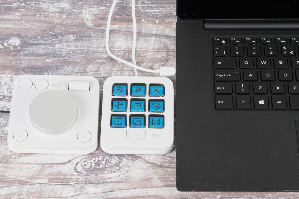
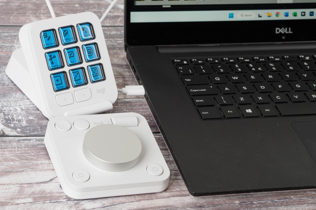
In terms of your desktop setup, the idea is that you’ll use the dialpad with your left hand while operating a mouse with your right, and then place the keypad wherever you find works best. To provide more flexibility here, Logitech includes a stand in the box that allows you to set the keypad at an angle.
Personally, I preferred having both sections to the left of my keyboard, with the keypad either lying flat on the right, or in tighter spaces, propped up on its stand behind the dialpad.
Logitech MX Creative Console key features:
- Dialpad: This section connects to your computer via Bluetooth and is powered by 2 AAA batteries
- Keypad: This connects via USB and has nine buttons, each with its own small LCD screen to show its current function
- Stand: You can use the supplied stand to set the keypad at an angle if you prefer
- Software: It’s necessary to install the free Logi Options+ app to use the device
Initial setup
To use the device, first you need to install the Logi Options+ App on your computer. Then pair the dialpad with your computer, and plug in the keypad. At this point, the app will detect the Creative Console and automatically download profiles for the imaging software you use, such as Photoshop and Lightroom. These profiles then define what the buttons and dials will be used for in each program.
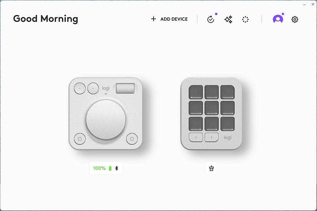
Annoyingly, though, this process requires you to create an account with Logitech, which demands to know your date of birth for no good reason. This is unnecessarily intrusive, and personally, I’d just enter a random date. I think Logitech should remove this requirement.
How does it work?
Once you’ve got the device set up and profiles installed, it’s time to get to work. Like all such consoles, there’s no way you’ll pick up how this one operates and start working fluently with it straight away. Instead, you first need to spend a bit of time exploring what the various buttons and dials all do. I mostly tested it using Lightroom, so I’ll concentrate on that in this review, but I also tried it out with Photoshop.
Thankfully, Logitech keeps the dialpad control functions admirably consistent between different programs. The main dial itself is contextual – on other words, it changes whatever setting you have selected using either the keypad or your mouse. So, for example, you can click on any slider in Lightroom’s Develop panel and spin the dial to change that setting. But it also has a default function that it goes back to when it’s not doing anything else, which is to scroll through images in your library.
The pair of buttons on the top left are undo/redo, while the roller dial alongside zooms in and out of your image. The lower left button is a custom key that in Lightroom toggles between Library and Develop modules, while that on the lower right calls up the ‘Actions Ring’.
Here you get a set of eight onscreen icons for different settings, which cover all of Lightroom’s white balance and tonal controls. Hover your mouse pointer over a function, and you can use the main dial to adjust it. In principle, this gives a really quick and easy means of making your major image adjustments.

Keypad button functions are shown clearly on their screens, with Logitech’s profile including a sensible set of options. While most of the buttons simply activate a function, sometimes they can work together with the dial. For example, there’s a whole page of controls in Photoshop where you can adjust brush parameters including size, hardness, and flow.
In Lightroom, the button functions change according to which module you’re in, and sometimes with the specific function you’re using. In the Library, they’re all about such things as rating and labelling your images, while in Develop, you get commonly used options like auto white balance and auto upright, plus various masking and gradient controls.
Press the ‘crop’ button, and the buttons change to selecting the aspect ratio. Engage AI masking, and you get one-button access to selecting the subject or background. So there’s a lot of really useful shortcuts here.
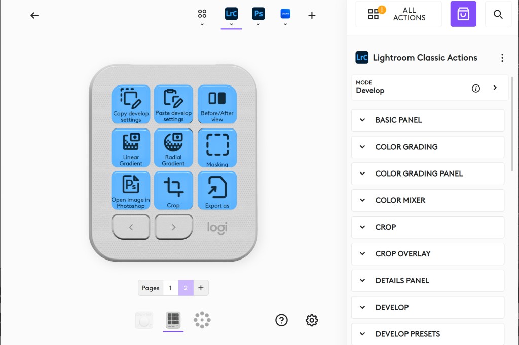
If you’d prefer to use the Keypad to activate other functions, the profiles can be edited in the Logi Options+ app. You can either replace existing functions with ones you use more often, or add entire new pages full of additional options. You can also change the functions of the Dialpad and the Actions Ring – it’s just a shame you can’t add additional ‘pages’ for the latter.
Glitchy software
After familiarising myself with how the MX Creative Console works, and using it to edit a number of images in Lightroom, it’s clear that this device has the potential to be an extremely useful editing tool. Indeed a lot of the time, it works really well. But the problem is that the software is a little buggy and unreliable, at least on my Dell XPS 15 Windows 11 laptop. (For the record, I prepared this review in November 2024 using Logi Options+ version 1.84.641293.)

A lot of the problems are related to using the Action Ring. Firstly, once you start using it to edit an image, the dial refuses to change any of the Lightroom sliders, so you have to use the mouse instead. Also, sometimes the dial will get stuck controlling a single function, rather than the one you actually have highlighted. This doesn’t happen all the time, but often enough to get irritating.
Most annoyingly of all, when you hover the mouse over an action button, occasionally the dial will decide to scroll through images instead. I tried disabling this scroll function in the Develop module, but then the dial refused to operate any Lightroom sliders at all.
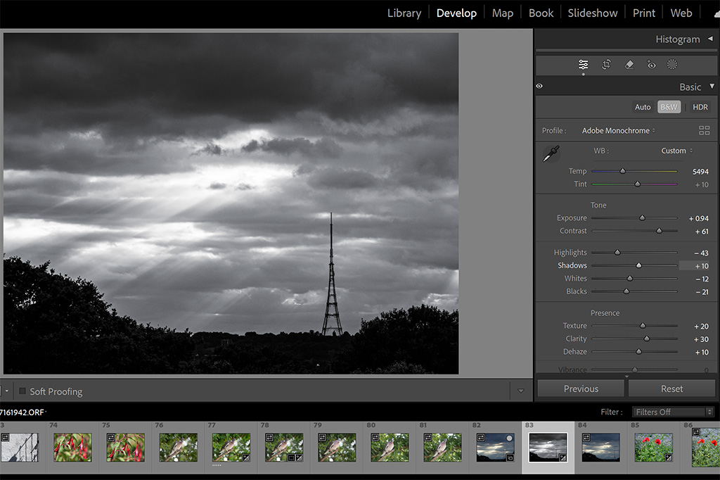
Occasionally I also had the console drop out of the Lightroom profile for no obvious reason, and revert to its default general-purpose profile instead. This leaves you twiddling the dial with no effect on your image (instead it’s changing your computer’s audio volume).
It’s also important to note that while the console is designed to operate most Adobe software, it doesn’t work with Bridge and Adobe Camera Raw. I’m told this isn’t Logitech’s fault, but instead down to Adobe’s software design – and to be fair, all the editing consoles I’ve used have the same limitation. But if this is how you prefer to work with your images, then you’re out of luck.
Our Verdict
In principle, there’s a great deal to like about the Logitech MX Creative Console. I like the flexibility of the two-part design and how it takes up relatively little space on your desk. I also appreciate the way that the dial pad is relatively simple and retains most of the same functions between apps. This means you’re not left staring at a load of unmarked buttons trying to remember what they all do.
Meanwhile the keypad, with its pages of functions, gives access to plenty of settings without needing to be physically huge. So when it comes to the concept and hardware design, Logitech has got many things fundamentally right.
Unfortunately, though, the overall experience and usability is currently let down by the glitchy software. The last thing you need from a device that’s meant to speed up your workflow is for it not to operate consistently. Just right now, it’s not quite reliable enough. But if the bugs all get ironed out, it could easily become the best image editing console on the market.

Follow AP on Facebook, X, Instagram, YouTube and TikTok.

