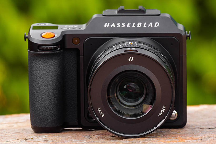
The Hasselblad X2D 100C may be simpler than most, but Tim Coleman more than likes it that way. Minimalism? Bring. It. On.
I recently reviewed the Hasselblad X2D 100C and besides admiring its stunning design, there was another thought going through my mind. Where is everything?
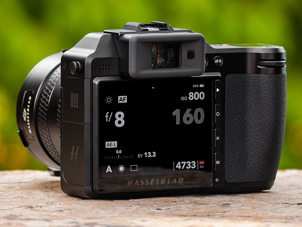
There’s a sparse selection of buttons and no shooting mode dials. It doesn’t have a battery door because the battery forms part of the camera’s exterior, while you don’t need external media because there’s a 1TB SSD built-in.
And take the new accompanying XCD V lenses. You’ll only find one external control – a manual focus clutch – and that is precisely one more than what’s on other Hasselblad XCD lenses.
Enter the main menu and you’ll find a single page with ten sections, all of which contain the bare essentials. So many of the choices we’re used to – take colour profiles (Standard, Vivid, Monochrome etc) – simply aren’t there.
Yes, it’s all so…simple. And I loved it.
You must be thinking that there is a whole lot more missing. In part, that is true – this is no high-speed camera packing autofocus tracking and shooting modes galore. It doesn’t even shoot video.
Yet as multi-disciplinary photographer and filmmaker, around 90% of the menu options in my hybrid mirrorless cameras from the likes of Nikon, Panasonic, and Canon go unused, while half the camera buttons are largely redundant. Menus are typically complex, there’s too many buttons, and too much going on. The X2D was the perfect remedy.
I had a similar thought recently about how my compact camera is a winner for photography over my smartphone for one key reason – it’s a camera only. It lacks all the other functions and distractions that a phone brings – even if my phone is just as convenient and capable of making pictures – and that’s the beauty.
Just because functions and controls are there, doesn’t mean you have to use them, I hear you say. True. But it would also be neat if the stuff I didn’t use wasn’t there. Minimalists will say that too much of anything causes stress, and frankly I don’t need to shoulder complexity in the tools I choose for the creative process.
Yes, I can customise these other cameras with my own menus containing regularly used settings for quicker access, but that’s another thing to do and trust me, it’s just not the same as having less options. It’s a solution for a problem that I didn’t ask for in the first place. You see, there is greater peace and focus in creating with a simpler tool.
Functionality isn’t always about offering everything possible – and ultimately that is the design and progress we’ve been fed in the majority of modern dedicated cameras. It’s what we know, but it doesn’t have to be. This other concept of functionality that Hasselblad proposes – simplicity – that’s my happy camp.
And I would go on to say that there is a world where simplicity and multi-functionality can combine. For me, it’s got to be where progress is made in camera design; reducing the number of user choices, covering gaps with intelligent tech advances. Yes, it’s time to make cameras simpler and technology can help with that.
Keep it simple, stupid.
Featured image credit: Damien Demolder.
Read the full Hasselblad X2D 100C review
Best Second-hand Digital Medium Format Cameras
The views expressed in this column are not necessarily those of Amateur Photographer magazine or Kelsey Media Limited. If you have an opinion you’d like to share on this topic, or any other photography related subject, email: ap.ed@kelsey.co.uk.


